Manage element settings. Set styles.
The Design pane consists of two major sections. The top part — the Element part — is for 'configuring' the selected element. Here you can specify, for example, the link of a button or provide alt text for an image. This is also where you can also select and add Foundation & Bootstrap (and custom) classes or add data attributes for creating interactive elements.
The second part is for adding Style(s) — for specifying the way the selected element looks. All CSS style properties are available through a set of intuitive design controls creating tremendous design powers!
Let’s get started with the Style section.
TOC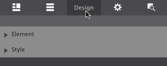
The two main sections of the Design pane.
The tool collections on the design pane have been organized in groups of related controls. Each of the groups (sections) can be collapsed an expanded when needed. When all the sections are expanded the scroll to the lower sections can be getting rather long...
Transitions — from one appearance to another — can only be created after the design is in place. So we skip those for now and go over the design tools found in each of the Style Control sections, starting with Typography.
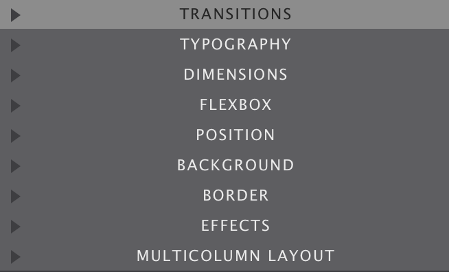
Overview of the Style Control sub-sections
The right choice of font, colors, and spacing greatly help to communicate the message of a website and contribute to the brand recognition. Site Designer features a big selection of font choices as well as a large set of typographic controls.
The Font drop down gives access to all the 808 font families in the Google font collection. A web safe (system) font can be selected just in case the primary selected font fails to load with the Fallback Font control.
The third dropdown can be used to select the font-weight. Some font families do not provide all options — in those cases the closest available option will be applied.
The next controls can be used to change the font-size and line-height for the active selector. These two properties can be specified in different units of measurement such as pixels (currently selected in the image) ems and rems. Clicking on the active unit will bring up a dropdown with other available options.
The color of the font can be changed by clicking on the little color tile — white in the image — next to the drop. The text element can also be set to be displayed in italic and small caps.
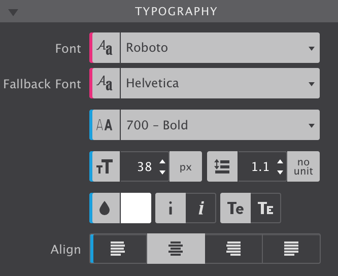
The first set of Typography controls.
The last control visible in the above image can be used to align the text. Left, right, center and justify are the available options.
Additional resources
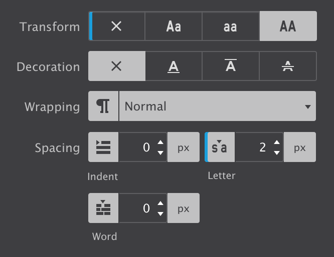
There are a couple more typographical controls available. The text-transform control can be used to specify the capitalization of an element's text. It can be used to make text appear in all-uppercase, all-lowercase or with each word capitalized.
Text-decoration sets the text formatting for the selector to underline, overline, or line-through. Underline and overline decorations are positioned under the text, line-through over it.
The wrapping control is for handling the white-space inside the text element which has a big effect on how the text wraps.
The three different Spacing icons show the effect of each of the controls on the text. The text-indent controls the indentation of the first formatted line of the block. The second control adds space between all the letters of the text element. Space can be added between words with the word-spacing control.
More design possibilities for text elements.
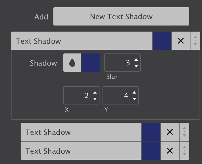
The last control for styling text elements is for adding shadow effects.
The ability to add multiple font-shadows, and the ability to control the exact settings for each of them, allows for really cool effects.
The above effect is created using three text-shadows with slightly different settings for the blur and distance values. Higher values for Blur make the shadow wider and longer.
The offset-x and offset-y values specify the horizontal (X) and vertical (Y) distance the shadow is placed from the text. Negative values are allowed — a negative X value places the shadow to the left of the text, and negative Y value above the text.
More design possibilities for text elements.
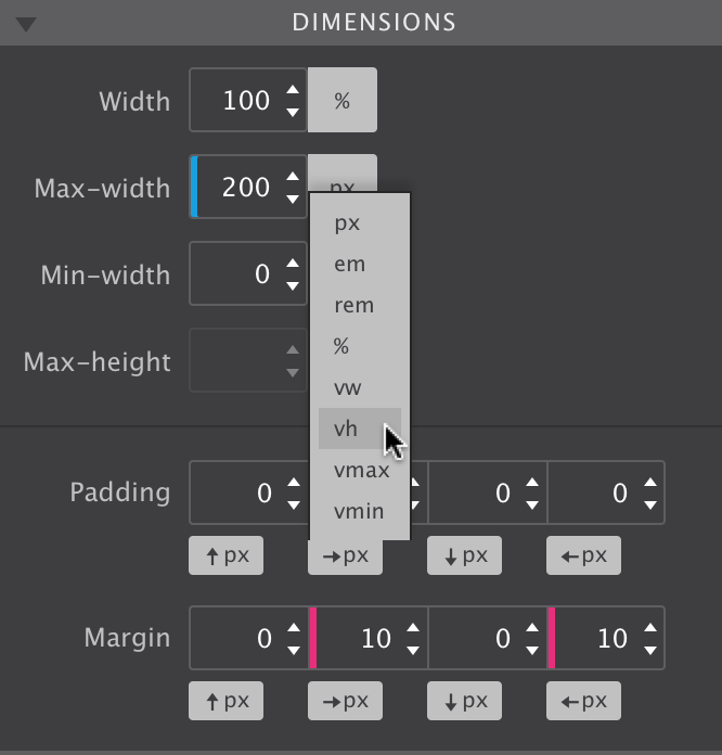
The exact number of controls on the dimensions pane depends on the Element Type. On the right the controls for the image element are shown. Containers, for example, have a larger selection of dimension controls. Together with the ability to use a specific unit of measurement for each control, amazing layouts and effects can be created.
The width and height controls, including the minimum and maximum, work on the content area of an element. The content area is the part inside of the padding, border, and margin of the element.
The Max-width tells the browser that an element can never become wider than the specified value. The Min-width does the contrary (and will override the Max-width setting) — it specifies a minimum for the width of an element. The height controls do the same for the height of an element.
The Padding controls the space between the content area of the element and the border. The space the padding takes up is part of the element and, for example, gets the same background color. The arrows denote where the padding will be applied, on the top, right, border or left side of the content area respectively.
Margin is the space between element. If an element is placed inside another element, the margin will push the (child) element away from the border of the parent element. A margin can also be a negative value.
One additional thing to know about Margin is that is can also be used to center elements within the parent container. Giving both the left and right margins the auto value will do the trick. This value is available by clicking on the unit switch dropdown.
Dimension controls and length units.
The same dropdown can be used to change the value type the dimension is specified in. Dimensions can be set in absolute pixel (px) values, or in relative values such as a percenlabele. Let’s look at that — how length can be defined in CSS — in a little more detail.
Pixels used to be a value that is normalized (the same) across devices and displays, but with the different new high resolutions screens that increasingly isn't true anymore. A pixel defined in CSS is now not necessarily the same as the pixels used by a device. Although an interesting topic, this is beyond the scope of this document.
Pixels used to be a value that is normalized (the same) across devices and displays, but with the different new high resolutions screens that increasingly isn't true anymore. A pixel defined in CSS is now not necessarily the same as the pixels used by a device. Although an interesting topic, this is beyond the scope of this document.
In a responsive design pixel values are mainly used for minimum and maximum width settings (if any) and for defining margins and paddings. For the default Width specification the auto and percent values are most common.
When a dimension is specified in a percent, the allotted space is calculated relative to the value of the parent element. This can be seen in the example below, the percent bar will under all circumstances take up half of the grey column.
The vh and vw are two interesting units that are relatively new to the table in terms of good browser support. The first unit stands for Viewport Height and assigns space relative to the height of the browser window. It can, for example, be used to create a cool effect with a background that takes up the full screen. This approach has been used in the Wave Weapons theme.
In the example below the width of the Viewport height bar is set relative to the height — when changing the height of the app (or browser window) you will see the width of the bar change accordingly.
The vw unit works the same, but is based upon the width of the viewport. The main use case is viewport based typography — the font can grow or shrink depending on the available space. The Wave Weapons theme showcases this as well. For dimensions this unit can be used to, for example, split screen design.
The em and rem units allocate space relative to font size. This is (almost) always 16px for both units. However, a website visitor could set his default font size at a higher (or lower) value, causing the em and rem based dimensions to change with it.
The vmin and vmax values are whichever is smaller respectively larger of either the vh or vw values. This can come in handy but is currently not supported by all browsers.
Additional resources
This section is used to manage the elements placement on the canvas. Flex, floats, blocks, absolute overlays…the possibilities are endless! It is also why this might take a little to get used to, but with this write up, some additional info links and a tad of practice, you will soon be positioning elements like a boss.
The Float was originally intended for text wrapping around other elements such as pictures. Simply set Float to right for the image and the paragraph will wrap around it. When the image is increased in size or replaced by a larger one, the text automatically adjusts and reflows around it.
By default elements are not floating and behave as blocks. Adding a float will place these blocks next to each other, if space permits.
The Clear is used in conjunction with floats. It can used be to move down (clear) the element following a floating element. Below you find a little example of the described behavior.
Floats work really well for many other layout constructs as well, including building an entire responsive grid system. However, they also come with a few peculiarities related. One of them can be seen at viewports widths below 440px — the Float C box will ‘float’ under B instead of A.
The new CSS Flexbox Module provides a superior method for aligning, ordering, sizing and positioning elements. Yup, it can do all of that and therefore is increasingly being used instead of floats. Setting the Display control to Flex for a Column or Container will make all elements inside flex-children. These children will then listen to the flex settings of the parent, but can also get some individual flex styles.
Let’s look at the other Display values in the next section before we start flexing things up.
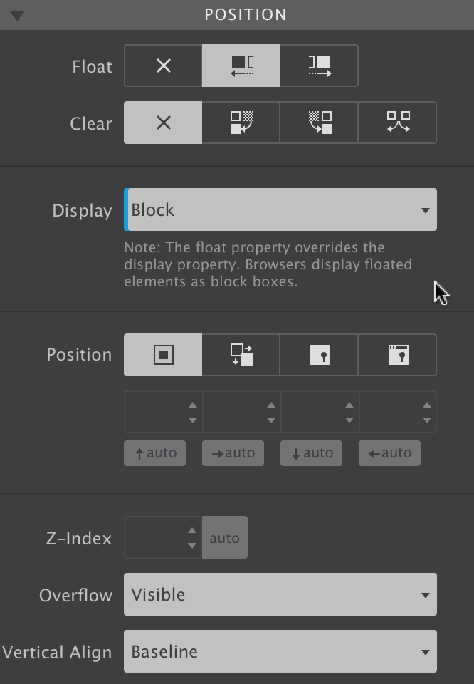
The tools in the Position section.
Additional resources
Most elements in the app are displayed as block by default. This means that they will stack. In addition to floating, Display inline or inline-block can be used to place them next to each other. Another possibility would be to use flex for the parent. We will come back to using Flexbox in the next section.
Buttons and text-links are displayed as inline-blocks by default. Inline-blocks can not be centered using auto value for the margins. This can be done by setting the text-align property of the parent column or container to center. The example below shows this for the two inline-blocks. Again, using Flexbox would be another option, but we will get back to that… I promise!
The inline value works similar to inline-blocks but the element looses its height and width. This is not recommended for elements that contain other elements.
The Display none value is used to hide or show element under specific circumstances. One example would be to not show an illustrative element on small screens. Another example are elements that only appear following user interaction — modal dialogs and larger mobile navigations are usually only visible following the click of a button.
The elements of (un) ordered lists are displayed as list items. The remainder of the possible values relates to the use of tables. Because of their ‘width requirements’ tables can be a bit of an issue in a responsive design. One of the approaches would be to build a Flexbox Table — detailed guide can be found here.
Additional resources
Flexbox is an extremely powerful weapon in responsive design. We will not be able to cover all details here. Check out our Design with Flexbox Guide for more details and examples.
A flex layout is created by setting the display property of a container element to flex. This can be any element that contains other elements, from a simple column or container, to a list element. The parent container becomes a flex-container, and all immediate children become flex-items.
The main characteristic of the flex container is the ability to modify the order, position, alignment, width or height of its children.
The Direction is used to define the direction the flex-items follow in the flex container. By default the flex-items will be positioned as (horizontal) Row. Changing the dropdown to Column will stack them.
The Wrap can be used to position a series of items on a single, or on multiple lines. If there is not enough space available, setting this property to wrap will place items that do not fit on the next line.
The Justify control determines how the elements are spaced out horizontally.
When there is more than a single line — more than a single column or row — of items, (align) Content can be used to distribute the space between the lines.
Using (align) Items the position of the elements on the cross axis of the defined direction can be managed.
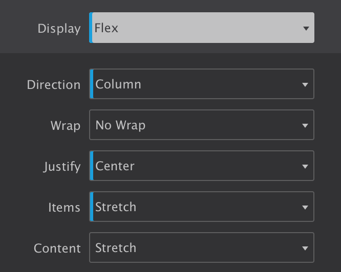
Flexbox controls
If you are reading this guide in the app, you can play with these settings in the example below and get hands on experience in how they work. The container has a class of flex-parent with initial settings of Direction row to place them next to eachother and Justify flex-start to align them to the left. The Item center value perfectly centers them vertically
The flex-items also use the flex display property. This allows us to easily vertically center the text using the column Direction now with center for the Justify control.
Bootstrap 2, 3 and 5 have enabled the clearfix class by default on containers. This can cause some unexpected alignment issues, so to help fix this we have added a new class to the wireframe called: .flex-clearfix which will disable the clearfix when needed. Need more info? Check out What is a Clearfix.
The flex-items can also take on individual flexbox rules. The example below is an extension from the previous example, but now each of the containers have one additional class — fi-1 to fi-4 — so individual rules can be applied. Please make sure to deselect the other classes before doing so!
It will be immediately clear that the blue box — item #4 — is now first in line. This is done with the Order control. Negative values can be used here as well, for fi-4 the -1 value puts it visually first in line.
The alignment specified by align-items on the parent container can be changed for individual flex items with the Align Self control. The black box has been pulled up by assigning the flex-start value to the fi-2 class. This overrides the center value specified on the parent.
The size of flex-items can be controlled with the Flex control. The Flex Basis specifies the initial size of a flex-item. This can be an absolute pixel value or a relative value like, for example, a percenlabele of the width of the parent.
The Flex Grow and Flex Shrink controls are powerful tools that can be used to control the growth or reduction of the element based upon the available display space.
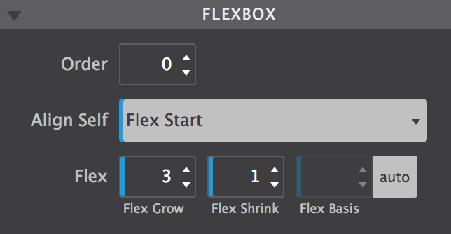
These controls can be used for additional control over the flex-items.
The image above shows the settings for the black box (flex-item #2). The initial width is not changed, the Flex Basis remains on auto. However, the Flex Grow setting tells the browser that the black box can take up 3 times as much of the remaining empty space as the other items.
Each of the items above has a different grow value, ranging from 1 to 4, causing the differences in width.
With the combination of Flex Basis and the unit switcher plus the Flex Grow control magical things can be achieved. In the example below the target (initial) value for each of the cards is set to 280px. When there is not enough room to get to that width, the item(s) will wrap.
They all have a Flex Grow value of 1 , so any remaining empty space will be distributed to them equally.
The result is that the sizing and positioning of the cards automagically adjusts to the available width and the height is maintained dynamically. Flexbox is an extremely powerful layout tool. Therefore we created a comprehensive interactive guide with real world design examples of how to use Flexbox (in Foundation 6). We highly recommend checking it out!
Additional resources
Did you know we brewed the worlds very first HTML Editor? From a coffee shop!?
Read onVisual CSS. Easy to manage custom breakpoints. Width slider. Prototyping and designing in the real production environment (yup, the browser) and so much more...
Designers rejoice!
Learn moreThe only way to complete a mission like that? Hard work, step-by-step, and with the support of our awesome customers!
Support usAs discussed earlier, elements stack and float to the top right of the parent container most of the times. This behavior can be changed using floats, displaying the element inline(-block) or using flexbox. The Position control can be used to define alternative rules for the positioning of an element.
Static — the first button — is the position value applied by the browser if no other value has been specified. These elements behave exactly as you would expect, according to the rules defined by the other controls. In the first row of the example below this is illustrated — four blocks, each 22% wide and 1% margin on the left and right are placed next to each other using flex-direction: row.
Making the container display: inline-block would have placed them next to eachother as well. However, Safari (Webkit) sometimes gets confused when switching from inline-block to block for the absolute positioned elements, so this was the safer choice.
Relative positioned elements behave very similar to static elements with two exceptions. Firstly, they can be moved around using offset values. The big difference with using margins for this is that other elements are displayed as if the element were in its normal position and taking up its normal space. The second row shows this — despite the dark block being visually out of position, the other blocks display exactly as in the row above.
Only a few controls, but with extreme powers!
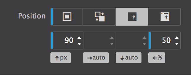
An absolute element can be positioned anywhere in the design using the same offset properties as relatively positioned elements. To do this inside of the current container or column, this parent container can not be positioned static.
Element that are positioned absolutely are taken out of the flow, taking up no space and not influencing the position of the other elements. Usually the z-index property is increased to make sure the element is visible on top of the other element. This is how dropdown menus are frequently created and illustrated in the third row. All types of cool stuff can be created with absolute positioned elements.
An element with a fixed position uses the viewport (browser window) as its coordinate system. This means it always stays at the exact same position, also when the page is scrolled.
Additional resources
When elements overlap, the Z-index determines which one covers the other. An element with a higher z-index covers an element with a lower one.
When a container has a specific height, there might not always be enough room for all the content to be displayed. With Overflow you can specify what needs to happen in that case. The content can be clipped or be allowed to overflow, which might impact elements below the container. The parent container can also be instructed to render scrollbars.
Vertical-align controls how inline elements are lined up vertically. The default value is baseline, which aligns the baseline of the element with the baseline of its parent.
The most common custom values are top, middle and bottom. The effect is shown in the examples below.

Stellar designs. Visually. CoffeeCup.
Stellar designs. Visually. CoffeeCup.
Stellar designs. Visually. CoffeeCup.
Please note that this CSS control does not allow you to vertically center an element within another element. Flexbox would be the tool of choice for that.
Additional resources
The CSS multi-column layout is mostly thought of as a way to create print-inspired text columns. However, it's a very versatile tool that extends to other bigger and smaller areas of layout creation — it can be applied to containers as well as single text elements.
As an example, this is a single paragraph using the multi-column settings. Whenever there's enough room to divide the text over two columns that are (at least) 220px wide, the browser will do so.
If this paragraph shows as a single column, it means that there was not enough room for two 220px columns. The cool thing is that the text automatically flows between the columns ‚ when text is added or text flows due to width changes — to create (approximately) the same height columns.
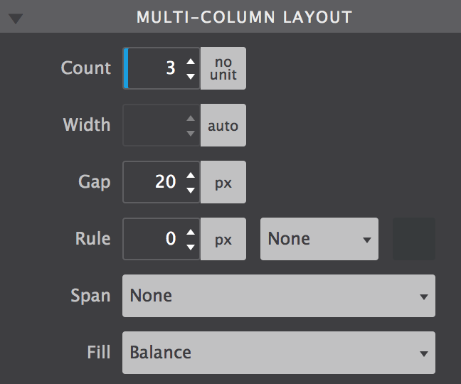
Count and Width are the most powerful tools. They control whether and how many columns will appear. Obviously, the Count sets the number of columns to a specific number.
The Width determines the minimum desired column width. If column-count is not also set, then the browser will automatically make as many columns as fit in the available width. Otherwise the browser will make columns of the specified width, with a maximum as defined by the Count.
The other controls enhance this core feature. The Gap let's you specify the space between the columns. A line can be drawn between the columns with the Rule control. The width, style and color can be specified as well.
When the multi-column is used on a container, elements inside can be instructed to span across all columns of the layout. Content before and after the element is still automatically balanced across columns before and after the element appears.
Multi-column layout settings are not limited to text and can be applied on parent containers as well. In the example below there's a bunch of cards that are flowing between different columns and for which the column count changes depending on the display width.
The tools for creating cool multi-column layouts.
Lorem ipsum dolor sit amet, consectetur adipiscing elit. Quisque nibh risus, sagittis nec suscipit nec, mollis laoreet eros. Donec faucibus, libero id faucibus scelerisque, justo justo nullam sodales.
This element spans both colums. The typographic possibilities are enormous! Adipiscing elit. Quisque nibh risus, sagittis nec suscipit nec, mollis laoreet eros.
Lorem ipsum dolor sit amet, consectetur adipiscing elit. Quisque nibh risus, sagittis nec suscipit nec, mollis laoreet eros. Donec faucibus, libero id faucibus scelerisque, justo justo nullam sodales.
Please note that in some browsers a tiny overflow effect can be visible at certain widths.
Additional resources
The background of an element is the total size of the element, that includes padding and border. The margin is the space between elements and not included.
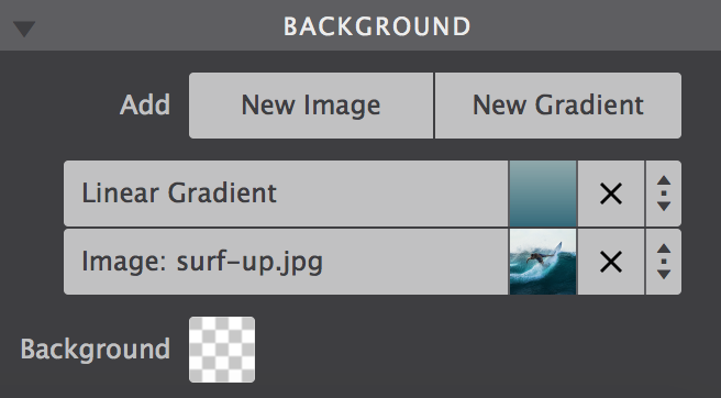
The web got a whole lot more interesting and beautiful with the new background properties introduced in CSS3. In addition to a simple solid backgrounds, beautiful full-size background-images can be applied. Background gradients can be declared in directly CSS. This offers better control over how the gradient is displayed as well as increased performance compared to using in image file.
Then there's the ability to use multiple-backgrounds. Combining images with overlaying semi-transparant gradients for example, can create really stunning effects.
The order in which these backgrounds are being applied is important for the desired effect. Generally speaking a gradient will need to be on top of an image, a small image on top of a larger image, etc.
The different background types.
The background up top in the control, will be visually on top in the canvas. To reorder the background layering you can grab one at the arrow icon, and drag it up or down to a different position. Clicking on a background will open it up to tweak the settings. Let's look at the gradient settings first.
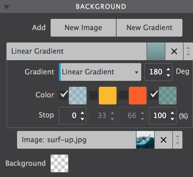
A gradient is made of a progressive transition between two or more colors. A linear gradient follows a line on which the colors fade from one color into the next. A radial gradient starts at a center and changes colors going to the outside of the circle (or ellipse) type of shape.
Linear
Gradient
For a linear gradient the angle can be changed by specifying a specific Degree. For example, changing the value from 180 to 90 would make the gradient run from left to right instead if top to bottom. Any value in between is possible as well!
A gradient can consist of up to 4 colors. A Color can be added into the mix by clicking the checkbox. The Stop defines where the color starts. As can be seen in the example below, the colors don't have to transition, a 'hard-stop' can be created by giving two color stops the same value.
Linear
Please note that the color defaults to the color of the first stop, which is needed for the effect above.
Background settings for gradients.
Linear and radial gradients work in very similar ways, except the degree control is not available for radials.
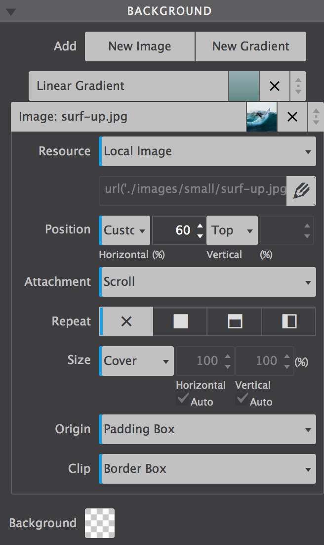
Images can be added to the project or linked in from any online source. The Resource control provides these options. In the example below a local background image is used. To change it for an online image choose URL from the dropdown instead of Local Image, then paste the link to the image in the box that appears below.
To change the image for a different project image, click on the edit icon. A dialog will come up from which a choice can be made between the various images in the existing collection in the project. New images can be added to the collection as well.
Images can also be changed at breakpoints, this way smaller and lighter images can be served to smaller devices (which frequently use less bandwidth).
The Position control can be used to move the image around. The default values are Left and Top. Custom values can be used as well — in the example the image has been moved so the surfer takes up a central position in the container.
The pane control is for reference purposes while reading this guide. I do suggest playing with the background settings for the surfer example. It will give you the best feeling for how these controls (and the generated CSS in the background) function.
In fact, play with all the examples! Change, tweak, even totally mess them up — it will really help to build a solid understanding of how the controls (and underlying CSS) work. To get back the the initial state simply hit undo or reload this document from the File --> New from Theme dialog.
The Attachment control specifies if the image's position is fixed within the viewport, or can scroll along with its containing block. The local setting means that if the element has a scrolling mechanism, the background scrolls with the element's contents.
The fixed setting works well for large background images on rows or wide columns as the Coast theme shows. Please note that mobile devices offer limited support for fixed backgrounds as it is (said to be) resource intensive and negatively impacts battery life. A good practice is to change from scroll to fixed for desktop devices, more or less on the right of the second Foundation breakpoint.
Small image patterns are frequently used to create a full background pattern. This is done using Repeat. In the example below a tiny thumbnail is instructed to repeat along both the x and y-axis. Alternatively the image can be only repeated along the x or y-axis, or not at all.
Background settings for images.
The Size control offers many options for specifying the size of the background-image. Images can be scaled up or down, made to cover the entire background or be instructed to display entirely. It's a very useful control so let's have a more detailed look.
The default is Auto, which tells the browser to calculate the size based on the actual size of the image and its aspect ratio.
Frequently used for full-background sections, Cover tells the browser to make the image covers the entire container. Even if the images needs to be stretched or cut a little bit off (on the edges). This is especially handy in a responsive design where the size of the element or container with the background usually has a variable width (and/or lenght).
The Contain setting on the other hand, gives the instruction to always show the whole image, even if that leaves a little space to the sides or bottom.
A Custom size can be specified for the width, height or both. By unchecking either or both Auto boxes a value can be specified. Please note that this can easily influence the aspect ratio and cause distortion in the image — use with care!
With backgrounds frequently defined for containing elements, Origin and Clip are probably the least frequently used background controls.
The Origin defines where the top-left corner of the background starts. Starting with the outside part of the element, the background extends to the edge of the border using the border-box value. The padding-box setting makes the background start at the border (underneath the padding) using padding-box.
When using content-box the background is restricted underneath the content area. Container type of elements don't have a content area and this setting will have no or minimal effect.
Clip works in a similar way, except it clips the background instead of resizing it.
Additional resources
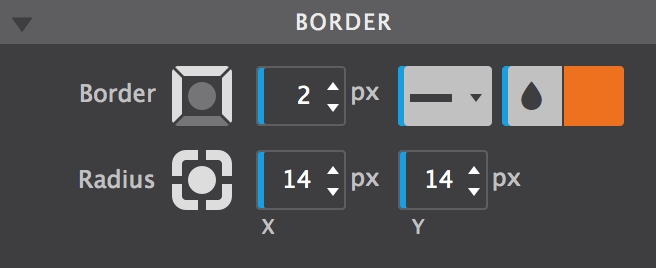
Borders can be added to elements using the Border control. Clicking on the circle in the center of the icon selects (or deselects) all borders. That does not mean that a border is enabled or disabled, it is just a way of selecting the border(s) for applying the style settings with the other controls.
Multiple borders can be styled at the same time. In the image the top, right and left border have been selected and a border-width or 2px has been applied. The border-style is (a) fixed (line) and the specified color is orange.
The bottom border — deselected in the image — has the same style and color, but has a width of 6px. This can be seen by deselecting the other borders and clicking on the bottom border in the icon to select it. The example below shows the result of the border (and border-radius) definitions.
If borders are selected that have different styles applied, a red line is visible at the bottom of the controls for which the styles differ. If these styles are changed, they will be synchronized over all selected controls and the red line will disappear.
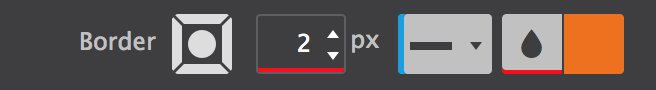
The border-width values are not the same for all borders.
Tool set for the border and border-radius.
In terms of selecting the border, the Radius control works in the exact same way as the Border control. This control can be used to 'round' the corners of an element. It is not required for an element to have borders to do so, in the absence of a border this will be applied to the background of the element.
The higher the value, the more rounded the corners. Setting different values for the horizontal (x) and vertical (y) part of the corner and/or for different corners can be used to create certain shapes.
To create a circle as seen in the flex card example, define an equal width and height, in combination with high radius values.
The effects sections consist of a number of controls that can add a nice touch to the initial appearance of a design. The controls also work great in combination with the hover and out of view states.
The below example uses a scale and rotate effect when the images, respectively the buttons, are hovered. To see the effect in the app hit the Preview icon in the toolbar, then hover the example.

The buttons use a little bit of box-shadow. This control is very similar to the text shadow control but, as the name implies, it works on the (element) box instead of the text.
In addition the shadow can be set on the inner element, inside the border. To do so simply click on the icon with the inward arrows. The Spread will cause the shadow to expand and grow bigger.
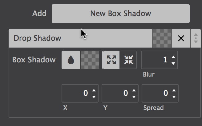
Shadow controls.
Just like backgrounds and text-shadows, box-shadows can be layered. In combination with the different controls for positioning, sizing and coloring the shadows, this can create some cool effects. One more thing that's good to know: if a border-radius is specified, the box shadow takes on the same rounded corners.
The Scale control is part of the CSS transform toolset. It modifies the size of an element or group of elements, increasing or decreasing it.
The Translate function moves an element sideways, up and down, or a combination. This 'shift' it often used for hover or 'scroll into view' animations. There are two main reasons, firstly moving objects with translate does not affect the position of other objects, the rest of the UI will remain stable. Secondly, moving elements with translate is less CPU intensive and better for overall performance then, let's say, moving absolutely positioned elements.
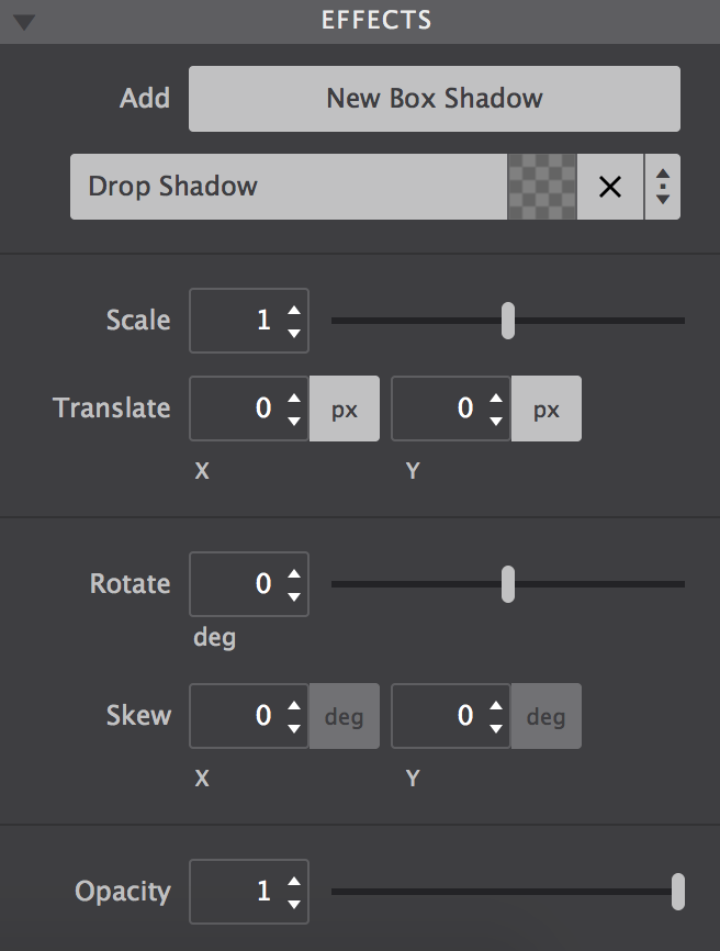
Tools for creating cool effects.
Elements can also be rotated. Rotate moves the element clockwise from its original position with positive values — negative values rotate it in the opposite direction.
The Skew transform tool 'tilts' an element one way or the other. It distorts the element by moving each point to the specified coordinates.
The Opacity tool defines the transparency of an element. The lower the value, the more of the background will 'shine through' the element. The value applies to the element as a whole, including the elements it contains.
Additional resources
With these controls you can change colors on the fly, tweak settings for smaller displays, and make them respond to user with interactive effects and transitions.
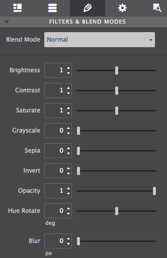
Transform images into stylish works of art by altering brightness, contrast, sepia, and more. Build them from scratch or drag in a customizable component.


Mouse over images to see the original
Prestyled effects. Fun to make and available as components too. Just select from the Components Library.
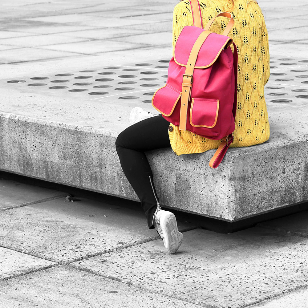
Mix multiple backgrounds and colors together along with Photoshop-like blend modes such as Overlay, Hard Light, and Color Burn.
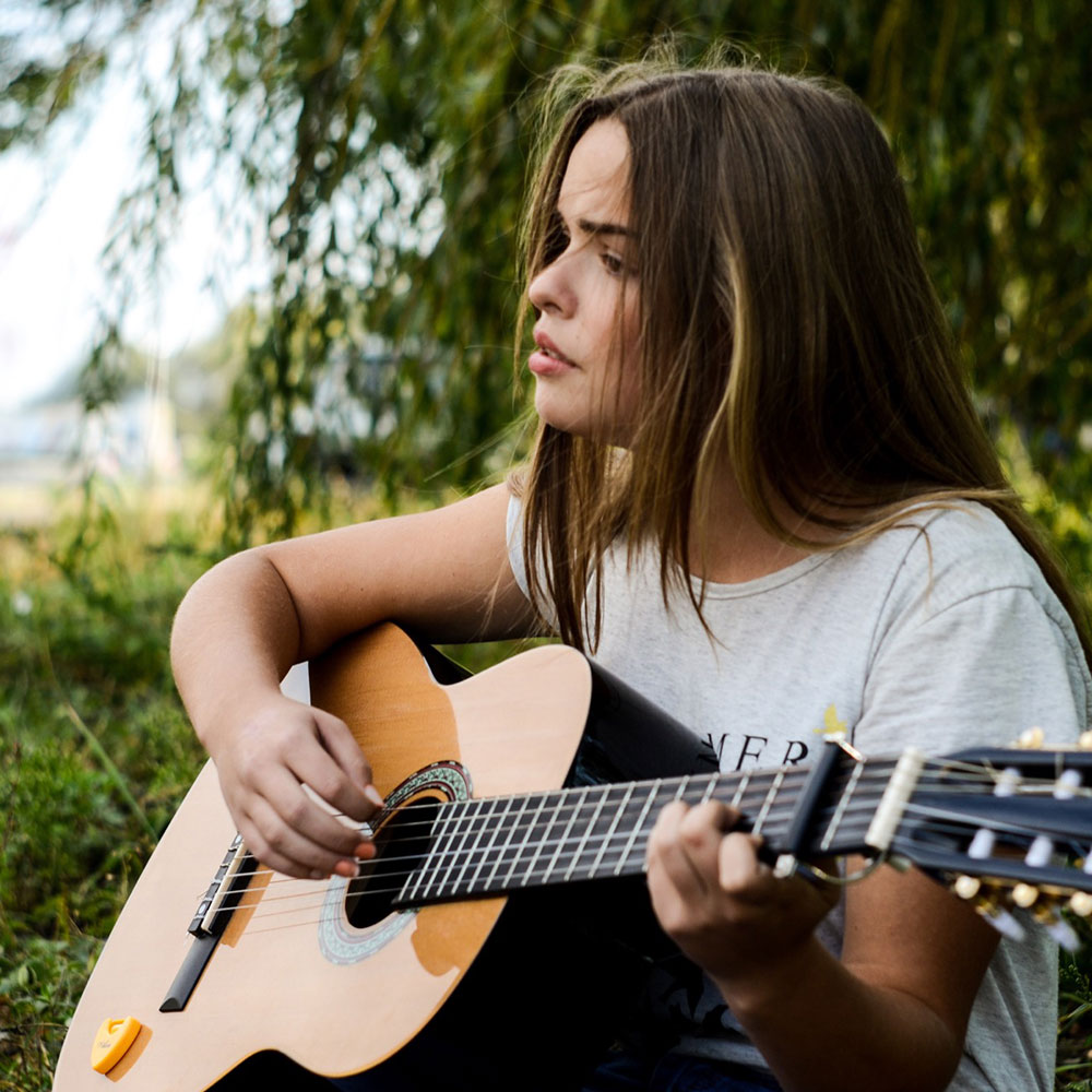
Double exposure, a trendy effect that is hard to recreate even with Photoshop. But with CoffeeCup you can get it running directly on pure CSS! Here we show a fixed forest image on the background with a girl scrolling over it and, lastly, text that blends on top. All them combined give you an incredible result that will make all the difference.
Apply scroll effects for desktop-viewers to stop them in their tracks as the image comes into view. Texts stay there which makes this accessible and SEO friendly.
Look mom, without images! Which makes this accessible and SEO friendly. Available as a component too so you can learn how to fuse the styles together.
These CSS controls are available for both the Picture and Picture Link Elements for better positioning images in a semantic way.
These controls allows media to auto-fill its container without losing its aspect ratio. No more hacks to fix distorted or cut off images. There are several values for implementing this handy method for scaling and cropping images.
The Fill value will allow the object to completely fill the container. If the image's aspect ratio does not match the aspect ratio of its container then the image will be stretched.
Selecting the Contain value will allow the image to fill the container while preserving its aspect ratio. The image will become letterboxed in the container if its aspect ratio does not match its container.
The Cover value will size the image to maintain its aspect ratio while filling the element’s entire container, clipping the graphic if the ration does not match.
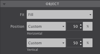
Object Controls
The Scale Down option will shrink the image in the container.
Choosing None will not resize the item.