View elements. Click to select or use the dropdown. Edit text.
The Content pane uses three sub-panes for organizing the various website building blocks, one for content Elements, one for Components, and one for Symbols.
When the Content pane is selected the most frequently used Elements, sub-pane is open by default. From this pane, you can add headings, buttons, images and more. These elements are the smallest site building blocks. Section 1 provides more details on the various element types.
Components usually consist of several elements. Together they perform a more complex role such as a navigation menu, a (series of) cards, an accordion or tabs. Components are discussed in more detail in section 2.
Symbols are special elements or groups of elements that are kept the exact same throughout a project. When one instance of a symbol is updated, all other instances in the project will be changed as well. This, for example, allows for updating a footer across all pages with one single edit.
TOC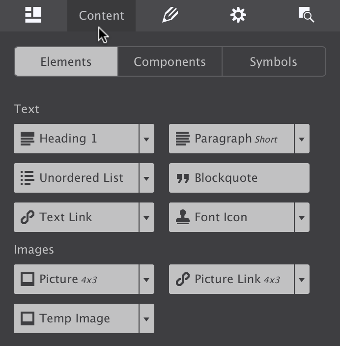
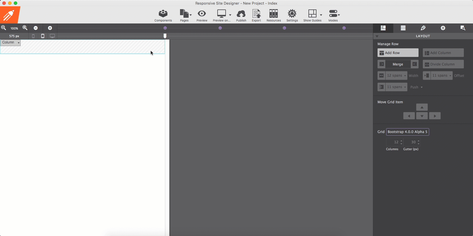
Default view of the Content pane.
Elements are the most basic building blocks. They have been organized into 4 main categories. We placed the most frequently used elements, Text and then Images at the top of the pane. Further down there’s a collection of ‘common’ elements (we could not agree on better wording indeed…) to add, for example, videos or custom HTML snippets.
Elements like buttons and social media icons are grouped as Interaction elements. The last category consists of elements that can help to create sophisticated responsive Layout constructs. Each of these categories is addressed in a bit more detail below.
Click the arrow to select an element variation.
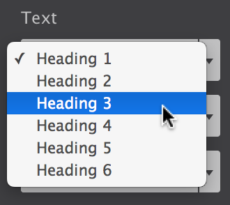
There are 6 different text elements available. The ones with a little arrow on the right of the button come in variations. Clicking the arrow of, for example, the Heading 1 allows you to choose from a heading 1 - 6.
Each of the elements performs a different (semantic) role. A heading element, for example, describes the topic of the section that follows. A paragraph is usually a block of text and so on. Simply choose the element that you feel will most suit the purpose of the text.
The placeholder texts can be replaced by typing or pasting text blocks in Text Edit mode. Triple-clicking a text element will start the text editor. Alternatively, you can use the edit button on the Design pane or use the right-click menu.
The Text Editor can also be used to add inline links and formatting. The link below provides more information.
Additional resources
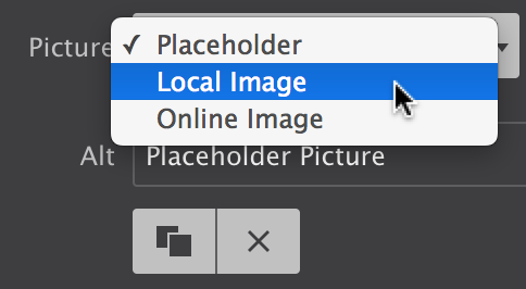
Select your image source from the dropdown on the Design pane.
When a picture element is added, initially a placeholder image is used. This allows for rapid experimenting or prototyping without immediately having the spend time on finding, optimizing, etc. real images.
Replacing the placeholder happens on the Design pane. Double-clicking the image opens this pane. The dropdown with the Picture label lets you switch between the placeholder and a local or online image.
When selecting a local image, you will be asked to select one from the file system. The chosen image will be added to the project and be displayed instead of the placeholder image. When you choose to publish or upload your project, this images will be included in the images folder.
You can also provide a link to an online image. In that case, you can insert (past) the URL to the image in the input box that appears below the dropdown.
The Design pane is probably where you will be hanging out most of the time when working with the app. This pane is discussed in detail further down below. However, we already touched upon it above and the temptations to start tinkering with the visual CSS controls is probably high.
The controls are mostly self-explanatory and since you will see the result of your edits in real-time on the canvas, please feel free to toy around a bit. Just keep in mind that for an efficient workflow an understanding of CSS selectors will be greatly beneficial. More about that in the Design pane section!
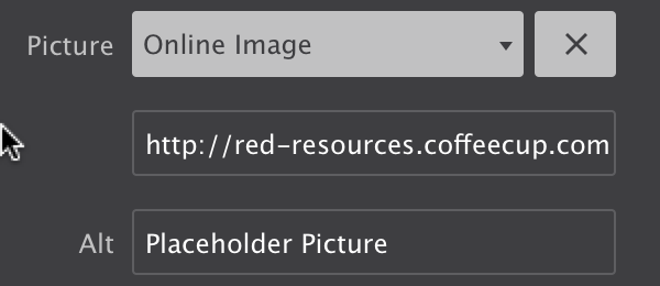
Using an online image.
You will notice that a newly added image will not be wider than 200px. This can be changed on the Design pane with the max-width control.
Site Designer uses the brand new <picture> element. This allows you to change the image at breakpoints, serving smaller images to mobile devices for better performance. Our very own Suzanne wrote an excellent article about this, please check it out!
Additional resources
Well, maybe not all that common… The horizontal rule certainly is, but we need to talk a bit more about the HTML and Video elements.
The HTML Element can be used to add custom code snippets or exports from other apps. This can be CoffeeCup apps like Web Form Builder, Responsive Content Slider or 3rd party apps. To not interfere with the other elements on the page currently a placeholder visual is displayed.
The Video Element allows for embedding responsive videos in the page. Indeed, responsive because most other video embeds will not automatically adjust to different screen widths!
Currently, you can embed videos from the most popular video services. If there’s one you think we should add please use the ‘Rate this app’ function under help and let us know in the comments what we can do for you.
Additional resources
The elements in the group generally perform and action following interaction with the visitor or user. A Button Link can open a menu, reveal a hidden element or show modal dialog. It can also take the user to a different location, on the page, site or to an entirely different site. Component (see below) often include this interactive behavior.
The Form Container, together with the Submit Button can, for example, be used to build custom HTML Paypal payment buttons. It can also can include other form elements found under the Input dropdown. Please note that the form (elements) can be hooked up — inputs for this are provided on the Design pane. However, form scripts or creating a fully functional form are beyond the scope of this app. For that we refer to Web Form Builder (with exciting news there coming soon…).
The Social Icons can both be used to build a following on the social networks and allow visitors to share information. Select the Follow or Share option on the Design pane (for networks that support these), then fill out the various options.
Additional resources
Layout elements offer more granular control over the page layout. They are also be used to build logical groups of elements or groups with a specific role of function such as a footer or card component.
The Subgrid Element gives the exact same control as the overall Foundation grid, but within a subset of the page. This element can be added to a column (or even container) to create custom layouts within that section. Just as the main grid subgrids can be reconfigured, e.g. columns widths can change, at breakpoints. These changes are also managed on the Layout pane.
List Containers are unordered lists with each list item being its own container. They are often used to build navigation components.
Containers often serve as ‘wrappers’ for related elements. When creating a card (component) the container often encapsulates one of more text elements, an image, a button and sometimes sub-container with additional elements. We will look at this in more detail in the Component section.
A link Container functions exactly as a container, but wrapped in an <a> label, making it one big link element.
Additional resources
Ready-to-go components are the bomb!
One of the coolest advantages of using CoffeeCup Apps is the ability to utilize interactive site items. Both the Foundation and Bootstrap frameworks offer an elegant way to build navigation menus, accordions, cool tab panels, modal dialogs, drop ups, and much, much more without having to mess with external scripts
RSD V2 gives you a leg up by including ready-made, customizable site items. Access these by clicking the Components icon in the top toolbar. Browse the ever-growing CoffeeCup Component Library, when you find one you like, click Add to Project. This will import the item into the Content pane > Components. Then style and adapt it to fit your content.
Creating your own interactive components is done visually by combining HTML elements, (predefined & custom) CSS, and the framework specific attributes. Mixin interactive scripts to create off-screen navigations, flex-cards, info-pop-ups, or galleries. Foundation and Bootstrap offer detailed documents on how components are structured.
Save custom components to your library to reuse them throughout your projects. Items can be given a description and organized in folders to keep you organized.
The foundation classes for an accordion item.
Additional resources
After adding a component to your project, you can access them on the Components sub-pane of the Content pane.
The first part of the pane shows a preview of the component. To improve visibility — a white component does not display that well on a white background — the background color of the previewer can be toggled. The bottom left button can change the setting between white, black and transparent.
The plus and minus buttons next to the background color button can be used to zoom in and out. In case there are similar components in the project, this provides a good level of detail to find the right one.
The preview shows the currently selected component from the list below the preview window. Clicking on a component will expand it so the name can be edited. To add a component to the canvas, click the plus (+) button. It will get inserted below the currently selected element. If a columns or container is selected, it will be placed below the last element in the parent. If the component itself is a column or row, it will be placed below the currently selected container or row.
The New Component button creates a fresh component based upon the currently selected element (group). This component will be placed at the bottom of the list. Project components can not be reordered, filtered or sorted at this moment.
To remove a component from the list use the delete (X) button. Note this will not remove the component from the canvas, only from the list.
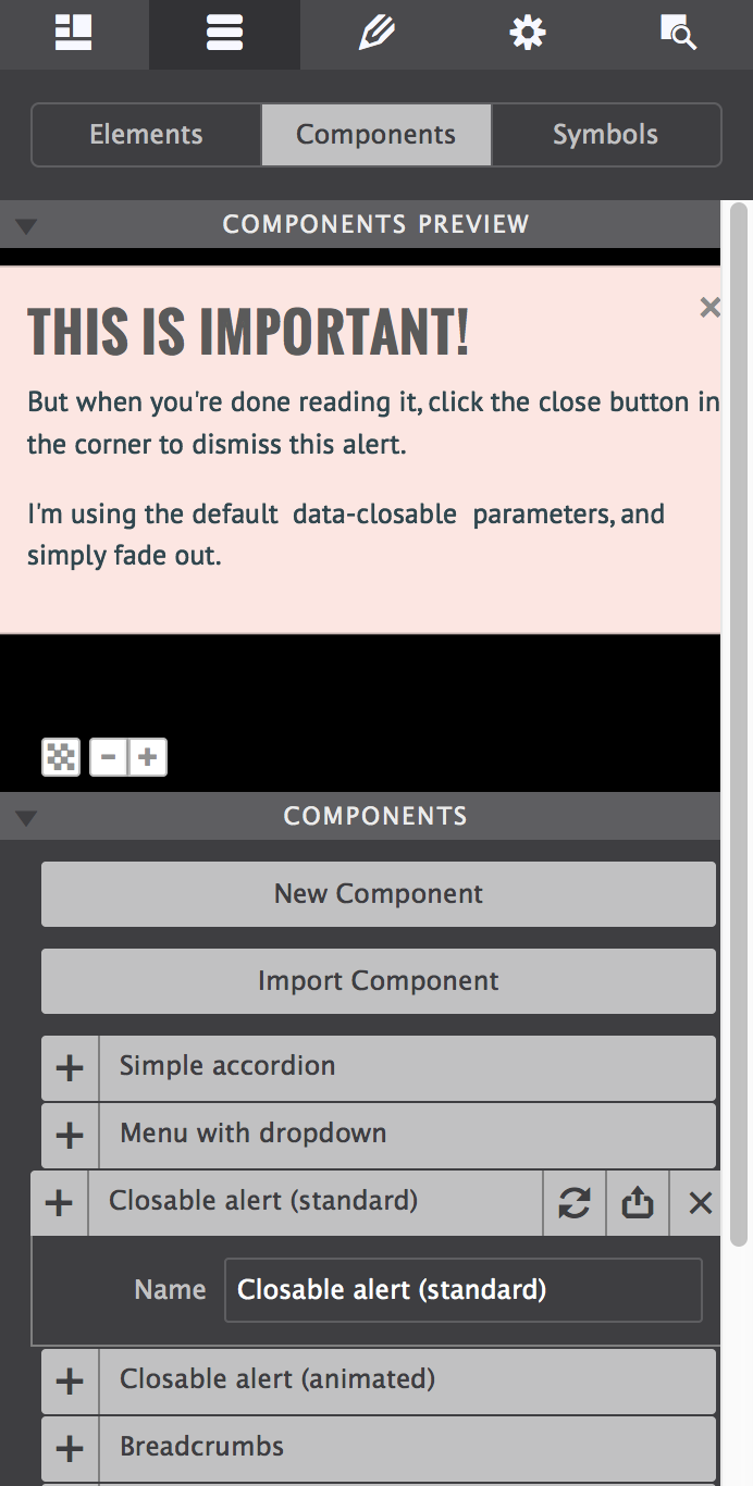
Select a component to preview or rename.
Most of the components found in the theme are core framework components — they are very similar to the components in the official Foundation documentation. Using these ‘base’ components, this theme can be used for quick functional prototyping and as a solid, proven, foundation for new projects.
Components generally consist of a number of nested elements combined with predefined classes. The image shows the classes for an accordion item.
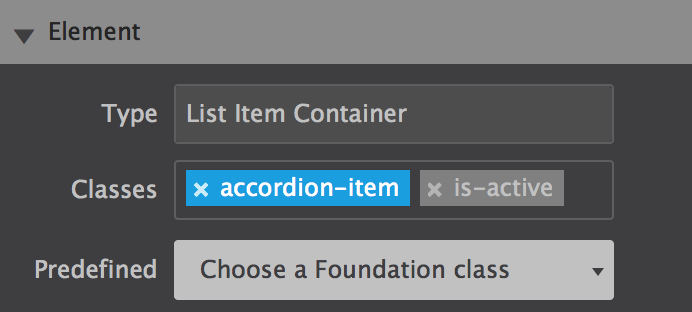
The foundation classes for an accordion item.
The image shows that the is-active Foundation classes have been disabled. This makes sure that any custom styles are only tied to the accordion-item class. We will talk more about the use and de-selecting of classes in the Design pane section.
Additional resources
Symbols: edit once, update everywhere!
Symbols are elements or groups of elements (components) that are kept the exact same throughout a project. When one instance of a symbol is updated, all other instances in the project will be changed as well.
This, for example, allows for adding a footer link across all pages with one single edit. Keep in mind that a single element such as a buy button or copyright notice that comes back in various place of a project can be a candidate for a symbol as well.
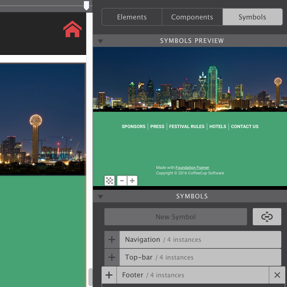
In the image below the footer symbol is selected on the Symbols sub-pane. The entire symbol is visible in the preview area, just as with the components. On the left, part of the footer is also visible on the canvas.
When a symbol is selected, it is surrounded by an orange line on the canvas. This is to help differentiate between symbols and ’normal’ element groups. The Symbol container will also have an orange dot on the right in the tree view of the Inspector pane. This pane will be discussed later in this guide.
Previewing Symbols
Symbols can not be nested — symbols can not contain other symbols — because that could create an update loop nobody can get out of...
Adding a Symbol to the Canvas works the same as for components. However, any changes to a Symbol will update all of the ‘instances’ — wherever they are located in the project Site Designer will keep them all exactly the same everywhere.
Creating a New Symbol also works in the exact same way as creating a new Component. When a symbol is deleted, it will be removed from the list, but all instances will still be in the project. From that moment they will behave as normal element groups, any changes will no longer trigger updates anywhere else.
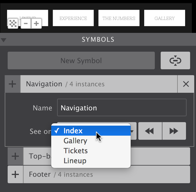
When looking at the image below, you will also note a few differences. For starters, the name of the Symbol is followed by an instances count. This tells you how many times the Symbol is used in the project.
Managing Symbols
The name of a symbol can be changed using the Name input. With the See on function, you either can circle through the pages where an instance of the symbol is located, or directly jump to a specific page with the dropdown. Using this function, the canvas is automatically scrolled to the place on the page where the Symbol is located.
Additional resources