Understanding The Color Coded CSS Selector System
The ability to add CSS selectors — Type, Classes and ID — to an element is an important tool to utilize. Located in the Styles pane at the top.
A selector ‘binds’ an element or group of elements to design rules defined in the Styles pane. Style definitions are related to selectors and the top part of the style section is used to manage exactly that.
Enter default styles to the Type. Apply a Class name so that common items share the same styles. While giving a unique ID name for an individual element with a one-time unique variation.
Using Selectors speeds up your design time, saving you from re-entering the same style choices multiple times. Apply selections to a Type or Class name to keep common styles in-sync.
Predefined, framework-specific Classes can also be selected from a drop down. While there is no requirement to use these predefined classes, but sometimes they come handy, especially when creating interactive components such as accordions and navigations.
In addition, the design rules associated with a predefined class can be fully customized using the CSS tools in the Style section.
Contents in this chapter
CSS SELECTORS EXPLAINED
For those that have been working with selectors before, the workflow will feel intuitive and powerful. It will still help to give this section a quick read and, for example, familiarize yourself with the color coding system for the different selector types.
If you never heard about or worked with selectors before, no worries. Our responsive apps can also automatically create selectors. However, to get the most out of our apps — to speed up the design workflow and make it easy to maintain any projects — we do recommend to slowly start accustoming yourself with the apps selector system and predefined Foundation classes. This section will serve as your guide.
A selector defines — ’selects’ — the elements to which a set of CSS rules applies. This is incredibly powerful because it makes it fast and easy to give multiple elements the same appearance. Or to apply the design rules to a newly added element without having to redefine all these rules.
The Predefined dropdown can be used to search and add framework-specific classes for which the design rules have been pre-specified. Let’s quickly go over an example using the class selector.
In Foundation a button is created by adding the class button to an element. The class (name) is the carrier of a set of styles such centered text, padding around the text and so on, that this way get applied to the element.
Other styles can be added by extending the rules set for the same class, or by adding another class with new rules. Foundation uses the second approach — by defining all base button styles on the button class and applying additional rules through new classes, contextual variations are created.
In the example below all three button elements use the button class. By default, these buttons appear blue. Then the green button is created through the success class. The orange button uses warning.
The additional class names create the contextual background color. Now you can make changes to all buttons by working with the button class, to all success buttons using the success class and so.
If you prefer a different type of base button set in your project, for example buttons that are the same width and have rounded corners, simply define these styles (in the style section that we will look at in a bit) on the button class and all buttons will take on that appearance.
Please note that I had to add one more class — button-cstm —to make these changes, if I had done that one the button class itself it would also have affected the previous example.
With this explanation and example under our belt, we should be ready for some more selector goodness. We will do that when discussing the style section next.
Apply Styles Section
As explained above, style definitions are related to selectors and the top part of the style section is used to manage exactly that.
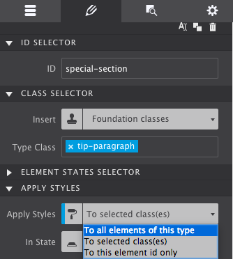
The Apply Styles dropdown is used to select the type of selector the style rules will be associated with. The choices are between Element Type, Class and ID.
The Reset function helps to keep the project code lean and clean. The dropdown gives an overview of the styles that have been applied. Styles can be removed by clicking on them.
The reset control will give you the option to reset styles individually at breakpoints or at all sizes. See it in action below:
APPLYING STYLES TO A SELECTOR
The selector options in the Apply Styles dropdown start with the broadest selection of elements, followed by a subset, and ends with the selection of a single element:
1 The Type selector is used to define styles for all elements of the same type.
2. When styles are associated with a Class selector, all elements (of the same type) that have that class will share them.
3. Each ID is unique, the style definitions will only apply to the single element currently selected.
The most efficient workflow is to first define styles for element Types. This way a common ‘starting style' for all elements of that type can be defined. Basically, your default choices. If you want all your headers to be a certain color, or your paragraphs to all be the same font-type. Applying the styles to the Types means you only have to select it once, and every time you add a new header or paragraph, the styles you originally chose will display.
For example, when Type is selected in the dropdown, further down on the pane in the Typography section Roboto can be set as the default font-family for all paragraphs
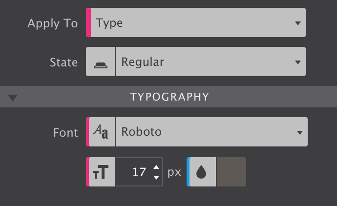
As can be seen from the image, styles applied to the Type have a pink indicator.
This way the font-familiy and font-size for all paragraph can be updated with one single edit. Also, whenever a new paragraph is added, these styles will already be present.
The proper use of selectors can speed up the design process and simplify the maintenance of a site.
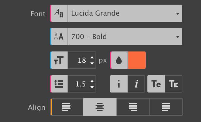
The blue indicators show that the font-size and weight are specified for the Class. The yellow line tells that the Align setting is applied for the specific element only —on the (unique) ID.
WORKING WITH CLASSES
With all default styles for the elements in place, Classes can be added to create design variations. For example, certain paragraphs that perform a different role can be given a different font family, size and/or color using a class selector.
To apply styles to a Class simply enter a class name in the Type Class box (in the Styles pane at top). Also make sure to select Class in the Apply Styles dropdown. Now all style adjustments with the design controls below —yes, we will get to work with them real soon! — will be tied to that class.
Any control used for applying a style to a class uses a blue indicator, like the font color thumbnail of the image in the previous section.
So what happens when different styles are assigned to different selectors? Some selectors are more powerful than others, their styles will prevail. In CSS this is called specificity, the styles from a more specific selector will take precedence over styles from less specific selectors.
A Class selector is more specific than a style applied to a Type and will therefore prevail. On its turn, an ID is more specific than a class and will prevail. Styles applied to an ID have an orange indicator.
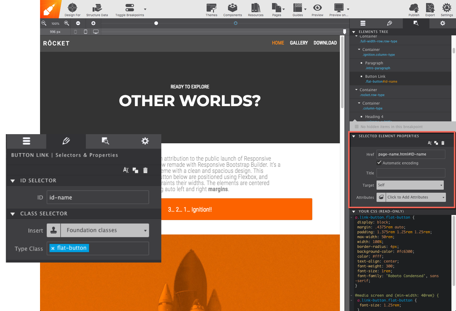
When an element has a ID applied to it, the object can be targeted within a link. This way the link will take the view directly to that section. Simply add #ID-Name at the end of your link address.
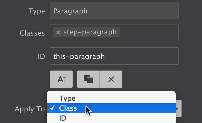
Styles attached to a class selector are intended to be used by multiple element. To add the class to another element simply type the class name in the Class input box. The image below shows that the auto-complete can be a great help!
Adding and deselecting classes.
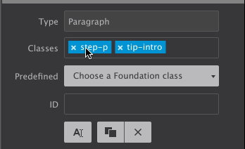
An element can be targetted by up to 5 different classes. Styles can be applied to a specific class selector by deselecting other classes. Deselected classes are gray (see ’step-p' above), any style updates will not apply to them, only to the class or class combination currently selected.
Styles can also be applied to class combinations. They are more specific than a single class and therefore these styles will take precedence.
Additional Resources
MORE SELECTOR COLOR CODING AND A RECAP
We already saw that pink is associated with style definitions for an element type and that a blue indicator tells us the style was set on a class. An orange indicator would correspond with a style coming from an ID. This covers most of the situations, but there’s a few additional cases we need to iron out.
First of all, we learned that classes can be deselected so style can be assigned to specific individual classes or class combinations. When a style applies to such a deselected a class (or class combination), the style control has a gray indicator.
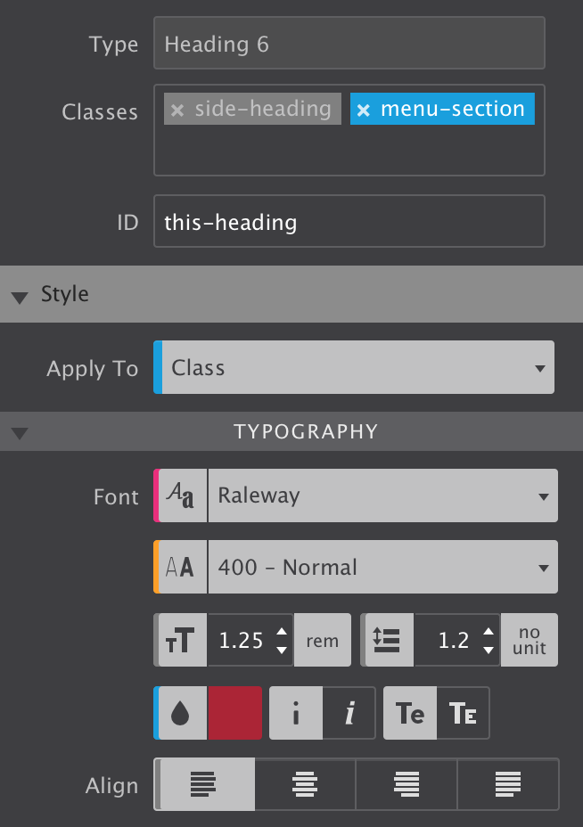
In the image, the class side-heading is deselected. On the Typography section the indicators for the font-size, line-height and text-align controls are gray. This means that these styles belong to the side-heading class.
Here’s one more situation where the color coding can come in really handy. When styles are applied to multiple selectors, e.g. a class and an ID, the style controls show the values of the styles associated with the selector type we are currently working with. This is the selector — Type, Class or ID — visible in the State dropdown. This sounds more complicated than it is really, a quick example will make that clear.
In the image the font-weight control shows a value of 400 - normal with an orange indicator. However, the Apply To dropdown shows we are currently working with class selectors. That means that the visible value — 400 - normal — belongs to a class. The orange indicator however tells us that a font-weight value has been specified for the ID as well. To view this value simply switch the Apply To dropdown to ID and the value associated with the ID will show up in the control.
The indicator will take the color of the strongest selector, because that is the style value that in the end will be visible in the browser. So in our case, if a different font-weight has been set for the ID that is what will show on the canvas.
Selectors and selector specificity in CSS can take a little to get used to, but with this color coding system you will be an expert before you know it!
Selector color coding.