The ability to make layout and design changes where needed is key to any responsive design. On wider screens, columns might need to be placed next to each other instead of being stacked. Font sizes might need to be increased and small images replaced with larger ones. The Width Slider can be used to view the website at any possible width and help decide if any such change will improve the user experience of the design.
Just grab the handle to move the slider left or right and see the viewport and canvas change. You can also click on it and move it left or right pixel by pixel with the keyboard arrow keys.
TOC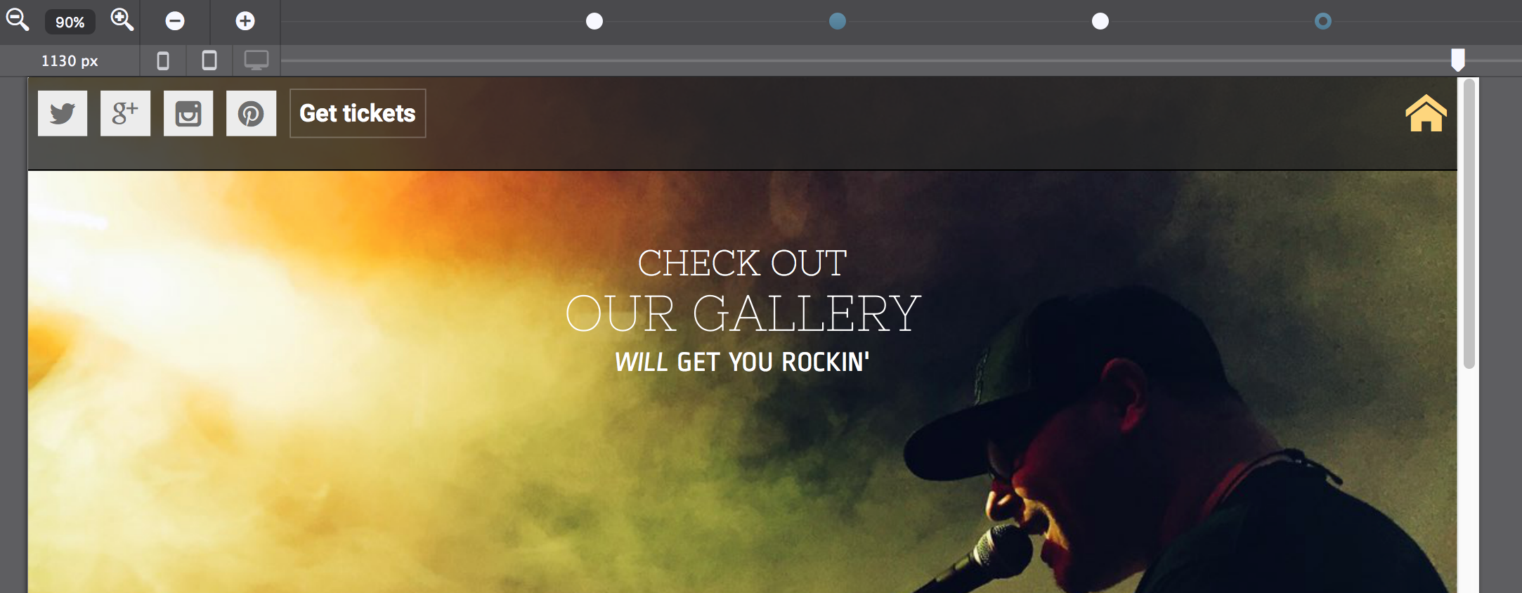
Width Slider, Breakpoints Manager and Zoom above the Canvas area.
Breakpoints are the places where layout or design changes are being made. They are represented by the little dots or 'points' above the Slider. Depending on the framework in use default breakpoints are colored either purple or blue. Purple for Bootstrap and blue for Foundation. A white dot, however, is a custom breakpoint.
A breakpoint is active when it lights up — when there's a little dark circle on top of the point. In the image above this is the fourth point from the left. A breakpoint becomes active when the slider is placed on the right of it and until the next breakpoint is reached.
Any layout or design change they apply only as of that (break) point. They apply for all screens wider than the position of the active breakpoint but can be further changed any of the next breakpoints.
A simple example is provided below. A subgrid element is used to build a product card. The subgrid uses two rows, one for the product name with a single column that stretches the full width of the grid. The second row has two columns. Below the smallest breakpoint, they stack and take up the full width, however, on the right of that breakpoint both columns are changed to a span 6.
This places the product image and description areas next to each other. In Site Designer, select one of these columns, and on the Layout pane see how the span number changes when moving through this breakpoint.
A couple of changes using the Design pane have been made to illustrate that point as well. The font-size of the elements increases at this breakpoint (as well as at some of the other breakpoints) and some additional explanatory text is brought in when there's ample room on wide screens by changing the Display from none to block.
There's a few more changes, as we have seen before, all added styles can be found in the CSS preview window on the Inspector pane. Another good method is peaking at the list in the Reset styles drop down. In short, all style rules can be updated at a breakpoint to create the best user experience for every device size.
Custom breakpoints can be added by clicking on the breakpoint line or with the plus icon on the left. They can be removed by selecting one — click on it — and hitting the minus icon. When selected they can also be moved left and right with the keyboard arrow keys. Please note that the default Foundation breakpoints can not be moved, nor removed.
Product description. Lorem ipsum dolor sit amet, consectetur adipiscing elit. Maecenas et metus.
Learn moreBuy now
The Zoom tool is placed on the left of the breakpoint buttons. Zooming out helps to design for large screens from smaller computers such as laptops and shows breakpoints that otherwise might be hidden behind the panes or even be offscreen.
The current viewport width — the position of the slider handle — is visible below the Zoom tool.
The three device icons on the right of that become brighter when the device type is more common at the current width. As desktop monitors, tablets, and phones all come in a variety of sizes; this is just for reference purposes. There is no specific phone or tablet width, nor is it possible to ‘design for phone.'
Instead, responsive design has to look good and perform well at every width — the icons are merely an indication of what type of device might be used for viewing the site at the current position of the slider.
Additional resources