Manage element settings. Set styles.
The Design pane consists of two major sections. The top part — the Element part — is for 'configuring' the selected element. Here you can specify, for example, the link of a button or provide alt text for an image. This is also where you can also select and add Foundation and Bootstrap (and custom) classes or add data attributes for creating interactive elements.
The second part is for adding Style(s) — for specifying the way the selected element looks. All CSS style properties are available through a set of intuitive design controls creating tremendous design powers!
Let’s get started with the Element section, then work our way down to all those fancy design tools.
TOC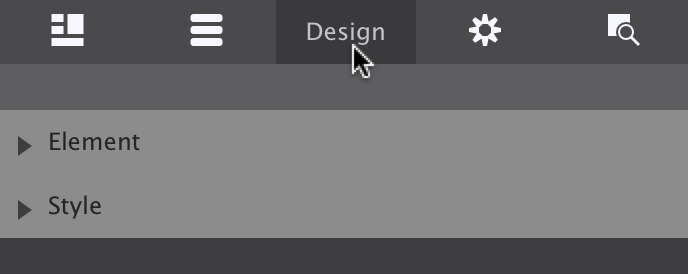
The two main sections of the Design pane.
The length of the Element section varies per Element Type. The image shows what the section will look like when an element of Type Picture is selected. The element type here is purely informative; this can not be edited (right now).
The ability to add CSS selectors — Classes and ID — to an element is an important part of this section. A selector ‘binds’ an element or group of elements to design rules defined in the Style section on the second half of the Design pane.
The Predefined dropdown can be used to search and add classes for which the design rules have been pre-specified in the Foundation or Bootstrap framework. For example, the thumbnail class (found in Foundations) that can be seen in the screenshot adds padding and a thin border to an image.
Clearly this can also be done manually with the Dimensions and Border tools in Foundation Framer. There is no requirement to use these predefined classes, but sometimes they come handy, especially when creating interactive components such as accordions and navigations. In addition, the design rules associated with a predefined class can be fully customized using the CSS tools in the Style section.
The Picture dropdown we discussed before and is specific to this element, as is the input for the Alt text.
The buttons below the Alt input can be used to duplicate or delete the element. In case a text element is selected there will be a third button — this edit button can be used to start the text editor.
The data attributes play an important part in adding interactivity to a design. See them as ‘hooks’ that tie an element to Javascript and clarifying can be used to as and to specify additional information about the element.
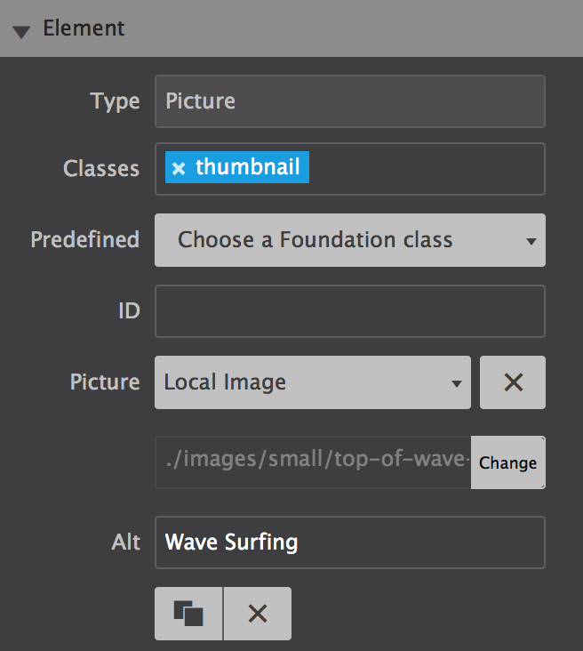
The Element section of a Picture element.
For those that have been working with selectors before, the workflow will feel intuitive and powerful. It will still help to give this section a quick read and, for example, familiarize yourself with the color coding system for the different selector types.
If you never heard about or worked with selectors before, no worries. Our responsive apps can also automatically create selectors. However, to get the most out of our apps — to speed up the design workflow and make it easy to maintain any projects — we do recommend to slowly start accustoming yourself with the apps selector system and predefined Foundation classes. This section will serve as your guide.
A selector defines — ’selects’ — the elements to which a set of CSS rules applies. This is incredibly powerful because it makes it fast and easy to give multiple elements the same appearance. Or to apply the design rules to a newly added element without having to redefine all these rules. Let’s quickly go over an example using the class selector.
In Foundation a button is created by adding the class button to an element. The class (name) is the carrier of a set of styles such centered text, padding around the text and so on, that this way get applied to the element.
Other styles can be added by extending the rules set for the same class, or by adding another class with new rules. Foundation uses the second approach — by defining all base button styles on the button class and applying additional rules through new classes, contextual variations are created.
In the example below all three button elements use the button class. By default, these buttons appear blue. Then the green button is created through the success class. The orange button uses warning.
The additional class names create the contextual background color. Now you can make changes to all buttons by working with the button class, to all success buttons using the success class and so.
If you prefer a different type of base button set in your project, for example buttons that are the same width and have rounded corners, simply define these styles (in the style section that we will look at in a bit) on the button class and all buttons will take on that appearance.
Please note that I had to add one more class — button-cstm —to make these changes, if I had done that one the button class itself it would also have affected the previous example.
With this explanation and example under our belt, we should be ready for some more selector goodness. We will do that when discussing the style section next.
Interactive elements add a touch of professionalism and a dash of fun to any website (who doesn’t like a nav menu that transforms into a hamburger icon on small devices?). But these types of features require communication with JavaScript, which means building sites without RSD V2 you’d have to mess with pulling those codes in yourself. This hard work is eliminated for you using the Foundation and Bootstrap CSS frameworks as the JavaScripts are built right into the framework and can be pulled in by using Attributes.
Depending on which framework you are using, there are many different options to build using attributes. You will also find Aria attributes within this section allowing you to set Aria based roles for elements in your design.
The attribute name can vary depending on the framework you are using. Foundation and Bootstrap offer some great documentation (links below) on the creation of components with the right combo of classes & attributes.
Let’s practice building a component together! Below you will find an example of an accordion menu built with the Foundation framework.
Adding an attribute
1. To create an accordion you need to apply a class name of .accordion and attribute of data-accordion to a List Container element.
2. Then, each List Item Container will need the class of .accordion-item and attribute data-accordion-item.
3. Next, add a Text Link element into each List Item Container and give it a class name of .accordion-title.
4. Now we can add the hidden content. To do this, add a Container element below the Text Link and give it a class name of .accordion-content and the attribute of data-tab-content. Repeat for each Text Link.
Lorem ipsum dolor sit amet, consectetur adipiscing elit. Integer nec odio. Praesent libero. Sed cursus ante dapibus diam. Sed nisi. Nulla quis sem at nibh elementum imperdiet. Duis sagittis ipsum. Praesent mauris. Fusce nec tellus sed augue semper porta. Mauris massa. Vestibulum lacinia arcu eget nulla. Class aptent taciti sociosqu ad litora torquent per conubia nostra, per inceptos himenaeos.
Lorem ipsum dolor sit amet, consectetur adipiscing elit. Quisque nibh risus, sagittis nec suscipit nec, mollis laoreet eros. Donec faucibus, libero id faucibus scelerisque, justo justo nullam sodales.
Lorem ipsum dolor sit amet, consectetur adipiscing elit. Quisque nibh risus, sagittis nec suscipit nec, mollis laoreet eros. Donec faucibus, libero id faucibus scelerisque, justo justo nullam sodales.
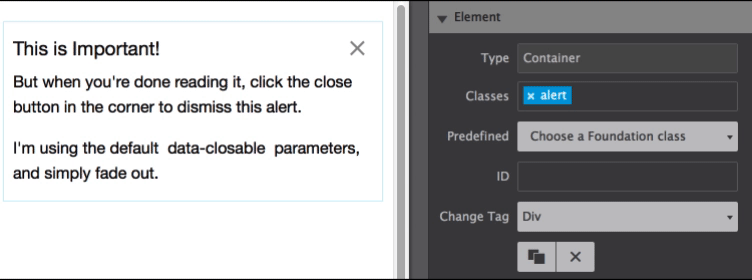
Button LinkWhen you add the .accordion-content class name to the container, it will disappear from view. This is because it is hidden from view, until the text link has been clicked.
To show this, go to the Inspector pane, and click the 'eye' icon next to the container. This will unhide it in the program so you can make edits.
Just note this will not make it visable when the page is previewed outside of the app.
Want to use a cool tip like this in your design? Check out the Components tab under the Content pane!
5. Add content to the hidden Container. Try adding a Paragraph element
6. Style the elements however you want. Change colors, size, and more!
7. To try out your creation, preview the page in your browser.
Bonus: To have one pane open by default, simply apply the .is-active class to a List Item Container.
Lorem ipsum dolor sit amet, consectetur adipiscing elit. Integer nec odio. Praesent libero. Sed cursus ante dapibus diam. Sed nisi. Nulla quis sem at nibh elementum imperdiet. Duis sagittis ipsum. Praesent mauris. Fusce nec tellus sed augue semper porta. Mauris massa. Vestibulum lacinia arcu eget nulla. Class aptent taciti sociosqu ad litora torquent per conubia nostra, per inceptos himenaeos.
Lorem ipsum dolor sit amet, consectetur adipiscing elit. Quisque nibh risus, sagittis nec suscipit nec, mollis laoreet eros. Donec faucibus, libero id faucibus scelerisque, justo justo nullam sodales.
Lorem ipsum dolor sit amet, consectetur adipiscing elit. Quisque nibh risus, sagittis nec suscipit nec, mollis laoreet eros. Donec faucibus, libero id faucibus scelerisque, justo justo nullam sodales.
Button LinkLorem ipsum dolor sit amet, consectetur adipiscing elit. Integer nec odio. Praesent libero. Sed cursus ante dapibus diam. Sed nisi. Nulla quis sem at nibh elementum imperdiet. Duis sagittis ipsum. Praesent mauris. Fusce nec tellus sed augue semper porta. Mauris massa. Vestibulum lacinia arcu eget nulla. Class aptent taciti sociosqu ad litora torquent per conubia nostra, per inceptos himenaeos.
Want to see a different menu that RSD that you can make in RSD? We have a cool, hamburger-transforming example along with other interactive demos and videos for you to feast on.
Additional resources
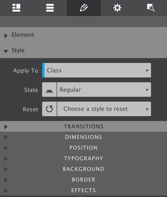
As explained above, style definitions are related to selectors and the top part of the style section is used to manage exactly that.
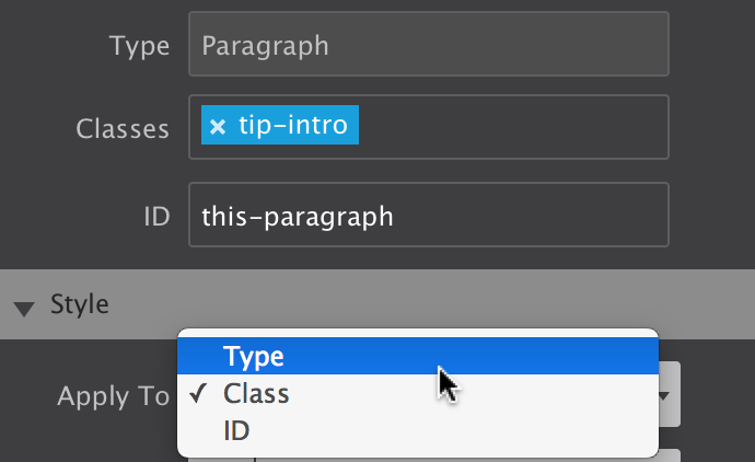
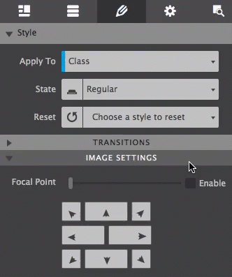
The Apply To dropdown is used to select the type of selector the style rules will be associated with. The choices are between Element Type, Class and ID.
The State dropdown can be used to specify a special state of the element targetted by a selector. For example :hover will apply a style when the user hovers over the element associated with the selector. You can also set Out of View effects using the State dropdown. You can learn more about Out of View in the 4.2.5 section below.
The Reset function helps to keep the project code lean and clean. The dropdown gives an overview of the styles that have been applied. Styles can be removed by clicking on them.
Each of these three functions is explained in more detail below.
The Style controls are organized in logical sub-sections such as Dimensions and Typography, on the second part of the Style section. They are discussed in part 3 below.
Selector management and Style Control Sections.
The selector options in the Apply To dropdown start with the broadest selection of elements, followed by a subset, and ends with the selection of a single element:
The three selector types.
The most efficient workflow is to first define styles for element types. This way a common ‘starting style' for all elements of that type can be defined.
For example, when Type is selected in the dropdown, further down on the pane in the Typography section Roboto can be set as the default font-family for all paragraphs.
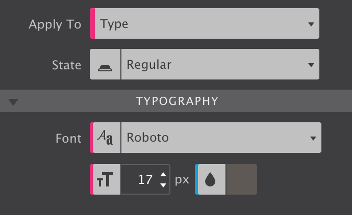
The Type selector in action.
As can be seen from the above image, styles applied to the type have a pink indicator.
This way the font-familiy and font-size for all paragraph can be updated with one single edit. Also, whenever a new paragraph is added, these styles will already be present.
Additional resources
With all default styles for the elements in place, Classes can be added to create design variations. For example, certain paragraphs that perform a different role can be given a different font family, size and/or color using a class selector.
To apply styles to a Class simply enter a class name in the Classes box (in the Element section of the Design pane). Also make sure to select Class in the Apply To dropdown. Now all style adjustments with the design controls below —yes, we will get to work with them real soon! — will be tied to that class.
Any control used for applying a style to a class uses a blue indicator, like the font color thumbnail of the image in the previous section.
The Class selector is more frequently used during the life-cycle of a project and therefore the default option in the Apply To dropdown.
Make sure to choose the correct selector in the dropdown when switching between elements.
So what happens when different styles are assigned to different selectos? Some selectors are more powerful than others, their styles will prevail. In CSS this is called specificity, the styles from a more specific selector will take precedence over styles from less specific selectors.
A Class selector is more specific than a style applied to a Type and will therefore prevail. On its turn, an ID is more specific than a class and will prevail. Styles applied to an ID have an orange indicator.
Styles attached to a class selector are intended to be used by multiple element. To add the class to another element simply type the class name in the Class input box. The image below shows that the auto-complete can be a great help!
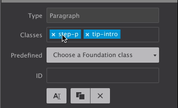
Adding and deselecting classes.
An element can be targetted by up to 5 different classes. Styles can be applied to a specific class selector by deselecting other classes. Deselected classes are gray (see ’step-p' above), any style updates will not apply to them, only to the class or class combination currently selected.
Styles can also be applied to class combinations. They are more specific than a single class and therefore these styles will take precedence.
One of the criticisms on (the use of) front-end frameworks is that it leads to sameness — many sites created with for example the Bootstrap framework look and feel the same and lack authenticity. Too many things have been predefined in too much detail.
In comparison, Foundation 6 (used by Foundation Framer) is less ‘opinionated’. With fewer framework styles to override and having a more neutral canvas to start with, designs are more unique.
There is something to say about both approaches and depending on the situation a specific approach or framework might be better suited.
We feel the ‘sameness argument' is moot when working with Foundation Framer — the visual controls make it super easy and fast to assign different styles to the Foundation classes and to give the elements and components a totally different appearance.
In addition, new custom classes can be added that bring their own style rules to the table — creating some unique is totally up to the designer!
As we saw in Section 1.1 with the button examples, Foundation has done a great job in modularizing the styles. These modular classes are designed to be used depending on the role and context of an element.
For example, this paragraph uses the class lead which makes it stand out
Using the modular class structure can be a great help in the initial phases of the project and help to think about the role of the content element. Updating the appearance by editing the styles associated with the classes, or adding new classes with different style rules is a cinch.
In this paragraph the lead-brd class is used to make it appear different.
The Predefined dropdown facilites the use of the framework classes and prevent typos. Simply start typing what you are looking for and the list will show an increasingly precise list of matching classes.
Adding predefined Foundation classes.
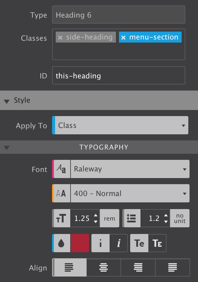
We already saw that pink is associated with style definitions for an element type and that a blue indicator tells us the style was set on a class. An orange indicator would correspond with a style coming from an ID. This covers most of the situations, but there’s a few additional cases we need to iron out.
First of all, we learned that classes can be deselected so style can be assigned to specific individual classes or class combinations. When a style applies to such a deselected a class (or class combination), the style control has a gray indicator.
In the image, the class side-heading is deslected. On the Typography section the indicators for the font-size, line-height and text-align controls are gray. This means that these styles belong to the side-heading class.
Here’s one more situation where the color coding can come in really handy. When styles are applied to multiple selectors, e.g. a class and an ID, the style controls show the values of the styles associated with the selector type we are currently working with. This is the selector — Type, Class or ID — visible in the State dropdown. This sounds more complicated than it is really, a quick example will make that clear.
In the image the font-weight control shows a value of 400 - normal with an orange indicator. However, the Apply To dropdown shows we are currently working with class selectors. That means that the visible value — 400 - normal — belongs to a class. The orange indicator however tells us that a font-weight value has been specified for the ID as well. To view this value simply switch the Apply To dropdown to ID and the value associated with the ID will show up in the control.
The indicator will take the color of the strongest selector, because that is the style value that in the end will be visible in the browser. So in our case, if a different font-weight has been set for the ID that is what will show on the canvas.
Selector color coding.
Selectors and selector specificity in CSS can take a little to get used to, but with this color coding system you will be an expert before you know it!
The State dropdown allows you to set specific styles for regular view, upon hover, when an item is active, as well as styles for how an item displays when it comes into-view (otherwise known as Out of View state).
This control is extreamly popular for creating a Hover state. For example if you want buttons to change color when someone hovers over it, select your button and change the state to Hover. Then apply the styles that you want to take effect for that state.
In a world where everything is competing for attention, adding that extra bit of life to the design increasingly makes the difference. Animations and transitions applied to the Out of View state can be used to spark interest, help the visitor focus on a specific area, increase usability or simply help to capture the attention just long enough.
Change any style, reveal content, even set backgrounds to move. With CoffeeCup responsive apps, these effects are fun to create. We made a video showing you apply one of these cool effects to a background image.
Out of View
A subtle animation where the icons slowly animate into place when the page loads, or when the icons are scrolled into view.
Creativity spurs from iteration and focus, not from solving coding problems. With our tools content and design come first.
Not just for websites and components such as Content Slide Shows. Our tools even solve the responsive email design problem!
Design with the famous front-end frameworks — visually. From the popular Bootstrap 3 (and 4), to the nifty Foundation 6.
Syncing Symbols, Filters & Blend Modes, Flexbox, Column Layout, Width Slider, Customer Breakpoints and much much — MUCHO — more...
Our apps are lean coding machines. The generated code us super clean and easy to work with for developers after export.
The CoffeeCup support team is considered the firendliest and most helpfull team around. Just ask around.
There are tons of ways backgrounds can be made to animate. Colors, opacities, overlays, scaling, translate, filters or blends can all be used to grab the visitor's attentions and create 'WOW' effects. In this demo the surf background slowly moves to the right. Make custom animations or select one from the CoffeeCup Components Library.