
CSS Grid is the new layout method for arranging content in an extremely better way. This technique, now incorporated into Site Designer V3 eliminates the traditional grid system that you’re used to in RSD V1 and V2. No more adding endless rows and dividing them into columns. Instead, organize all your content into Containers and then position the content within them accordingly.
In this tutorial, we'll explain the workflow for converting previous Responsive Site Designer projects. You'll be able to use this suggested workflow to modify any section of the project to the CSS Grid display.
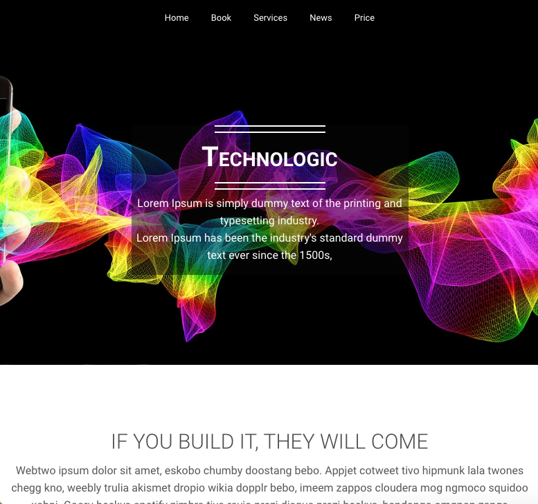
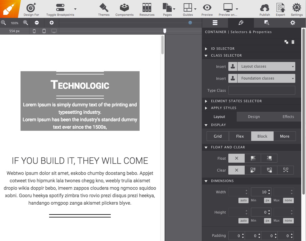
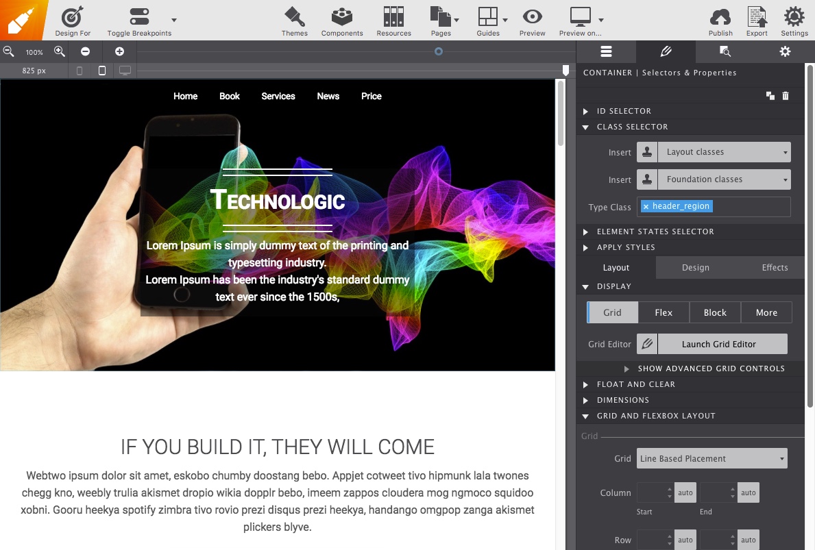
The Technologic theme will set the stage for this demonstration. However, the steps are the same regardless of the framework you're using. The original design included two rows. The top row being used for the navigation menu responsive-menu and the second row reserved for highlighted-heading the hero message.
With CSS Grid, this will be combined into one parent container with both items directly told where in the Container to position themselves. You’re welcome to download the V2 project file and follow along as we convert the header into a Grid-friendly format.
Upon opening the project, the first thing you’ll notice is the grid is now gone. Individual elements can be dropped right onto the canvas and positioned using a wide variety of way, while groups of elements are organized into Containers.
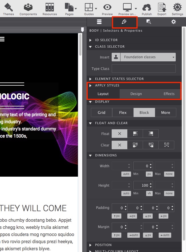
The Styles Pane contains all the design properties for an element. Here you'll position the element, set colors, size, spacing, font types, and shadows, along with applying any interactive effects. Double-clicking any item on the canvas will automatically launch the Styles pane on the right.
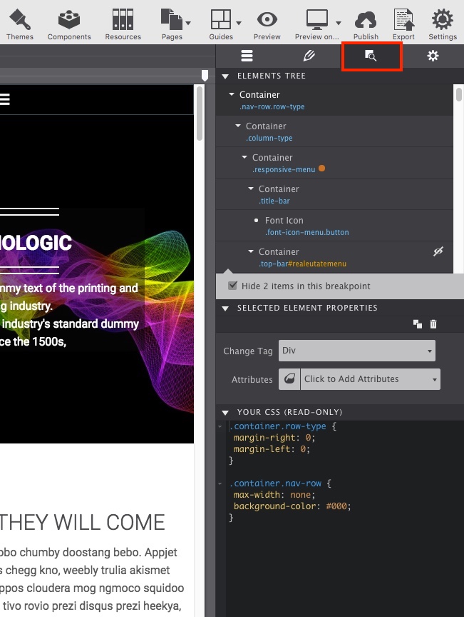
You can also use this control panel to toggle hidden items into view. By clicking the little eye indicator, the hidden item will display on screen for you to make style modifications. This is useful for projects that have a mobile menu component such as the Technologic theme.
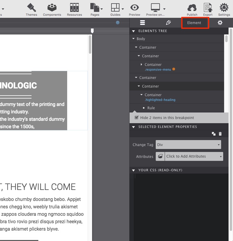
The Elements Pane is where you’ll find the tree of all the elements used in the project. This control panel makes it especially easy to find an element you want to work on, rearrange elements with drag-n-drop, or to gain a better understanding of how a component is set up within the design.
The Element control pane also holds the element's specific properties. For example, you'll be able swap out image placeholders with your Picture Resources or apply special Attributes.
With the big UI changes explained, you are now ready to start the project conversion.
Our new Components Shop will be up soon. In the meantime, you can bring in the components from older projects as needed. You'll need to update them to Grid and then resave.
This is the better workflow versus mass importing because it will be easier to keep track of which components use Grid and which do not. Stay tuned as the launch of the Component Shop will be very soon....
Upon opening a previous project, you’ll notice the grid is now gone and all elements that were once within a Column will be automatically converted into a Container.
On the Styles pane, each newly created Container in the project will have a pre-generated Layout Class name. This indicates the type of content that was converted, for example, if the content was originally a Row then the Class Selector > Layout Class may say row .
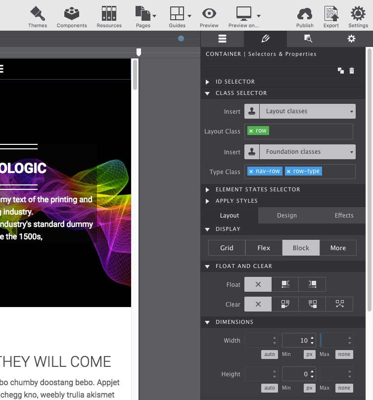
This Layout Class name will appear in the Element pane so you can quickly identify it. It will also correspond to the label on the Styles pane under the Layout Class section.
Begin by deleting all the Layout Classes related to the original Rows and Columns for both the navigation menu and header message. In doing so, some styles that are associated with these classes, such as the background image, will get deleted.
By deleting these classes, we'll also be resetting their original layout properties allowing for fresh controls to be set. We'll reapply the lost styles in Step Three.
You can verify that you have deleted all of the row and column Layout Class names easily by using the Elements pane. The classes are listed in blue for each element on your tree. If you identify one you missed, double-click it to launch the Styles pane and remove them.
The goal of this section is for the navigation and the hero message to rest on top of the colorful background image. To achieve this, we will need a single Container element to hold both the responsive-menu container and the highlighted-heading container.
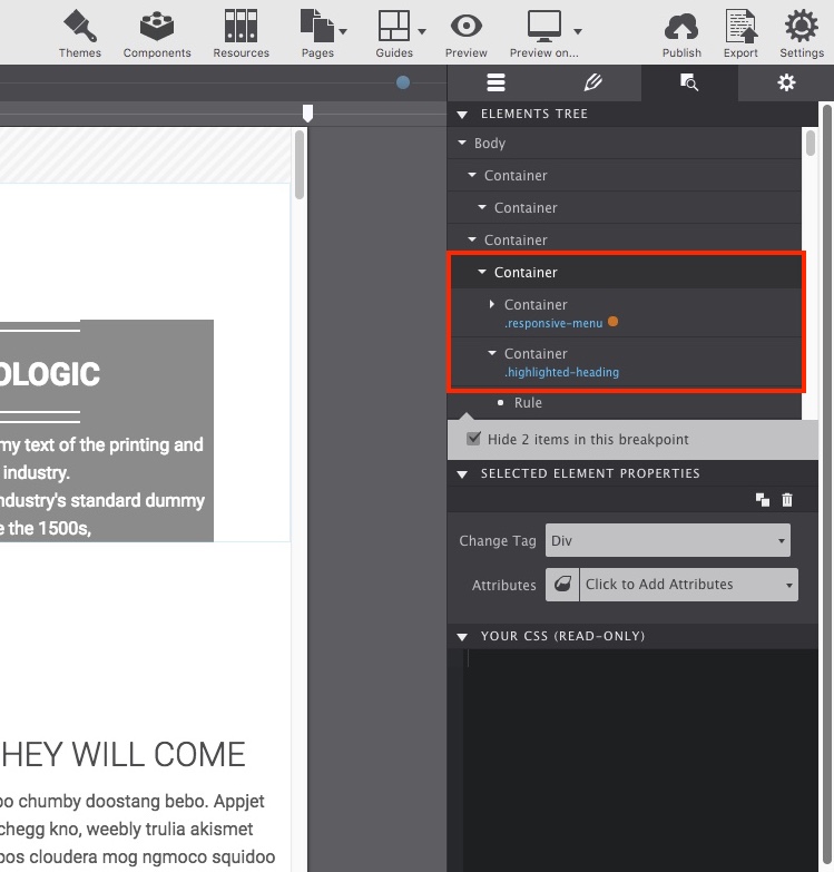
Looking at the Element pane, we can see there are a many unnecessary Containers. So the menu content container will be moved into the Container wrapping the highlighted-heading . This main container will serve as the parent for both the Navigation and Hero Message.
As you can see in the demonstration below, this leaves three containers that are unnecessary. Clean up the project by deleting the redundant Containers.
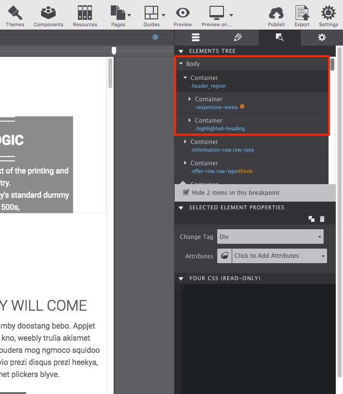
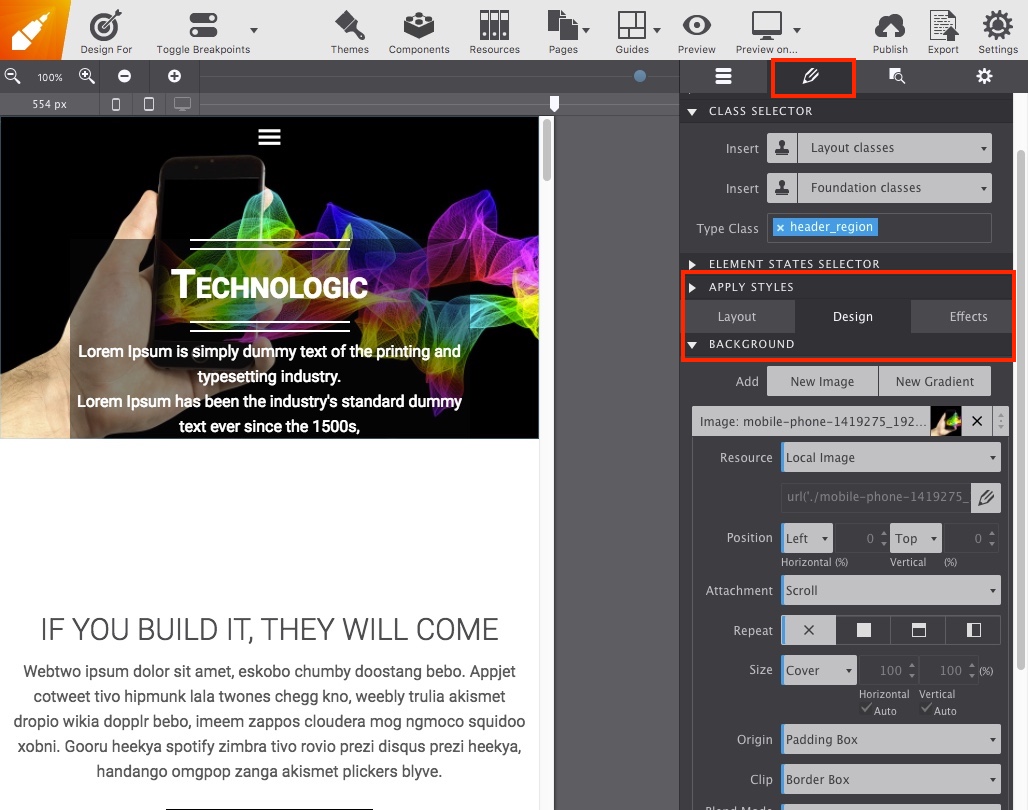
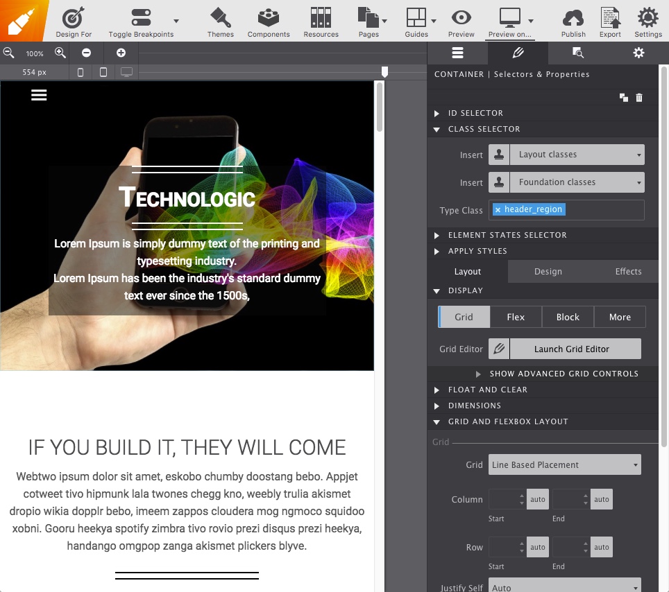
The parent Container will be given the class name header_region to make it easily identifiable on the Element tree. With the extra Containers deleted, that will leave us with the desired single Container with both content element containers nested within it as demonstrated below:
With CSS Grid we can instruct the children elements (the menu and hero message) exactly where to go within the header_region container. However, to make sure unsupported browsers will still display the content in the right order, you'll want to ensure the content is positioned is the correct order of priority. For example, the menu will need to be positioned in a higher hierarchy to the hero header message.
With the content in the proper display order, you are now ready to get griddy with the section...
Now the fun part! Select the header_region Container and go to the Styles pane. Let’s go ahead and re-add the background image so we can better see the elements we are working with. To do this, go to Styles > Design > Background > New Image. The image controls will appear. Using the Resource dropdown, choose the Local Image and select the mobile-phone graphic.
The image properties can be tweaked. In this case, the Size is changed to Cover.
With the header_region container still selected, go to the Styles > Layout section and choose Display: Grid. Then click on 'Launch Grid Editor' to begin setting up the grid structure for the container.
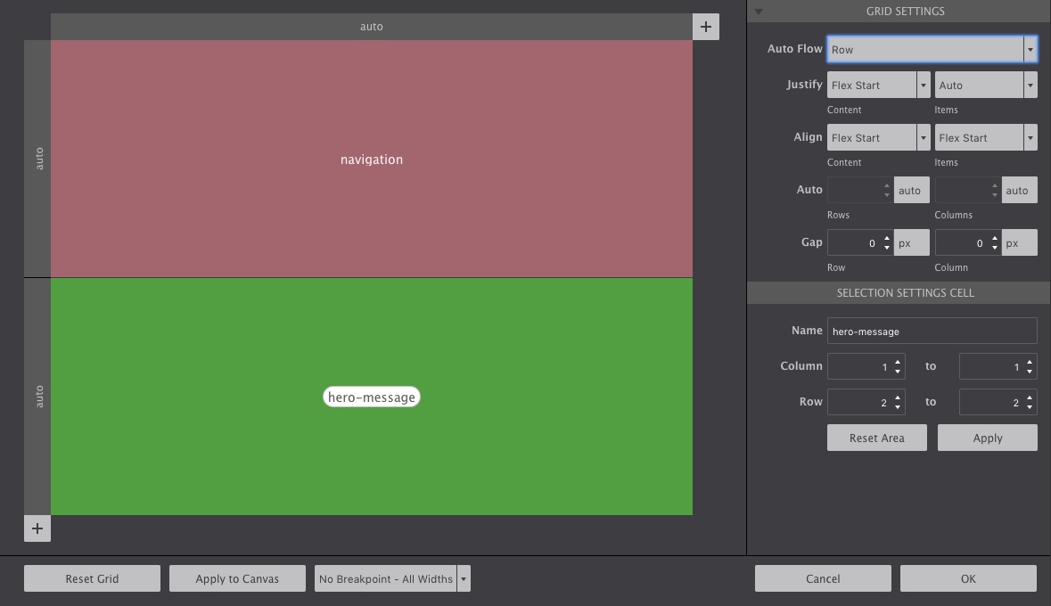
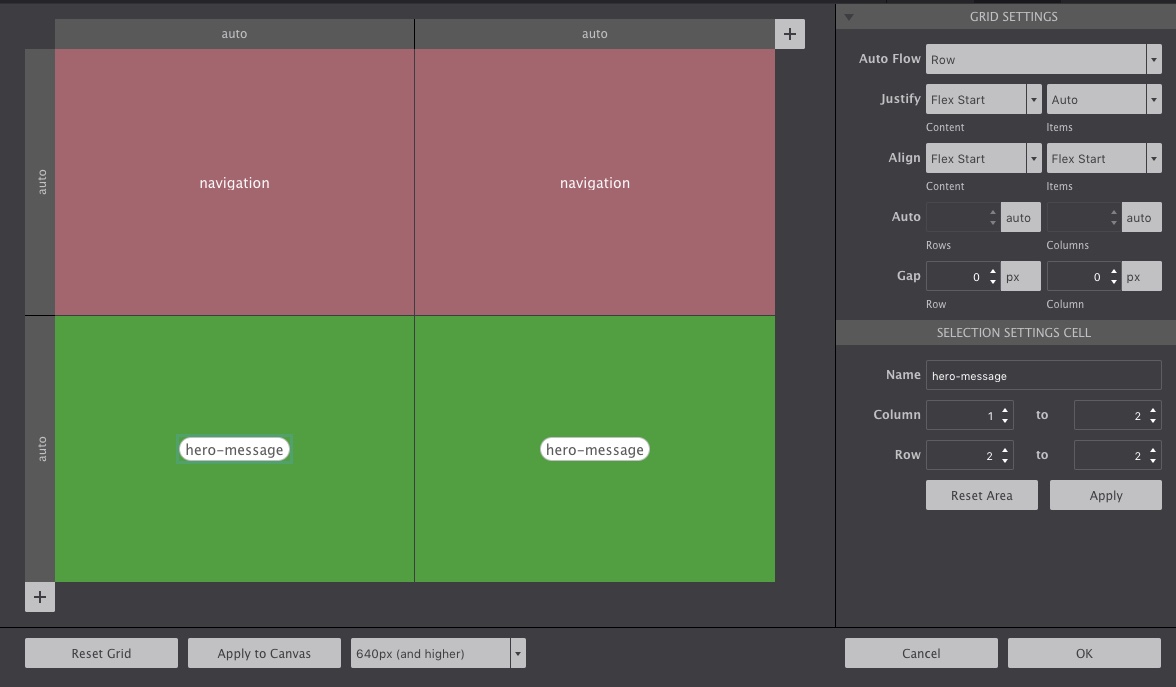
This header_region container needs to be divided into 2 sections. The container will already be divided as much, but if you wanted to change up the structure, you would use the + Arrow to divide the container into as many sections you want. By using Grid Area Names you are able to specify exactly where we want the content to be placed.
Clicking on the grid sections (the little gray dot on the canvas), type the grid area names you want to use to identify the content (important: no spaces or capitalizations!). This demo uses navigation and hero-message for the area names. Select OK to apply the grid configurations to the container.
Next, you will need to apply the same grid area names to the content. Starting with the menu, select its container responsive-menu and go to Styles > Layout > Grid and Flexbox Layout section. Set the following two properties:
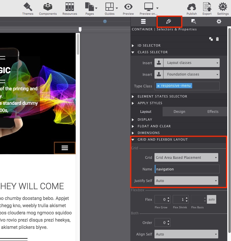
Notice in that screenshot above the menu is in the bottom right corner. Once you hit Enter or click out of the grid area name property, then it will automatically snap into the correct place up top.
Repeat the same steps for the hero section container. So select the container with the class name highlighted-heading and change the Grid and Flexbox Layout controls. This time using the Name: hero-message for the grid area name.
While this demonstration used a very basic, two content centered set-up, it is extremely simple to move items around within the container. You can essentially direct your content to move to any location within your grid at any given viewport size.
For example, let's say you want that menu in the left-hand corner instead of centered. To do that, you would only need to make a small tweak to the grid. Select the heading_region Container and go to the Styles > Layout > Display and Launch Grid Editor once more.
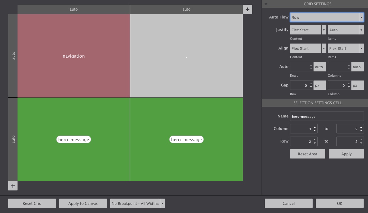
Click on the top-right plus arrow (+) to add a new column to the grid. Doing so will create a four-column grid structure, two on top and two on the bottom.
Since we only want the menu to be on the left, leaving the dot on the top-right will indicate to the navigation menu to remain only in the left side of the heading_region container. To make the hero-message take up the full container, click the lower empty column and add the same grid area name hero-message . The figure below shows you the visual representation of the content placement.
Once you click OK the navigation will snap into the left corner! See, take a look:
With the grid layout applied, you can now tweak the styles. Use the width slider to view the design at various screen sizes and modify as needed. The grid can be changed at any breakpoint too. For desktop, our moble menu expands out, so it would look better centered. So to change that out, move the slider past the breakpoint and launch the Grid Editor once more to change the structure.
Once you click OK the navigation will snap into the center! These types of changes are so easy to make that it allows you to experiment with various content positioning without hassle.
The end result is code that is leaner, cleaner, more concise and much easier to manage! Learn more about working with CSS Grid layout positioning controls using the resources below.