The four main sections.
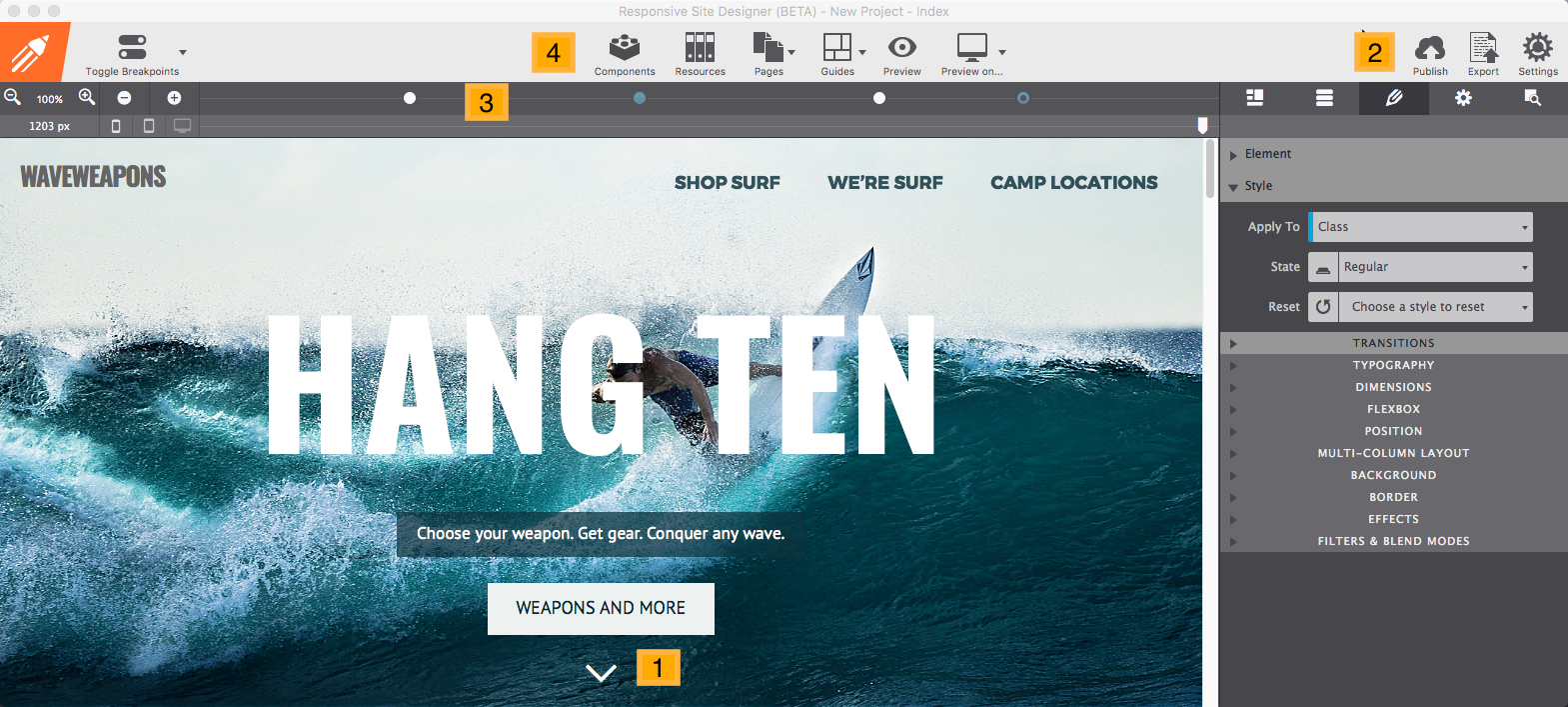
If you are reading this in the app, you’re currently looking at the most viewed part of the Site Designer: the real-time canvas. The canvas, marked as #1 in the image below, is a browser-based working area. A major advantage is that what you are creating, will look and feel the same as when the site is actually published on the web. The canvas is mainly used for the live design view, selecting or reordering elements, and editing texts.
The rest of the app is for managing what happens in the working area. On the right, there are 5 panes, marked as #2, each with specific roles for visually managing the content, HTML, CSS and Javascript.
Right above the working area, you will see a bar aka 'The Responsifier’. This bar, marked as #3, contains a number of tools for managing the design at all possible devices widths.
TOCSite Designer offers the ability to build sites based on the Foundation or Bootstrap frameworks, which are both 'mobile-first' workflows. This means the design process is initially focussed on small (mobile) devices at widths to the left of the most left dot. Then adjustments can be made for larger screens when a breakpoint becomes active — when a dot shows a black center. If you’ve been hand coding with Foundation or Bootstrap this will immediately be obvious. If not don’t worry, we will discuss (custom) breakpoints in detail later.
The toolbar, marked as #4, gives access to functions as the Page Manager, can be used to switch between several Design Modes and launch a Preview in a specific browser. In the next sections of this document, we will summarize the purpose of each of the specified areas and their functions for creating responsive designs.
View elements. Click to select or use the dropdown. Edit text.
This area visualizes what the web site visitor will experience when landing on the page. In combination with the Slider (part of The Responsifier), every device width can be previewed while designing.
If you are interested to see how a specific part of the design behaves at different screen widths, select any element in that section. In normal browsers the content will flow out of view when resized, however, in Site Designer the selected content is auto-scrolled back into view. A small, but an extremely handy perk of the app!
On the canvas, elements can be selected by clicking on them or by selecting them from the dynamic dropdown. A selected element can be dragged and dropped into a different position or column. Selected elements can also be duplicated or copied and pasted into a different area.
Text elements can be edited in place when the Text Editor is active. The editor can be activated in a number of ways. Right-clicking a text element will bring up a contextual menu that gives access to common functions, including Text Edit.
Power users will appreciate being able using a keyboard combination for the actions available in the menu. A complete list of keyboard shortcuts will be included in this document.
The most important tools to manage the content and design on the Canvas are located in the Control panes. Let’s look at them next.
Layout, content, style, page settings, inspector.
On the right side of the UI, there are 5 panes each with a specific role in creating the responsive design. The icon is replaced by the pane name upon hover. Here’s an overview of each of the panes, details on each pane are provided in the next sections.
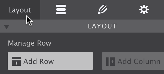
The pane on the most left is the Layout pane. This pane includes the controls for working with the grid. Here you can add rows, columns (which hold the actual content elements) and specify, for example, the width of a column and adjust it for different display widths.
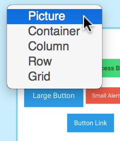
The next pane is the Content pane. Elements like headings, paragraphs, buttons, images and videos (and a whole bunch more) can be inserted into any column on the canvas.
Also on the Content pane are the project Components. This subpane gives access to all prebuilt components like navigations, cards, and modals that are included in the project. Symbols are accessible through the Content pane. Symbols are elements such as a buy button, or components such as a footer, that are being kept in sync across all places and pages of the project.
Out of the five panes, the Design pane is probably the most frequented one. The top part is used to configure the HTML / content part of the element. For example, Foundation or Bootstrap classes can be ‘filtered up’ from a predefined list, custom classes can be added or URLs specified. The second part contains all the inputs, tools and controls to control the design of the element, subdivided into sections such as Typography, Dimensions and so on.
The fourth tab is the Settings pane. Here you can set meta data for search engine optimization. Enter a page title, description, keywords, or insert content into the head and footer sections.
The last pane is the Inspector pane. The top part gives a tree like overview of all elements on the page. It offers a fast way of selecting and reordering elements and, for example, toggling the visibility of hidden elements. The bottom part offers a preview of the CSS rules added.
This only touches upon the design and creation possibilities the panes offer. More detail on each of them can be found in the next sections. And since we are big fans of designing content-first*, let’s get started with the Content pane.
*This is very similar to designing mobile-first. A key argument for designing mobile-first is that the small space forces proper content prioritization. Content-first proposes the same, but independent of screen size. The “Disable breakpoints’ setting (see below) is a great help here.

In app toolbar
The toolbar includes direct access to a bunch of tools, settings, and functions.
The main toolbar gives access to functions less relevant to the design workflow. There are buttons to reach the page manager or manage project resources such as images and additional files. You can also use the toolbar functions to preview the design on any installed browser, or to export and publish the site.
These functions are also available under the dropdown menus and through keyboard shortcuts.
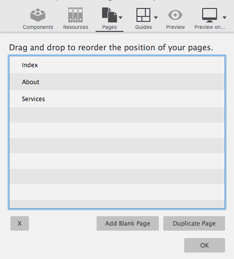
The most used toolbar button is the Pages control. Here you can add new pages to your project, change pages name, or rearrange page order.
The Components button allows you to insert website building blocks such as navigation menus, social icons, buttons, headers and more. These handy components speed up the design or prototyping process and are easy to customize.
The Guides button allows you to visually toggle indicators around elements and the grid structure making it easy to know where elements are located and spaced.
Gridlines are lightly colored horizontal and vertical lines that appear around elements in your project. These guidelines are used to define the boundaries of cells, columns, and rows on your page.
X-Ray mode allows you to see at a glance how the rows, columns and containers are set up. When this is enabled, all grid options are turned on background images are removed and an opacity is set on all elements allowing you to see the grid configuration You will also notice that things are color coded for easy recognition.
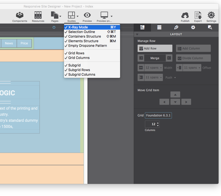
Turn on Grid Lines
Breakpoint mode can be used to define styles for a particular media query, independent of the slider position. By disabling all breakpoints styles are not tied to any media query. This, for example, allows you to have more space in the working area while working on the default styles. If you are used to working desktop-down this feature can be extremely handy. Just be sure to re-enable them when you are ready to make adjustments for larger screens.

Toggle Breakpoints
Keep in the know and always keep your software updated. To see if you're using the latest version, go to the Help Menu and select Check for Updates. If you are using an older version of the software, you will then be prompted to download the updated release. No need to worry about checking every day as well. The software automatically phone's home once every seven days to check and see if any updates are available.
After the software update is downloaded to your computer, close Responsive Site Designer and then launch the installer. After installation, open any project file and your update is complete.
RSD comes with an extensive collection of themes for both Foundation and Bootstrap frameworks. Use these themes to jump-start your website creation. Go to File > New From Theme to launch the theme manager. Once you select your theme, just change the text and images to fit your needs, and your task is complete!
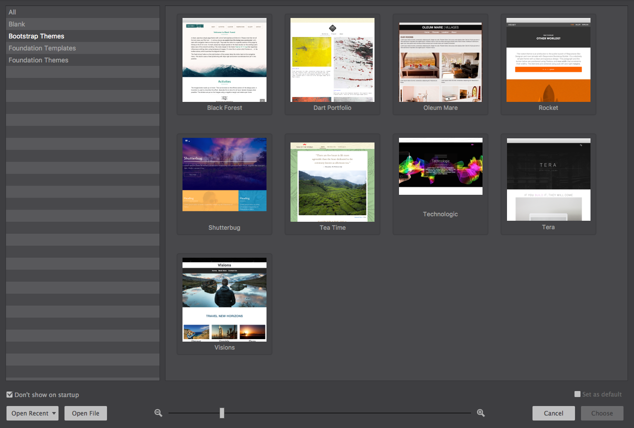
Bootstrap themes.
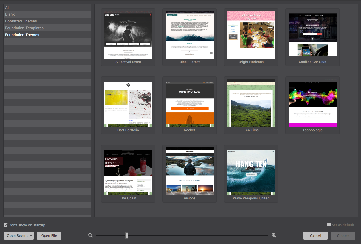
Foundation themes.
If you want to build your website free of a pre-designed theme, use one of the “blank” themes and start with a clean canvas.
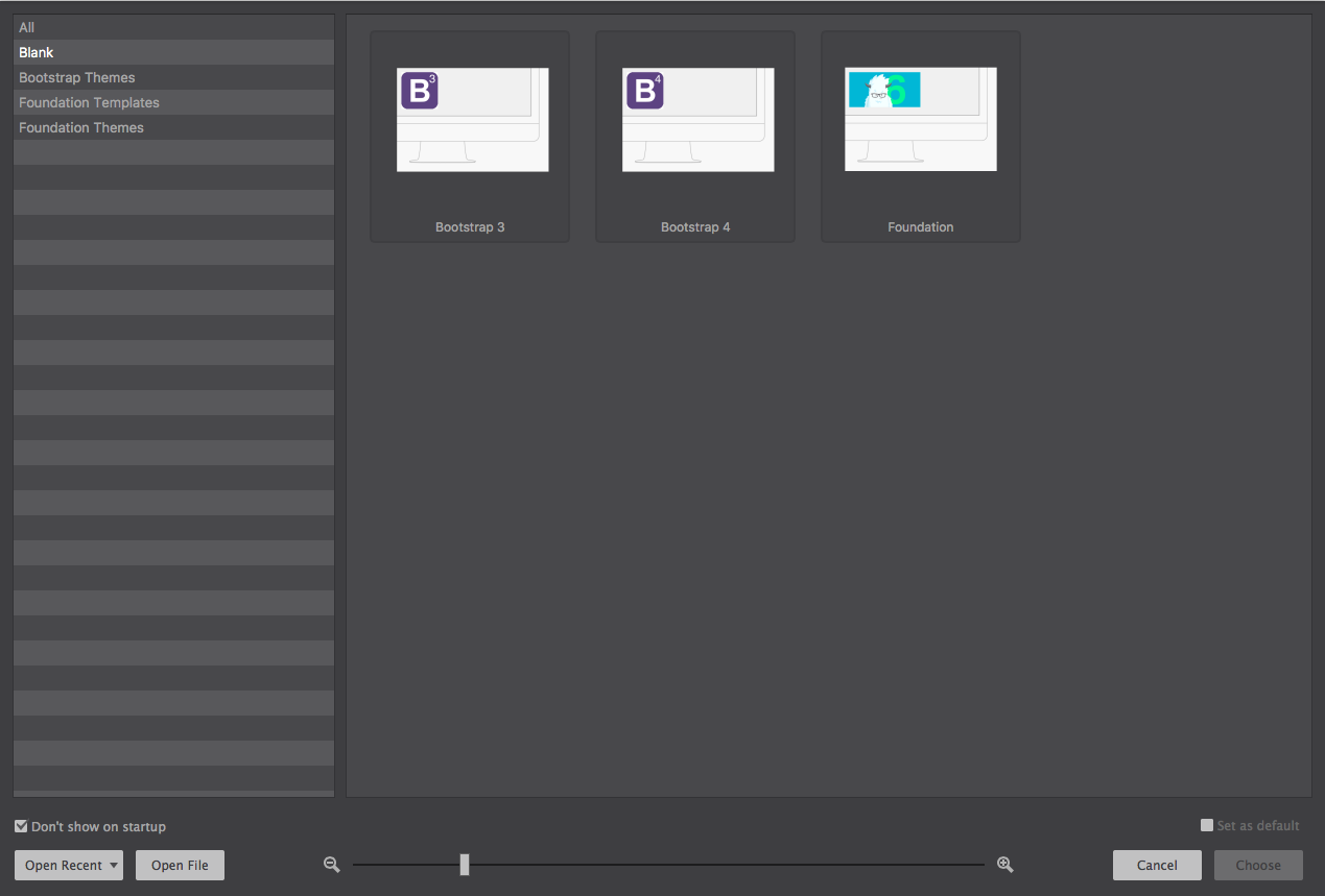
Choose to create your own, using the built in Blank themes.
Which one to choose? Picking a framework is like choosing a fine wine. One isn’t necessarily better than the other. They’re both awesome. It all just depends on your personal preference.
Manage all the pages in your website project using the Pages icon. From here you can jump to the Next or Previous page in the site. You can also Add a new Blank page or Duplicate an existing page. Currently the app supports up to 125 pages. This number continues to increase on a regular basis.
Managing your project pages is easy from this section too. Just select Manage Pages to view an editable list of your pages. Double click any page title to rename it, or click-n-drag to rearrange the page order. Your page names are what you will use when linking from other locations. So remember to never use spaces within your page names. If your page names are multi-words long, then always use hyphens to separate the words, or smush them together to make one long word.
Add and Delete Pages in your project