Visually manage the grid.
Design grids have been used with great success in print design for decades. A grid consists of a series of rows and columns, very similar to a spreadsheet, that help to create order in the way information is presented. The grid is managed from the Layout pane.
Most buttons on this pane are rather self-explanatory. The Add Row buttons adds another row below the currently selected (or active) row. The Add Column button inserts a column inside of the currently selected row.
The content elements we looked at in the previous section ‘live’ inside the columns. This creates the desired order and alignment. Unlike these elements, rows and columns can not be dragged and dropped.
Row and columns can be moved around with the Move Grid Item control. Please note that columns can not be moved to another row. However, a column can be copied to the clipboard and pasted into another row.
Columns can be merged with the left or right neighboring column using the Merge arrows. A column can be split with the Divide Column button.
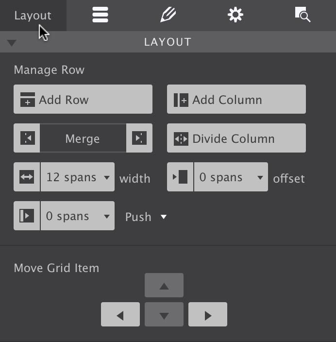
The powerful Layout pane.
The Foundation grid uses a 12 column system — basically that means that each row can hold up to 12 columns. With each column spanning 1/12 of the row, the 12 columns will fit. However, columns can also be instructed to take up — 'span' — a larger part the row. This is done with the span-width dropdown.
A span of 6 means a column takes up half (6/12) of the row. That leaves room for another column with a span of 6 next to it (or 2 columns with span 3 etc). If the total span exceeds 12, the columns that don’t fit will be placed below the proceeding columns. This way content can be placed next to each other on wide screens, and appear stacked on mobile devices.
The span-width control is the most important tool for building the layout and for subsequently adjusting the layout for different screen widths. Layout changes at breakpoints will be addressed later in this document.
The Offset and Push/Pull controls can be used to create advanced layouts. The layout of this document provides a good example.
At small and medium widths — everything on the left of the second (768px) Foundation breakpoint — all columns span the full width of 12 columns. However, this changes on the right of the breakpoint — there the main columns use a span of 9 and are being offset by a span of 3 to create room for an occasional column on the left.
On the right of the third breakpoint another layout change is made. The main columns get a span of 5 and are being offset by 2.
Layout adjustments like this are super easy to create with Foundation Framer. How this exactly works will be explained further down below. First, let’s get to work with the great Design pane!
Additional resources
Some grid system restrict the width of the rows by default, frequently to 1200px. This keeps the content centered on larger displays. To make a row stretch, the Max-width restriction needs to be removed.
In Foundation the rows are always taking up the full width — by default the Max-width is set to none. To center the content, a max-width can be added to the row. However, if the background of the row needs to stretch the full width, the content must be centered in some other way.
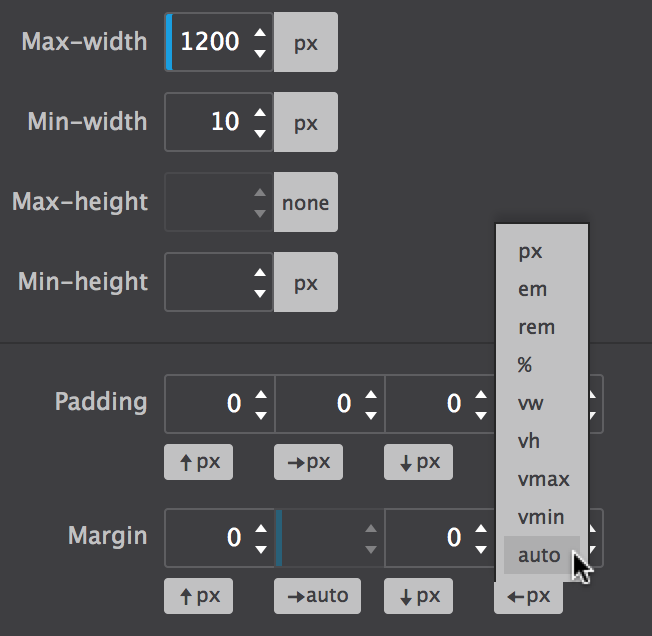
There are various ways of doing this, depending on the design case. A versatile, yet fail-proof method is adding a subgrid or container element. Their width can be limited using the dimension tools and be placed in the middle by setting the left and right margins to auto. This content can then be placed inside the subgrid or container.