Your guide to email & newsletter development with Email Designer.
Introduction: Create better performing emails.
Even emails that are not responsive are hard to code and display intact in all email clients, many of which have various peculiarities (yea, looking at you Outlook). This is also one of the reasons other email builders are so limited, more design freedom can cause the email to 'break' in some clients.
Email design is not the same as web design.
With RED all that is in the past. Powered by an innovative email code generator and built upon a solid foundation, emails are displayed consistently across all (major) email clients. On top of that, RED offers design options and layout tools unique to any email editor, allowing for a rich email experience on large screens and mobile devices alike. Now, that's a powerful app indeed!
Less (or none) code savvy designers will not be bogged down by coding details. Using visual CSS controls the focus is on the content and experience design, not on hunting and tweaking code snippets.
We have heard from a great many Photoshop and Illustrator specialists with limited CSS experience how spectacularly their workflow has improved. They are now designing in one of our responsive apps, directly for the web.
The graphics programs are now used as they should, for creating supporting materials such as icons, backgrounds and for image effects*. No more laborious static prototyping for various screen sizes, just one design that can be viewed and adjusted for any device width. And the results are super spectacular too!
Unchained from rigid templates, design and campaign creativity can run free.
These days over 50% of emails are first opened on a mobile device. Technology and design that improves the mobile email experience offers incredible benefits. Plus, of the top ten most used email clients, several now support background images, border radius, shadows and a number of typographic features.
It is important to realize that designing an HTML email is nothing like building for the modern web. Indeed, it’s very much like the days of Internet Explorer 6 & 7 where endless tweaks had to be made so that sites would function across browsers that were using very different display rules.
The workflow and interface of Responsive Email Designer is very similar to Site Designer. Sometimes we will link to more indepth articles, tutorial videos or helpful tips originally created for these apps. Just thought to give you all the heads up when you notice a RSD icon or reference — the instructions will apply to RED in the same (or scarily similar) way.
Help will always be given at CoffeeCup to those who ask for it. You can visit our forums to ask questions or our five star support team. Also the Help Dialog in the Email Designer toolbar is only one click away :)
Meet the app interface
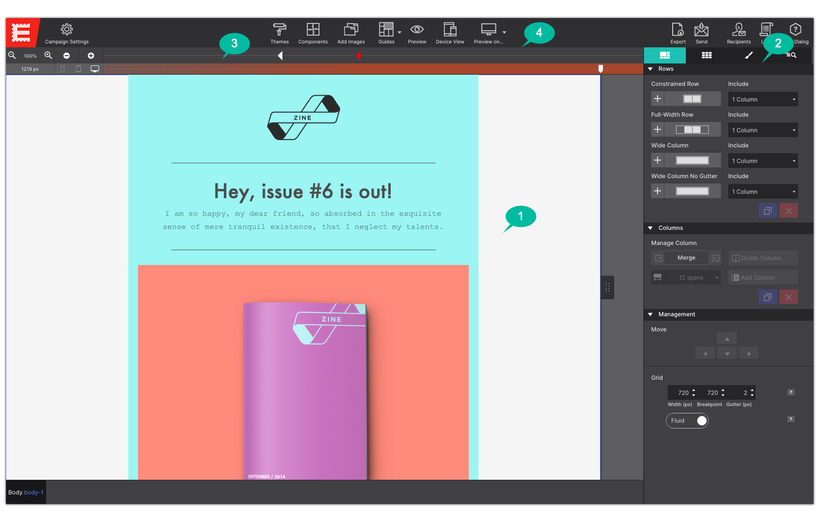
1 The Real-Time Canvas.
The most used part of Responsive Email Designer: the real-time canvas. The canvas, marked as #1 in the image below, is a browser-based working area. A major advantage is that what you are creating, will look and feel the same as when the site is actually published on the web. The canvas is mainly used for the live design view, selecting or reordering elements, and editing texts.
2 The Control Panes.
The rest of the app is for managing what happens in the working area. On the right there are 4 panes, marked as #2, each with a specific role for visually managing the content, elements and effects.
3 Viewport Slider & Breakpoint Manager.
Right above the working area you will see a bar aka 'The Responsifier’. This bar, marked as #3, contains a number of tool for managing the design at all possible devices widths.
Breakpoints. The RED framework is ‘Desktop-down’. This means the design process is initially focussed on large (desktop) devices at widths to the right of the red dot. Then adjustments can be made for smaller screens when a breakpoint becomes active — when a grey dot shows a black center.
4 The Toolbar.
The toolbar, marked as #4, gives access to functions such as the Campaign Settings, Components, the ability to Add Images, and much more. You can also use it to switch between several Design Modes and launch a Preview in a specific browser or even export and send your email.
Video Tour of Email Designer
The Canvas (Working Area)
This area visualizes what the email opener will see when landing on the page. In combination with the Slider (part of The Responsifier), every device width can be previewed while designing.
On the canvas elements can be selected by clicking on them or by selecting them from the dynamic dropdown. A selected element can be dragged and dropped into a different position or column. Selected elements can also be duplicated or copied and pasted into a different area.
Text elements can be edited in place when the Text Editor is active. The editor can be activated in a number of ways. Right-clicking a text element will bring up a contextual menu that gives access to common functions, including Text Edit.
Power users will appreciate being able using a keyboard combination for the actions available in the menu. A complete list of keyboard shortcuts will be included in this document.
The most important tools to manage the content and design on the Canvas are located in the Control Panes. Let’s look at them next.
The Control Panes
On the right side of the UI, there are 4 panes each with a specific role in creating the responsive design. The icon is replaced by the pane name upon hover. Here’s an overview of each of the panes, details on each pane are provided in the next sections.
The pane on the most left is the Layout pane. This pane includes the controls for working with the grid. Here you can add rows, columns (which hold the actual content elements) and specify, for example, the width of a column and adjust it for different display widths.
The next pane is the Content pane. Elements like headings, paragraphs, buttons, images and a whole bunch more can be inserted into any column on the canvas.
Also on the Content pane are the project Components. This subpane gives access to all prebuilt components like navigations, cards, and modals that are included in the project.
Out of the four panes, the Design pane is probably the most frequented one. The top part is used to configure the HTML / content part of the element. The second part contains all the inputs, tools and controls to control the design of the element, subdivided into sections such as Typography, Dimensions and so on.
The last pane is the Inspector pane. This view gives a tree like overview of all elements on the page. It offers a fast way of selecting and reordering elements and, for example, toggling the visibility of hidden elements.
This only touches upon the design and creation possibilities the panes offer. More detail on each of them can be found in the next sections.
The Toolbar
The toolbar includes direct access to a bunch of tools, settings, and functions.
The main toolbar gives access to functions less relevant to the design workflow. There are buttons to reach the manage project resources (images), recipients and lists. You can also use the toolbar functions to preview the design on any installed browser, or to export and send the email.
These functions are also available under the dropdown menus and through keyboard shortcuts.
The Components button allows you to insert email building blocks such as navigation menus, social icons, buttons, headers and more. These handy components speed up the design or prototyping process and are easy to customize.
Campaign Settings
On the right side of the UI, there are three panes each with a specific role in creating your responsive design. The icon is replaced by the pane name upon hover. Here’s an overview of each of the panes, details on each pane are provided in the next sections.
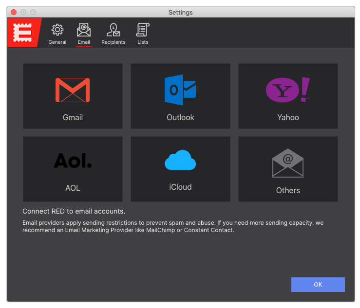
Under the Email tab you can connect to your personal or business email to send to individuals and small groups. Most importantly you may send tests of the email so you can evaluate the design across various mail clients.
In order to send, you will need to configure an SMTP server which will be used to send the email. To do that select from Google, Outlook, Yahoo, AOL, iCloud depending on who is your email manager. Using another email provider? Choose Others to configure the SMTP settings for alternative clients. After you save the account configurations, use the Account drop down menu, to select the email account you want to test from.
For more details about setting up your Email configurations please see the Campaign Settings chapter in the resources below.
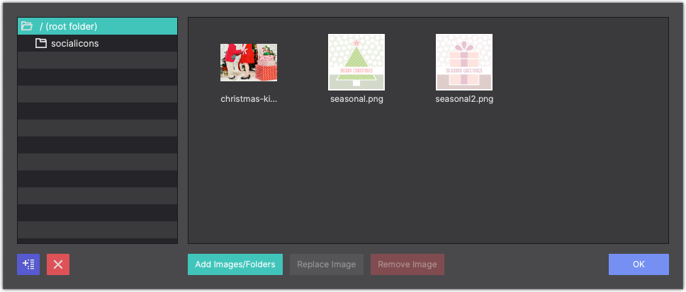
Manage your email resources by clicking the Add Images toolbar icon. Images you add here can be loaded into your canvas when you add any Image element to your design. Use the + arrow to organize your resources into folders.
You can also drag-n-drop a picture onto the canvas and it will automatically appear here within your resources.
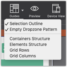
Guides
The Guides button allows you to visually toggle indicators around elements and the grid structure making it easy to know where elements are located and spaced.
Gridlines are lightly colored horizontal and vertical lines that appear around elements in your project. These guidelines are used to define the boundaries of cells, columns, and rows on your page.
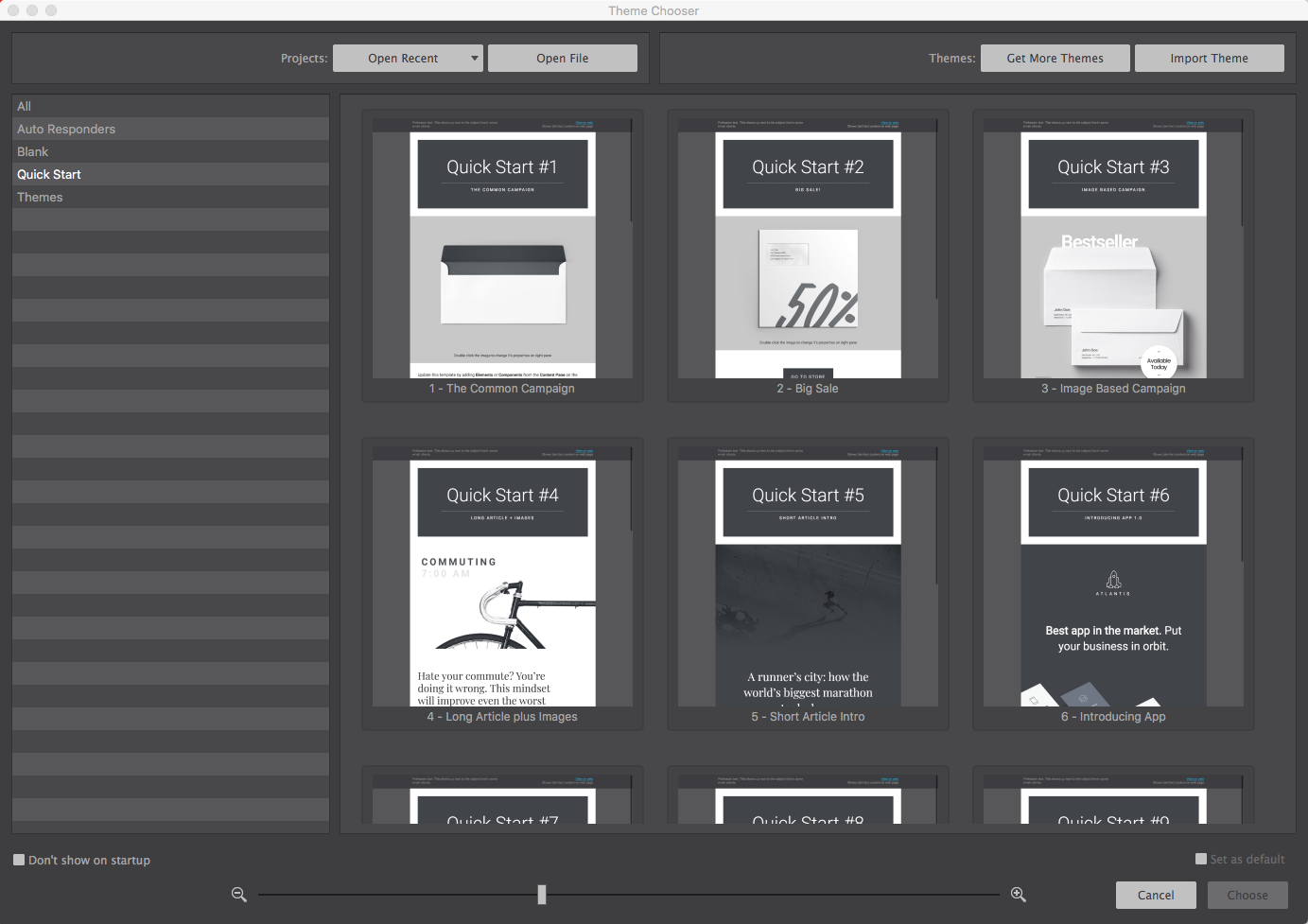
Template Manager
Email Designer comes with an extensive collection of themes aka templates. Use these themes to jump-start your email campaign. Once you select your theme, just change the text and images to fit your needs, and your task is complete!
If you want to build your email or newsletter free of a pre-designed theme, use one of the “blank” themes and start with a clean canvas.
Quick Start designs are lightly styled templates to help you launch a project fast.
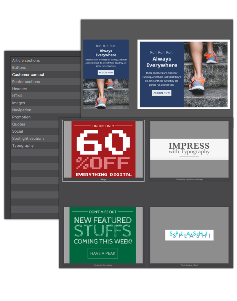
Components
With built in customizable prebuilt components you can spruce up your campaigns in no time. You can choose from navigation menus, accordions, cool tab panels, footer sections, quotes, and much, much more.
Simply click the Components toolbar icon to access the CoffeeCup Components library or to view the items you have saved to your library.
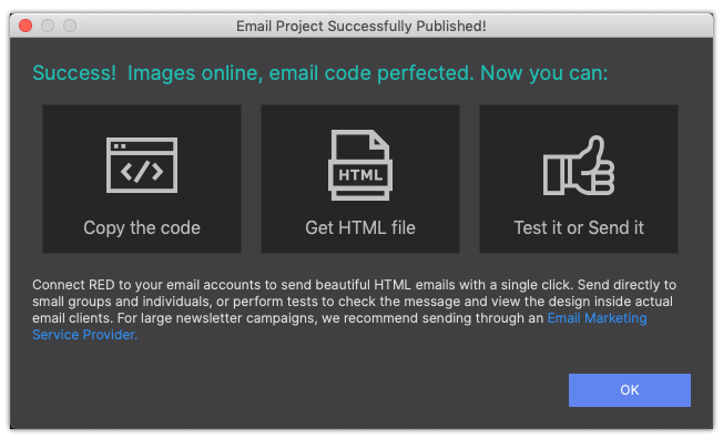
Designs made with RED can be sent with your Email Marketing Service Provider. Once you're ready to send, hit the Export toolbar icon. The app will generate the code and the HTML file for you.
Simply take the generated code and send with your EMSP. We like MailChimp and Constant Contact, but you're welcome to use whomever you like.
In the video demonstration below, watch how easy it is to send your emails using the MailChimp platform.
RED can handle sends to small user lists or to individuals. Import user lists easily from a CSV file.
To add a new recipient, click Campaign Settings, and then the Recipient icon. From here you can setup different recipients, that can be later added to a list. To add a recipient, click the +icon. Right now, RED allows you to enter a bunch of different information for each. When you are done, click Save Recipient. Continue adding all your recipients.
Now you need to assign recipients to a list. A recipient can be in as many lists as you like. Lists allow you to group recipients into categories making it easier to send test emails to lists instead of individual people. To add someone to the list, click the + icon and select Add existing recipient.

