Email Designer Guide
The Email Designer Responsify
Viewport Slider & Breakpoints
The Viewport Width Slider and Breakpoint controls are used for previewing and managing the page at different screen sizes.

The built-in width slider helps to test the layout, design and usability of the content at all possible screen widths. The page elements proportionally grow and shrink depending on the available space for displaying it. However, at some point layout or design changes are needed to prevent elements and content to become too small or otherwise unusable.
This is where the so called breakpoints come in. They provide the power to serve your viewer's an altered design depending on screen size.
Width Slider
The ability to make layout and design changes where needed is key to any responsive design. On wider screens, content might need to be placed next to each other instead of being stacked. Font sizes might need to be increased and small images replaced with larger ones. The Width Slider can be used to view the website at any possible width and help decide if any such change will improve the user experience of the design.
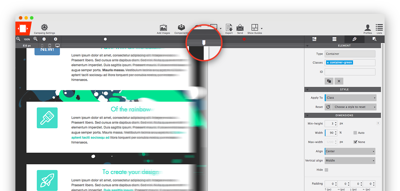
Just grab the handle to move the slider left or right and see the viewport and canvas change. You can also click on it and move it left or right pixel by pixel with the keyboard arrow keys.
The current viewport width — the position of the slider handle — is visible below the Zoom tool.
Breakpoint Management
Breakpoints are the secret weapon of responsive web design. They are the places where layout or style changes are being made. They are represented by the little dots or 'points' above the Slider. The red dot is the default layout change. You can set this position under the Layout pane. The red breakpoint cannot be deleted. A white dot, however, is a custom breakpoint and can be added and deleted as needed.
Desktop monitors have grown a lot over the years and offer lots of space, allowing for a wide multi-content layout with large fonts and imagery. However, for content to be readable and usable on narrow screens such as mobile phones and tablets, a smaller but taller content structure is needed. With breakpoints the same content can be presented in optimal form across the entire range of device sizes and screen widths.
Following each breakpoint a specific set of style rules is delivered, so the site seems to ‘respond’ to the size of the display device. Layouts, widths, font sizes and other design elements are revised where needed to keep the content in focus and pleasant to consume. This feels really dynamic, that’s why we started calling these breakpoint induced changes ‘responsive actions’.
A breakpoint is active when it lights up — when there's a little dark circle on top of the point. In the image above this is the fourth point from the left. A breakpoint becomes active when the slider is placed on the right of it and until the next breakpoint is reached.

Any layout or design change they apply only as of that (break) point. They apply for all screens wider than the position of the active breakpoint but can be further changed at any of the next breakpoints.
Custom breakpoints can be added by clicking on the breakpoint line or with the plus icon on the left. They can be removed by selecting one — click on it — and hitting the minus icon. When selected they can also be moved left and right with the keyboard arrow keys.
Design Changes at Breakpoints
The styles applied on the design pane will remain the same when the width becomes smaller unless different styles are applied on a breakpoint to the left. The column width settings in the layout pane work the same way, the column widths stay the same but can be changed at any breakpoint going to the left. Let’s look at an example.
The image below shows an actual CoffeeCup newsletter from December 2014. At a font size of 30px the main heading — ‘Connect to everything. Move files from anywhere.’ — takes up the full width of this 700px wide layout.

When the available display width offers less room, the header text will start wrapping. A little wrapping is not necessarily bad, but without adjustments the text will soon be disproportional to the screen size. Smaller (mobile) devices are usually closer to the eye and obnoxiously large fonts that take up most of the screen real estate can therefore give the impression of being yelled at.

The header is clearly important, but having it take up such a big part of the screen on mobile devices is not the intent. Also, with the text being disproportionately large relative to other content elements, such as the image below, the design feels pretty unbalanced. Still, as can be seen on the section below, things could be significantly worse.
Luckily creating responsive emails with granular control over how the content displays on mobile devices is easy with RED. Whenever the header wraps over 3 lines (or 2 if you prefer) a breakpoint is added and the text size decreased. In the original email the font size for the headers goes down to 20px, using 4 breakpoints. Going to the left each breakpoints overrides the font size styles of the breakpoint on the right. The fonts become smaller, eventually ending at the 20px mark for the smallest screens.

Now, other content or design decisions could have been made, but that is the beauty of RED. The email editor and testing workflow make it super fast and easy to try and look at alternatives. Break free from the restricted templates and let the designers, writers, campaign team, or (customer) test results make the decisions instead!
Adjustments & Optimizations
A good rule of thumb is to make sure that the text is very easy to scan, and pleasant to read through, at all times. A lot of good articles have been written about good web typography, most of which apply to email design as well. For mobile devices, this means that header font sizes are often decreased (as seen in the examples above).
A font size of around 20px will still clearly mark the text as a header, especially if a different color or typeface are used to distinguish the header from the regular paragraph text. Improvements include the reduced vertical space and smoother navigation and reading experience on mobile screens.
Paragraph font sizes are often slightly increased to about 15px (or higher). This largely depends on the original design — in the CoffeeCup newsletters we use a relatively large font of 17px for the desktop version friendlier, which we feel is too much for the mobile reader. We reduce the paragraph texts to 15px, but depending on the design, type and spacing that number can be a bit higher. We would not recommend font sizes below 14px, unless it is intended to optional to read like for example disclaimers.
Another frequently used design change is to center elements and center align texts on the mobile screen. The natural ‘encapsulation’ by the edges of the screen creates a smooth flow down to more information or a call to action, with minor eye movement. Please note that center aligning wider blocks of text, for example for desktop readers, usually has a negative impact on readability. Also, centering elements is certainly not an imperative. It might be a bit harder, but there are numerous great designs created without doing so.
Many newsletters use a multiple column structure for the desktop version. In most designs, mobile phone screens in a vertical position do not offer enough room for more than one column. And, as we’ve seen, presenting mobile readers a ‘zoomed out’ desktop version causes a whole different set of problems. Reducing the number of columns as the screen becomes smaller is a tedious job when hand coding, even harder than doing this for a website. Since the change (should) depend on the actual content and design, templates with pre-configured changes don’t offer a real solution. Many responsive email designs therefore addressed this by using a single column structure everywhere, from desktop all the way down to mobile. RED offers the flexibility to use the column structure of choice, the layout that best supports the content and design, at any width. Let’s see how this works.
The Zoom Tool
The Zoom tool (the +/- magnifying glass) is placed on the left of the breakpoint buttons. Zooming out helps to design for large screens from smaller computers such as laptops and shows breakpoints that otherwise might be hidden behind the panes or even be offscreen.

The current viewport width — the position of the slider handle — is visible below the Zoom tool.
Device Icons
The three device icons on the right of that become brighter when the device type is more common at the current width. As desktop monitors, tablets, and phones all come in a variety of sizes; this is just for reference purposes. There is no specific phone or tablet width, nor is it possible to ‘design for phone.'
Instead, responsive design has to look good and perform well at every width — the icons are merely an indication of what type of device might be used for viewing the site at the current position of the slider.