Email Designer Guide
The Email Designer Content Pane
Introduction
The Content pane uses two sub-panes for organizing the various email building blocks, one for content Elements, one for Components.
When the Content pane is selected the most frequently used Elements sub-pane is open by default. From this pane you can add headings, buttons, images and more. These elements are the smallest site building blocks.
Components usually consist of several elements. Together they perform a more complex role such as a navigation menu, a (series of) cards, specially formatted hero sections, headers, footers, and more.
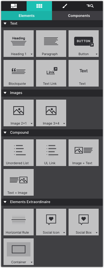
Elements
Elements are the most basic building blocks. They have been organized into categories. We placed the most frequently used elements, Text and then Images at the top of the pane. Further down there’s a collection of ‘compound’ elements to add, for example, UL links, or Images + Text.
Elements like and social media icons are grouped as Elements Extraordiniare. The last category consists of elements that can help to create sophisticated responsive Layout constructs. Each of these categories is addressed in a bit more detail below.
Drag-n-drop elements onto the canvas or click to add.
Text Elements
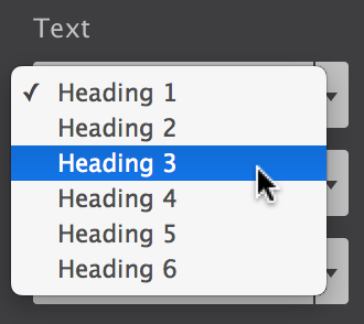
There are 6 different text elements available. The ones with a little arrow on the right of the button come in variations. Clicking the arrow of, for example, the Heading 1 allows you to choose from a heading 1 - 6.
Each of the elements performs a different (semantic) role. A Heading element, for example, describes the topic of the section that follows. A Paragraph is usually a block of text and so on. Simply choose the element that you feel will most suit the purpose of the text.
The placeholder texts can be replaced by typing or pasting text blocks in Text Edit mode. Double clicking a text element will start the text editor. Alternatively, you can use the Edit icon A that appears when hovering over the item. This icon is also location at the top of the Design pane. You can also right-click on the canvas and choose Edit Text.
The Text Editor can also be used to add inline links and formatting. The link below provides more information.
__DATA_HTMLEMBED_277__
Edit Text: Video Tutorial
__DATA_HTMLEMBED_278__
Image Elements
When an image element is added, initially a placeholder images is used. This allows for rapid experimenting or prototyping without immediatly having the spend time on finding, optimizing etc. real images.
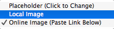
Replacing the placeholder happens on the Design pane. Double-clicking the image opens this pane. The dropdown with the Source label let’s you switch between the placeholder, and a local or online image.
When selecting a local image you will be asked to select one from the file system. The chosen image will be added to the project and be displayed instead of the placeholder image. When you choose to publish or upload your project, this images will be included in the images folder.
You can also provide a link to an online image. In that case you can insert (past) the URL to the image in the input box that appears below the dropdown.
You will notice that a newly added image will not be wider than 200px. This can be changed on the Design pane with the max-width control.
Online Image Source
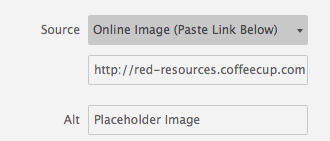
Use the ALT box to add alternative text. This is especially helpful for email clients that don't load images by default. Descriptive text will help the reader understand what the image is so they can choose to load the graphic.
Compound Elements
The Compound section house some of the more common elements. The Unordered List and UL Link certainly are, but we need to talk a bit more about the Image + Text element.
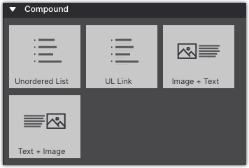
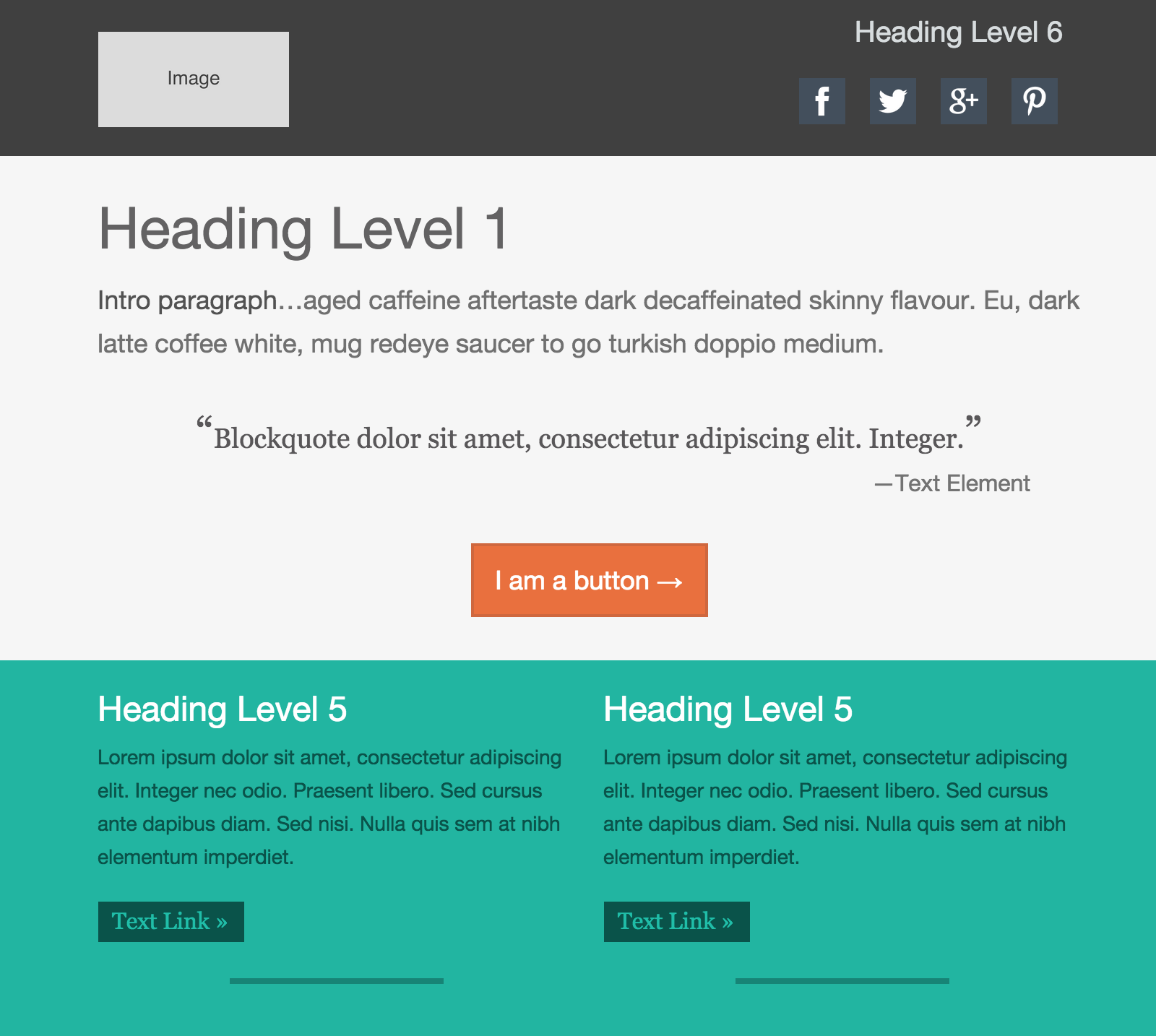
The ‘Image and Text’ elements consist of an image and paragraph, wrapped in a parent container. Depending on the sizes of the components, the text will float around the image. This is not supported by all email clients. Outlook for example will display the text to the right (or left) of the image. However, for the supporting email clients the floating text can be a nice touch.
Extraordaire Elements
The Social Icons can both be used to build a following on the social networks and allow vistors to share information. Select the Follow or Share option on the Design pane (for networks that support these), then fill out the various options.
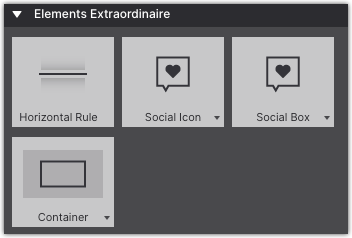
The Social Box is a set of customizable icons that can be linked to social network profiles or to share specified pages.
Layout elements offer more granular control over the page layout. They are also be used to build logical groups of elements or groups with a specific role of function.
Containers often serve as ‘wrappers’ for related elements. When creating a card (component) the container often encapsulates one of more text elements, an image, a button and sometimes sub-container with additional elements. We will look at this in more detail in the Component section.
A Link Container functions exactly as a container, but wrapped in an <a> label, making it one big link element.
Special Elements
Responsive Email Designer helps bring your form notifications into the responsive world. These elements are specifically used in our Web Form Builder app to include form elements within a notification or confirmation email.
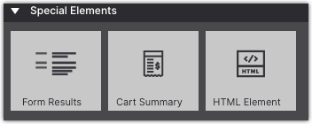
RED also provides an HTML Element for inclusion of personal code. Please be aware that email clients behave differently from browsers. The code might not work on certain email clients and certain code can even break the email. Only proceed if you know what you are doing.
Components
The CoffeeCup Component Library is fill with pre-built items that can be imported into your project. These items are 100% customizable so they can be tailored to fit your specifications.
You can also save your own custom components to your library. Saving components to your library is especially helpful if you use the same features such as Header, Logo, Footer in recurring campaigns. This saves you from having to rebuild common items with each new project.
Access the Library by clicking the Components icon in the top toolbar. Browse the ever-growing CoffeeCup Component Library, when you find one you like, click Add to Project. This will import the selected item into the Content pane > Components. Then style and adapt it to fit your content.
Project Components
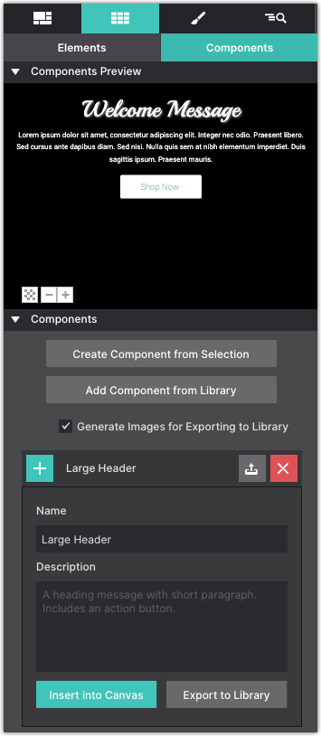
The components included in the project can be accessed on the Components sub-pane of the Content pane.
The first part of the pane shows a preview of the component. To improve visibility — a white component does not display that well on a white background — the background color of the previewer can be toggled. The bottom left button can change the setting between white, black and transparant.
The plus and minus buttons next to the background color button can be used to zoom in and out. In case there are similar components in the project, this provides a good level of detail to find the right one.
The preview shows the currently selected component form the list below the preview window. Clicking on a component will expand it so the name can be edited. A list of all the project components will be listed in this section.
To add a component to the canvas, click the plus (+) button or the Insert into Canvas button. It will get inserted below the currently seleted element. If a columns or container is selected, it will be placed below the last element in the parent. If the component itself is a column or row, it will be placed below the currently selected container or row.
Create Custom Components
To save a selection from your project as a component, first select it on the canvas, then go to the Components Section.
Click Create Component from Selection button to generate a fresh component based upon the currently selected element (group). This component will be placed at the bottom of the list. Project components can not be reordered, filtered or sorted at this moment.
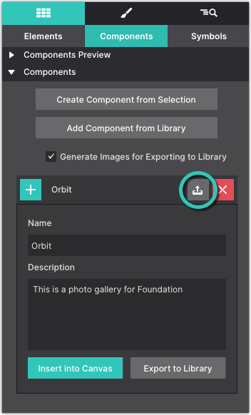
Give your component a Name so that you can identify what it is and add a description. To save it to your Component LIbrary to reuse in other projects, click the up arrow next to the component title.
Working With Elements Video
The Gutter is the space between Columns. This can also be set to zero and managed when working with individual columns. There is no right or wrong, the approach will simply vary with the design needs.
__DATA_HTMLEMBED_276__