Email Designer Guide
The Email Designer Design Pane
Introduction
Before you start designing your newsletter or email, or start tweaking one of the themes, it is important to realize that designing an HTML email is nothing like building for the modern web. While web browsers (mostly) adhere to web standards and use the same display rules, the opposite is true for mail clients. Without the proper tweaks and precautions, automagically added by RED, even Outlook.com would display emails differently than desktop relatives like Outlook 2010/13.
To increase display consistency, HTML emails are constructed from a series of nested tables and inline CSS, often supplemented with HTML attributes and conditional display rules. But although this is very unlike modern web design, RED does an amazing job in making it seem that way. The editing environment looks and feels like you are designing a website in a browser!
The editing and live preview area resembles a website, and the controls are very similar to our other responsive apps. The email client specific code that reinforces display consistency is added upon exporting or sending by the unique Email Code Generator (ECG). The scripts used by ECG are frequently updated, and reloaded by RED when possible. Although this makes the emails display as consistent as possible across the various email clients, there are things that certain email clients simply can’t do though. Slight differences are to be expected.
The Design pane consists of two major sections. The top-part — the Element part — is for 'configuring' the selected element. Here you can specify, for example, the link of a button or provide alt text for an image. More importantly, this is also where you specify Class and ID names for recurring content styles.
The Design pane's second part for adding Style(s) — for specifying the way the selected element looks. All CSS style properties are available through a set of intuitive design controls creating tremendous design powers!
Design Controls Overview
Depending on the element you have selected, the controls that popular under the Design section will vary. Only the options available for that specific element will appear.
Collections on the Design pane have been organized in groups of related controls. Each of the groups (sections) can be collapsed an expanded when needed.
Double-clicking any item on the canvas will automatically launch the Design pane on the right. It is sorted into sections based on the element that is currently selected.
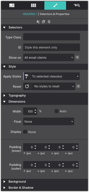
The Element Section
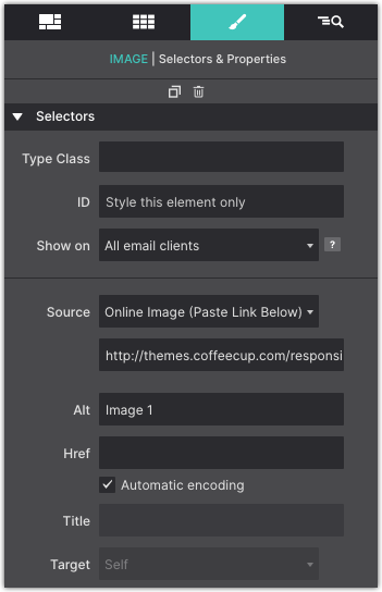
The length of the Element section varies per Element Type. The image shows what the section will look like when an element of Type Image is selected. The element type here is purely informative, this can not be edited (right now).
The ability to add CSS selectors — Classes and ID — to an element is an important part of this section. A selector ‘binds’ an element or group of elements to design rules defined in the Style section on the second half of the Design pane.
The Source dropdown we discussed before and is specific to this element, as is the input for the Alt text.
The buttons at the bottom can be used to duplicate or delete the element. In case a text element is selected there will be a third button — this edit button can be used to start the text editor.
CSS Selectors Explained
For those that have been working with selectors before, the workflow in Responsive Email Designer will feel intuitive and powerful. It will still help to give this section a quick read and, for example, familiarize yourself with the color coding system for the different selector types.
If you never heard about or worked with selectors before, no worries. Our responsive apps can also automatically create selectors. However, to get the most out of our apps — to speed up the design workflow and make it easy to maintain any projects — we do recommend to slowly start accustoming yourself with the apps selector system. This section will serve as your guide.
A selector defines — ’selects’ — the elements to which a set of CSS rules applies. This is incredibly powerful because it makes it fast and easy to give multiple elements the same appearance. Or to apply the design rules to a newly added element without having to redefine all these rules. Let’s quickly go over an example using the class selector.
The Type is the default styles you want for the specific element. For example, if all your paragraphs will have the same font type or color.
The Class (name) is a variation from the default Type settings.
Other styles can be added by extending the rules set for the same class, or by adding another class with new rules.
An ID name is a single instance of a style variation.
With this explanation and example under our belt, we should be ready for some more selector goodness. We will do that when discussing the style section next.
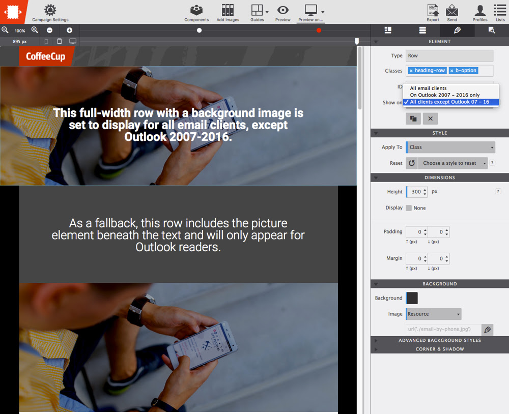
Outlook Conditional Show
As of 2007 Outlook email clients on Windows use Microsoft Word as it's rendering engine. Word provides extremely limited CSS support, severely restricting email design freedom for users.
But fret not, RED's 'conditional show' function regains some of that freedom.
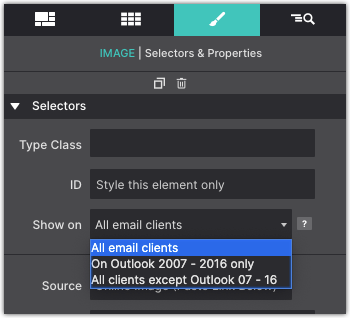
This will allow you to fine tune your email creations to all users, rather then have them fail on less supported email clients.
You can, for example, create a header row with a transparency and a cool background image for email clients that support those CSS properities. Then create an alternative with just a heading and an image, that will only show on Outlook 2007-2016.
As you can see below, the header is duplicated providing a fallback for Outlook clients.
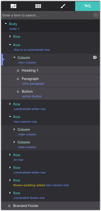
To keep your email design clean and easy to work with, Responsive Email Designer offers the ability to hide your conditional elements. You can do this from the Inspector pane.
From the Inspector pane you can click on the little eye indicator to the right of the element to show/hide the item.
The Style Section
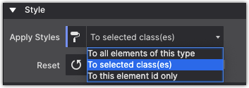
As explained above, style definitions are related to selectors and the top part of the style section is used to manage exactly that.
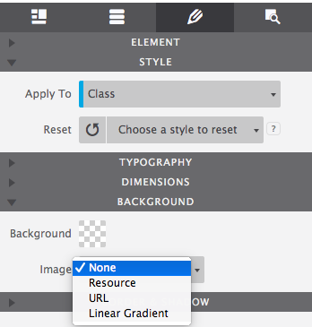
The Apply To dropdown is used to select the type of selector the style rules will be associated with. The choices are between Element Type, Class and ID.
The Reset function helps to keep the project code lean and clean. The dropdown gives an overview of the styles that have been applied. Styles can be removed by clicking on them.
The Reset dropdown gives a contextual overview of the all styles that have been applied. When class is selected from the Apply To dropdown, the associated class styles will be shown and can be removed. Breakpoint specific styles are shown here when the breakpoint is active and so on.
Specific styles can be removed by clicking on them, or all styles can be whiped out at once. Whatever you do, don’t created a bloated style sheet with conflicting rules, clean up where needed!
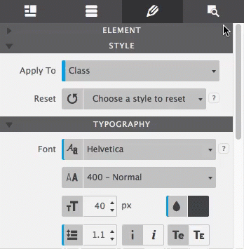
Typography
The right choice of font, colors, and spacing greatly help to communicate the message of a great email campaign and contribute to the brand recognition. Responsive Email Designer features a big selection of font choices as well as a large set of typographic controls.
The Font drop down gives access to all the 808 font families in the Google font collection. A web safe (system) font can be selected just in case the primary selected font fails to load with the Fallback Font control.
The third dropdown can be used to select the font-weight. Some font families do not provide all options — in those cases the closest available option will be applied.
Typography
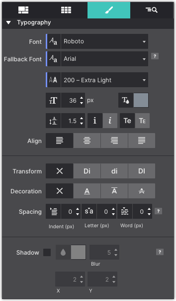
The next controls can be used to change the font-size, font-color and line-height for the active selector.
The color of the font can be changed by clicking on the little color tile — white in the image — next to the drop. The text element can also be set to be displayed in italic and small caps.
The last control visibile in the image can be used to align the text. Left, right, center and justify are the available options.
There are a couple more typographical controls available. The text-transform control can be used to specify the capitalization of an element's text. It can be used to make text appear in all-uppercase, all-lowercase or with each word capitalized.
Text-decoration sets the text formatting for the selector to underline, overline, or line-through. Underline and overline decorations are positioned under the text, line-through over it.
The three different Spacing icons show the effect of each of the controls on the text. The text-indent controls the indentation of the first formatted line of the block. The second control adds space between all the letters of the text element. Space can be added between words with the word-spacing control.
The last control for styling text elements is for adding shadow effects. Which is explained in more detail in Progressive Enhancement in Email Design.
Dimensions
The exact number of controls on the dimensions pane depends on the Element Type. On the right the controls for the image element are shown. Containers, for example, have a larger selection of dimension controls.
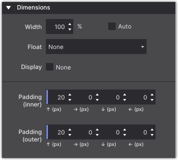
The width and max-width work on the content area of an element. The content area is the part inside the padding, border, and margin of the element.
The Max-width tells the browser or email client, that an element can never become wider than the specified value.
The Float is used to left, center, or right align the selected element. Similar to how you center text in a paragrpah, this control centers the element within it's container.
When Display none value is checked the element is hidden under specific circumstances. One example would be to not show an illustrative element on small screens.
The Padding (inner) controls the space between the content area of the element and the border. The space the padding takes up is part of the element and, for example, gets the same background color. The arrows denote where the padding will be applied, on the top, right, border or left side of the content area respectively.
Padding (outer) or margin is the space between elements. If an element is placed inside another element, the margin will push the (child) element away from the border of the parent element.
Background
The background of an element is the total size of the element, that includes padding and border. The margin is the space between elements and not included.
The web got a whole lot more interesting and beautiful with the new background properties introduced in CSS3. In addition to simple solid backgrounds, beautiful full-size background-images can be applied. Background gradients can be declared in directly CSS. This offers better control over how the gradient is displayed as well as increased performance compared to using an image file.
Keep in mind however, that while the web has been updated, most email clients do not allow for cool background effects using images or gradients. But since, 'The Outlooks' are the only popular email client with no, or limited support, why not snazz the design up for the readers that are using something else? This technique is often referred to as progressive enchancement and is a good way to approach display differences between platforms.
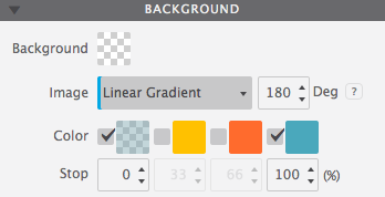
Background Gradient
A gradient is made of a progressive transition between two or more colors. A linear gradient follows a line on which the colors fade from one color into the next. A radial gradient starts at a center and changes colors going to the outside of the circle (or ellipse) type of shape.
For a linear gradient the angle can be changed by specifying a specific Degree. For example, changing the value from 180 to 90 would make the gradient run from left to right instead if top to bottom. Any value in between is possible as well!
A gradient can consist of up to 4 colors. A Color can be added into the mix by clicking the checkbox. The Stop defines where the color starts. As can be seen in the example below, the colors don't have to transition, a 'hard-stop' can be created by giving two color stops the same value.
Please note that the color defaults to the color of the first stop, which is needed for the effect above.
Background Images
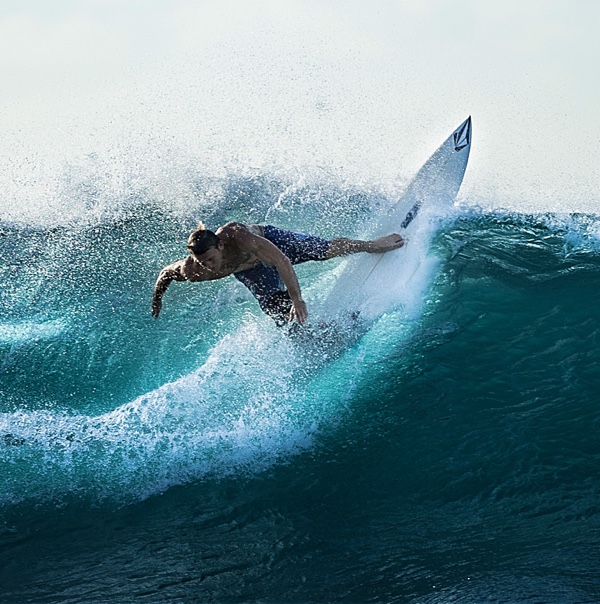
Images can be added to the project or linked in from any online source. The Resource control provides these options. In the example below a local background image is used. To change it for an online image choose URL from the dropdown instead of Local Image, then paste the link to the image in the box that appears below.
To change the image for a different project image, click on the edit icon. A dialog will come up from which a choice can be made between the various images in the existing collection in the project. New images can be added to the collection as well.
The Position control can be used to move the image around. The default values are Left and Top. Custom values can be used as well — in the example the image has been moved so the surfer takes up a central position in the container.
The Attachment control specifies if the image's position is fixed within the viewport, or can scroll along with its containing block. The local setting means that if the element has a scrolling mechanism, the background scrolls with the element's contents.
The fixed setting works well for large background images on containers. Please note that mobile devices offer limited support for fixed backgrounds as it is (said to be) resource intensive and negatively impacts battery life. A good practice is to change from scroll to fixed for desktop devices, more or less on the right of the second Foundation breakpoint.
Small image patterns are frequently used to create a full background pattern. This is done using Repeat. In the example below a tiny thumbnail is instructed to repeat along both the x and y-axis. Alternatively the image can be only repeated along the x or y-axis, or not at all.
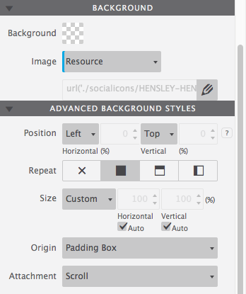
The Size control offers many options for specifying the size of the background-image. Images can be scaled up or down, made to cover the entire background or be instructed to display entirely. It's a very useful control so let's have a more detailed look.
The default is Auto, which tells the browser to calculate the size based on the actual size of the image and its aspect ratio.
Frequently used for full-background sections, Cover tells the browser to make the image covers the entire container. Even if the images needs to be stretched or cut a little bit off (on the edges). This is especially handy in a responsive design where the size of the element or container with the background usually has a variable width (and/or length).
The Contain setting on the other hand, gives the instruction to always show the whole image, even if that leaves a little space to the sides or bottom.
A Custom size can be specified for the width, height or both. By unchecking either or both Auto boxes a value can be specified. Please note that this can easily influence the aspect ratio and cause distortion in the image — use with care!
With backgrounds frequently defined for containing elements, Origin and Clip are probably the least frequently used background controls.
The Origin defines where the top-left corner of the background starts. Starting with the outside part of the element, the background extends to the edge of the border using the border-box value. The padding-box setting makes the background start at the border (underneath the padding) using padding-box.
When using content-box the background is restricted underneath the content area. Container type of elements don't have a content area and this setting will have no or minimal effect.
Clip works in a similar way, except it clips the background instead of resizing it.
Border
Borders can be added to elements using the Border control. Clicking on the circle in the center of the icon selects (or deselects) all borders. That does not mean that a border is enabled or disabled, it is just a way of selecting the border(s) for applying the style settings with the other controls.
Multiple borders can be styled at the same time. In the image the top, right and left border have been selected and a border-width or 2px has been applied. The border-style is (a) fixed (line) and the specified color is orange.
The bottom border — deselected in the image — has the same style and color, but has a width of 6px. This can be seen by deselecting the other borders and clicking on the bottom border in the icon to select it. The example below shows the result of the border (and border-radius) definitions.
If borders are selected that have different styles applied, a red line is visible at the bottom of the controls for which the styles differ. If these styles are changed, they will be synchronized over all selected controls and the red line will disappear.
Tool set for the border and border-radius:
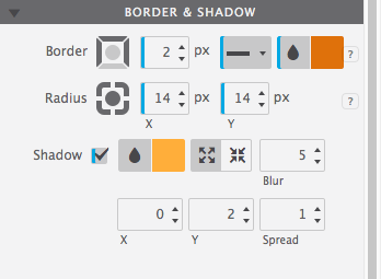
In terms of selecting the border, the Radius control works in the exact same way as the Border control. This control can be used to 'round' the corners of an element. It is not required for an element to have borders to do so, in the absence of a border this will be applied to the background of the element.
The higher the value, the more rounded the corners. Setting different values for the horizontal (x) and vertical (y) part of the corner and/or for different corners can be used to create certain shapes.
To create a circle as seen in the flex card example, define an equal width and height, in combination with high radius values.
In addition the shadow can be set on the inner element, inside the border. To do so simply click on the icon with the inward arrows. The Spread will cause the shadow to expand and grow bigger.