Learn how to create something special from scratch by using our powerful tools.
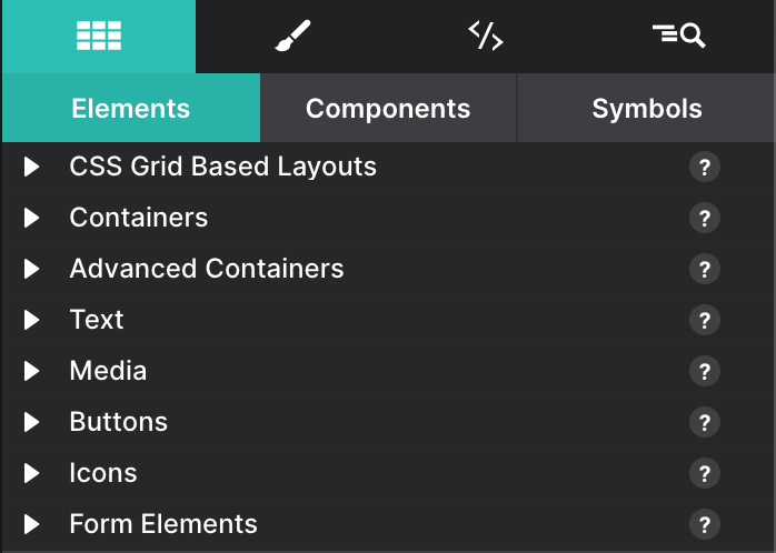
The Content Pane - Elements
The Content pane uses three sub-panes for organizing the various website building blocks, one for content Elements, one for Components, and one for Symbols.
When the Content pane is selected the most frequently used, Elements sub-pane is open by default. From this pane, you can add headings, buttons, images and more to the canvas to build your page.
Elements are the most basic building blocks of a webpage. They have been organized into categories to make it easier to locate the one you seek. We placed the most frequently used elements such as Layouts, Containers, Text and Media at the top of the pane.
Further down you can find Buttons like for using as Links, for Paypal or just regular buttons. Then, you can find an Icons section for the Font Icons and Social Icons.
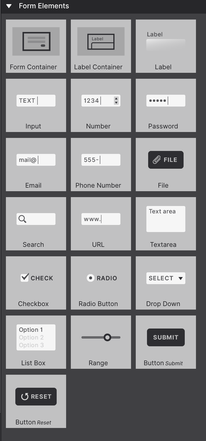
The last category consists of Form Elements that can help to create sophisticated responsive forms. Each of these categories is addressed in a bit more detail below.
To add elements to your design, simply drag and drop your selections onto the canvas. You can also click the element and it will automatically appear on the canvas. Rearrange items using drag and drop too!
If an element offers multiple options, such as Heading 1-6, use the little down arrow to view the element variations and choose your desired option.
A Useful Tip!
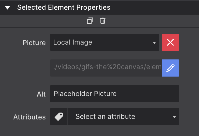
If an element links to other locations (such as a Link or to an image) the URL and destination info is configured on the Element pane > Selected Element Properties.
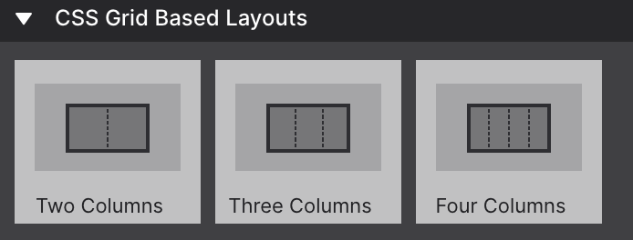
Layout Elements
Layout elements are pre-configured Container elements nested within a parent Container that allows them to stack vertically for small screens and stretch out horizontally for wide screens.
In the CSS Grid Based Layout elements you can find some predefined two, three and four columns layouts. They are composed of a Container with a special class with the styles to define the columns using CSS Grid. Inside you can find another layer of Containers for placing the elements inside.
If you are using one of the existing framerworks (Foundation, Bootstrap or Materialize) you can also find the Framework Based Layouts. These are also two, three and four columns layouts, but this time based on the framework layout class system.
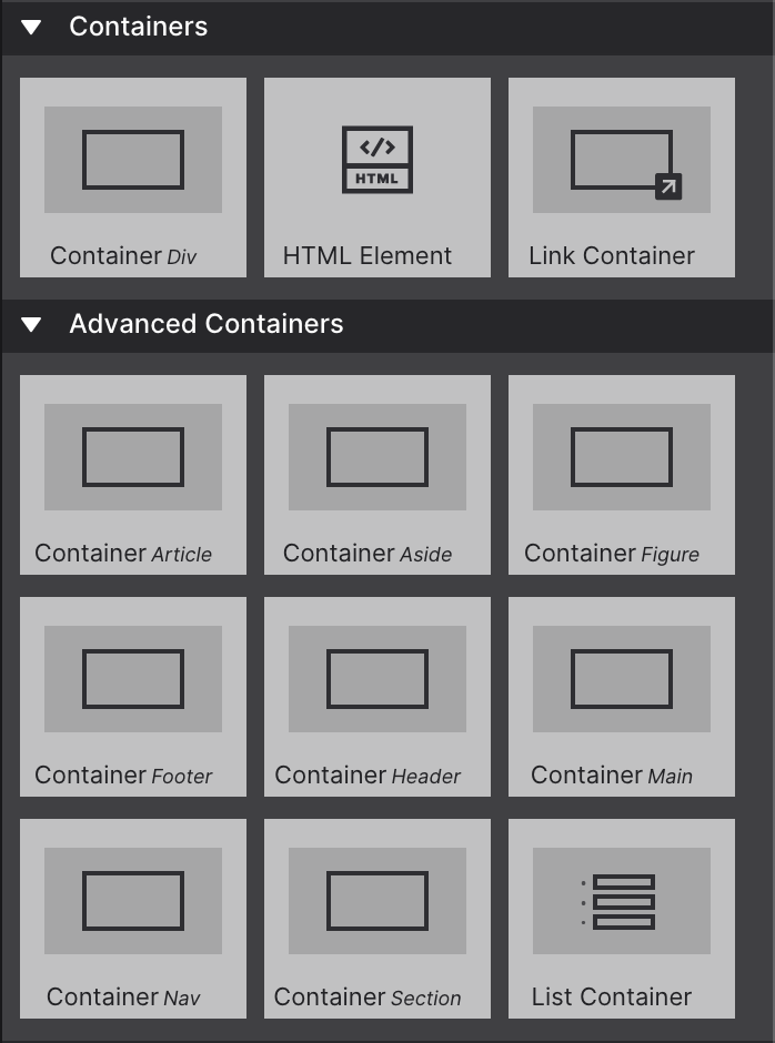
Container Elements
Containers (Div) often serve as "wrappers" for related elements. For example, when creating a card (component), the container often encapsulates one of more text elements, an image, a button and sometimes sub-containers with additional elements.
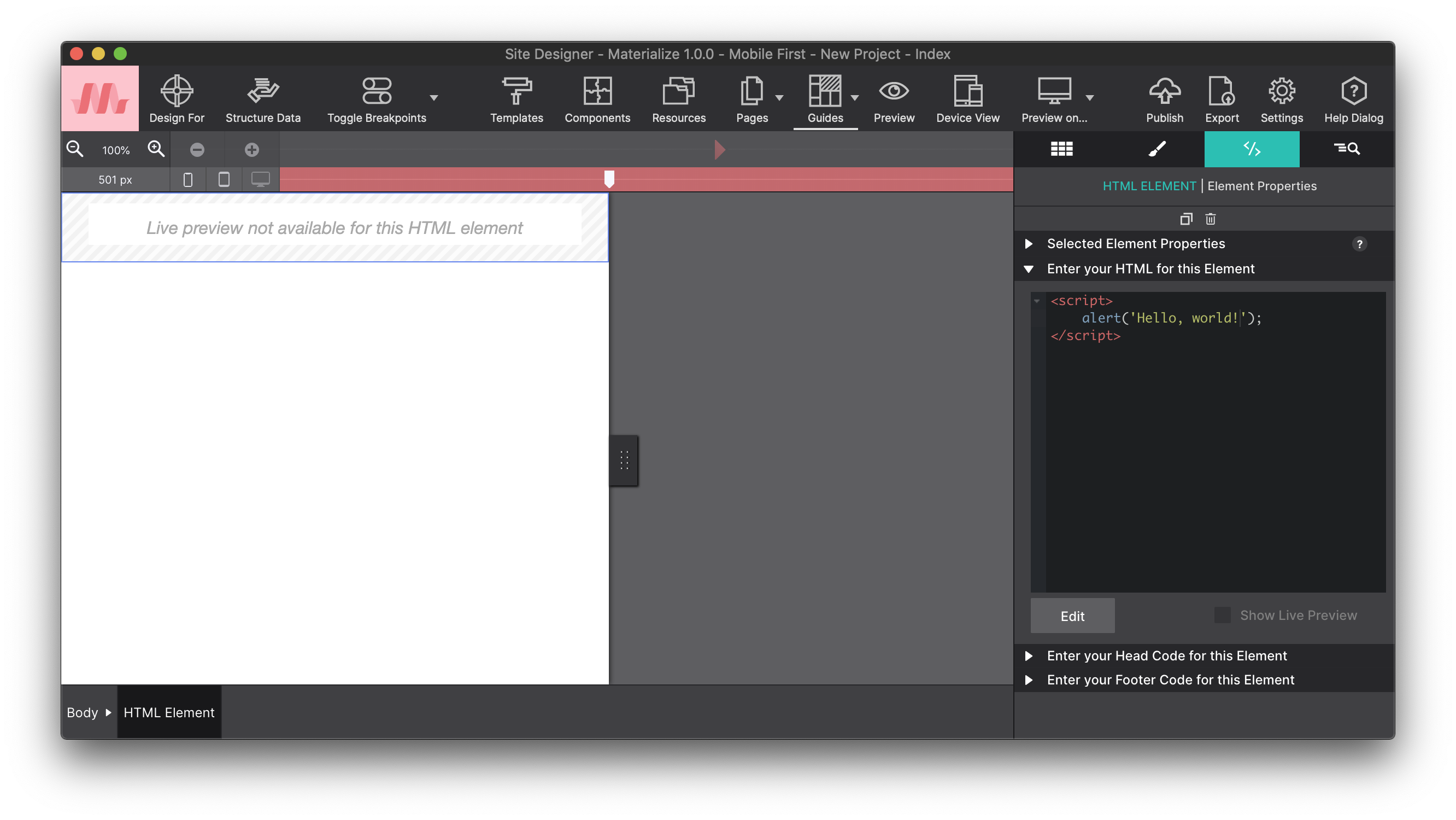
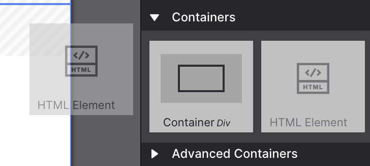
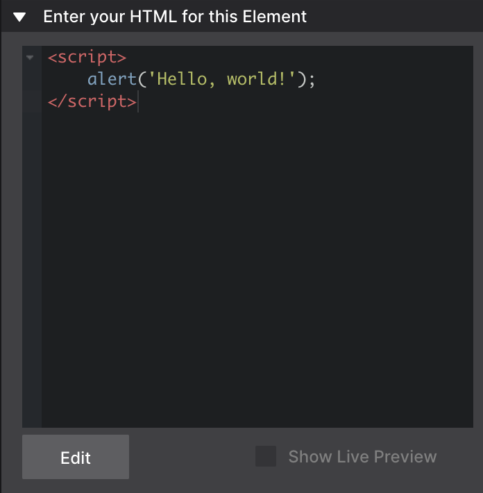
The HTML Element can be used to add custom code snippets or exports from other apps. This can be CoffeeCup apps like Web Form Builder, or 3rd party apps and widgets. To not interfere with the other elements on the page currently a placeholder visual is displayed.
A Link Container functions exactly as a container, but wrapped in a label, making it one big link element.
Even though the Container Div used to be the most common container element, you do have the choice among other 9 different ones under Advanced Containers element types which allows you to create more structured and semantic websites.
While not required, best practices are to use a container that is semantic, meaning they provide greater meaning to the search engines to what that container div holds. For example, a 'Container Nav' would be used when building a navigation, while a 'Container Footer' would be appropriate for page footer sections.
List Containers are unordered lists with each list item being its own container. They are often used to build navigation components.
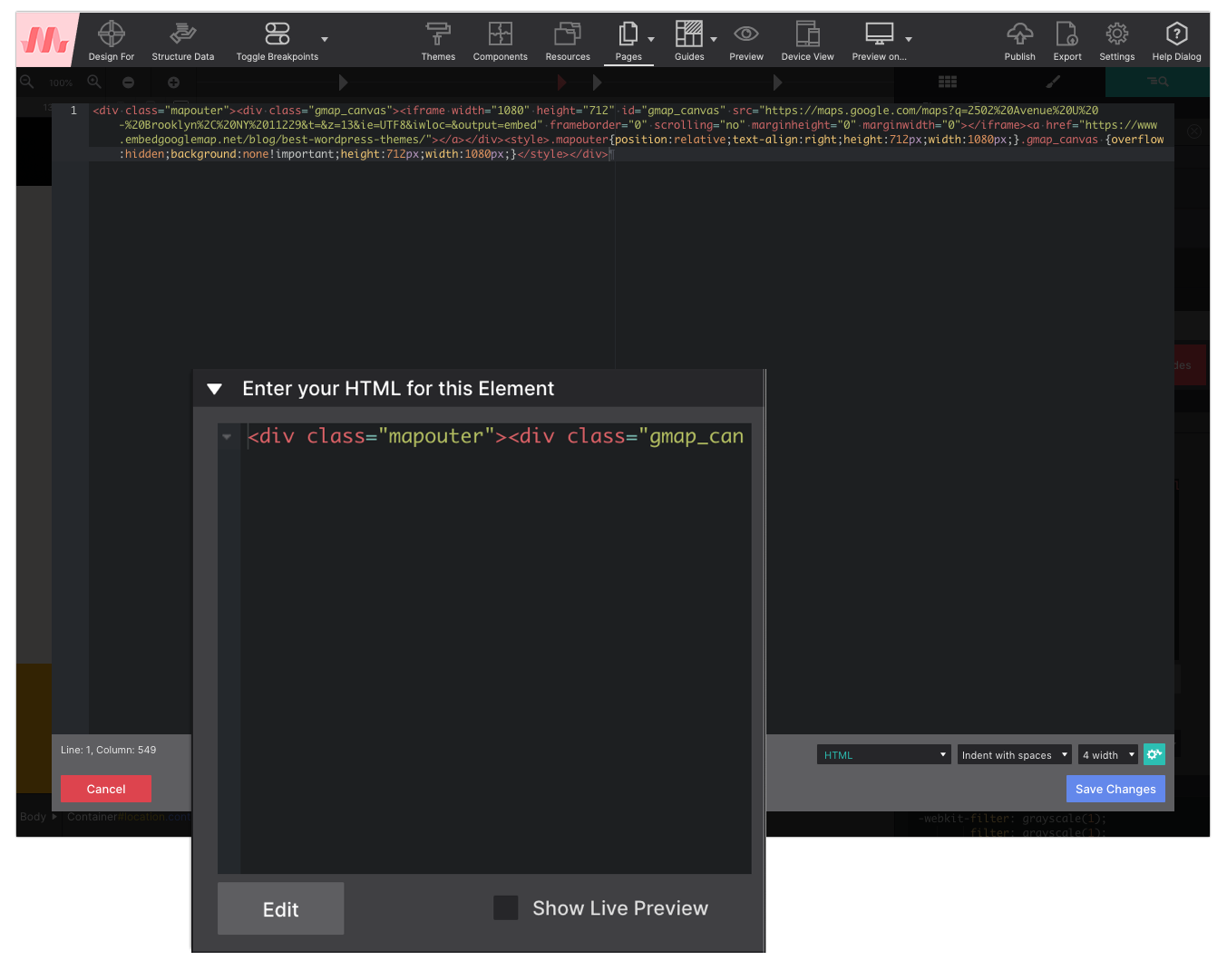
Adding custom HTML or code objects to your page is easy. Markup for the HTML element is inserted on the Element pane > Selected Element Properties within the HTML box.
The built-in Code Editor dialog will provide you with a nice coding environment. Simply add an HTML Element to your page and from the Element pane choose 'Edit in Dialog' to launch the code editor.
Please note, to not interfere with the internals of the app some objects, mostly the ones using Javascript, objects cannot be previewed live in the working area right now. You will need to use the 'Preview on…' icon in the toolbar to view them in the browser.
Step 1
Drop the HTML Element. Place it where you want the custom code or object to appear. This works great for all types of objects, from menus and web forms, to cool slideshows.
Step 2
Add code — tweak the design. The code can be inserted into the HTML box on the Element pane. It can be positioned and styled just like other elements with borders, backgrounds, etc.
Step 3
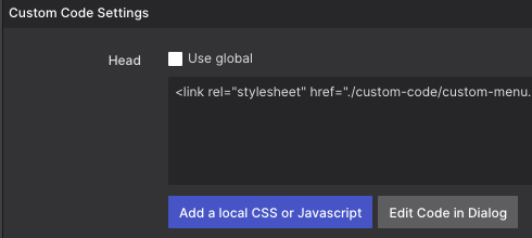
If needed, connect additional code or link to resources. Stylesheets and other resource files can be linked using the Head (or Footer) boxes on the Page Manager.
Working with custom HTML, CSS, and JavaScript is a cinch using the HTML element. Watch as we demonstrate how to insert your custom scripts and edit them within Site Designer.
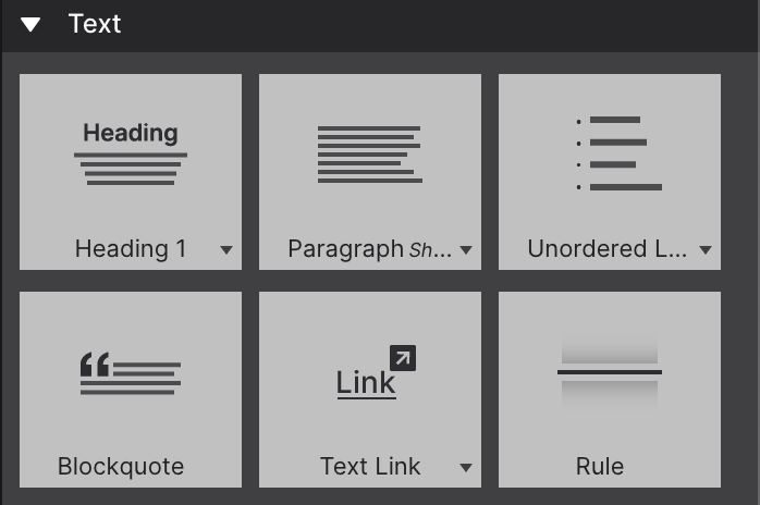
Text Elements
There are a few different text elements available. Each of the elements performs a different (semantic) role.
The Heading element, for example, describes the topic of the section that follows. They play an important role for structuring documents. HTML defines six levels of headings. Heading 1 being the most important level while the Heading 6 the least important level.
A Paragraph is usually a block of text. The Paragraph element comes in 3 variations, Small, Medium, and Large to help represent actual content when drafting a layout.
The Text and Text Link elements are used generally for short pieces of content. The latter being used when you would like to apply a link to other content.
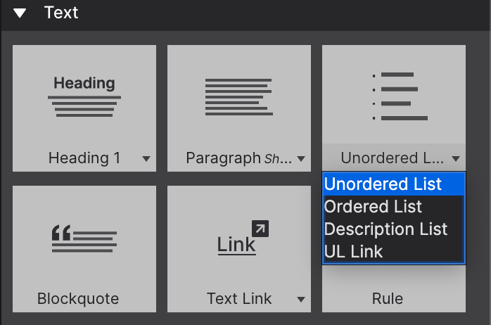
Click the arrow to select an element variation.
The List elements (Unordered, Ordered and Link) are used to create structured lists. The Unordered List will generate a list with bulleted dots representing each list item. The Ordered List element will generate a numbered list, and the Link List will make a bulleted list of links. The last option, the Description List, will generate an indented list. List features such as length are configured on the Element pane > Selected Element Properties.
The Blockquote element is perfect for formatting page quotes. Another element is the Rule element places a line across the page. It makes a great way to break up content on the page.
The placeholder texts can be replaced by typing or pasting text blocks in Text Edit mode. Triple-clicking a text element will start the text editor. Alternatively, you can use the Aꕯ button on the Design pane or use the right-click menu. The Text Editor can also be used to add inline links and formatting.
A Very Important Tip!
The style choices configured on the Text Editor panel are for inline editing only. Your global typography selections (like font type, color, size, spacing, etc) that you want throughout the entire project should always be configured on the Styles Pane > Design > Typography section.
It is a common mistake to accidentally apply global styles within the Text Editor pane. While it will work, it can cause difficulties for you in the future if you ever need to make global style changes. Plus it makes the backend markup kinda messy.
Be sure to exit out of the Text Edit/Inline Editor mode before you begin changing the appearance of the text.
Working with Links
With the exception of inline links (which are configured with the Text Editor), all link elements including Text Links, Picture Links, Container Links, and Button Links are configured under the Element Pane > Selected Element Properties > HREF section.
Links can be configured to direct the audience to another page in your project, a third party web address, another location on the page, or to a document.
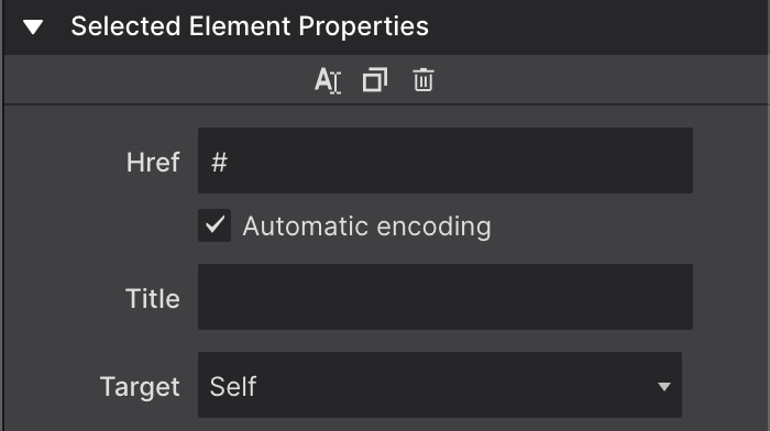
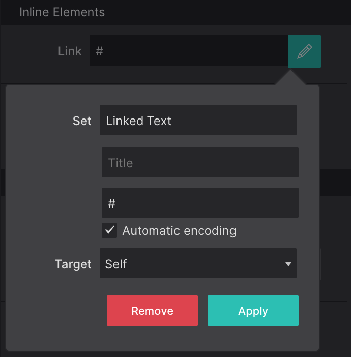
Using the Href control you can insert the link destination. You can use external links like https://www.example.com or internal links of your project.
If you are linking to another page in the website project, remove the # symbol and type the page name. It will auto populate in the box for you to select any existing page in the project. If you will be linking to a region on the current page, format the link as #ID-Name.
The Automatic encoding is enabled by default. This is in case you add invalid characters for URLs (like spaces), it will fix them for you. Only disable this if you need to use some kind of specific code on your Href.
The Title control is used to provide additional information upon hover to help describe the purpose of a link.
With the Target control you can specify a window or a frame where the linked document is loaded. These include the following four choices. Self lets you open the linked document in the same page as it was clicked (this is default). Blank will open the linked document in a new window or tab instead. The other two are less frequently used, as they are related when using iframes. Parent let's you open the linked document in the parent frame and Top will open the linked document in the full body of the window.
Inline Links are links that are injected within a Paragraph or Text element. When activating the inline text editor, you can highlight the word(s) you want to apply a link destination to. At the top of the Text Edit Mode click the + to open the Link controls.
Apply a class name to your inline link to standardize the styles. Be sure this is done within the Text Edit Mode, otherwise you will apply them to all the text.
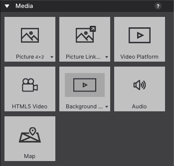
Image Elements
When a Picture element is added, initially a placeholder image is used. This allows for rapid experimenting or prototyping without immediately having the spend time on finding, optimizing, etc. real images.
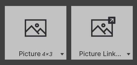
If you are making wireframes or prototypes, you can use the Picture element variations to add a placeholder with the aspect ratio close to what you expect the final graphic to match.
A Picture Link element gives you the ability to apply a link to the graphic so when clicked the reader is re-directed to a new place.
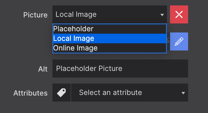
Replacing the placeholder happens on the Element pane. You can also right-click and select 'Edit Picture'.
Select your image source from the dropdown.
From the Element pane > Selected Element Properties > Picture use the dropdown to switch between the placeholder, local, or online image.
When selecting a local image, you will be asked to select one from the file system. The chosen image will be added to the project and be displayed instead of the placeholder image.
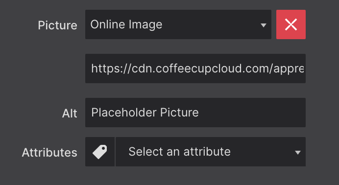
Select Online Image for entering a URL for your image
You can also provide a link to an online image. In that case, you can insert (paste) the URL to the image in the input box that appears below the dropdown.
You will notice that a newly added image will not be wider than 200px. This can be changed on the Styles pane > Layout > Dimiension with the max-width control.
Using the Picture element, you can change the image at breakpoints, serving smaller images to mobile devices for better performance. This is handy if you want to show a cropped version of the image for smaller screens.
Level Up
Want to learn more about the mighty Picture element? Read more about image optimization, the importance of applying Lazy Loading, and get tips on how to position your images (such as centering them) using the following help article.
The Video and Audio elements allow for embedding responsive media in the page. Indeed, responsive because most other video embeds will not automatically adjust to different screen widths!
Two options are provided to add background videos to the canvas, Background Video Container and the Full Screen Background Video. Both video background options consist of two elements: a Container element and an HTML5 Video element. To select an element that is nested, use the context menu when hovering over the element on the canvas.
The Background Video Container gives you the ability to add a video background section to the web page. Size adjutments can be configured to the parent Container at the height and width of your needs. The alternative, the Full Screen Background Video, is used to cover the entire viewport (canvas).
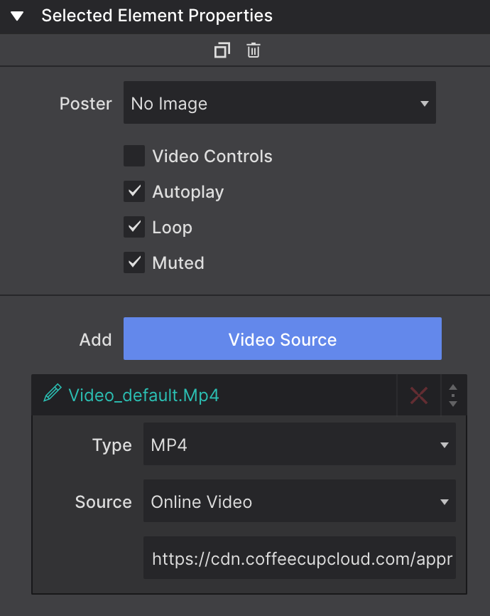
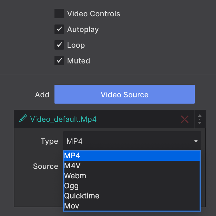
When one of these elements are added to the canvas, a media placeholder will appear. On the Element pane > Selected Element Properties you can configure the video source details and apply a Poster. The element supports MP4, M4V, Webm, Ogg, Quicktime, and Mov file types.
Click the red X next to the 'Video_default.Mp4' to remove the placeholder. Click the blue Add Video Source button to add in a new source file. The Poster control allows you to configure a cover image to display before the video is played.
The Video Controls will let you show or hide the play buttons when the page is exported or previewed. Autoplay will make the video play as soon as the page is loaded. The Loop will make the video to start again once it is finished. And Muted will play the video with no sound.
With the HTML5 Video element you can simply load up your MP4, M4V, OGV, OGM, WAV, M4A, WEBM, OGG and MOV files locally or from an online link.
Use the Video Platformelement to sync with a file loaded on a third party source such as YouTube or Vimeo. You will enter the full URL for the video source located at the third party site.
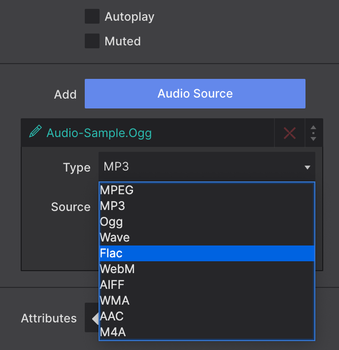
Using the Audio element, play MPEG, OGG, WAVE, and FLAC tracks. You'll be able to quickly post your weekly church sermons or share your garage band's latest jam.
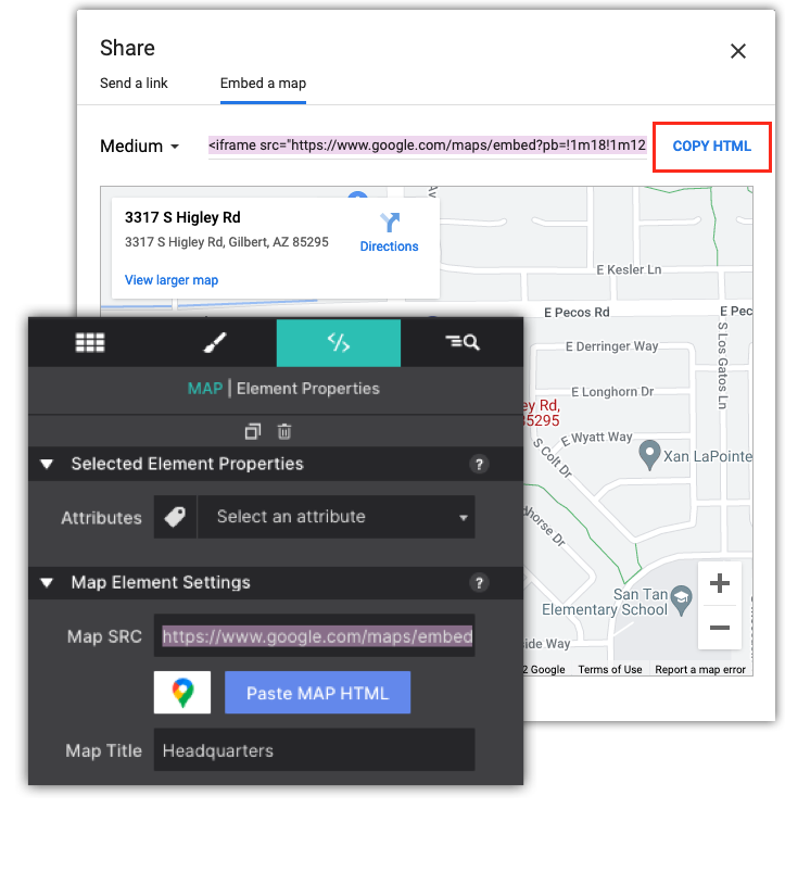
The Map element gives you the power to embed a responsive Google Map. Simply copy the Google Map embed code for your destination and paste it into the Map SRC box on the element pane.
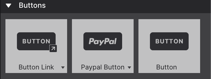
The elements in the group generally perform an action following interaction with the visitor or user. A Button Link is the most common link element. When clicked, it will direct the reader to a new location. It can open a menu, reveal a hidden element or show modal dialog. It can also take the user to a different location, on the page, site or to an entirely different site
Variations of the Button Link element include Button Link Image which images a graphic or a Button Link Icon which pulls a font icon within the button. The Download Button element is used to immediately download pdfs, images, etc that are loaded within your project resources.
Configure the link destination on the Element Pane > Selected Element Properties.
The Buttonelement is used when configuring external features such as a custom form. Also can be used in combination with custom Javascripts or framework capabilities.
The PayPal Button is used to build custom HTML Paypal payment buttons. From the Element pane, simply enter your PayPal ID to sync the button with your merchant account.
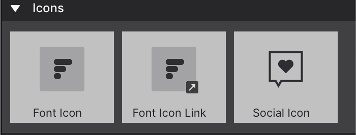
The Font Icon and Font Icon Link elements give you the ability to popular a small font icon graphic (the Icon Moon collection). The font icons and associated links are configured on the Element Pane > Selected Element Properties.
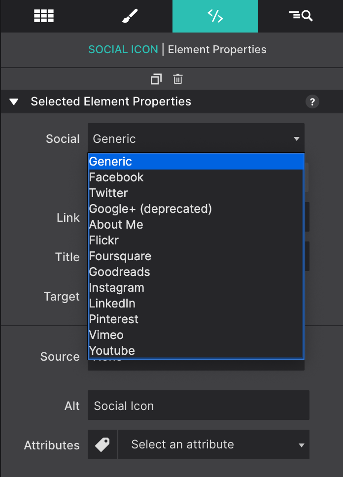
The Social Icons can both be used to build a following on the social networks and allow visitors to share information. When added to your page a default icon will appear. You can change the social media type and connect to your social media account from the Element Pane.
The Element Pane > Selected Element Properties will give you the ability to select which social account to activate. Once selected, the standard icon for that service will appear. Basic styles can be applied to change the size, colors and layout.
Depending on the type of social account activated you will be presented with additional options such as Follow and Share. Follow let you direct the user to your social page so they can 'like' your page. Meanwhile, Share allows the user to share a post of your message. For example, re-tweet.
Only certain social media programs allow for follow and share. In some cases a Button Link or Picture Link elements might be most appropriate. For example, LinkedIn only works for individual pages at this time. We are working to add support for company profiles to the panel. It is also best to use Picture Link elements if you would like to use custom social media icons.
Form Elements
The Form Container, together with the Email element and Button Submit element can, for example, be used to create custom web form designs. A wide range of form elements are made available in the Form Elements section.
Please note that the form (elements) will need to be hooked up — sync'd with custom scripts on the Element pane to make it functional. However, form scripts for creating fully functional forms are beyond the scope of this app. If you are unsure how to create a custom form script then we refer to Web Form Builder.