Learn how to create something special from scratch by using our powerful tools.
The Content Pane - Symbols
Symbols helps you to speed up your workflow by allowing you to reuse common elements across your project. When you make a change on a Symbol on the page, these changes will be reproduced everywhere this Symbol appears. They are managed using the subpanel within the Content Pane > Symbols section.
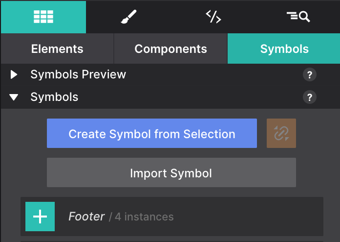
Creating a New Symbol also works in the exact same way as creating a new Component. You only need to select the element you want to create the Symbol from and click Create Symbol From Selection.
This will also turn the element into a Symbol instance. Meaning that now is part of that Symbol group of references. From now on, every change you do on one of the instances, will be applied to all of them no matter which page they are (or even on the same page).
Adding Symbol Instances
Adding a Symbol to the Canvas works the same as for components. To add a Symbol to the canvas, click the plus (+) button. It will get inserted below the currently selected element.
However, any changes to a Symbol will update all of the ‘instances’ — wherever they are located in the project, the app will keep them all exactly the same everywhere.
When adding a Symbol instance to the canvas you will see how the number of instances will increase.
Using Symbols
The Symbols allows you, for example, to add a footer link across all pages, and update them with one single edit. Keep in mind that a single element such as a buy button or copyright notice that comes back in various places of a project can be a candidate for a symbol as well.
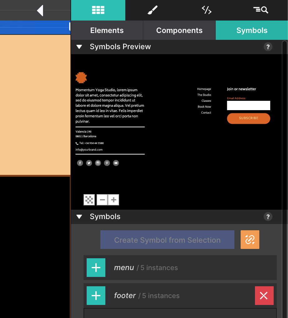
In the image below the footer symbol is selected on the Symbols sub-pane. The entire symbol is visible in the Symbols Preview area, just as with the components. On the left, part of the footer is also visible on the canvas.
When a Symbol is selected, it is surrounded by an orange line on the canvas. This is to help differentiate between symbols and ’normal’ element groups. The Symbol container will also have an orange dot on the right in the tree view of the Element pane. This pane will be discussed later in this guide.
Symbols can not be nested — symbols can not contain other symbols — because that could create an update loop nobody can get out of...
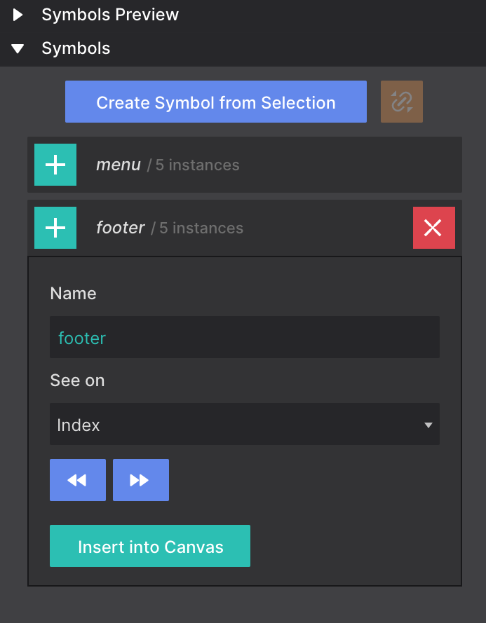
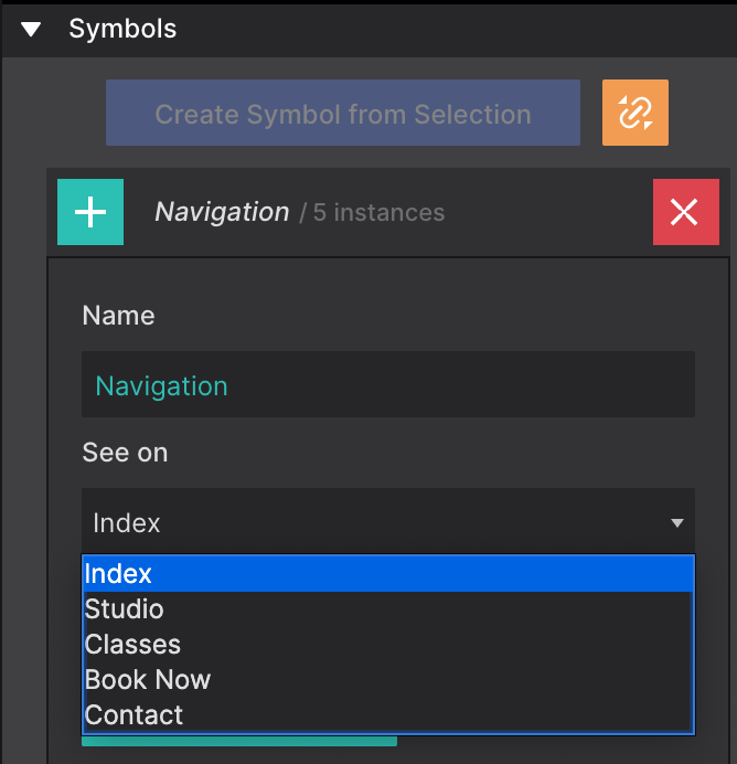
When looking at the image below, you will also note a few differences. For starters, the name of the Symbol is followed by an instances count. This tells you how many times the Symbol is used in the project.
The name of a symbol can be changed using the Name input. With the See on function, you either can circle through the pages where an instance of the symbol is located, or directly jump to a specific page with the dropdown. Using this function, the canvas is automatically scrolled to the place on the page where the Symbol is located.
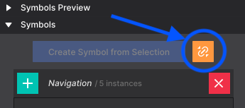
Unlinking Symbol Instances
When you need to make edits to an individual Symbol instance without it to be replicated to all of the other instances you will need to Unlink the Symbol. For doing this, you just need to click the orange button with the breaking chain icon.
In case you want all the instances to behave as regular elements, you can just remove the Symbol using the X button. Notice that when a symbol is deleted, it will be removed from the list, but all instances will still be in the project.