Learn how to create something special from scratch by using our powerful tools.
The Styles Pane – Layout
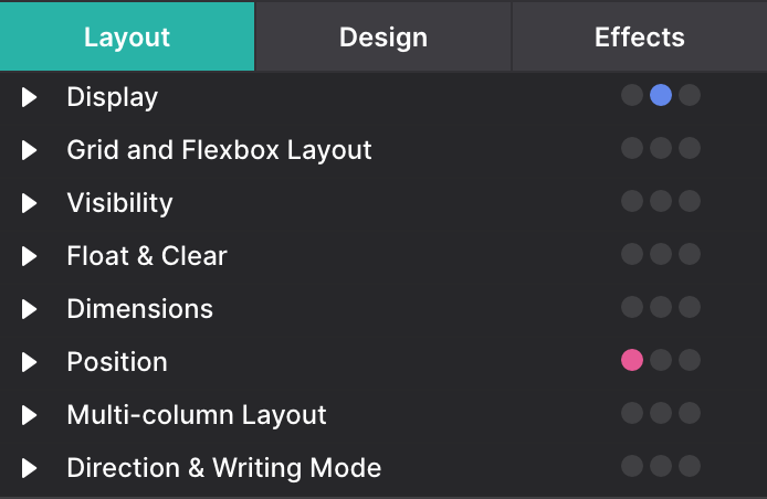
On the Styles Pane under the Layout section, several positioning options are made available to you so you can pick the method that fits best with your design. The three most common layout methods options CSS Grid, Flexbox, and Block. You can also layout your elements with more specific and less frequent layout methods like Position, Tables and Multi-column. We will cover the most important ones in this chapter.
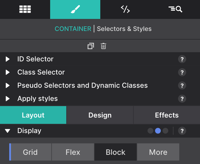
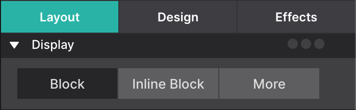
Our first stop will be the Display control. When having a container selected in the canvas, you will be able to choose between Grid, Flex and Block. This will allow you to select one of the main techniques we will describe below. On the More you can find some other display options like None (to hide an element), Inline Block, Inline, Table (and its variants), List, etc...
Preview of the Layout & Positioning Controls
The tools on the Styles pane > Layout section have been organized in groups of related controls. Each of the groups (sections) can be collapsed and expanded when needed. When all the sections are expanded the scroll to the lower sections can be getting rather long.
CSS Grid layouts are the most powerful layout controls in CSS. It is a two-dimensional system that handles both rows and columns. The "Grid' is great for a modular design approach. Used to manage major page areas or small combinations of elements.
This system allows you to design without having to use floats and other positioning methods.
Organize page content into Container elements then position the content accordingly within it. You basically build a mini grid within the Container. The children within the parent element can be directly told where to go within the grid. You can either give each item an area name, or give it coordinates that match the lines you want them on.
We see Grid being the layout method of choice for content on the web - especially now that all modern browsers support it.
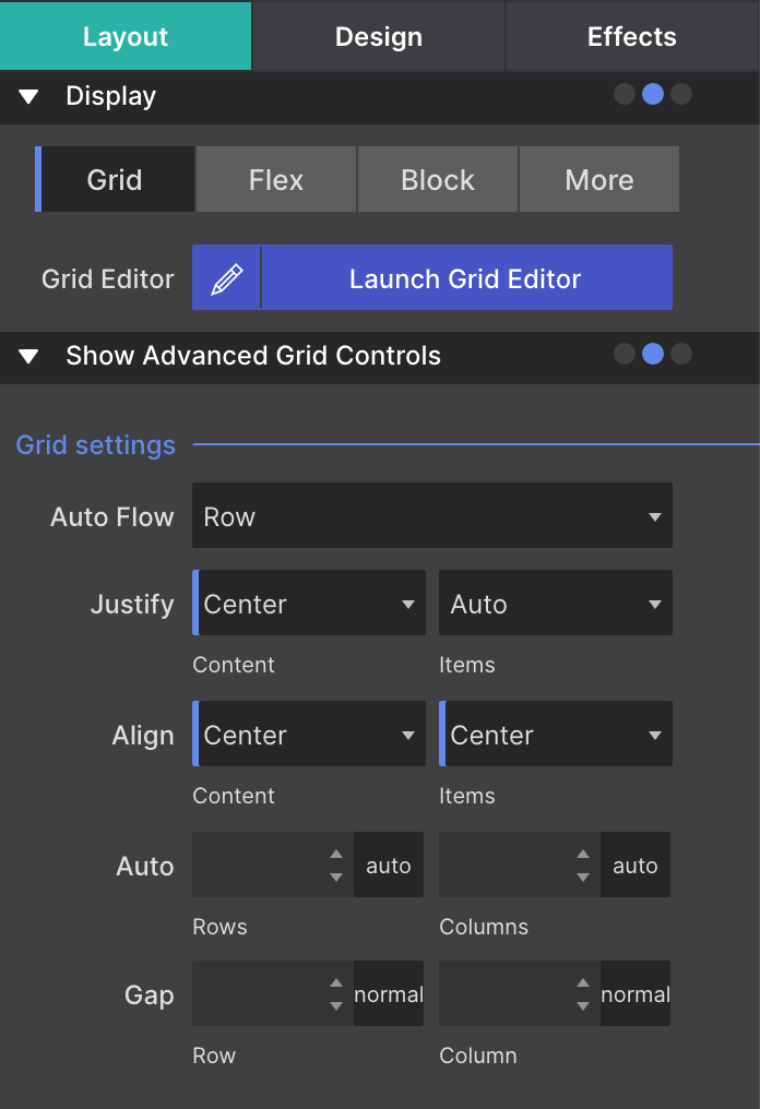
To activate the CSS Grid controls, select any Container element on the canvas and go to the Styles pane > Layout > Display > Grid. Click on the Launch Grid Editor button to open the Grid control panel.
In this panel, you will find the most important controls to set up your Grid. Notice that you can attach the controls in the panel or as a dialog using the “Attach as right panel” or “Center in app” green button.
Let’s do an example to understand the concepts for the CSS Grid.
1. Configuring the parent and children containers
First, we are going to prepare the base structure for our layout. We will be using a parent container with a min-height of 100vh (“vh” is a CSS unit which stands for viewport height). This way the parent container will take at least 100% of the height of the canvas.
Then, we can drag inside the containers that will become children of this parent. We will also apply to each of them a different color. This way we can identify them easily. Also, remember to add a meaningful class name to each container.
2. Configuring the Grid Area Based Names for the children containers
We will give all the children containers a name for the grid area they will be placed on. For doing this you will need to go to the Styles pane > Layout > Grid and Flexbox Layout section for each element. Then in the Grid subsection > Grid control, use the drop-down box to select Grid Area Based Placement.
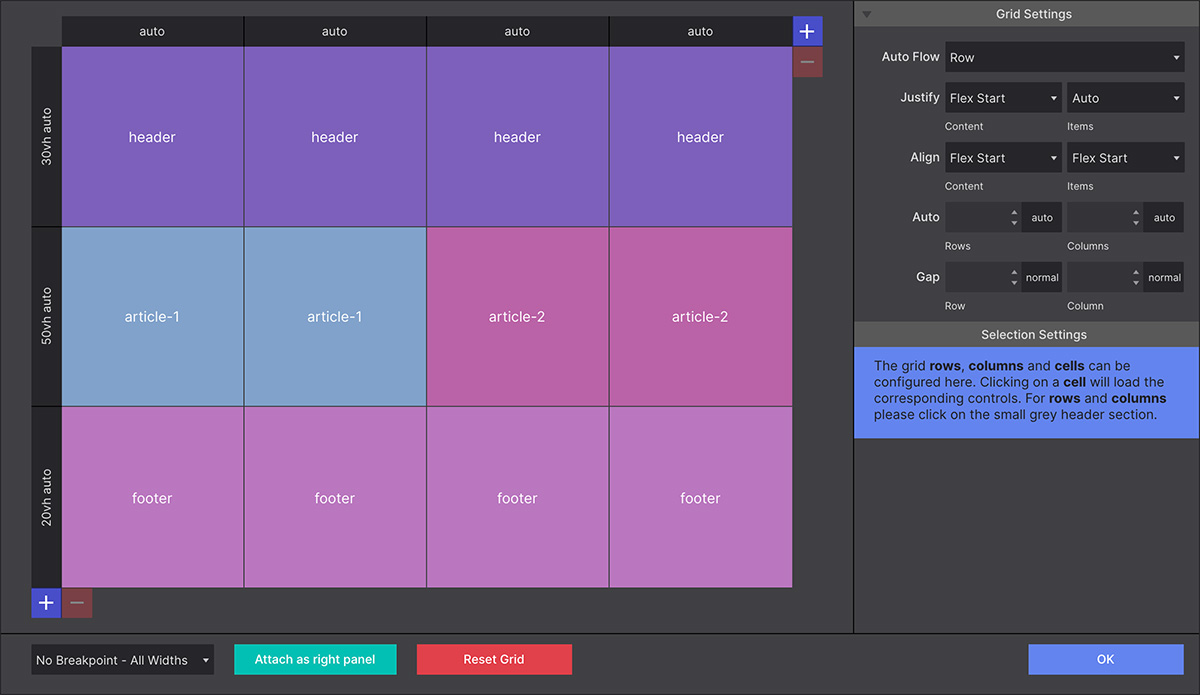
In the Name box, delete the placeholder ‘elementArea’ and enter the element name you will use on the Grid Settings in the next step. We are going to use these names for the example: “header”,“article-1”, “article-2”, and “footer”.
3. Configuring the Grid on the parent
Select the parent Container element on the canvas and go to the Styles pane > Layout > Display > Grid. Click on the Launch Grid Editor button to open the Grid control panel.
With the Grid Editor launched, you can now begin creating your grid layout. Grid columns and rows — grid tracks — are added using the respective + buttons.
Now we have the base structure ready, let’s assign the grid area names we configured before in this structure. For doing so, just click on a cell to open up the text input box (oval). You can enter the name directly in the cell or in the corresponding control area under the Selection Settings Cell Name box.
Note: When entering the cell name, be sure to remove the dot “.” from the name. The dot is only left in the cell when you want to leave that cell empty.
4. Fixing the Grid
Now let’s change the size of the rows to have a bigger content for the two areas in the middle of the grid.
For doing so we need to configure row (or column if we want to) settings. Simply click on the header on the side where the text “auto” appears. The panel beneath the grid builder will change, presenting the appropriate Selection Settings.
We will apply to the first and last rows a Height of MinMax and we will enter a “25vh” on the Min field and keep “auto” for the Max. This way those rows will take at least the 25% height of the canvas and, since we set “auto” for the Max, in case it needs to grow it will automatically.
Then for the middle row, we will apply also a Height of MinMax and we will enter this time “50vh” on the Min field and keep “auto” for the Max.
5. Adding some content to the Grid
Now we are ready to add some content to the grid areas. For this example, we will just add some headings to identify each section. In real life, we will add our navigation on the “header”, some links on the “footer”, and the proper content on each of the “article-1” and “article-2”.
6. Making the Grid responsive
When we move the slider to see how it looks on smaller devices, we see that the space for the “article-1” and “article-2” is too small. For this situation we want both sections to stack instead of sit next to each other.
So let’s move the slider to a position where we feel the stack needs to happen and add a breakpoint there (if we don’t have it already). On this breakpoint, we will add our switch of the layout so we need to ensure that the breakpoint is active. We can click on it, or see if it has a darker mark inside.
Once we are on the breakpoint we are ready to apply the stacking. We will launch again the Grid Editor to modify the setup. We will add a new row from the respective + button. Then also we need to modify the sizes, so now all the rows will have a 25vh as we did in step 4.
And last, we just need to rename the areas so each row has one of the names “header”, “article-1”, “article-2”, and “footer”.
7. Playing with the Grid
Now we have the base structure working, we can liberate our imagination on how we could make this layout more appealing.
We can tweak the area names from the Grid Editor to create different layouts. The only restriction is that the areas need to be contiguous creating rectangles.
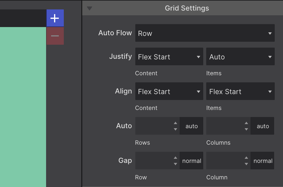
CSS Grid - Settings
Now let’s dive into the controls and different screens for configuring you grid. This way you can learn about the different possibilities you can achieve with CSS Grid. First step will be the main Grid Settings on the Grid Editor dialog.
The way the elements are placed into the grid can be influenced with the Auto Flow control available through the corresponding dropdown in this section. By default grid-items are automatically filling the cells on a row by row basis. But this can be changed to be filled by columns, or some more advanced ways like dense, row dense or column dense.
The Justify and Align controls work very similar to how Flexbox align items. They determine where the items are placed in a grid area along the column (block) and row (inline) axis.
Rows and columns that are automatically created normally grow and shrink to accommodate the content they hold. Using the Auto controls a default size can be specified for that situation.
Gutters can be specified with the Gap controls, to create a separation between the rows/columns in the grid.
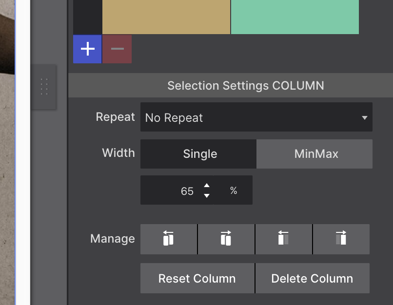
CSS Grid - Rows and Columns
Like in the example above, you can create your grid layout using the respective + buttons for grid columns and rows, also known as grid tracks. To configureRow or Column settings, simply click on the header. The panel beneath the grid builder will change, presenting the appropriate Selection Settings
The widths and heights by default are set to Auto. These can be changed using the input and unit chooser which includes the awesome fr unit. The new fr unit represents a fraction of the available space in the grid container (learn more). Also Single value or MinMax values can be selected with the height (rows) or width (columns) toggle
There are also Manage controls that make it easy to duplicate rows and columns or move them into different positions.
TIP: Using Fractional Space
The fr unit represents a fraction of the remaining free space in the grid container. The word 'remaining' is an important one here — first all the specifically defined space such as 100px or 20% is allocated. Then, if any space remains, it will go to the tracks using a fr unit.
This space is proportionally divided between the 'fr tracks' according to the number of fr's.
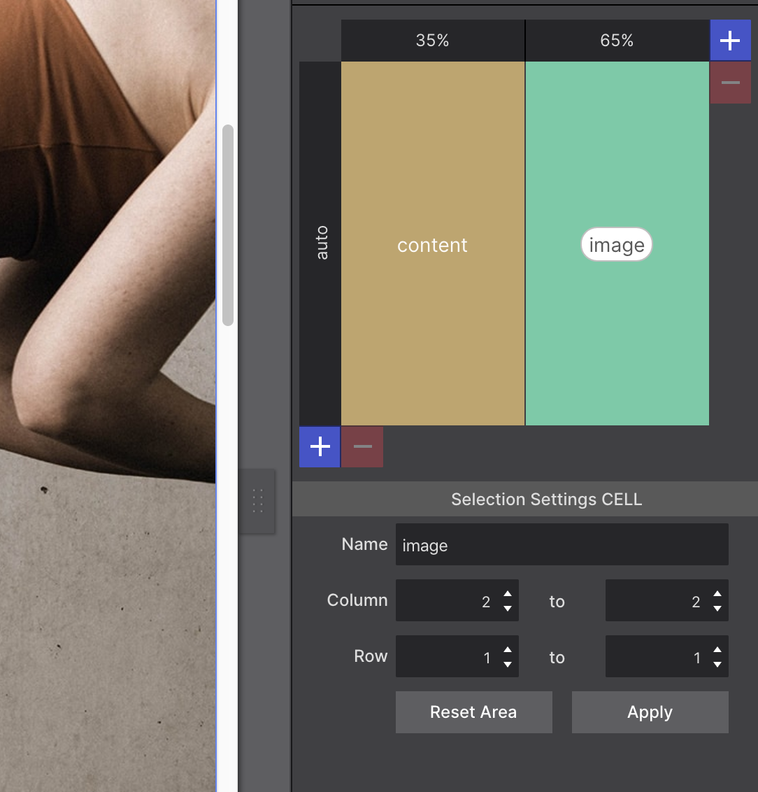
CSS Grid - Cell Settings
The cells within your grid may be given a name. The name can be entered directly in the cell or in the corresponding control area under the Name box. When entering the cell name, be sure to remove the dot "." from the name. The dot is only left in the cell when you want to leave that cell empty.
When adjacent cells have the same name grid areas are created. These grid areas can also be created using the Column and Row controls specifying how far an area needs to stretch, with what column and/or row it starts and where it ends.
Items can be placed by simply specifying what area they belong to. Note that these Grid Areas can be changed at breakpoints.
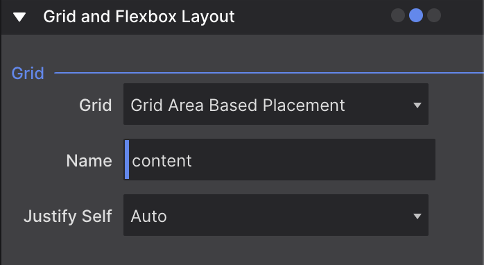
Grid Area Placement
To place an item in an area, you will need to close out the Grid Editor by hitting the OK button at the top of the panel. Then go to the Styles pane > Layout > Grid and Flexbox Layout section. In the Grid region > Grid control, use the drop down box to select Grid Area Based Placement.
In the Name control, delete the placeholder ‘elementArea’ and enter the element name you assigned in the Grid Settings. If you suffer from a bad memory when designing, the auto-suggest is a great help!
Also you can find some examples how to use this Grid Area Names here:
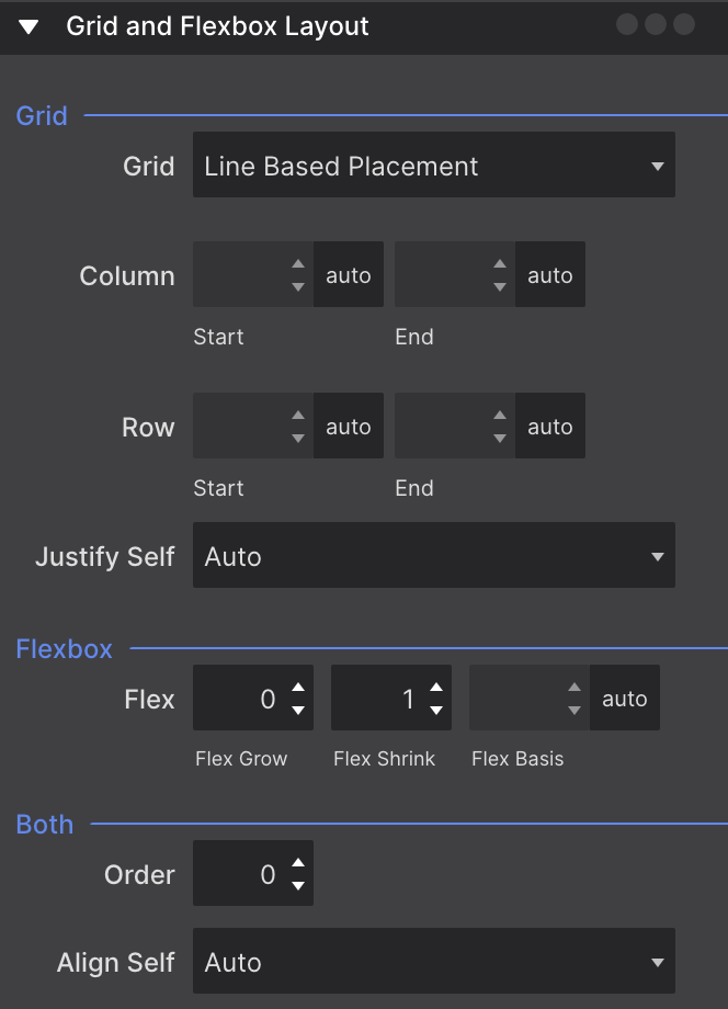
Another way of positioning your elements within the grid could be using the Line Based Placement. This can be found in the Styles pane > Layout > Grid and Flexbox Layout section. In the Grid region > Grid control. Although it is less intuitive than the Grid Area Names, it could be useful for quick adjustments and making elements stretch without having to set up the Grid Area Names.
You can make the element stretch both through columns and/or through rows. There are two possible ways of doing it. First, you can use the “no unit” values that translate into where the start and end of the element will be, and using “span” which will make the element stretch how many columns/rows you have defined.
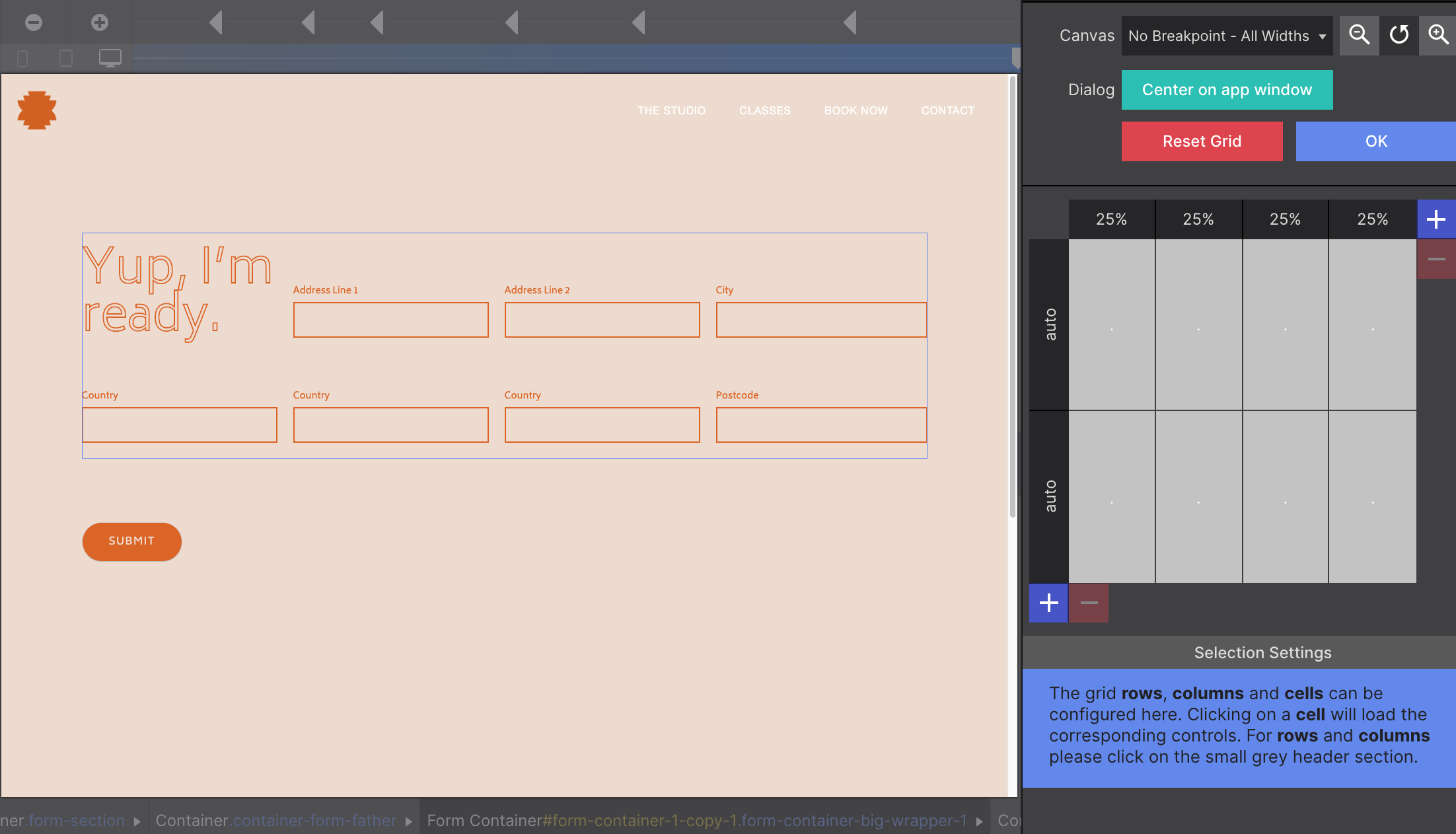
For example let’s say you have a 4 column grid setup, but you have a heading element you want to stretch throughout the four columns. First thing we need to select the heading and go to Styles pane > Layout > Grid and Flexbox Layout section. In the Grid region > Grid control switch to the Line Based Placement. Now we can make the heading stretch.
You can do this in two different ways. One possible way could be using the "no unit" values. For this we need to apply as the Column Start1 no unit, and as Column End, use 5 no unit.
The reason that the end value is “5” and not “4” is cause the end means where it will stop stretching. Using “4” will mean that it will stop just before the 4th column, but we want it to stretch including the end of the 4th column, therefore we need to set “5” (before the 5th column if it exists).
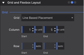
Another way to achieve the same result is using the span units. For this we need to apply as Column Start just the value 4 span. This will mean the element will span the four existing columns.
Flexbox - Basics
Flexbox provides a superior method for aligning, ordering, sizing, and positioning elements. Yup, it can do all of that and therefore is increasingly being used instead of other positioning controls.
A flex layout is created by setting the display property of a container element to Flex from the Styles pane > Layout > Display section. This can be any element that contains other elements, from a simple container to a list element. This will make all elements inside this container flex-children.
The main characteristic of the flex container is the ability to modify the order, position, alignment, width, or height of its children. These children will therefore listen to the flex settings of the parent, but can also get some individual flex styles.
Flexbox - Positioning Controls
The Direction control is used to define the direction the flex-items follow in the flex container. By default, the flex-items will be positioned as (horizontal) Row. Changing the dropdown to Column will stack them.
The Wrap control can be used to position a series of items on a single, or on multiple lines. If there is not enough space available, setting this property to wrap will place items that do not fit on the next line.
The Justify control determines how the elements are spaced out horizontally.
The Align Content control, when there is more than a single line — more than a single column or row — of items, can be used to distribute the space between the lines.
Using the Align Items control, the position of the elements on the cross axis of the defined direction can be managed.
Flexbox - Examples
Now let’s go together through some examples on how to use flexbox.
Vertically Center a Picture
First, we are going to add a container to our canvas. Then, we go to Style pane > Layout > Dimensions and we will apply to this container a minimum height of 100vh. This way, we have the container big enough to later center something vertically inside it.
Next, inside this container, let's add a picture, and, through the Style pane > Layout > Dimensions, we will constrain the Picture to a maximum width of 400px.
We are ready to apply the flex properties to center the picture in the container. For doing this, we will now the container, and go to Style pane > Layout > Display and apply Flex.
This will make to appear some controls for managing the Flexbox properties. In order to center both vertically and horizontally the picture, we need to apply these two values. First, we need to set the Align Items to Center, making the picture to center vertically. Next, we will set the Justify Content control to also Center to make the picture to be centered horizontally.
Playing with with Flexbox
For this example, we are going to do something similar for centering the image, but we are going to use more than one element.
So again, we add a container to our canvas and we go to Style pane > Layout > Dimensions and we will apply to this container a minimum height of 100vh.
This time we are going to add inside the container a Heading 2, a Paragraph, and a Text Link. We are ready to apply the flex properties to center the picture in the container. For doing this, we will now the container, and go to Style pane > Layout > Display and apply Flex.
Now with the Flexbox properties shown, we will first change the Direction control to use Column, so the element stack one over the other. And, because of this, now to center horizontally the items, we should use Align Items to Center. The other values, Flex Start will move the elements to the left side of the Container, and Flex End to the right side.
With the Justify Content control, we can use the value Center to vertically center the elements. Flex Start to align them to the top, and Flex End to align them to the bottom. But also, we can do some interesting things like use Space Between which will create space between the elements, or Space Around which will do something similar, but also adding space on the top and bottom to separate the elements evenly.
Flexbox with No Wrap
In this example, we have added four pictures to a container, and in the container, we have gone to Style pane > Layout > Display and apply Flex. To each of the pictures, we will constrain its width to a maximum width of 180px.
If you resize the window of your browser to a smaller size, at some point you will see how the images are getting smaller and smaller. This is because the Wrap control by default uses the value No Wrap, which will make the content not to stack and get downsized (if possible).
Flexbox with images with the property Wrap set on WRAP
On the opposite side of the previous example, is the one you can see below. In this case, we have forced the Wrap control to use Wrap. This will make the content of the container to wrap (or to stack) when there is no more space available.
So, if you again resize the window of the browser to a smaller size, you will see that when the images don’t fit in the space available, they will stack down creating a new “row” of images.
Flexbox with images with the property Direction set on COLUMN
For this example, we have just changed the Direction control to use the value Column. This will make the elements inside the container to position themselves one above the other, instead of next to each other.
Flexbox with images with the property Justify set on SPACE BETWEEN
Now, we will just add three pictures to our flex container. This will make them by default to position next to each other, aligned to the left. But, since we have space available, we would like to distribute them evenly on the container.
For doing so, we only need to go to the Justify Content control and set the value Space Between. This will make the pictures on the sides to be on the edges of the container, and the others to be spaced evenly.
Flexbox - Children Controls
The size of the flex children can be controlled from the Style pane > Layout > Grid and Flexbox Layout. Inside the subsection of Flexbox and Both, you can find the controls related to these flex items.
The Flex Basis control specifies the initial size of a flex item. This can be an absolute pixel value or a relative value like, for example, a percentage of the width of the parent.
The Flex Grow control and Flex Shrink control are powerful tools that can be used to control the growth or reduction of the element based upon the available display space. These are unitless values that will relate to other grow/shrink values of other sibling items.
For example, if you have three elements with 1, 2, and 3 flex-grow values each, means that the first one will occupy one space available, the second will take double the first one, and the third three times the space of the first one.
The Order control will allow you to move the element priority position between the other children. This can be handy if you want to switch the position of the elements on a breakpoint for example after stacking them.
Most elements in the app are displayed as Block by default, like the Containers for example. This means the elements they will stack on top of each other vertically. This will arrange the elements in the normal flow of its position in the DOM (Document Object Model). This just means on the order of how it will appear in the HTML.
To change the normal flow of an element, you can go to Styles pane > Layout > Display and switch between previously explained layout systems (like Grid and Flexbox) and Block or Others.
By default, a Block level element's content is 100% of the width of its parent element, and as tall as the content inside him. But, even if we force the width of these elements to be 50%, they will still stack on top of each other.
In the More value, you can find different display values. One of the most commonly used is Inline-Block. These make the elements to be placed next to each other if there is available space. In case you want to center these elements, you may need to set the text align property to center on its parent container through Styles pane > Design > Typography.
The Inline value works similar to inline-blocks but the element loses its height and width. This is not recommended for elements that contain other elements.
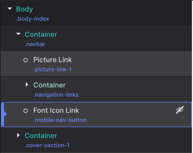
Another important value commonly used is the display None. It is used to hide or show elements under specific circumstances. One example would be to not show an illustrative element on small screens.
If you need to show the element for editing it, you can use the eye icon from the Element pane > Elements Tree.
The remaining values for the display control are less commonly used. Only for very specific situations. These are the values related to Lists and Tables.
Float Layouts
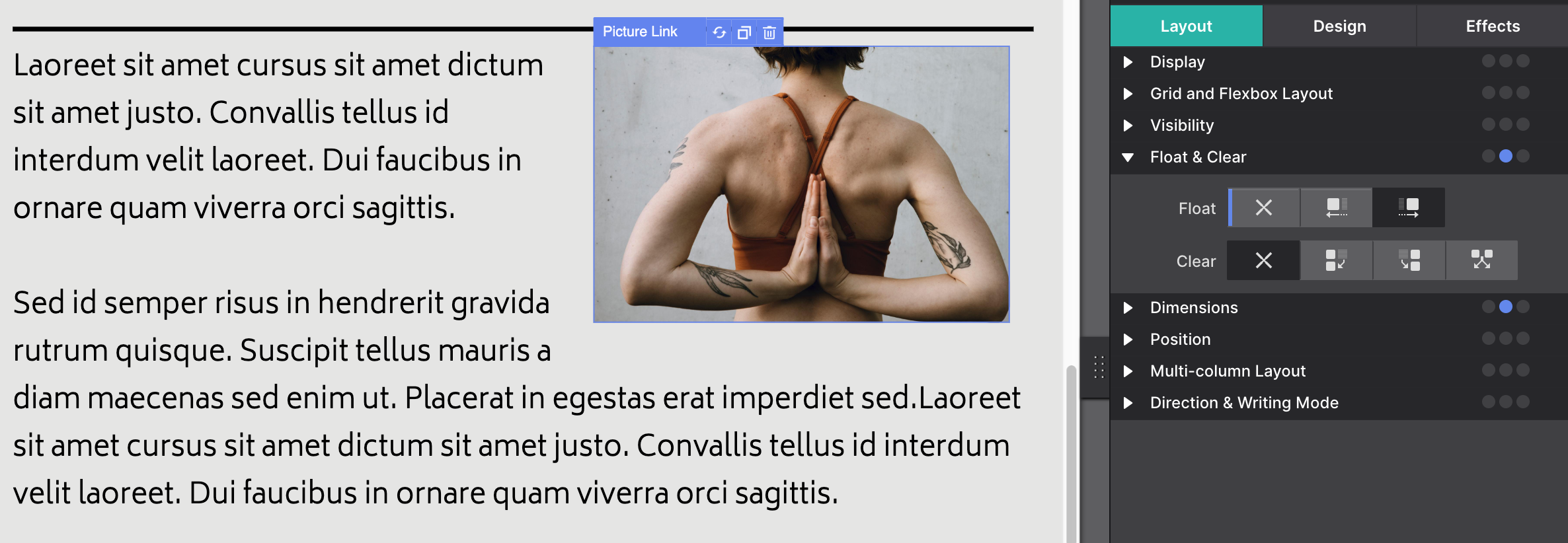
The Float control can be found on Styles pane > Layout > Float & Clear. Elements can be set to be floated Left, Right, or None (normal flow). Note that, when applying a float left or right, the elements are taken out of the normal flow of the page.
It was originally intended for text wrapping around other elements such as pictures. Simply set Float to Right for the image and the paragraph will wrap around it. When the image is increased in size or replaced by a larger one, the text automatically adjusts and reflows around it.
The Clear control is used in conjunction with floats. It can be used to move down (clear) the element following or preceding a floating element. You can use Left, Right, or Both, indicating which side of the float you want to prevent.
For example, if you want to make an element to don’t have floating elements on its left side, you can set the Clear control to Left. This will prevent any wrapping around a floating element.
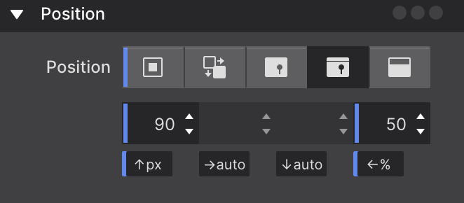
The Position control under the Styles pane > Layout > Position can be used to define alternative rules for the positioning of an element.
Static — the first button — is the position value applied by the browser if no other value has been specified. These elements behave exactly as you would expect, according to the rules defined by the other controls.
Relative positioned elements behave very similar to static elements with two exceptions. Firstly, they can be moved around using offset values. The big difference with using margins for this is that other elements are displayed as if the element were in its normal position and taking up its normal space.
An Absolute element can be positioned anywhere in the design using the same offset properties as relatively positioned elements. To do this inside of the current container or column, this parent container cannot be positioned static, needs to be Relative.
Elements that are positioned absolutely are taken out of the flow, taking up no space and not influencing the position of the other elements. Usually the z-index property is increased to make sure the element is visible on top of the other element.
An element with a Fixed position uses the viewport (browser window) as its coordinate system. This means it always stays at the exact same position, also when the page is scrolled.
A Sticky positioned element is an element that "sticks" to its nearest ancestor that has scrolling. This means that you can make the element to be positioned at the same position in it's parent container while scrolling. For example, in this guide, the titles for each section are sticky when using a mobile device. You can try it reducing the width of your browser.
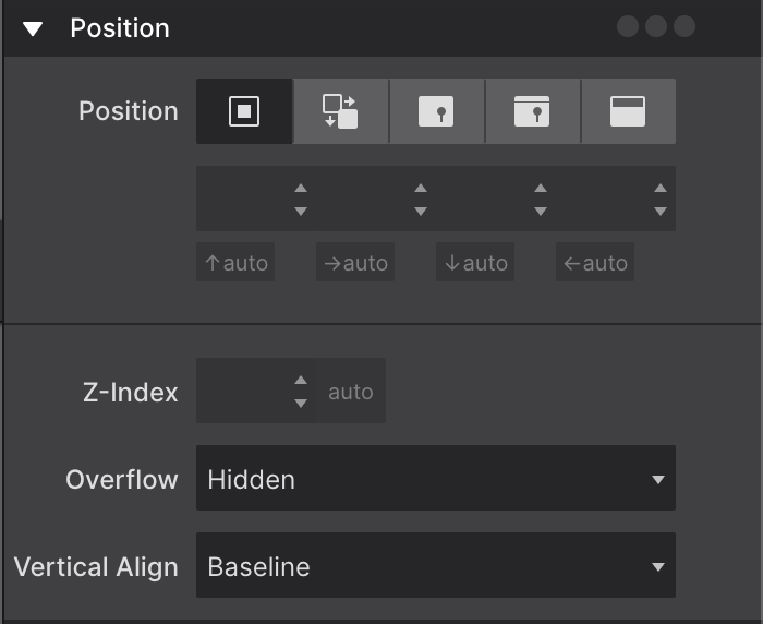
Z-Index, Overflow, and Vertical Align
When elements overlap, the Z-index determines which one covers the other. An element with a higher z-index covers an element with a lower one. To achieve this you can use the Z-Index control you can find under the Design Pane > Layout > Position section.
In the example below, you can see how the Z-index 2 is over the Z-index 1, even though in the HTML it is positioned before (therefore behind) the other.
Z-index 2
Z-index 1
When a container has a fixed height, there might not always be enough room for all the content to be displayed. With Overflow control you can specify what needs to happen in that case. The content can be clipped or be allowed to overflow, which might impact elements below the container. The parent container can also be instructed to render scrollbars.
Vertical-align controls how inline elements are lined up vertically. The default value is baseline, which aligns the baseline of the element with the baseline of its parent. The most common custom values are top, middle and bottom.
Please note that this CSS control does not allow you to vertically center an element within another element. Flexbox would be the tool of choice for that.
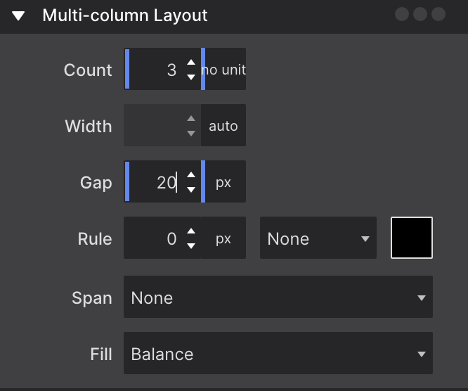
The CSS multi-column layout is mostly thought of as a way to create print-inspired text columns. However, it's a very versatile tool that extends to other bigger and smaller areas of layout creation — it can be applied to containers as well as single text elements.
As an example, this is a single paragraph using the multi-column settings. Whenever there's enough room to divide the text over two columns that are (at least) 220px wide, the browser will do so. If this paragraph shows as a single column, it means that there was not enough room for two 220px columns. The cool thing is that the text automatically flows between the columns‚ when text is added or text flows due to width changes — to create (approximately) the same height columns.
Count and Width are the most powerful tools. They control whether and how many columns will appear. Obviously, the Count sets the number of columns to a specific number.
The Width determines the minimum desired column width. If column-count is not also set, then the browser will automatically make as many columns as fit in the available width. Otherwise the browser will make columns of the specified width, with a maximum as defined by the Count.
The tools for creating cool multi-column layouts.
The other controls enhance this core feature. The Gap let's you specify the space between the columns. A line can be drawn between the columns with the Rule control. The width, style and color can be specified as well.
Column-span
Multi-column layout settings are not limited to text and can be applied on parent containers as well. When the multi-column is used on a container, elements inside can be instructed to Span across all columns of the layout. Content before and after the element is still automatically balanced across columns before and after the element appears.
Column-span
Lorem ipsum dolor sit amet, consectetur adipiscing elit. Quisque nibh risus, sagittis nec suscipit nec, mollis laoreet eros. Donec faucibus, libero id faucibus scelerisque, justo justo nullam sodales.
This element spans both columns. Quisque nibh risus, sagittis nec suscipit nec, mollis laoreet eros. Donec faucibus, libero id faucibus scelerisque, justo justo nullam sodales.
Lorem ipsum dolor sit amet, consectetur adipiscing elit. Quisque nibh risus, sagittis nec suscipit nec, mollis laoreet eros. Donec faucibus, libero id faucibus scelerisque, justo justo nullam sodales.
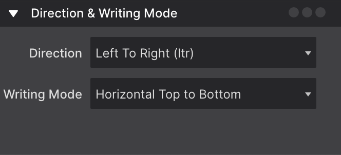
These controls allow you to which way text and content is positioned. It opens the door for displaying content in cool ways.
Setting the Direction sets how the content is layed out. The default is Left to Right (LTR) but you can also choose Right to Left (RTL). This is helpful when using languages that are written RTL.
Writing Mode allows you to change text orientation. Flip the text Horizontal or, like the example below, make it flow Vertically. Adjusting the Orientation of content is possible too to Mixed or Upright.
Vertical writing mode with mixed orientation
Horizontal
Vertical writing mode with upright orientation
Horizontal
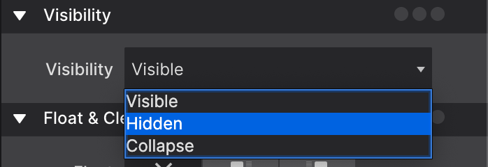
Visibility
The Visibility control hides an element without changing the layout of a document. This means that the space the element takes will remain in the canvas, but the element is hidden.
The possible values for this control are Visible which will be just the regular state of the element. Then, we have Hidden which is what will hide the element and keep the space. Last, we have Collapse, which for most elements will behave as Hidden, but on Flexboxitems will take away their space on the canvas.
A Very Important Tip!
To both hide an element and remove it from the document layout so it doesn't take up the space, you need to set the display control to More and then choose None instead of using this Visibility control.
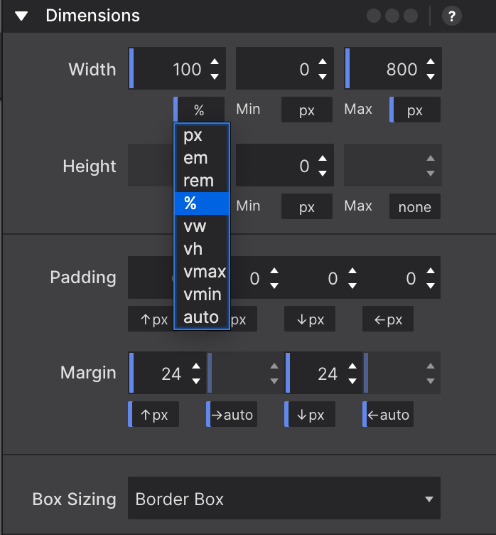
Dimensions
The exact number of controls on the dimensions pane depends on the Element Type. On the right the controls for the image element are shown. Containers, for example, have a larger selection of dimension controls. Together with the ability to use a specific unit of measurement for each control, amazing layouts and effects can be created.
The width and height controls, including the minimum and maximum, work on the content area of an element. The content area is the part inside of the padding, border, and margin of the element.
The Max-width tells the browser that an element can never become wider than the specified value. The Min-width does the contrary (and will override the Max-width setting) — it specifies a minimum for the width of an element. The height controls do the same for the height of an element.
The Padding controls the space between the content area of the element and the border. The space the padding takes up is part of the element and, for example, gets the same background color. The arrows denote where the padding will be applied, on the top, right, border or left side of the content area respectively.
Margin control modifies the space between elements. If an element is placed inside another element, the margin will push the (child) element away from the border of the parent element. A margin can also be a negative value.
The Box Sizing control defines how the total width and height of an element is calculated. This control is used for some advanced situations (mostly when using Frameworkless projects). If you set the value to Content Box, then the element width will be 100 pixels wide plus any border or padding, making the element wider than 100px. On the other hand, with a Border Box value the width will never be larger than 100px no matter the padding or border applied.
One additional thing to know is that Margin can also be used to center elements within the parent container. Giving both the left and right margins the auto value will do the trick. Also for flex children, you can set the top and bottom to auto to vertically center the element on the remaining space of its container. This value is available by clicking on the unit switch dropdown.
The same dropdown can be used to change the value type the dimension is specified in. Dimensions can be set in absolute pixel (px) values, or in relative values such as a percentile. Let’s look at that — how length can be defined in CSS — in a little more detail.
Dimensions Length in CSS
Pixels used to be a value that is normalized (the same) across devices and displays, but with the different new high resolutions screens that increasingly isn't true anymore. A pixel defined in CSS is now not necessarily the same as the pixels used by a device. Although an interesting topic, this is beyond the scope of this document.
When a dimension is specified in a percent, the allotted space is calculated relative to the value of the parent element. This can be seen in the example below, the percent bar will under all circumstances take up half of the grey column.
The vh and vw are two interesting units that are relatively new to the table in terms of good browser support. The first unit stands for Viewport Height and assigns space relative to the height of the browser window. It can, for example, be used to create a cool effect with a background that takes up the full screen.
In the example below the width of the Viewport height bar is set relative to the height — when changing the height of the app (or browser window) you will see the width of the bar change accordingly.
The vw unit works the same, but is based upon the width of the viewport. The main use case is viewport based typography — the font can grow or shrink depending on the available space. The Wave Weapons theme showcases this as well. For dimensions this unit can be used to, for example, split screen design.
The em and rem units allocate space relative to font size. This is (almost) always 16px for both units. However, a website visitor could set his default font size at a higher (or lower) value, causing the em and rem based dimensions to change with it.
Controlling a responsive design pixel values are mainly used for minimum and maximum width settings (if any) and for defining margins and paddings. For the default Width specification the auto and percent values are most common.
The vmin and vmax values are whichever is smaller respectively larger of either the vh or vw values. This can come in handy but is currently not supported by all browsers.

