Your guide to website development with Site Designer.
Introduction
CoffeeCup Site Designer is a web development tool to create and design a new website, or to modify and enhance your existing website. Site Designer is a WYSIWYG tool which provides a real-time visual design environment for building or modifying websites. Site Designer was developed for both users who do not have experience using core technologies for building web pages, like HTML (Hypertext Markup Language), CSS (Cascading Style Sheets) and JavaScript, and for those who do.
If you are one of those non-coding users, Site Designer offers a real-time canvas and the possibility to drag and drop web elements to construct their new website. Our app has integrated pre-built website Templates and Components which users can easily modify to get started quickly.
But if you are an experienced web developer, you will love the integrated support for the popular CSS Frameworks like Bootstrap 4, Foundation 6 and Materialize, and the ability to add your custom HTML and CSS markups without any hassle.
Our mission
CoffeeCup Software’s goal is to be the Swiss Army Knife for the web development community for those who code, and those who don’t.
We want to facilitate the process of web development making people’s working lives simpler, more pleasant, more productive and with total freedom.
Freedom
CoffeeCup Software has provided web developers with powerful tools since 1996. We want you to have the freedom to make what you want, how you want it, and publish your work where you want. We believe software is not a service, but rather a tool which you may own, and with which you can modify your creations at any time in the future, either with or without an internet connection, and without an expensive confining subscription.
Get started with a new website
Site Designer offers three ways to start a new website project. You can start with an existing Site Designer project file (.rsd or .rlm file), a pre-built Template, or a blank project which can be based on one of the supported CSS frameworks (Bootstrap, Foundation or Materialize) or frameworkless. Once the website project is open, you can add Elements to the canvas like Containers, Paragraphs, Headings, Pictures, Videos or your own custom HTML code. Also, with just three clicks, you can add some of the included pre-built Components like animations, photo sliders, or navigation menus, etc to your canvas
On the canvas, you can rearrange, move, delete or duplicate the Elements with a click of the mouse or the keyboard.
With one click, you can preview your work in the app, or in your favourite web browser. Upon export, the app will prepare all the necessary files (images and other project resources, HTML, CSS and JS) so you can upload them to the hosting environment of your choice. All generated crispy clean code, 100% compatible with the rest of the world, unlike many other online website builders out there.
In 2019, Andy Clarke wrote in his book, Art Direction for the Web, “CoffeeCup Software outputs clean CSS and accessible markup”. We strive every day to keep that statement true.
With the Publish option, you can immediately put a live version of your website in your free hosting at CoffeeCup, called S-Drive, using a subdomain like https://blog.coffeecup.com
Site Designer is a great tool for learning CSS and to design with Foundation, Bootstrap, and Materialize. The visual design controls in combination with the real-time preview provide an excellent feedback mechanism that helps to understand the effects of adding or changing CSS code.
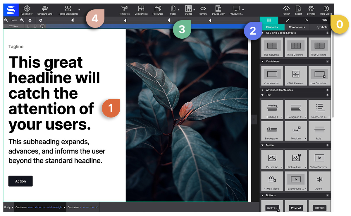
Meet the app interface
0 HELP!
Help will always be given at CoffeeCup to those who ask for it. You can visit our forums to ask questions or our five star support team. Also the Help Dialog in the Site Designer toolbar is only one click away :)
1 The Real-Time Canvas.
This is a browser-based working area. A major advantage of this is that what you are creating will look and feel the same as when the site is published on the web. The canvas is mainly used for the live design view, selecting or reordering elements, and editing texts.
2 The Control Panes.
On the right side of the app, there are 3 control panes, each with specific roles for visually managing the content, layout, styles, HTML, CSS and Javascript, and page properties.
3 Viewport Slider & Breakpoint Manager.
Above the canvas working area, you will see a bar aka 'Viewport Width Slider’. This bar contains a number of tools for managing the design at all possible device widths.
The breakpoints (also known as media queries) indicate changes in layout or content styles for a certain screen size. They are noted with a triangle along the top of the Viewport Width Slider. When they are active, meaning that styles will be applied to that viewport width, these triangles will be filled with another dark triangle inside.
The ones that are framework specific breakpoints are indicated by a color (blue, pink, and purple). The breakpoints you create will display as white. Add and delete custom breakpoints using the +/- at the left side of the width slider bar.
4 The Toolbar.
Access commonly used functions such as the Page Manager to add and delete pages, manage project Resources such as images, browse the Components Library, launch a Preview in a specific browser, Toggle Breakpoints, even Publish.
CSS Frameworks are used by millions of designers and developers to jump start project styles. Frameworks use well organized HTML, CSS and Javascript that is frequently maintained and updated. Furthermore, they allow for creating cool interactive components such as dropups, navigation menus, galleries and more without wrestling with extra scripts — sweet!
With Site Designer, you can kickoff your site projects from three epic framework choices: Foundation, Bootstrap, Materialize. You can also choose to go at without a base framework too.
When you first start the app, you'll be prompted to choose a template using the framework you want to build your project with. You can also save your preference for future site projects as well. All three frameworks use a mobile-first workflow, so you’ll design for small screens first and tweak your designs for wider screens later. The framework you choose for your project will be reflected in the top left corner of the app. This helps you identify which one you are working with quickly when jumping between multiple projects.
Which one should you choose? Below you can learn some key differences between them, but mostly it all boils down to your personal preference.
Foundation
Foundation offers minimal pre-set styles on elements with just 3 default breakpoints (layout sizes). With less pre-set styles to manage, it can be easier to apply your customizations.
Bootstrap has been king of the frameworks for a while and is loved by many for its highly styled element classes. These pre-set styles allow for rapid design with a consistent appearance. It also features a wider set of default breakpoints for more screen size variation.
Materialize, based on Google's Material Design, is opinionated about how UX elements should behave. Its impressive interactive components capabilities make it a rising star!
Not a fan of CSS Frameworks? Going frameworkless lets you tackle the design your way! It does not have any pre-sets — no fixed breakpoints, no predefined selectors, no default element styles. It is lightweight, yet totally responsive thanks to CSS Grid and Flexbox.
Choosing the frameworkless option also gives you the power to choose your default workflow. Decide to work or mobile-first or desktop-down. For the latter, build your pages wide, then move the width slider to the left to tweak the layout and styles for smaller screens. Or start in the middle and tweak your design for larger and wide screens.
Just a little note, to create interactive components with the frameworkless option you would have to connect your own scripts. Otherwise, you can use the built-in interactive scripts of Bootstrap, Foundation and Materialize to make framework specific drop-down menus, photo galleries, popups and more.
The Canvas
This area visualizes what the website visitor will experience when landing on the page. In combination with the Viewport Slider, every device width can be previewed while designing.
If you are interested to see how a specific part of the design behaves at different screen widths, select any element in that section. In normal browsers the content will flow out of view when resized, however, in Site Designer the selected content is auto-scrolled back into view. A small, but an extremely handy perk of the app!
Hovering over any element on the canvas will display the popup context menu in the top left of the item. Use this menu to select nested elements from the dropdown or access common actions such as edit text, duplicate, or delete the item.
On the canvas, elements can be selected by clicking on them or by selecting them from the context dropdown menu. A selected element can be dragged and dropped into a different position or nested inside a Container element. Selected elements can also be duplicated or copied and pasted into a different area.
Text Editor
Text elements (Headings, Paragraphs, Text Links) can be edited right on the screen when the Text Editor is active. It can be activated in a number of ways. Right-clicking a text element will open up a contextual menu with the option Text Edit.
You can also double click the text on screen to begin typing your words. Lastly, click the Aꕯ the icon at the top of the Styles pane, or when you hover over any text element.
When the Text Edit Mode is activated, the working control panels will be replaced with the inline design options with a blue banner indicator displaying at the top of the panel.
Several typography controls will display as well for making inline edit. It is important to note that these style options are not to be used for styling global properties. Use inline styles to make selected style options for individual words. For example, bold words within a paragraph, insert a link, change colors or fonts within a block of text, and more. Only use these style controls when you want to make a variation from your regular, default typography selections.
For example, bolding words in the middle of a sentence, or changing a color of a word would be styled inline with the text editor pane.
A Very Important Tip!
The style choices configured on the Text Editor panel are for inline editing only. Your global typography selections (like font type, color, size, spacing, etc) that you want throughout the entire project should always be configured on the Styles Pane > Design > Typography section.
It is a common mistake to accidentally apply global styles within the Text Editor pane. While it will work, it can cause difficulties for you in the future if you ever need to make global style changes. Plus it makes the backend markup kinda messy.
Be sure to exit out of the Text Edit/Inline Editor mode before you begin changing the appearance of the text.
Working With Text Video Demonstration
The Control Panes
On the right side of the UI, there are three panes each with a specific role in creating your responsive design. The icon is replaced by the pane name upon hover. Here’s an overview of each of the panes, details on each pane are provided in the next sections.
1. Content Pane
The pane on the far left is the Content pane. The Content pane is divided into three subpanels: Elements, Components, and Symbols. Here, you will add the content of your website by adding Elements, like paragraphs, headings and images, or by inserting pre-made Components, or Symbols which are globally synced content such as menus and footers.
Under Element, one single click on the element icon will add simple page elements such as lists, text links and picture links, but also complex prebuilt elements like form containers, buttons and videos to the canvas or to a container.
The second sub panel, Components, is the holding place for all the prebuilt components like navigations, cards, and modals that are included within the project. Anytime a component is downloaded from the Component Library it will appear in this section. If you want to save a feature as a component you would manage that from this panel as well.
The Symbols sub panel includes elements such as a logo, page header, or common items such as a menu or footer, that need to be kept in sync across all places and pages of the project. When a new page is added to your project, you will come to the Symbols panel to inject your synced features into the page.
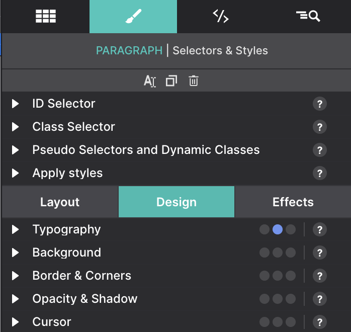
2. Styles Pane
Control Panes for managing and styling your project.
The second control pane, the Styles pane, is probably the most frequented. It is organized into two main parts. The top section is used to configure how and where to apply the styles for the element selected. For example, you can create your custom classes and IDs for the element. Also if you want to apply styles into a specific state like hover, active, focus, etc this is the place to do it.
The lower portion of the Styles pane is divided into three sections: Layout, Design, Effects. The Layout section is where you will find the tools for managing element position and spacing. Under the Design section, access tools for typography, colors, backgrounds, borders, shadows and more. The Effects panel is where you will find fancier action-based controls such as 3D effects, and filters and blend modes.
The Styles pane serves as the command center for applying all characteristics to elements and layout.
3. Element Pane
The third control panel is the Element pane. The top part of this panel gives a page-inspector view, a tree-like, overview of all elements on the page. It offers a fast way of selecting and reordering elements and, for example, toggling the visibility of hidden elements.
The middle section shows the Element Property fields, where you can configure the elements that require linking with a resource (such as pictures, videos, etc), or apply custom attributes for the framework.
The bottom part offers a preview of the CSS rules applied to the element selected.
Thetoptoolbar gives access to functions less relevant to the design workflow. There are buttons to reach the Page manager or manage project Resources such as images and additional files. Get quick access to the Template manager as well as pre-built components.Access more advanced controls such as activating Feature Queries and insert Structured Data. You can also use the toolbar functions to Preview the design on any installed browser, to Export and Publish the site.
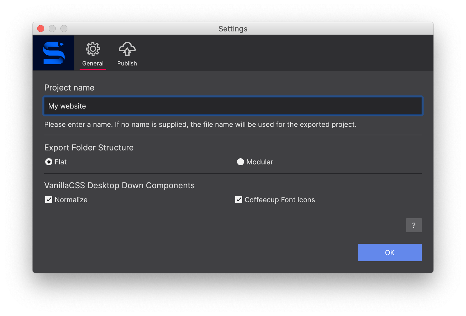
General Settings
The General Settings is where you can configure the project name and export folder structure.
Publish and Export
Control your content with two options to choose from for putting your site online; publish to the CoffeeCup S-Drive hosting or Export the files to your computer to host your site on any server.
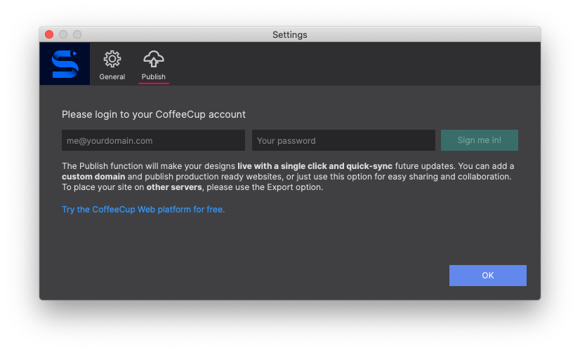
With Publish to S-Drive, the app does all the work for you by automatically uploading all files to your CoffeeCup Account. No muss, no fuss! To do so, click the Settings toolbar button and switch to the Publish section. Then enter your CoffeeCup account information.
When using the Export method, a folder will be generated that contains all of your website files. This gives you the freedom to upload your site to your own hosting service using any upload utility (you can check our nifty Free FTP utility). Click either the Export toolbar icon or go to the File menu > Export to begin the export process.
Site Designer creates crispy clean HTML and CSS markup, but don’t take our word for it. ;) Right click an element, or a container with a bunch of elements, and select view element in Codepen to inspect, study or experiment with the generated code. This is the “proof of the pudding” that we are serious about your web development freedom.
You are free to copy and paste this HTML and CSS into your existing website to add oodles of fresh content, all without writing one single line of code!
Simply right-click any element to activate the option to open in CodePen.
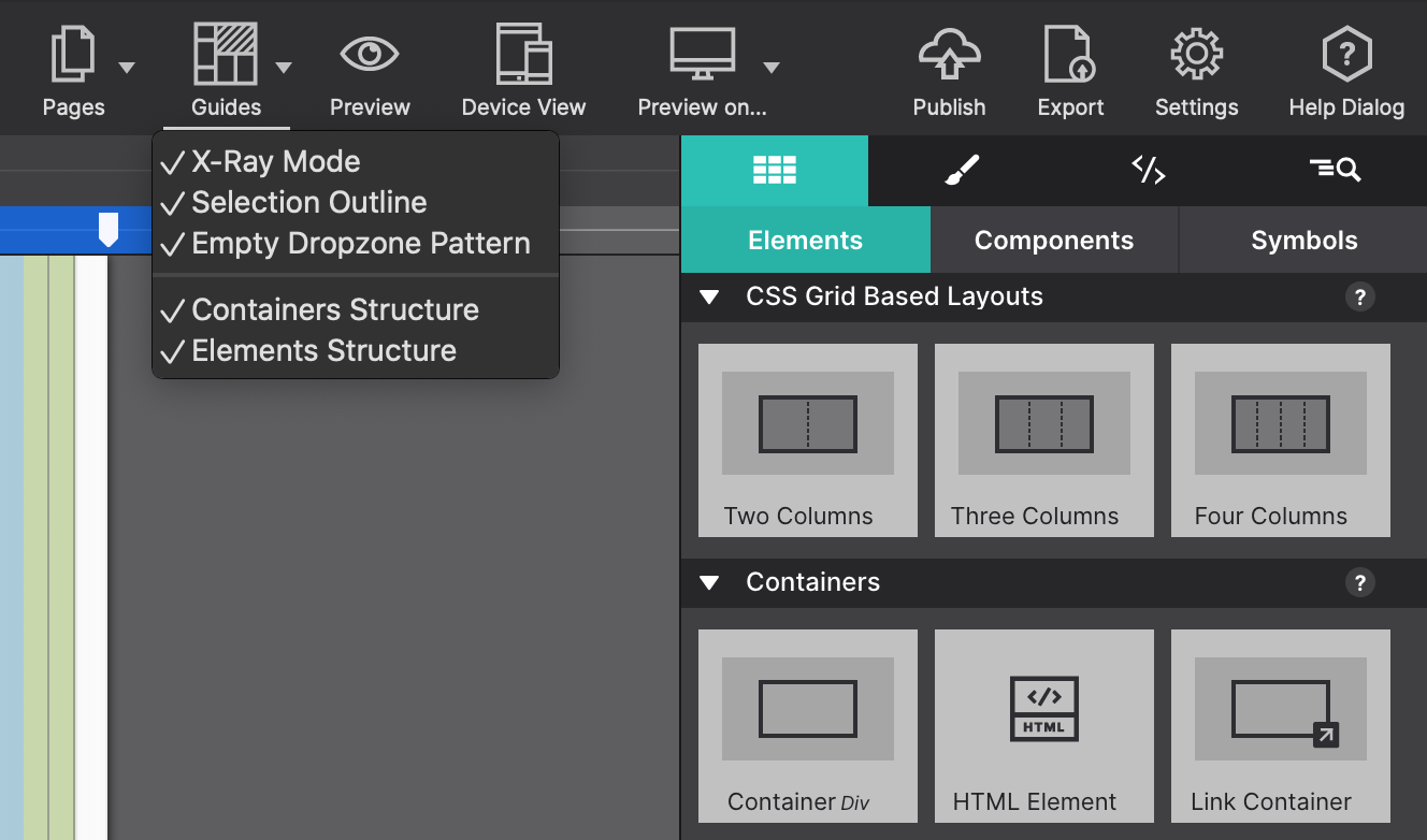
Guides
The Guides button allows you to visually toggle indicators around elements and the grid structure making it easy to know where elements are located and spaced.
Gridlines are lightly colored horizontal and vertical lines that appear around elements in your project. These guidelines are used to define the boundaries of elements and containers on the page.
X-Ray mode allows you to see at a glance how the elements containers are set up. When this is enabled, all grid options are turned on background images are removed and an opacity is set on all elements allowing you to see the grid configuration. You will also notice that things are color coded for easy recognition.
Template Manager
Access default templates or any imported designs from the template store. Use these templates to jump-start your website creation. Go to File > New From Template to launch the templates manager. Once you select your templates, just change the text and images to fit your needs, and your task is complete!
To build your website free of a pre-designed template, use one of the “blank” templates and start with a clean canvas.
If you have downloaded a template from the Template Shop, double click the .rsdtheme file and the template will automatically install within your Template Manager. You'll then be able to choose it from the template prompt.
Breakpoint mode can be used to define styles for a particular media query, independent of the slider position. By disabling all breakpoints styles are not tied to any media query.
This, for example, allows you to have more space in the working area while working on the default styles. If you are used to working desktop-down this feature can be extremely handy. Just be sure to re-enable them when you are ready to make adjustments for larger screens.
Device View
Use Device View to preview your creation across various types of screens. This helps you test how your content will display on specific devices and determine if tweaks are needed.
Popular devices are pre-loaded such as iPads, iPhones, Kindles, Galaxy phones and more. Modify your list to the devices of your choosing or enter custom Width and Height values.
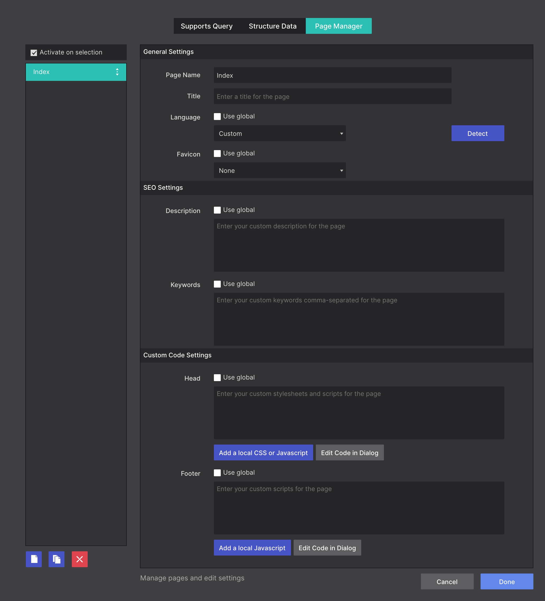
Pages & the Page Manager
Need to add a new page to the project? How about editing the page properties such as SEO details? Click on the Page Manager icon in the top toolbar. This will launch the page manager dialog box. This is the command center for all your page configurations.
Managing your project pages, changing page order, and adding meta data is easy from this section.
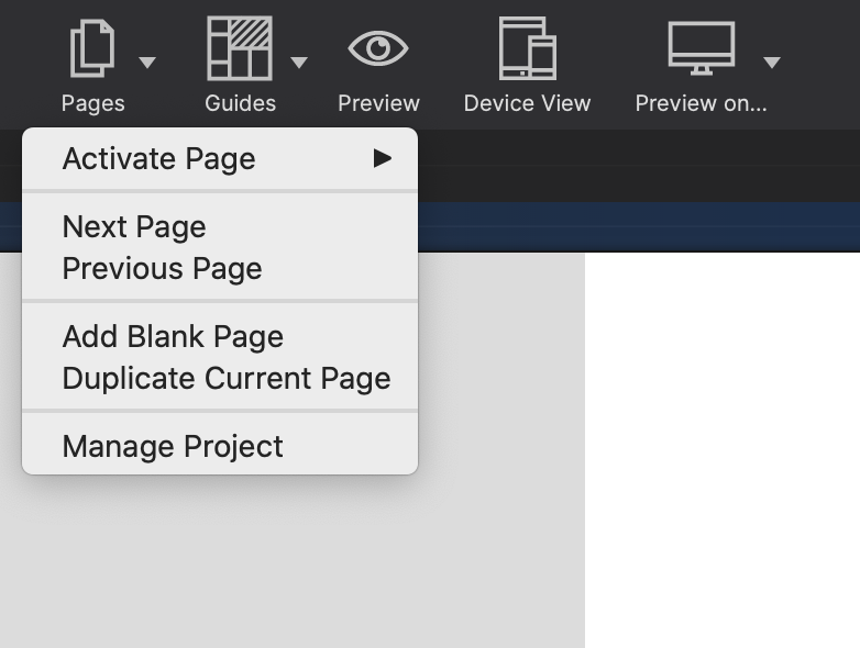
From the canvas, if you need to jump to a new page in your project or add new pages, use the Pages toolbar icon. You'll see a list of all the pages in the site project and can cycle among them.
From here you can quickly Add a Blank Page or Duplicate an existing page in the project.
Save time and create components with your designs or use the ones bundled with the app. You can add your prebuilt components to any new project allowing you to reuse them between projects.
Use them to build navigation menus, accordions, cool tab panels, modal dialogs, drop ups, and much, much more without having to mess with external scripts. Click on the Components toolbar icon to browse the growing library of premade site features to inject them into your project.
Add Components from your library using the Components toolbar icon.
Jump to the chapter detailing everything you’ll need to know about working with Components.
The Resources toolbar icon launches your file management window. The Resource Dialog is an vital part of your website design workflow. It contains and organizes all your files, images, documents, and connected scripts.
Access quick methods for creating HTML, CSS, and JS files. Quickly generate Picture or Picture Link elements in a single click. You will also be able to view extra resource insight such as file type, size, and full file name in the handy info region.
Along the side panel is where you may organize your resources into folder. Use the + arrow located in the bottom left to create folders. For example, organize your images, documents, and scripts into appropriate corresponding folder names. When the site is published or is exported, the file structure will remain intact.
Folders and files within your resources may also be dragged and dropped to be moved within other folders.
You can also edit any custom css or javascript files in the resources directly in the app using the Edit Code dialog.
At the top of the Resource Dialog you will find drop down controls for filtering and sorting content. This allows you to quickly locate a specific file, or inspect your resource to determine if optimization is needed.
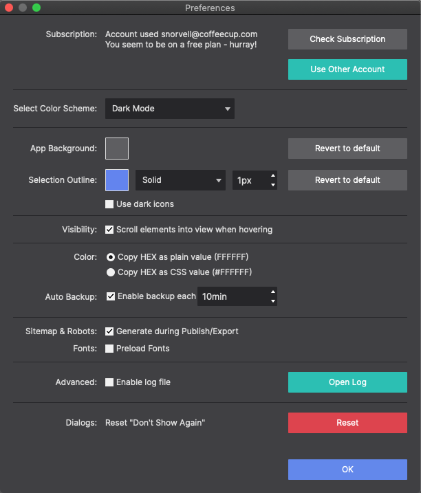
Nestled within the Preferences file menu toolbar are some handy features. These include powerful options for generating Sitemap and Robots files for your projects.
For Windows user hit Command+ to launch the preferences dialog. MacOS users can hit Command, to open the window. The first option in the dialog is your license settings. Here you can check if you have an active license.
If you like working with a different color background for your canvas, click the App Background color box to pick your favorite. You can even choose your app's Color Scheme with both Dark Mode and Light Mode options.
Selection Outline determines how you would like the grid lines to appear. Choose your preferred color, line style, and line thickness.
Any choice may be reset to the default if you ever change your mind.
Additional options include selecting your element Visibility. Meaning you want elements to come into view when hovering over them.
Choose your preferred color code type: HEX as plain value or HEX as CSS value.
Auto Backup is handy so that the software continues to grab a backup for you while you are cruising along with your design process.
The Enable log file is helpful to enable as it logs any issues the software may encounter. If you ever run into trouble, our developers can take a peek at the log and see what may be cauing any wackiness.
When using the app for the first time you are presented with helpful Dialog tips. These tips guide you to areas of more explanation in case you need it. These tips only appear once. If you want to reset them so they appear once more, you would set that here.
Finally, you can choose to let Site Designer build a Sitemap and Robots files based on your entire project. A sitemap is a blueprint of your website that help search engines find, crawl and index all of your website's content. It give Google important information such, when the page was last updated and any alternate language versions of the page.
Since the app doesn't know your final website destination you will need to slightly tweak the exported file. After export you will need to open the Sitemap file with a text editor or note pad. You'll notice the links are listed as: REPLACE_WITH_YOUR_SERVER_PATH/styles-pane-design.html
You will need to edit the file path to include your website address, for example that link above would be changed to reflect the final website address:


