Learn how to create something special from scratch by using our powerful tools.
Understanding the CSS Selectors
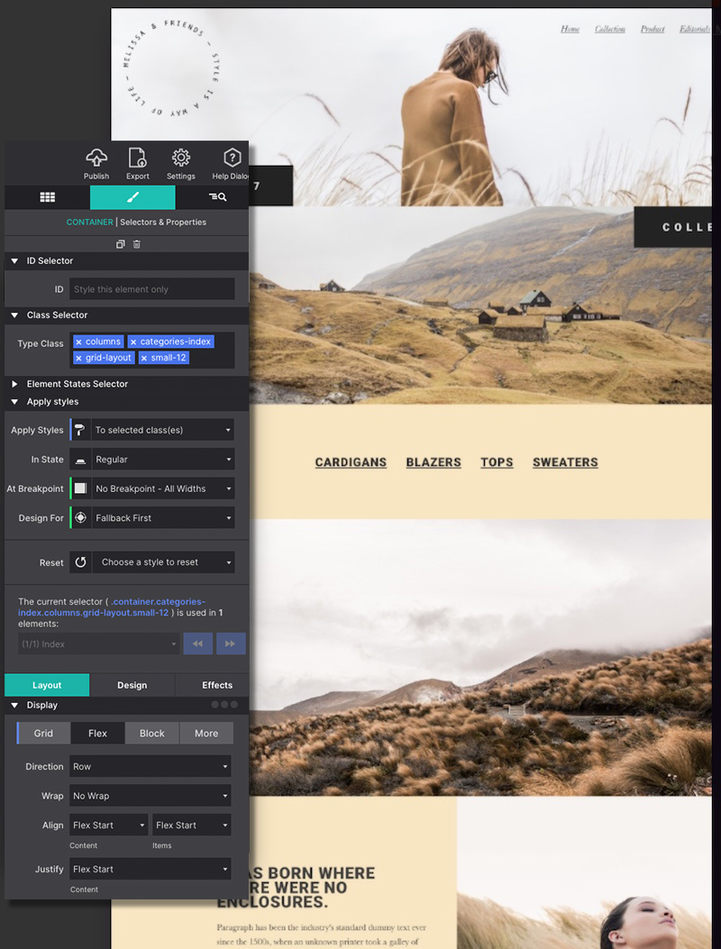
The ability to add CSS selectors — Type, Classes and ID — to an element is an important tool to utilize. These are configured in the Styles pane at the top.
A selector ‘binds’ an element or group of elements to design rules defined in the Styles pane. Style definitions are related to selectors and the top part of the style section is used to manage exactly that.
Enter default styles to the Type.
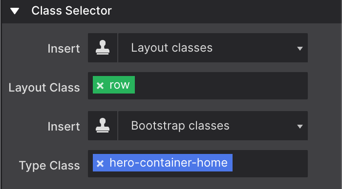
Use a Class name so that common items share the same styles.
Give a unique ID name for an individual element with a one-time unique variation.
Tip: Why using selectors?
Using Selectors speeds up your design time, saving you from re-entering the same style choices multiple times. Apply selections to a Type or Class name to keep common styles in-sync.
Predefined, framework-specific Classes can also be selected from a drop down. There is no requirement to use these predefined classes, but they come handy, especially when creating interactive components such as accordions and navigations.
In addition, the design rules associated with a predefined class can be fully customized using the CSS tools in the Style section.
For those that have been working with CSS selectors before, the workflow will feel intuitive and powerful. It will still help to give this section a quick read and, for example, familiarize yourself with the colorcodingsystem for the different selector types.
If you never heard about or worked with selectors before, no worries. Our responsive apps can also automatically create selectors. However, to get the most out of our apps — to speed up the design workflow and make it easy to maintain any projects — we do recommend to slowly start accustoming yourself with the app's selector system and predefined framework classes. This section will serve as your guide.
A selector defines — ’selects’ — the elements to which a set of CSS rules applies. This is incredibly powerful because it makes it fast and easy to give multiple elements the same appearance. Or to apply the design rules to a newly added element without having to redefine all these rules.
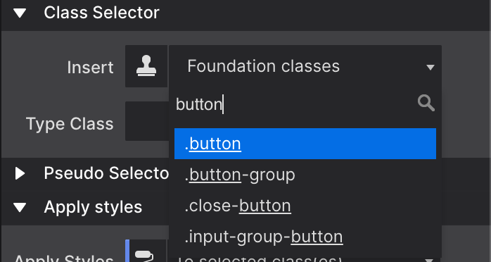
If you are using one of the frameworks (Foundation, Bootstrap or Materialize), the Insert Framework classes can be used to search and add framework-specific classes for which the design rules have been pre-specified.
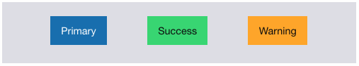
Let’s quickly go over an example using the class selector. For example, in Foundation a button is created by adding the class button to an element. The class (name) is the carrier of a set of styles such centered text, padding around the text and so on, that this way gets applied to the element.
Other styles can be added by extending the rules set for the same class, or by adding another class with new rules. Foundation uses the second approach — by defining all base button styles on the button class and applying additional rules through new classes, contextual variations are created.
In the example below all three button elements use the button class. By default, these buttons appear blue. Then the green button is created through the success class. The orange button uses warning.
The additional class names create the contextual background color. Now you can make changes to all buttons by working with the button class, to all success buttons using the success class and so.
If you prefer a different type of base button set in your project, for example buttons that are the same width and have rounded corners, simply define these styles (in the style section that we will look at in a bit) on the button class and all buttons will take on that appearance.
Please note that you can add one more class — like button-custom —to make these changes. If you do it to the button class itself it would also have affected any other button in the project.
With this explanation and example under our belt, we should be ready for some more selector goodness. We will do that when discussing the style section next.
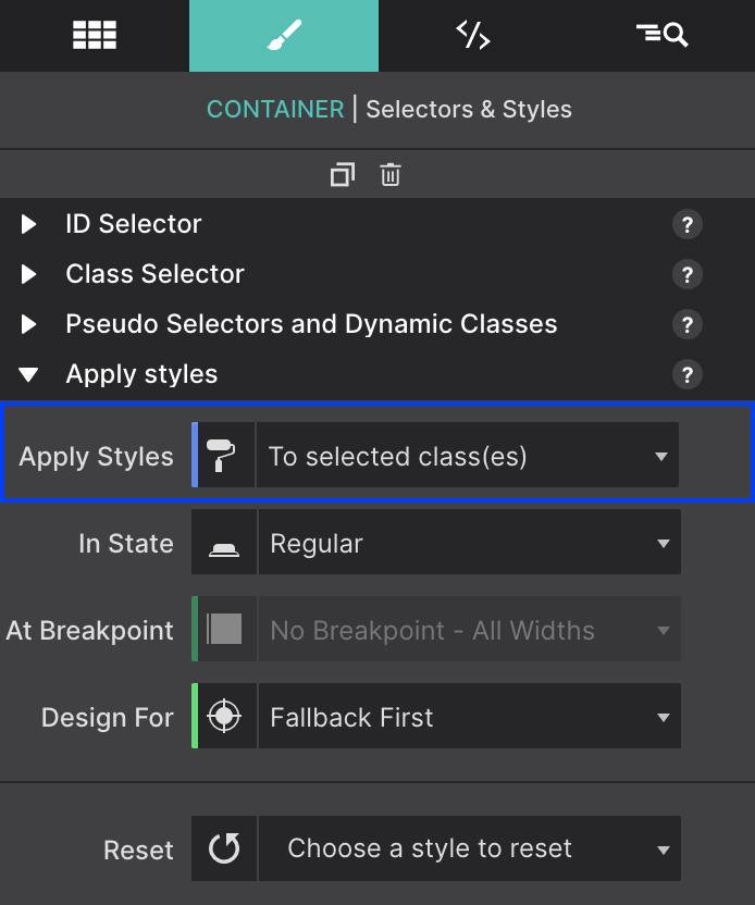
Apply Styles Section
As explained above, style definitions are related to selectors and the top part of the style section is used to manage exactly that.
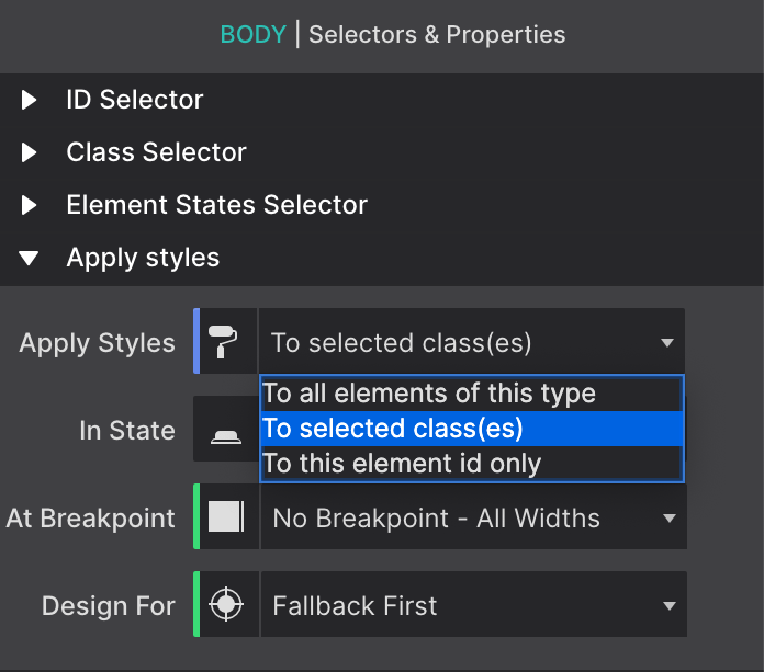
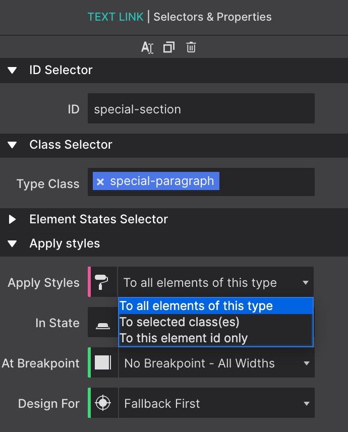
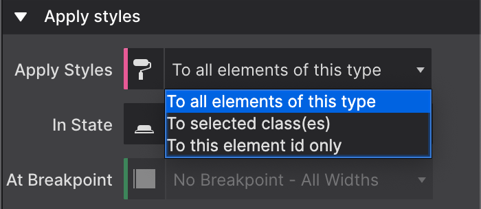
The Apply Styles dropdown is used to select the type of selector the style rules will be associated with. The choices are between Element Type, Class and ID.
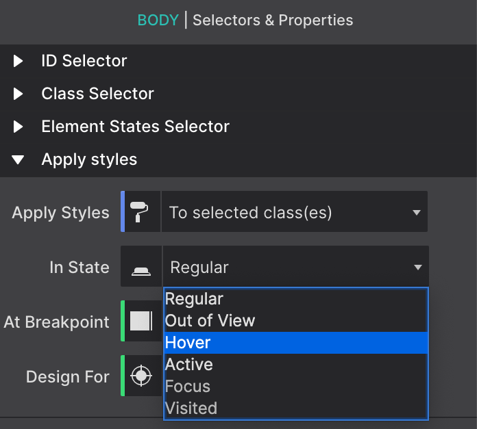
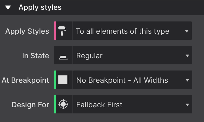
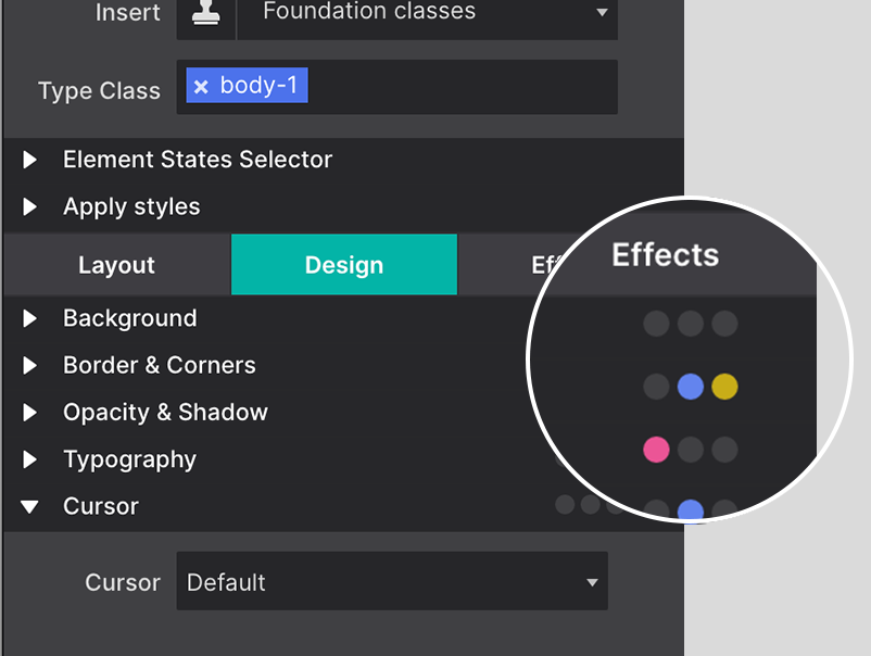
The In State dropdown can be used to specify a special state of the element targeted by a selector. For example :hover will apply a style when the user hovers over the element associated with the selector. You can also set Out of View effects using the State dropdown. You can learn more about Out of View in the sections below.
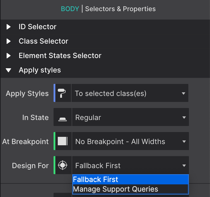
The Design For... control allows you to pick which Feature Query, such as Fallback First or Display Grid, that you want the styles to be associated with.
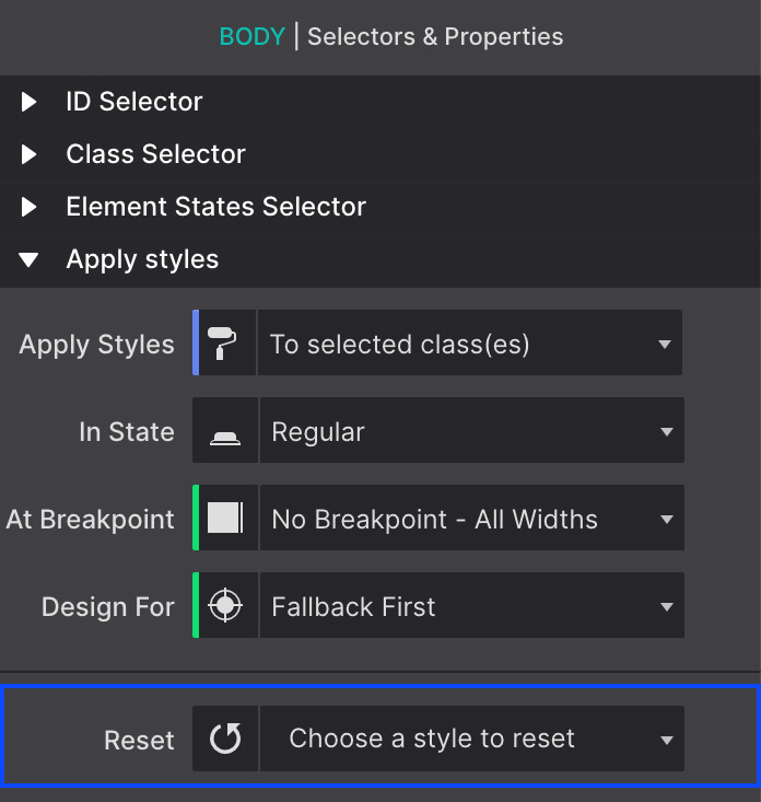
The Reset function helps to keep the project code lean and clean. If you have tried out styles or placement options but decide to not use them, you'll want to remove the choices from the exported CSS stylesheet. This will improve your workflow and the overall performance of your website.
The Reset drop down will provide you with an overview of the styles that have been applied to the current selector. Use the search box at the top to locate the style you want to remove or scroll down the list. Styles can be removed by clicking on them.
The Reset control will give you the option to reset styles individually at breakpoints or at all sizes. Read more about this topic or watch the video tutorial below.
Applying Styles to a Selector
The selector options in the Apply Styles dropdown start with the broadest selection of elements, followed by a subset, and ends with the selection of a single element:
1 The Type selector is used to define styles for all elements of the same type.
2. When styles are associated with a Class selector, all elements (of the same type) that have that class will share them.
3. Each ID is unique, the style definitions will only apply to the single element currently selected.
The most efficient workflow is to first define styles for element Types. This way a common ‘starting style' for all elements of that type can be defined. Basically, your default choices. If you want all your headers to be a certain color, or your paragraphs to all be the same font-type. Applying the styles to the Types means you only have to select it once, and every time you add a new header or paragraph, the styles you originally chose will display.
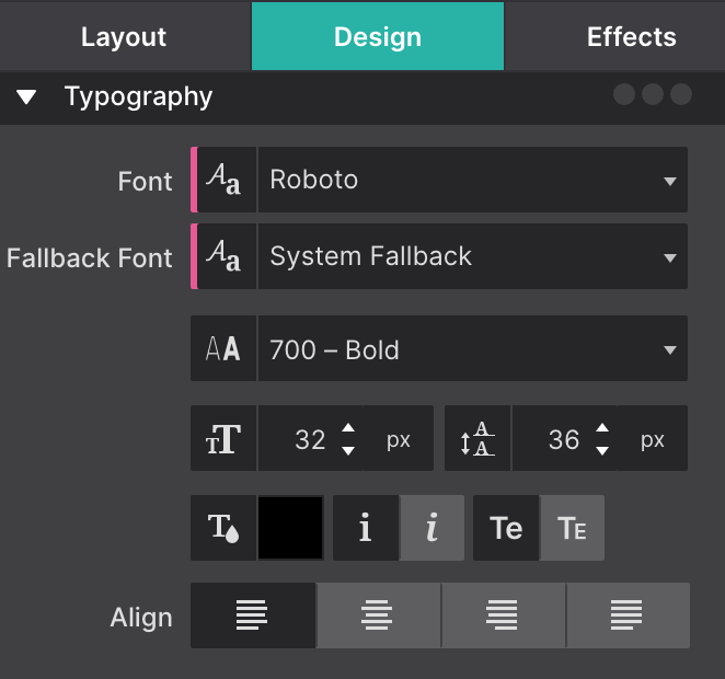
For example, when Type is selected in the dropdown, further down on the pane in the Typography section Roboto can be set as the default font-family for all paragraphs.
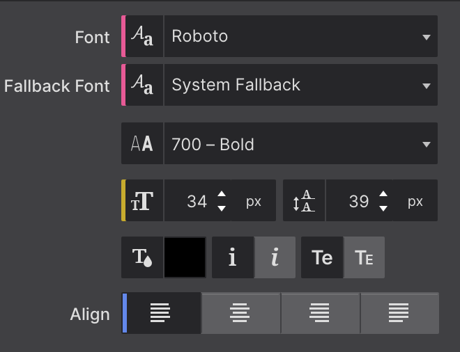
As can be seen from the image, styles applied to the Type have a pink indicator.
This way the font-familiy and font-size for all paragraphs can be updated with one single edit. Also, whenever a new paragraph is added, these styles will already be present.
The proper use of selectors can speed up the design process and simplify the maintenance of a site.
The most efficient workflow is to first define all default styles for element Types. Choose the Type selector from the Apply Styles dropdown before using the design controls further below. Styles applied to the type have a pink indicator.
In the example above, the header has the font-family specified for the type, but uses a class to add a top border and make the font italic. Classes can be added to create design variations. The variations are related to a different usage of the element in the design.
The image above shows that the font family for the paragraph from step 1 is specified in pink for the Type. The same is true for the color and line-height.
The yellow indicator shows that the font-size is specified for that specific element only — on the (unique) ID. The blue line tells that the Align setting is applied for the Class name.
Working with Classes
With all default styles for the elements in place, Classes can be added to create design variations. For example, certain paragraphs that perform a different role can be given a different font family, size and/or color using a class selector.
To apply styles to a Class simply enter a class name in the Type Class box (in the Styles pane at top). Also make sure to select Class in the Apply Styles dropdown. Now all style adjustments with the design controls below —yes, we will get to work with them real soon! — will be tied to that class.
Any control used for applying a style to a class uses a blue indicator, like the font color thumbnail of the image in the previous section.
So what happens when different styles are assigned to different selectors? Some selectors are more powerful than others, their styles will prevail. In CSS this is called specificity, the styles from a more specific selector will take precedence over styles from less specific selectors.
A Class selector is more specific than a style applied to a Type and will therefore prevail. On its turn, an ID is more specific than a class and will prevail. Styles applied to an ID have an orange indicator.
When an element has an ID applied to it, the object can be targeted within a link. This way the link will take the view directly to that section. Simply add #ID-Name at the end of your link address.
Styles attached to a class selector are intended to be used by multiple elements. To add the class to another element simply type the class name in the Class input box. The image below shows that the auto-complete can be a great help!
An element can be targeted by up to 5 different classes. Styles can be applied to a specific class selector by deselecting other classes. Deselected classes are gray (see ’step-p' above), any style updates will not apply to them, only to the class or class combination currently selected.
Styles can also be applied to class combinations. They are more specific than a single class and therefore these styles will take precedence.
The Insert Framework Classes dropdown can be used to search and add classes for which the design rules have been pre-specified in the Foundation, Bootstrap, and Materialize framework.
One of the criticisms on (the use of) front-end frameworks is that it leads to sameness — many sites created with for example the Bootstrap framework look and feel the same and lack authenticity. Too many things have been predefined in too much detail.
In comparison, Foundation is less ‘opinionated’. With fewer framework styles to override and having a more neutral canvas to start with, designs are more unique. There is something to say about both approaches and depending on the situation a specific approach or framework might be better suited.
In addition, new custom classes can be added that bring their own style rules to the table — creating some unique is totally up to the designer!
Adding predefined Foundation classes
As we saw earlier with the button examples, Foundation has done a great job in modularizing the styles. These modular classes are designed to be used depending on the role and context of an element.
Using the modular class structure can be a great help in the initial phases of the project and help to think about the role of the content element. Updating the appearance by editing the styles associated with the classes, or adding new classes with different style rules is a cinch.
The Insert Framework Classes dropdown facilitates the use of the framework classes and prevents typos. Simply start typing what you are looking for and the list will show an increasingly precise list of matching classes.
Importing a project from an older app that used Rows and Columns? If so, you'll notice special Layout Classes and unknown Type Class names inserted into the project. These classes are the associated CSS styles that had been applied to Rows and Columns in previous versions of the app.
Site Designer now prefers to use CSS Grid for layout instead of rows and columns (meaning all content is now placed into Container elements). When importing previous projects, to preserve styles applied to rows and columns, these new class names were applied. You'll notice that these class names generally have the term row or col to indicate what type of layout feature was converted.
Elements that were originally within a Row and Column will automatically be converted into a Container.
You may delete these class names, we actually recommend cleaning up the project structure. Just be aware that when removed, you will need to re-apply any styles that were associated with the class.
We wrote up a helpful step-by-step tutorial to help you understand how to delete these class names and convert the content structure for CSS Grid.
The In State dropdown allows you to set specific styles for regular view, upon hover, when an item is active, as well as styles for how an item displays when it comes into-view (otherwise known as Out of View state).
By default, Regular state is always selected. Pre-loaded States include Hover, Active, Out of View, Focus, and Visited. You can add additional State Selectors using the drop-down menu under the Pseudo Selectors and Dynamic Classes section.
The In State control is extremely popular for creating a Hover effect. For example, if you want buttons to change color when someone hovers over it, select your button and change the state to Hover. Then apply the styles that you want to take effect for that state. In State styles can be applied to any element.
In a world where everything is competing for attention, adding that extra bit of life to the design increasingly makes the difference. Animations and transitions applied to the Out of View state can be used to spark interest, help the visitor focus on a specific area, increase usability or simply help to capture the attention just long enough.
Demo: Animated Icons
There are endless possibilities with the In State feature. Here are some examples to give you a bit of inspiration.
This example uses the Out Of View State control. This lets you style how you want the element to apear by default, then set a regular style for the when they come into view. This demo uses a subtle animation where the icons slowly animate into place when the page loads, or when the icons are scrolled into view.
Creative Design
Lorem ipsum dolor sit amet, consectetur adipiscing elit. Quisque nibh risus, sagittis nec suscipit nec, mollis laoreet eros. Donec faucibus, libero id faucibus scelerisque, justo justo nullam sodales.
Technical Support
Lorem ipsum dolor sit amet, consectetur adipiscing elit. Quisque nibh risus, sagittis nec suscipit nec, mollis laoreet eros. Donec faucibus, libero id faucibus scelerisque, justo justo nullam sodales.
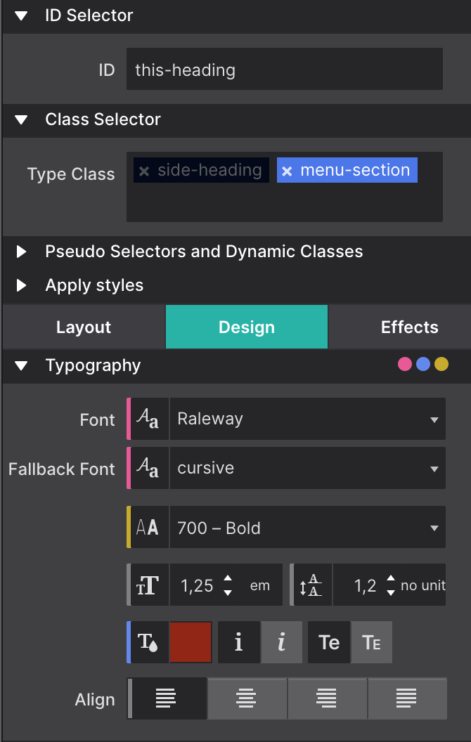
Color Coding Recap
We already saw that pink is associated with style definitions for an element type and that a blue indicator tells us the style was set on a class. An orange indicator would correspond with a style coming from an ID.
Workflow indicators are located throughout the Style pane to help you identify which controls have CSS selectors applied to them.
The main three selectors (Type, Class, and ID) covers most of the situations, but there are a few additional cases we need to iron out. First of all, we learned that classes can be deselected so style can be assigned to specific individual classes or class combinations. When a style applies to such a deselected class (or class combination), the style control has a gray indicator.
Selector color coding
In the image, the class side-heading is deselected. On the Typography section the indicators for the font-size, line-height and text-align controls are gray. This means that these styles belong to the side-heading class.
Here’s one more situation where the color coding can come in really handy. When styles are applied to multiple selectors, e.g. a class and an ID, the style controls show the values of the styles associated with the selector type we are currently working with. This is the selector — Type, Class or ID — visible in the State dropdown. This sounds more complicated than it is really, a quick example will make that clear.
In the image the font-weight control shows a value of 400 - normal with an orange indicator. However, the Apply To dropdown shows we are currently working with class selectors. That means that the visible value — 400 - normal — belongs to a class. The orange indicator however tells us that a font-weight value has been specified for the ID as well. To view this value simply switch the Apply To dropdown to ID and the value associated with the ID will show up in the control.
The indicator will take the color of the strongest selector, because that is the style value that in the end will be visible in the browser. So in our case, if a different font-weight has been set for the ID that is what will show on the canvas.
Selectors and selector specificity in CSS can take a little to get used to, but with this color coding system you will be an expert before you know it!