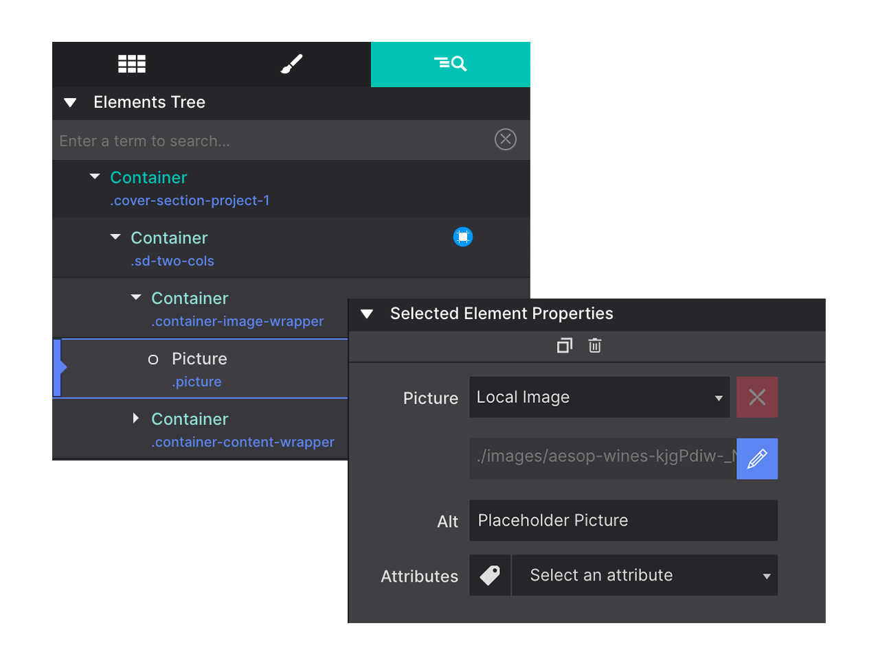
The Element Pane
In this pane you can configure special properties of elements such as image or link sources and add attributes to the selected element. Also, you can handcode your custom scripts and styles on a per element basis.
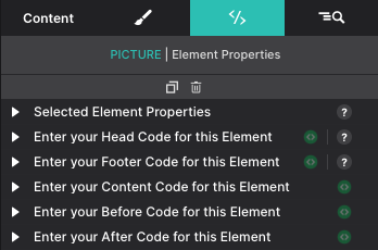
In this pane you can configure special properties of elements such as image or link sources and add attributes to the selected element. Also, you can handcode your custom scripts and styles on a per element basis.
Customize your CSS, JS (javascript) and various other properties and configurations on a per element basis here. You can apply the source for Link, Picture and Video elements, and insert custom markup into the HTML elements. Also, use the element properties to connect your social media buttons to your accounts or configure interactive elements.
Framework specific attributes can also be assigned to elements from this control panel.
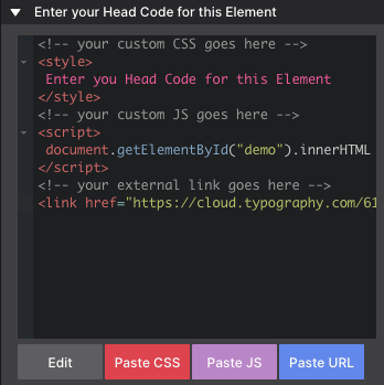
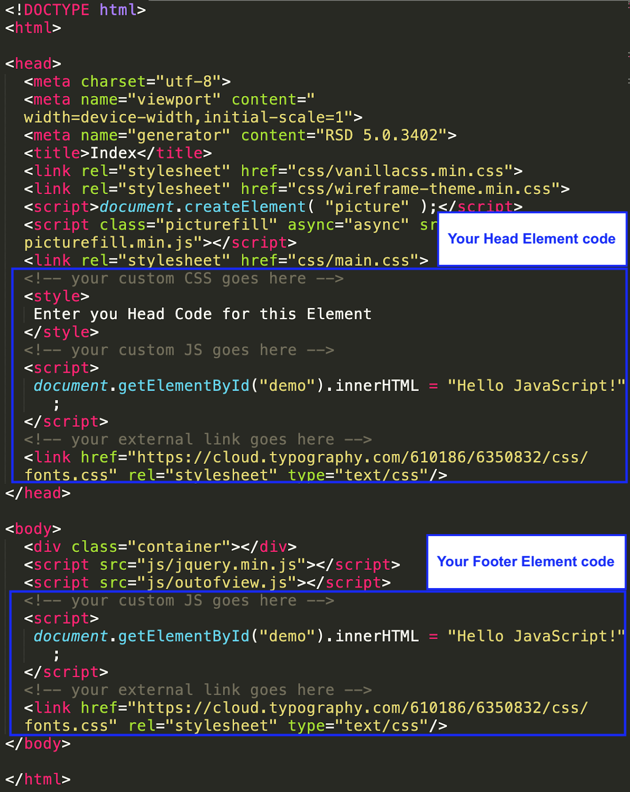
The beauty of this newly added power feature is the ability to organize your custom CSS or JS (javascript) on a per element or container basis. Upon export, Site Designer will include this custom code in the <head> section of your HTML file. Of course, you may also include a link to an external stylesheet or javascript.
The CSS code entered here (paste CSS) must be used with the <style> tags.
The JS code entered here (paste JS) must be used with the <script> tag
If you would like to include an external file (paste URL) like a style sheet, make sure you include the HTML <link href> tag and attribute with the url. For Javascripts remember to use <script src> one.
Using the coloured Paste buttons provided will automatically include the correct tags around the contents of your clipboard.
For performance reasons, we recommend to place javascript in the footer section of their html document, right before the </body> tag. This is helpful also if they need to modify the DOM, as this will be ready to be used before the script is executed.
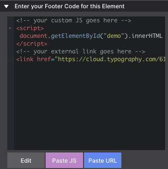
Another reason for placing javascript in the footer is that javascript execution blocks the rendering of the page. This means that the visitor of your site will need to wait for the script, before he is able to see any content. Therefore, putting it at the very end of the document, the visitor can start reading the content of the page sooner.
Upon export of your Site Designer project file, your HTML file will look like this:
Enter your content code for this element to unlock its customized settings and features. This code allows you to easily apply pre-set designs or content configurations to enhance your project. For example, this code entry section displays the server errors.
Enter your Before code for this element to add content or styling that appears just before the element in your layout. This allows you to customize the look or function of your page by inserting code that enhances user interaction or design flow. For example, this code dialog displays PHP server errors.
Enter your After code for this element to include content or styling that appears immediately after the element in your layout. This feature enables you to enhance the user experience by adding additional information, design elements, or functionality seamlessly. For example, if using custom PHP you can have this display the date and time.
Using the custom coding capabilities on the Element makes it easy to inject your own scripts or borrow from other sources. Codepen.io offers a wealth of unique scripts for adding complex features to your design. In our demonstration below, we will borrow a cool animation and show you how to copy that custom script into Site Designer in just a few clicks.
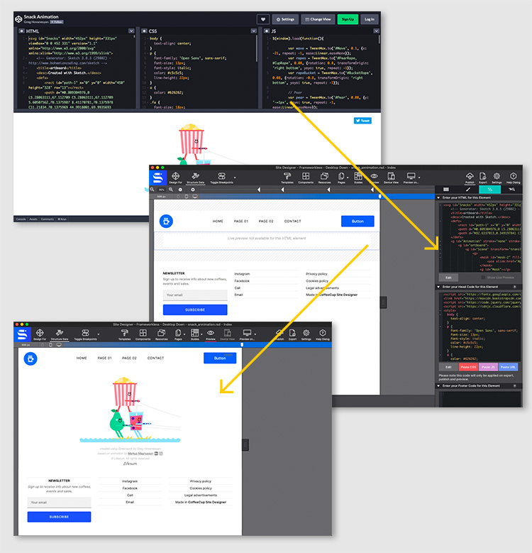
To copy this feature into Site Designer you would do the following:
1. First, add an HTML Element to the canvas and go to the Element pane.
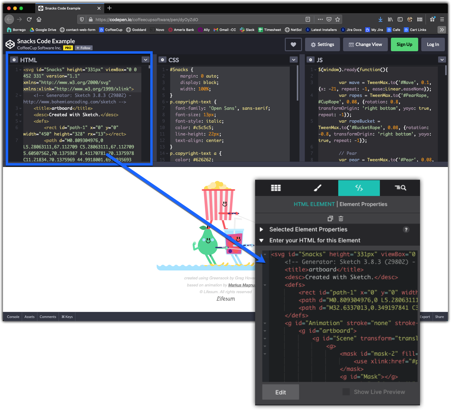
2. From Codepen copy the HTML from the window and paste it into the Element pane > HTML for this Element box.
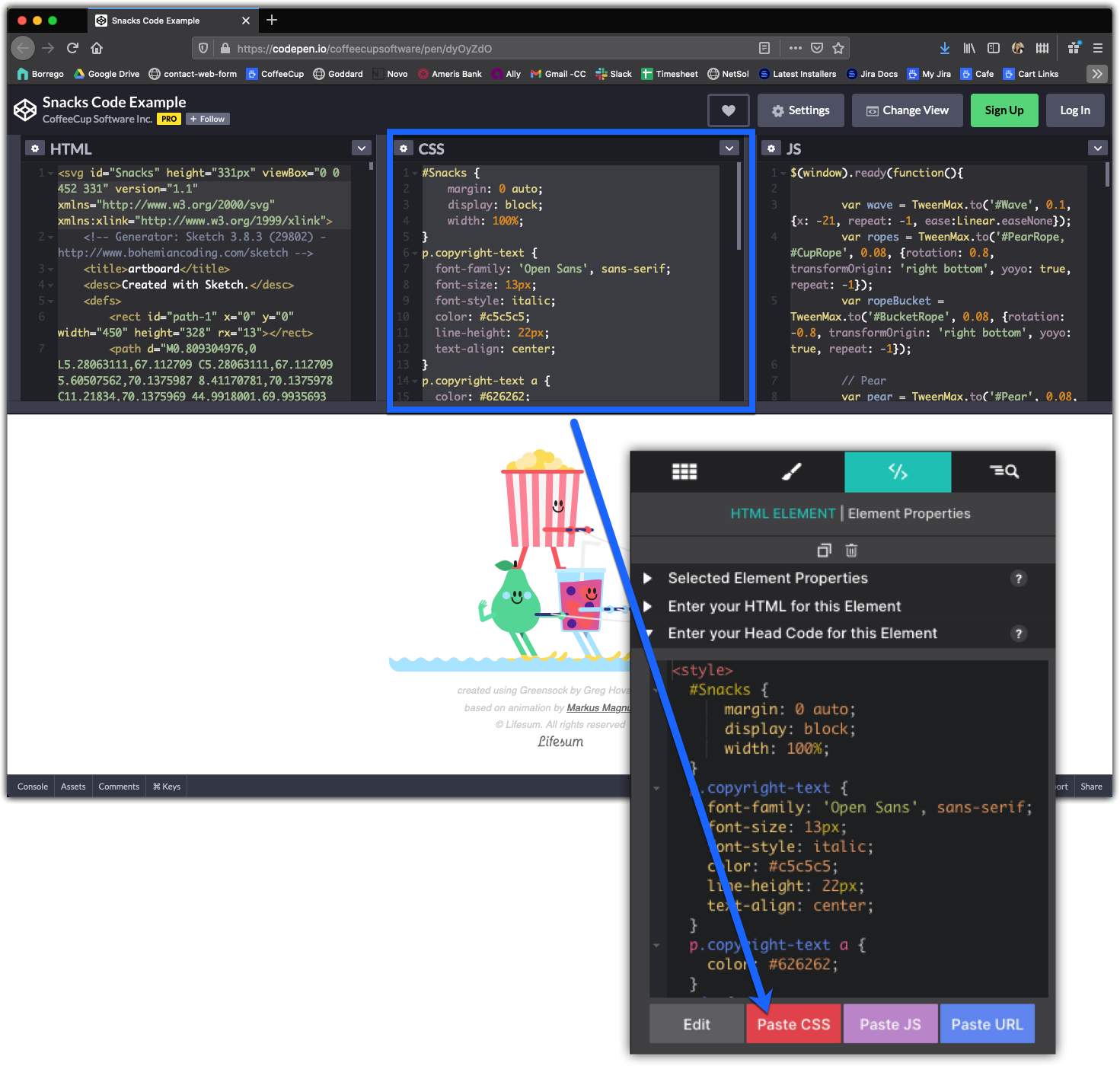
3. From Codepen copy the CSS from the window and paste it into the Element pane > Head Code for this Element box using the Paste CSS button.
4. From Codepen click on Settings > JS to grab the TweenMax.min.js resource file only and paste it into the Element pane > Footer Code for this Element box as an link using the Paste URL button.
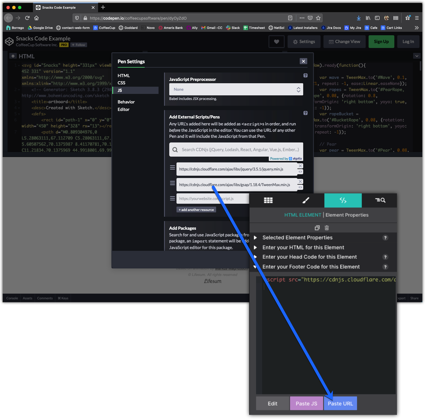
5. From Codepen copy JS from the window and paste it into the Element pane > Footer Code for this Element box using the Paste JS button.
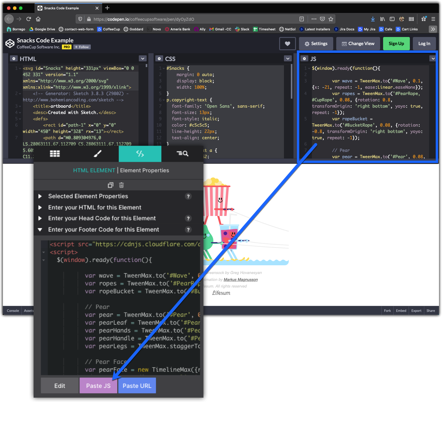
6. Hit Preview to wave hello to the fancy, custom animation.
The data attributes play an important part in adding interactivity to a design. See them as ‘hooks’ that tie an element to Javascript and clarifying can be used to as and to specify additional information about the element.
Interactive elements add a touch of professionalism and a dash of fun to any website (who doesn’t like a nav menu that transforms into a hamburger icon on small devices?). But these types of features require communication with JavaScript, which means building sites without this app you’d have to mess with pulling those codes in yourself. This hard work is eliminated for you using the Foundation, Materialize and Bootstrap CSS frameworks as the JavaScripts are built right into the framework and can be pulled in by using Attributes.
Depending on which framework you are using, there are many different options to build using attributes. You will also find Aria attributes within this section allowing you to set Aria based roles for elements in your design.
The attribute name can vary depending on the framework you are using. Foundation, Materialize and Bootstrap offer some great documentation (links below) on the creation of components with the right combo of classes & attributes.
Let's now see some guides and tutorials on how to create this interactive elements using the Attributes control.
Using Foundation, learn how to create a multi-level responsive navigation menu. The menu transforms into a mobile menu icon that triggers the menu for small screens.
The full breakdown for this video, including screenshots and class names can be found in this knowledge base article.
In the video demonstration, the webpage is built with Foundation. So the Class names and Attributes are assigned by that framework. The goal is for a button to show a hidden section of the page.
The Button will be the Toggle, and the pricing Container is the Toggler.
1. The Data Toggle attribute is applied to the trigger element (in this case the button) on the Element pane. The attribute value Price. This value is the ID name of the content that is being called to appear.
2. Next, select the element or the group you want triggered to show/hide when the button is clicked. In the video, the parent container holding the pricing info is selected. On the Styles pane, the ID name Price is applied to that it matches the value entered to the Data Toggle.
3. The triggered element is given the Class Name is-hidden
4. On the Element pane, the triggered element is given the attribute Data Toggler with the value is-hidden.
In the video demonstration, the webpage is built with Bootstrap. So the Class names and Attributes are assigned by that framework. Using Bootstrap's names, we are going to make a button trigger a full screen video modal to pop over the webpage.
The Button will be the Toggle, and the Container with Video Element is the Targ
1. A Container element with a Video Platform element are added to the design. The Container element is assigned a unique ID name (in this example the ID is video-demo) so that it can be targeted to display by the button.
2. Next, The Container element is assigned the Class name modal. This causes the container with its children content to disappear.
3. The Button will be the item to trigger the display action. From the Element pane > Properties > Attributes the attribute Data Toggle with a value Modal.
4. A second attribute is also added to the button, Data Target with a value #video-demo. The value must match the ID name you have set on your modal.
In the video tutorial, learn how to build a picture carousel - slideshow - using the Bootstrap framework. While this tutorial uses the Picture element within the carousel, it would work for any design such as applying the image to the background of the Containers and layering text on top.
The basic structure is made up of two Container elements. One will serve as the main carousel wrapper, the second designated as the inner-wrapper. Nested inside the second Container will hold the desired content. In this example, the inner wrapper will hold three additional containers, each the parent of the individual images for the slideshow.
1. The first parent Container element is added to the canvas. On the Styles pane the ID name is associated with the slider. In the example, the ID carousel-example is given. Next the Class names carousel and slide are applied.
The data attribute data-ride with value carousel is applied on the Element Pane.
2. Next, a second Container element is nested inside the first Container by dragging and dropping it onto the canvas. You can also use the Element pane to move the second container into the first. The Class name carousel-inner is assigned.
3. With the base structure of the slider in place, the children Containers can be added. These will serve as the gallery slides. In this example we have three slides. So three Container elements are nested into the carousel-inner Container.
Each of the three slide containers will get assigned the Class name carousel-item. The slide you want to designate as the first will get a second class name active.
Use the eye icon on the Element pane to show/hide any element that may be hidden on the screen such as the additional slides in the gallery. The eye icon allows you to style the otherwise hidden slide.
4. Within each carousel-item Container will hold a Picture element. The Picture elements will all have the same two class names: d-block and w-100.
Style the Picture elements how you would like them to appear. The image resource is assigned on the Element Pane. The layout is also tweaked, making the images have a Max-Width: None.
5. Add two Button Link elements to the parent Container (carousel).
6. The left-side button is given the class name carousel-control-prev. This button also get three Attributes: role=button data-slide=prev and aria-hidden=true
7. The right-side button is given the class name carousel-control-next. This button also get three Attributes: role=button data-slide=next and aria-hidden=true
8. Finally, both buttons need to be linked to the parent Container's ID name. In this case, the ID #carousel-example is entered on the Element pane in the HREF box.