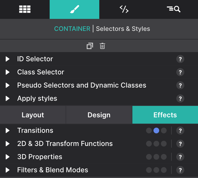
The Styles Pane – Effects
The effects sections consist of a number of controls that can add a nice touch to the initial appearance of a design. The controls also work great in combination with the hover and out of view states.
The effects sections consist of a number of controls that can add a nice touch to the initial appearance of a design. The controls also work great in combination with the hover and out of view states.
CSS transitions allow you to change property values smoothly, over a given duration and after some delay, rather than having them occur immediately. For example, this is handy when you mouse over an element and you want to change its color gradually.
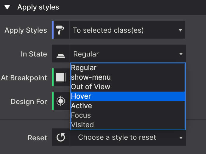
Let’s create a quick example of a mouse over effect on a Text Link. We will make the color change and grow the link font size a bit. First, select the Text Link element on the canvas. Then let’s set the “In State” control to “Hover” using the Styles pane > Apply Styles > In State dropdown. This way we will apply the styles that will display for the user when they mouse over the link.
We will change its font color to dark blue under the Styles pane > Design > Typography > Color, and also, we will increase the Font Size to 44px. Now, if you preview, you will see how the changes apply immediately. So instead, let’s make this a smooth effect using the Transitions.
Let’s change back to the “Regular” state through the “In State” control, as we want to apply this transition not only when we mouse over, but also when we mouse out of the element (this Regular state means that it will be applied to all states).
Now let’s activate the transition under the Styles pane > Effects > Transitions section. Click on “All Properties” to expand the transition controls. Set a Duration of 0.06s and a Delay of 0.2.
If you now preview, you will see how the change applies to the element much more smoothly.
The transform tools let you rotate, scale, skew, or translate an element. The below example uses a scale and rotate effect when the image. The button also uses a shadow effect when you hover it.
How to do the image effect?
The image uses a rotate and scale effect when you hover the image. To do this, select the image and go to the In State dialog and select Hover. Now, all the changes that you make are applied when you hover the element, in this case, the image.
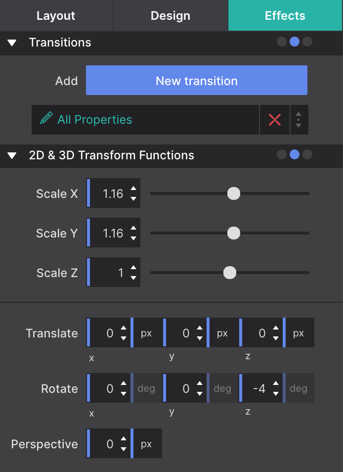
Once you have selected the image, go to the Effects panel to the 2D & 3D Transform functions to tweak the values to get the effect desired. In the example above, we have changed the Scale X and Y to increase the size of the element.
Also, we applied a Rotate which moves the element clockwise from its original position. You can use the Z axis to get a rotation. The X and Y axes are for doing more complex 3D rotations.
Another common effect is the Translate function moves an element sideways, up and down, or a combination of both without affecting the elements around it. This is useful for out-of-view animations for example.
You can apply other effects like the Skew transform tool, which 'tilts' an element one way or the other. Another one is the Opacity tool which defines the transparency of an element. And last the Perspective which sets the distance between the user and the z=0 plane (for more advanced 3D effects).
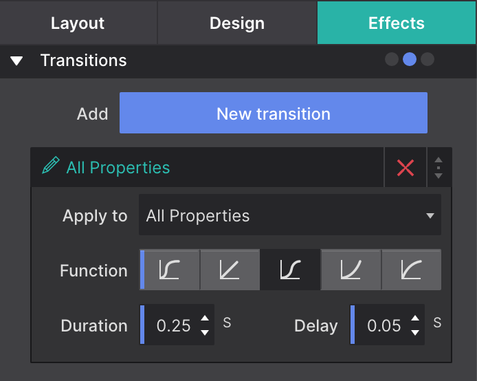
Finally, on the Regular state (In state control), you can go now to the Effects panel, and set a Transition so the change is smoother. You can play with the curves, the delay time, and the total duration of the transition.
How to do the Button effect?
The button uses a little bit of a box-shadow. This control is very similar to the text-shadow control, but it works on the (element) box instead of the text. You can define the horizontal and vertical offsets for the shadow with the X and Y values. If you use negative values it will switch from right to left and top to bottom.
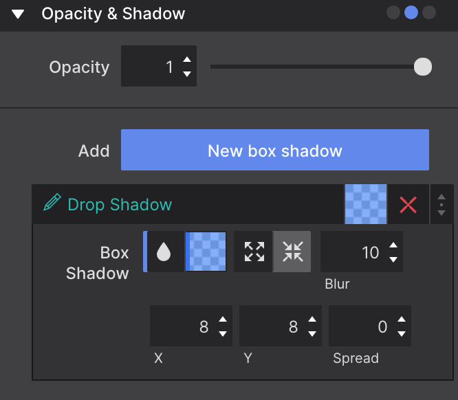
Also, the shadow can be set on the inner element to make it appear inside the border box. To do this, simply click on the icon with the inward arrows. Also, the spread will cause the shadow to expand and grow bigger.
With these controls you can change colors on the fly, tweak settings for smaller displays, and make them respond to user with interactive effects and transitions.
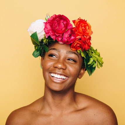
Transform images into stylish works of art by altering brightness, contrast, sepia, and more.
Grayscale
Sepia
Saturation
Hue Rotate
Grayscale +Brightness + Contrast
Invert + Hue Rotate
Opacity
Blur
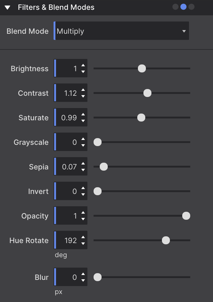
Mix multiple backgrounds and colors together along with Photoshop-like blend modes such as Overlay, Hard Light, and Color Burn.
To create these effects, put the image inside a container, put a color on that container, and then apply the blend mode to the image on the effects panel. This way you will mix the solid background color with the image creating these good looking effects.
Multiply
Screen
Overlay
Darken
Lighten
Color Dodge
Color Burn
Hard Light
Soft Light
Difference
Exclusion