Learn how to create something special from scratch by using our powerful tools.
The Content Pane - Components
Components usually consist of a group of several elements. Together they perform a more complex role such as a navigation menu, a photo gallery, a (series of) cards, an accordion or tabs. Pre-built components can be imported into the project from the Component Library. You would manage these components under the Content Pane > Components region.
Using the Component toolbar icon, you can access the CoffeeCup library of components. These pre-made items can be imported into your project and customized to fit your specific needs. The library is constantly growing with features such as headers, navigation menus, page layouts, sliders, and much more.
This feature also lets you save and reuse content you’ve created, rescuing you from repetitive design work and speeding up production time. You can save anything to your component library. Generally, they make up a combination of elements that together produce a special function.
A great example of using components can be seen in this Help Guide. Most of its pages share common features such as a chapter list, additional resource links, quote showcases, and video & image hero sections.
Since these items are saved to the library, anytime a new chapter is added, they can be popped into place quickly and then edited appropriately.
One of the coolest advantages of using CoffeeCup Apps is the ability to utilize interactive site items. All three of CSS frameworks (Foundation, Materialize, and Bootstrap) offer an elegant way to build navigation menus, accordions, cool tab panels, modal dialogs, drop ups, and much, much more without having to mess with external scripts.
Creating your own interactive components is done visually by combining HTML elements, (predefined & custom) CSS, and the framework specific attributes. Mixin interactive scripts to create off-screen navigations, flex-cards, info-pop-ups, or galleries. Foundation, Materialize, and Bootstrap all offer detailed documents on how components are structured.
Save custom components to your library to reuse them throughout your projects. Items can be given a description and organized in folders to keep you organized.
Most of the components found in the theme are core framework components. Using these 'base' components, themes can be used for quick functional prototyping and as a solid, proven, foundation for new projects.
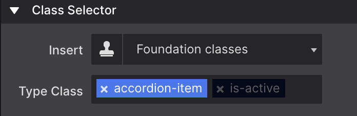
Components generally consist of a number of nested elements combined with predefined classes. The image shows the classes for an accordion item.
The image shows that the is-active Foundation class have been disabled. This makes sure that any custom styles are only tied to the accordion-item class. We will talk more about the use and de-selecting of classes in the Style pane section.
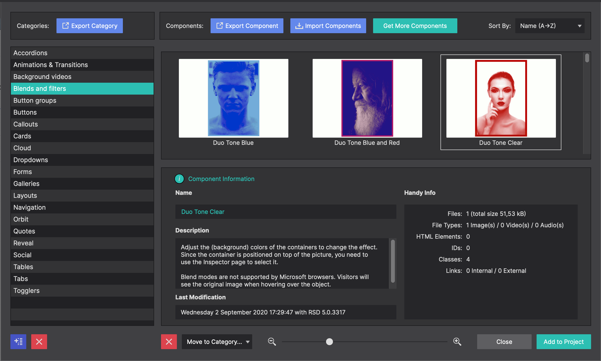
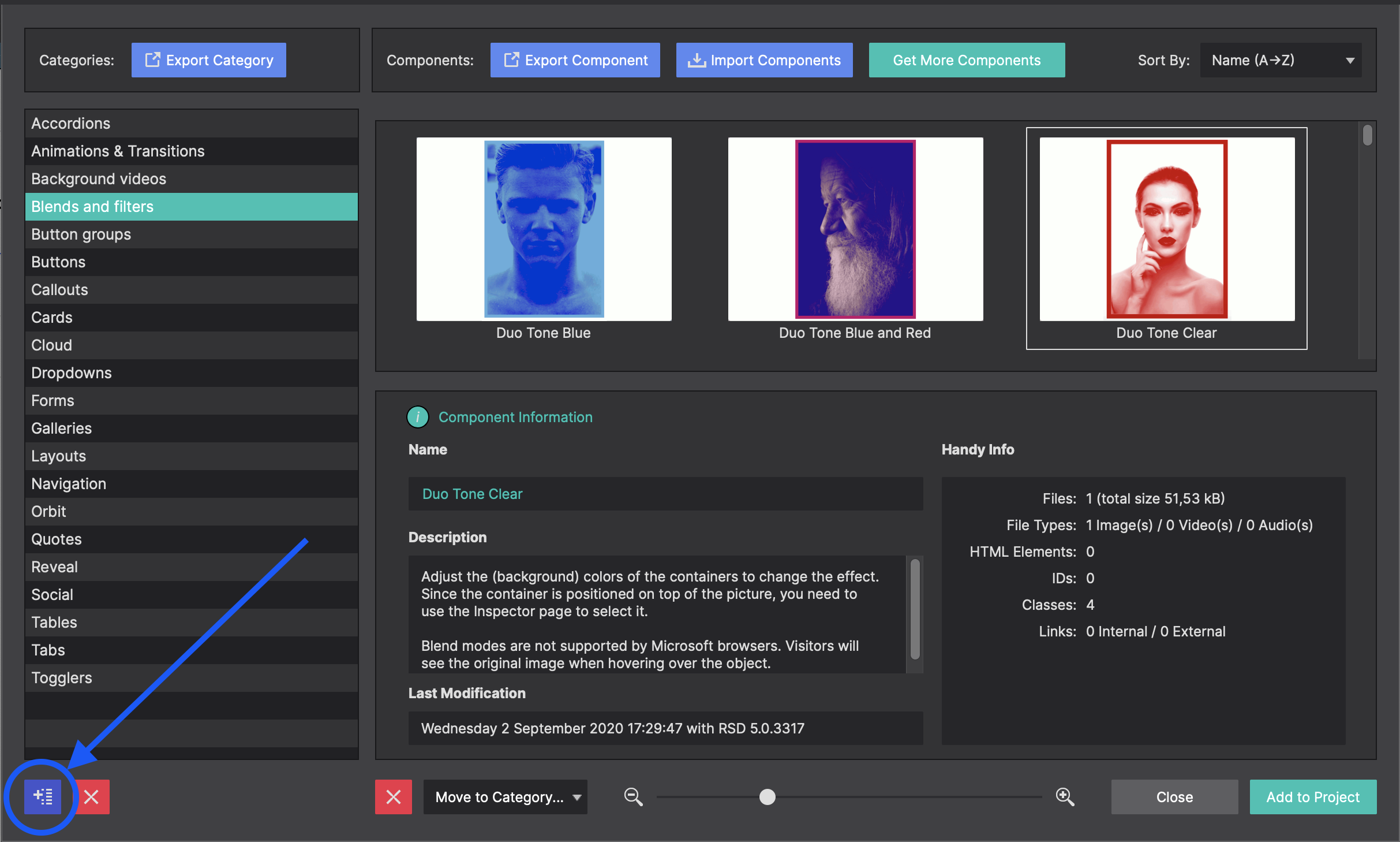
To add a pre-built component to your project click on the Components toolbar icon. This will launch the library. Along the left hand side you will be presented with the available components for your project framework. Detailed descriptions are provided below the selected component to give you an overview of the feature.
When you find the component you want to use, click on the Add To Project button in the lower right corner. This will import the component into the Content pane > Components Section.
Project Components
After adding a component to your project, you can access them on the Components sub-pane of the Content pane.
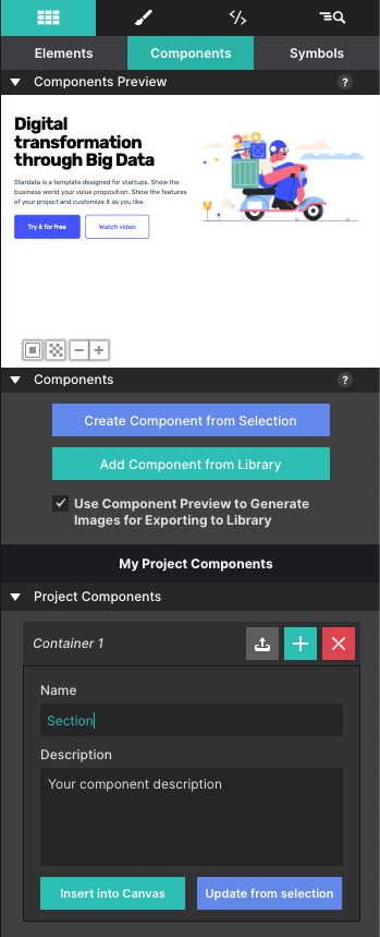
The upper part of the pane shows a preview of the component. To improve visibility — a white component does not display that well on a white background — the background color of the previewer can be toggled. The bottom left button can change the setting between white, black and transparent.
The plus and minus buttons next to the background color button can be used to zoom in and out. In case there are similar components in the project, this provides a good level of detail to find the right one.
The preview shows the currently selected component from the list below the preview window. Clicking on a component will expand it so the name can be edited. To add a component to the canvas, click the plus (+) button. It will get inserted below the currently selected element.
To remove a component from the list use the delete (X) button next to the component title. Note this will not remove the component from the canvas, only from the list.
Create Custom Components
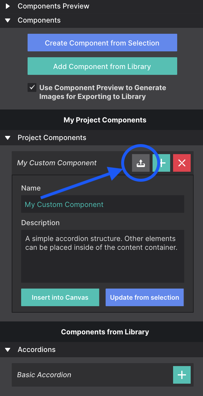
To save a selection from your project as a component, first select it on the canvas, then go to the Components Section. Be sure to select the Parent element for the component such as the main Container element.
Click Create Component from Selection button to generate a fresh component based upon the currently selected element (group). This component will be placed at the bottom of the list. Project components can not be reordered, filtered or sorted at this moment.
Give your component a Name so that you can identify what it is and add a description. To save it to your Component Library to reuse in other projects, click the up arrow next to the component title.
When saving to your library, use the blue button in the bottom left corner to create folders. This way you can organize your components into categories.
Video: Export Pages to Other Projects
The Components Library is one of the most powerful and useful features within Site Designer. It gives you the power to save content and reuse it within other website projects. You can even save entire pages and reuse them over and over again.
Here is a common scenario: You’ve already been using Site Designer for your business website. Then recently you noticed a killer layout showcased in one of our complementary templates that would go perfect with your content. Using the Component Library, you may import that page into your existing website and make it a part of your current design.
In this video tutorial, we will show you exactly how you would accomplish this using the Components Library.