Learn how to create something special from scratch by using our powerful tools.
Your Canvas
In this chapter you will learn how to select and navigate through your elements. Not only that but also see how they will display on different widths for all the devices out there. Learn how to change page styles and layout for different screen sizes using the powerful Viewport Slider and Breakpoints Bar.
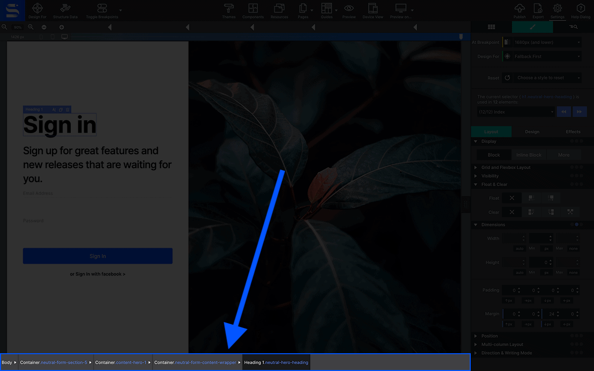
For selecting elements to style or position, you just need to click on them on the canvas. You will see a thin line around them showing you that has been selected. Along the bottom bar you will see how the element selected changes and you can go to any of his parents clicking in that node of the bar.
The Viewport Width Slider and Breakpoint controls are used for previewing and managing the page at different screen sizes.
The built-in width slider helps to test the layout, design and usability of the content at all possible screen widths. The page elements proportionally grow and shrink depending on the available space for displaying it. However, at some point layout or design changes are needed to prevent elements and content to become too small or otherwise unusable.
This is where the breakpoints come in. Anytime you feel a style or layout change is needed for a certain screen size, add a breakpoint, then customize the design as needed. The browser your viewer is using will see these breakpoints and will display the appropriate version of the design to the viewer.
Select Elements
Selecting elements is as easy as clicking on them. You will see a thin line around them to let you know this is selected. Once it is selected you are ready to make changes on it. You can launch the text editor to change text, go to the Styles pane to change a background color or maybe swap out the picture for a new one you want to show.
Tip: Is it hard for you to see this line? You can change the color or the thickness of this outline via the Preferences.
Indicator Hover Bar
When you hover an element with your mouse you will see a small bar on top of it. This menu lets you access quick actions on the element.
The left part is a dropdown that will show you the parents of the element. This is handy when you need to select one of its containers but there is no gap to do it with a regular click.
On the right side of this bar you can find quick actions for the element. You can duplicate the element or remove it. Also depending on the element you will be able to replace the image, edit the text or even modify the grid configuration.
Focus Viewer
Watch as we demonstrate how to adjust the drop zone line indicator and use the focus viewer. Using this context menu you'll be able to easily select nested elements.
Element Navigator
On the bottom of your canvas you can find the element navigation. This helps you when you need to quickly move between elements in the same hierarchy. You can go back and forward between parent and children elements.
Also you can see what Classes and/or IDs the element has applied. But we will talk more about these Classes and IDs on the CSS Selector chapter.
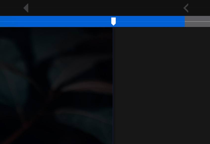
Viewport Slider
The ability to make layout and design changes where needed is key to any responsive design. On wider screens, content might need to be placed next to each other instead of being stacked. Font sizes might need to be increased and small images replaced with larger ones. The Width Slider can be used to view the website at any possible width and help you decide if any such change will improve the user experience of the design.
Just grab the side handle along the middle of the canvas to move the slider left or right and see the viewport and canvas change. You can also click on the handle and move it left or right pixel by pixel with the keyboard arrow keys.
The current viewport width — the position of the slider handle — is visible below the Zoom tool. You can also switch the viewport measurements. Click the current breakpoints measure indicator to toggle between PX and EM.
Breakpoints
Breakpoints are the secret weapon of responsive web design. They are the places where layout or style changes are being made. They are represented by the little dots or 'points' above the Slider. Depending on the framework in use default breakpoints are colored either pink, purple or blue. Pink represents Materialize, purple for Bootstrap and blue for Foundation. A white dot, however, is a custom breakpoint, extra ones that you inject where you see fit.
Foundation Framework
Bootstrap Framework
Materialize Framework
Frameworkless
Desktop monitors have grown a lot over the years and offer lots of space, allowing for a wide multi-content layout with large fonts and imagery. However, for content to be readable and usable on narrow screens such as mobile phones and tablets, a smaller but taller content structure is needed. With breakpoints the same content can be presented in optimal form across the entire range of device sizes and screen widths.
Following each breakpoint a specific set of style rules is delivered, so the site seems to ‘respond’ to the size of the display device. Layouts, widths, font sizes and other design elements are revised where needed to keep the content in focus and pleasant to consume. This feels really dynamic, that’s why we started calling these breakpoint induced changes ‘responsive actions’.
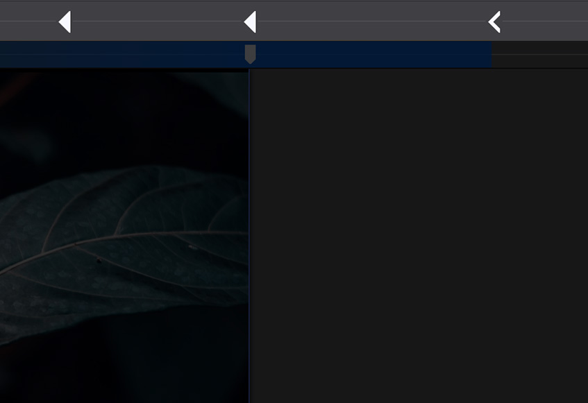
A breakpoint is active when the dot turns from a solid triangular shape to the carrot icon. The breakpoints are pointing towards the direction of the workflow. For example, if it is pointing to the right, your style and layout changes will apply to that specific size and higher. A breakpoint becomes active when the slider is placed on the right of it and until the next breakpoint is reached.
Custom breakpoints can be added by clicking on the breakpoint bar or with the plus icon on the left. They can be removed by selecting one — click on it — and hitting the minus icon. When selected they can also be moved left and right with the keyboard arrow keys. Please note that the default Foundation, Bootstrap, and Materialize breakpoints can not be moved, nor removed.
Mobile First vs Desktop Down
The workflow for configuring element defaults is based on the framework you have chosen.
Foundation, Bootstrap, and Materialize all use a Mobile-First workflow. This means you will design for small screens first — set your default styles such as typography and configure your default image resources for mobile sizes — then make style and layout tweaks for larger screens. When working mobile-first, be sure your slider is to the left of the smallest breakpoint. Changes made to the right of the breakpoint will only appear when the viewer's screen is that particular size or larger.
Mobile first (Foundation, Bootstrap and Materialize workflow)
Desktop down (Frameworkless workflow)
TIP: You can use the Toggle Breakpoint toolbar icon to disable the breakpoints. This will allow you to configure styles with the slider at any position.
If you are using the frameworkless option, you can work Desktop-Down. This means your slider would be to the right of the largest breakpoint for applying global styles. Then you would tweak the desk by moving the slider to the left of a breakpoint.
The slider will turn into a greater-than symbol to indicate which breakpoint area you are designing for. The breakpoints themselves are defined with an arrow shape directing mobile first or desktop down workflows.
Design Changes at a Breakpoint
Layout changes is what responsive design is best known for. They create room where needed, or fill in gaps when enough room is available. Frequently minor changes to the font size of headings is made to prevent them from wrapping at smaller widths. Such a wrap can have a big impact on the overall layout but this is easy to remedy in the app. Simply add a breakpoint just before the wrap happens and the layout breaks, then adjust the font size. Now continue to slide and you will see that with that change the layout will continue to look good a long way.
An almost endless number of responsive actions may be specified, ranging from minor adjustments to image sizes, margins, and font sizes, to major layout changes. These major layout modifications are what Responsive Web Design is best known for. Responsive actions like shifting, stacking, and swapping of page elements is what make a site truly device agnostic.
The Viewport Width Slider
The width slider can be used to view the design at any possible viewport width and is instrumental for creating websites that look good on any screen and device.
Edit Design
Tweak the design. Little indicators give you an idea of what size device your design would be seen on. Change layout structure, size of text, make buttons bigger or smaller, anything!
Breakpoints
Add additional breakpoints if needed. If your framework doesn't include all the layout sizes you require, use the +/- to manage extra breakpoints.
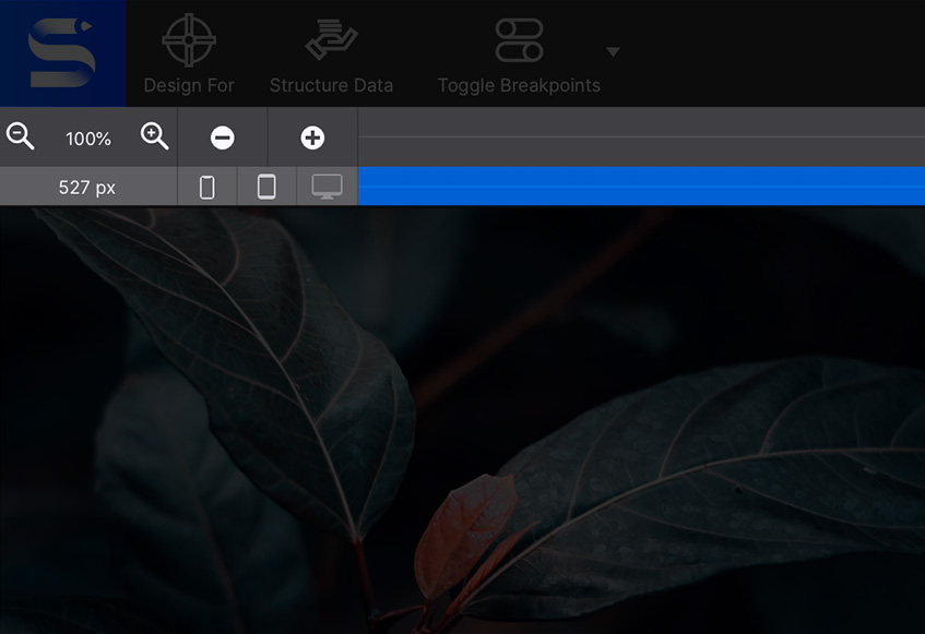
The Zoom Tool
The Zoom tool (the +/- magnifying glass) is placed on the left of the breakpoint buttons. Zooming out helps to design for large screens from smaller computers such as laptops and shows breakpoints that otherwise might be hidden behind the panes or even be offscreen.
When you zoom out you can preview your design by seeing more of the canvas vertically. Click Preview to preview on the canvas and test interactive features.
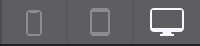
Device Icons
The three device icons located below the add/delete breakpoint buttons will become brighter to indicate the common size device you are currently designing for.
As desktop monitors, tablets, and phones all come in a variety of sizes; this is just for reference purposes. There is no specific phone or tablet width, nor is it possible to ‘design for phone.'
Instead, responsive design has to look good and perform well at every width — the icons are merely an indication of what type of device might be used for viewing the site at the current position of the slider.


