The ABC of A CSS GRID
As mentioned in the intro section, Grid Layout is entirely created in CSS, without any HTML. This allows us to fully focus on the natural content order, and visually place the elements independent of their position in the HTML. On smaller (or wider) screen the elements can be easily replaced if beneficial for the visual presentation.
The ability to separate layout from markup is huge.
Setting up a CSS Grid is remarkably easy. Simply declare display: grid; on any container, specify the columns and/or rows with some CSS like grid-template-columns: auto auto; and your initial grid is ready to be used!
These two little pieces of code do a lot of work: they create the grid parent (the container) with two auto-width columns, make the elements inside of that container (the children) grid items and place the items automatically on the created grid. How cool is that!
This immediately touches upon a number of the big advantages of CSS Grid. The amount of CSS is really minimal — especially when compared to the code used in the responsive grid frameworks — and very intuitive to use. As soon as you get the hang of it that is — the specification is extensive and offers a lot of power. But, as with any new powerful tool or technique, requires some studying and practice. And that is exactly what this guide is for!
Another advantage is that Grid does not require a whole slew of containers and classes just for layout purposes. In fact, it is the first time in the history of the web that presentation and content are truly separated.
Grid can be defined for an entire page, for page areas or small UI elements. Grids can be nested as well; a grid parent can have children that on their own can also act as a grid parent for their children.
Let's get started with some demos to build a solid understanding of this exciting new technology...and that's not a simple orange block you see down below there yo!
Contents in this chapter
Demo: Setting Up The Grid Parent
If the above grid just looks like a big orange block with some letters to you right now, don't worry, the grid structure will appear as soon as we specify a gutter.
Creating of an automatic Grid
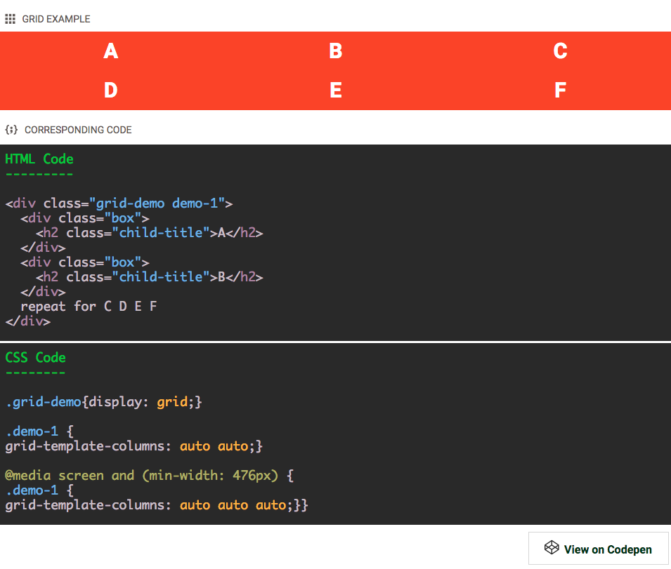
The HTML structure (partially) shown is pretty straightforward: there is one container which includes 6 other containers. To distinguish these containers, each of them contains a <h1> element with a different letter, from A to F.
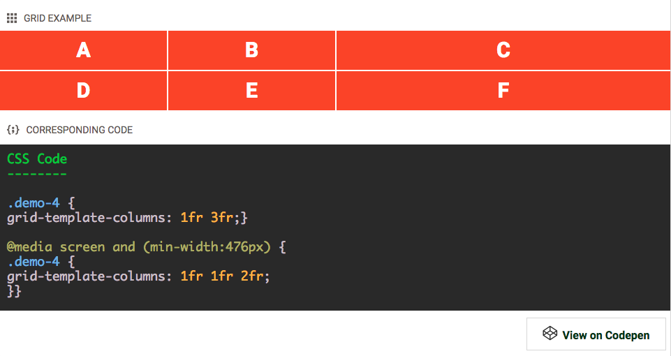
The first (outer most) container, the <div> with classes .grid-demo and .demo-1, is made a Grid parent by applying display: grid; in the CSS. Then, on the same container, two grid columns are created for small screens and three columns for wider screens through the .demo-1 selector class. As can be seen in the CSS code box above, using the auto value twice creates two columns, and writing it out it three times sets up the three column structure.
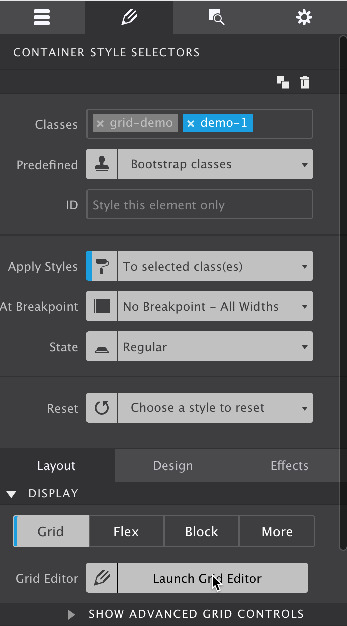
If you are trying to replicate this in Site Designer or CSS Grid Builder, the screenshot below shows what the Design pane indicates with the grid container selected.
If the 'Launch Grid Editor' button is clicked the grid can be specified. When opened initially there might be a bunch of rows, one for each element. They are automatically created by the browser. For our setup, simply remove all the rows by selecting them and clicking the delete button (X). Then select the column. At this stage we are not making any changes to the column settings, we are simply adding a new one with the same auto (width) value. You will find that the Duplicate buttons can be of great help here. The next image shows the setup below the first breakpoint.
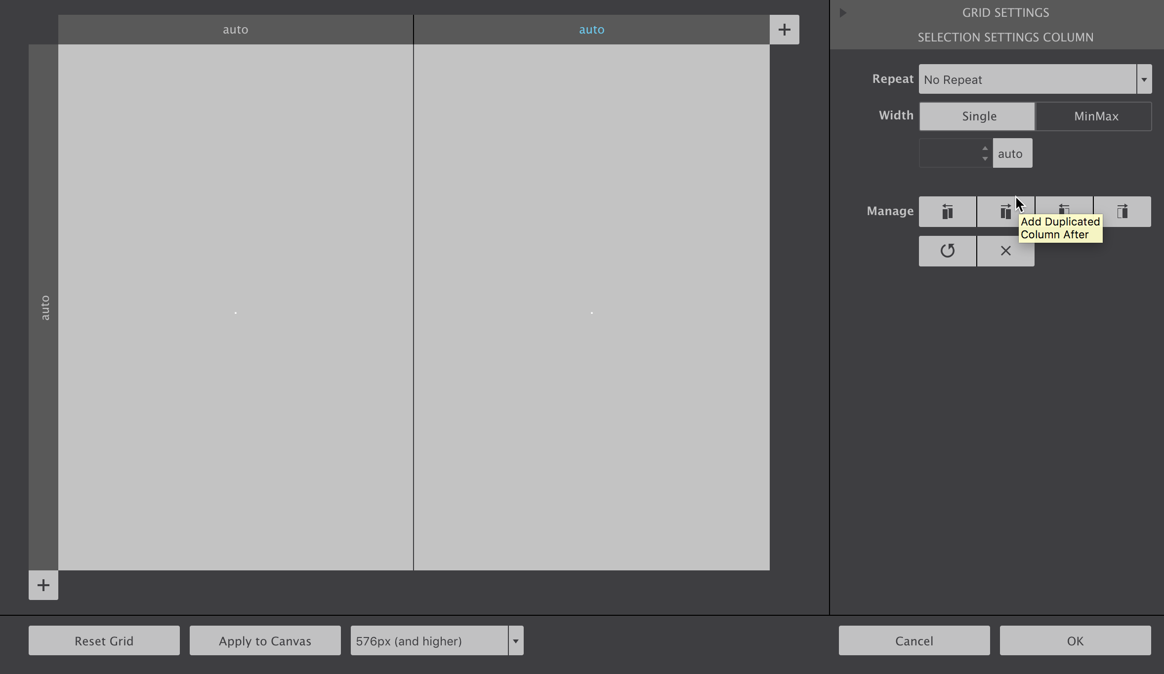
To create the three column structure at the next breakpoint simply move the viewport slider past it, or toggle the breakpoint dropdown in the Grid Editor and duplicate one more row.
The auto value means that the width column is automatically calculated by the browser; it will scale with the amount of content. Specific column (and row) sizes can also be defined, we will come to this later.
That little bit of CSS code automatically places the Grid children, the six <div>'s with the orange background, in a two or three column structure as seen in the example above. All without setting up a complex HTML structure of rows and columns — by simply making the parent <div> a grid-container the six containers become grid-items and are positioned according to the grid rules of the parent.
Speaking about rows, you might be surprised that no single row has been defined. Yet, the items clearly seem positioned that way! These rows are generated, where needed, by the Grid. Invisible, smart enough to create rows...feeling like the Matrix already? It's not that exactly, but CSS Grid is very flexible and helpful — we will come back to the implicit grid towards the end of this document.
Clearly the H1 elements could have been placed in the grid directly. However, the containers will come really handy when I explain the explicit placement of grid-items later in this tutorial.
The cool thing about the CSS Grid is that because it is CSS (duh!) it can be easily redefined at any breakpoint. In the above example the grid is changed to take advantage of the increased width at (above) the 476px breakpoint — for screens with a minimum width of 476px three columns have been specified. There the grid-items are auto-placed in the new structure.
Grid-items are automatically placed in empty grid cells according to their order in the HTML. The auto placement intelligence of CSS Grid is a great help. We will talk about the placement of items in more detail later in this tutorial. First, let's add some grid gutter!
Code Demo: The Gutter Of Our Dreams
Explanation: The Gutter of Our Dreams
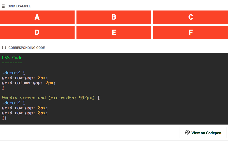
Bye bye orange block — hello grid structure! A gutter can be inserted between grid columns and / or grid rows with the grid-gap property.
Form small screens this is 2px, both between the columns and rows. For larger screens, above 992px, this is increased to 8px.
Being able to define an explicit gutter between the elements is one of the big advantages over flexbox or float-based layout methods. As can be seen in the code box above, just two simple lines of CSS on the grid parent (container) are needed to create a consistent space between the grid items.
A very different approach compared to the older methods where you had to specify a space (margin) on the element. Which would come with some problems such as unwanted space at the edges of the of the grid. This space then had to be removed on that specific element...but when the elements wrap at smaller screens a different element would sit at the end...creating a 'chasing space' type of nightmare.
When is comes to creating consistent space between items, Grid beats any other layout method hands down.
Flexbox has the 'space between' property but this space varies with the available display width and does not create a consistent gutter.
Now we can control the gutter, let's move on to creating columns and rows of different sizes.
Grid Track Sizing — Setting Widths and Heights
A grid track is either a full row, or a column: both A - C and B - E are examples of tracks in the grid above.
Controlling Column Width And Row Height
The size (height or width) of a track can be defined in a number of different units. We started the tutorial by not specifying a specific width for the columns, having them default to auto. In this scenario the browser will automatically size them based upon their contents, a column with more content gets more of the available display space. Since all grid items have the exact same amount of content, the space was divided equally.
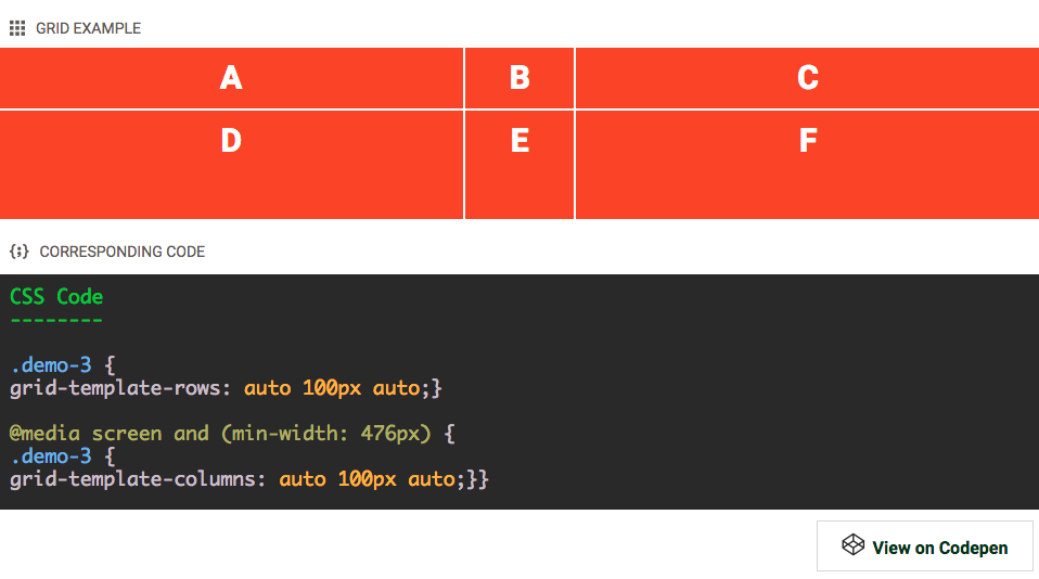
In this demo the second row gets a (fixed) pixel height of 100px. This makes the middle row (or bottom row on wider screens) taller than the other row(s) which still take up the same space as before.
Above the second (476px) breakpoint, the second column gets the same 100px value. The two other columns automatically take up the rest of the space, making them wider than the middle one.
The track sizes can be defined in the same units — pixels (px), percentages (%) and viewport sizes (vh, vw) — that have already been available for other CSS properties such as margin and padding. However, there is also a new unit kid on the grid that is creating quite some excitement!
I believe one of the 1st people to write about this and come up with the abstraction here was Dave Ellis, a Leeds based web designer. Other, more famous, designers have been ranting and writing about this as well. Brad Frost, for example, wrote an excellent piece labeled, trouble in framework paradise. CSS Grid is totally different, but will it change this? I think it will, let's get into it!