Feature Queries for CSS Grid Fallbacks
The Design For toolbar icon allows you to activate the power of Feature Queries. This is used for creating fallback stylesheets (layout variations) for different browsers. This way you can create great viewing experiences for everyone.
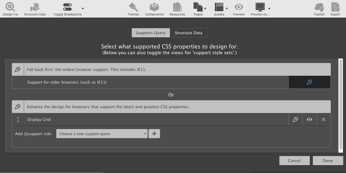
Once your choice is activated, you'll be able to select it on the Style pane using the Design For drop-down.
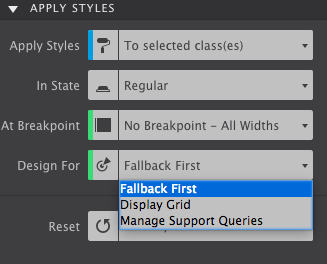
Simply select the Fallback First mode to set your basic styles. Then switch to the other mode and design away for modern browsers.
Contents in this chapter
Introduction
When showcasing how CSS Grid is used for creating a new cool hero section for our homepage, we stumbled upon one block: browser support. Now don't get me wrong here, CSS Grid is very well supported. All the current versions of modern browsers, from Firefox to Microsoft Edge offer full support for this great new layout technique. Unfortunately, not everybody is using these browsers (just yet).
Based upon statistics from Browser Market Share Worldwide, an estimated (shrinking) 30% is currently browsing the web without full CSS Grid support. However, this is hardly a reason to withhold the other (growing) 70% a great CSS Grid based layout experience. The reason is...feature queries!
Feature queries can be used to test if a browser is able to understand a CSS feature. With the @supports rule the browser is asked (queried) whether or not a specific CSS property is supported. Then, if the answer is positive, the browser is instructed to apply a series of style rules.
In the example below the browser is first asked if it supports CSS Grid with @supports (display: grid). Then, if grid is supported, the browser is told to create a grid with a single column and 4 rows for elements using the .hero-grid class. If the browser does not support either grid or the @support rule, all the styling that follows will be skipped.
That last part is crucial, if the browser does not support the CSS property OR does not understand feature queries, the code included in the query will be skipped.
The feature query test can also include a not operator. That means that the browser can be told to do something, if a specific feature is not supported. I have seen quite a few examples where this approach is used to provide alternative layout code, like flexbox, for browsers that do not support CSS Grid. I am showing an example below that I actually have seen in the wild — just be aware that this does not work!
Why? Well, if feature queries are not supported, the browser won't get to the code inside. For example, as soon as IE11 gets to that support query in the code block below, it skips over everything inside, and continues as of the closing bracket. And although it does support flexbox, the line with display: flex is never read and therefore not rendered as such. With that being clear, let's look at a proper way to create a fallback layout for browsers that are not supporting CSS Grid.
Fallback First
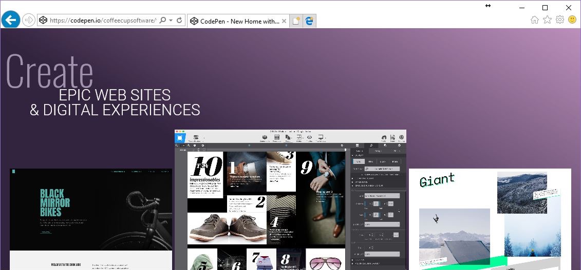
The CSS Code in the first code box above comes from a showcase where I used CSS Grid to create a new hero section for our homepage. If you hop over to that demo real quick you will see that is looks great, on small mobile screens and larger (desktop) screens. Unless you are using IE11, then it looks that what you see in the image below.
Terrible? At the very minimum the content is accessible. IE11 renders all of that, but skips the CSS such as display: grid that it does not support. Where no (layout) code is provided, it simply renders the browser's default styles and stacks all elements. Using a 'fallback first' approach, the experience for IE11 visitors can be made significantly better.
In short this approach means first defining the fallback layout with code these browsers understand. Then, after that experience is 'good enough' a better layout experience can be created with CSS Grid code inside of a feature query.
The CSS code box below represents a simple flexbox setup, creating the initial layout for our hero section. (I replicated the HTML code from my 'A new homepage for CoffeeCup with CSS Grid' article so you don't have to keep jumping back and forth).
If no 'grid code' is added, this code determines what our layout will look like in all browsers (that support flexbox). Once additional grid code is added, this code is still what determines the layout in IE11 and all other browsers that do not support grid. I placed a screenshot of how this looks in IE11 below the HTML code box.
Not as grand as our animated CSS Grid layout, but very workable indeed.
.hero-grid {
display: flex;
flex-wrap: wrap;
justify-content: center;
align-items: flex-end;
max-width: 1600px;
margin: 0px auto;
}
.hero-text-wrapper {
flex: 100%;
padding: 40px 0 20px 0;
}
.hero-image {
max-width: 40%;
margin: 0px 0.2%;
}
.layer-3 {
max-width: 28%;
}
.layer-2 {
max-width: 28%;
order: 3;
}
The CSS Code in the first code box above comes from a showcase where I used CSS Grid to create a new hero section for our homepage. If you hop over to that demo real quick you will see that is looks great, on small mobile screens and larger (desktop) screens. Unless you are using IE11, then it looks that what you see in the image below.
Terrible? At the very minimum the content is accessible. IE11 renders all of that, but skips the CSS such as display: grid that it does not support. Where no (layout) code is provided, it simply renders the browser's default styles and stacks all elements. Using a 'fallback first' approach, the experience for IE11 visitors can be made significantly better.
It is beyond the scope of this article to look at the code in detail, but let's quickly go over some of the highlights.
Most importantly, the .hero-grid container is instructed to be a flex parent with display: flex. This automatically makes all content inside flex children, who are allowed to go to a next line, to wrap, when needed.
Then the text container is instructed to take up the full width of the container through flex: 100%. The 3 images will consequently move down to the next line.
The images all share the .hero-image class. The margin of 0.2% creates some space between them. With a maximum width of 40%, the last image will still wrap to the next line. That is remedied by applying a smaller width of 28% to the images with the .layer-2 and .layer-3 classes. Finally the image with the .layer-2 class is moved to the right using the flexbox order property.
A decent layout overall, now let's spiff it up with CSS Grid!
Jumping forward (into the grid)
This is where we are going to use the feature query to supply modern browsers with some fancy grid code. The code is the same as previously used — basically all we need to do is wrap it in a support query.
First we are going to tackle the mobile view. We start with our test, if the browser supports display: grid, create a single column and 4 grid rows. Support for 'grid' on mobile browsers is (almost) universal, so people on phones and (smaller) tablets will see the grid layout defined in the code box. Except..if you look at the image below the box, you will see this doesn’t do what we want. Several fallback styles are still applied, influencing what is happening in our Grid layout.
Fixing Fallbacks
What we need to do here is review the layout styles we specified in the 'fallback' code block. For each selector we need to decide if any of the applied styles influence our desired result, and redefine the styles where needed. Doing that within the @support query makes sure these new styles will not be read by browsers that do not understand CSS Grid and therefore will not mess up our fallback layout.
Our first candidate is the .hero-grid selector. Where we previously aligned the flex items to the bottom of the container, now we want them to start at the top of each grid cell. From there they will go down, no longer overlapping the text and instead disappearing behind the image in the next row down. To do this we change the value of the align-items property from flex-end to start.
The styles for the .hero-text-wrapper are just fine, the images are not overlapping it anymore and it will sit in the very first grid row as intended.
The images are still very small due to the width constraint applied to the .hero-image selector. Setting that to 100% already gives us largely the layout we are looking for. We do want to center them though — for that we set the left and right margin to auto (from 0.2% initially).
The rest is just tweaking to get the effect we want. The images in the back need to be a little smaller to create the perspective — I set these values to 90% and 96%. Also, the flexbox order property is pushing .layer-2 image forward. We reverse that by setting the order value to 0.
To top it off I added a bit of shadow on the .hero-image selector, emphasizing the 'depth perspective' and resulting in the design showcased below the code box. Spiffy!
Jumping Forward (For Wide Screens)
Without further changes the layout will look like the above on all browsers that support CSS Grid — from mobile browsers to super large screens. We really should make good use of the real estate of wider screens and show more of the images that are currently placed in the back.
To do so we going to change our grid structure at the 64rem (1024px) breakpoint. (Clearly this could have been done at any other (custom) breakpoint as well. The plan is to continue showing the app screenshot in the front, but with the other 2 images on the side. This is similar to the fallback layout, except that the main image will partially overlap the side images.
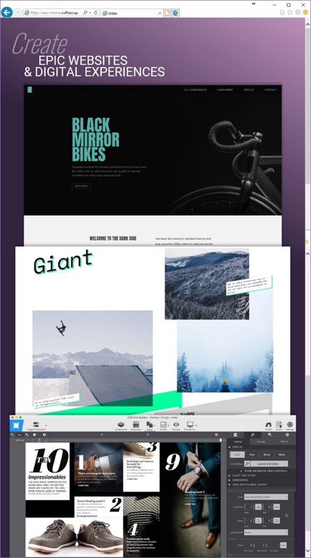
For this we will need 4 columns and 2 rows. We prototyped the desktop layout before with the help of CSS Grid Builder, so we can simply grab that code and place it in the support query.
The code below tests for 2 conditionals: 1. if the browser supports CSS Grid (or not), and 2. if the viewport is wider than 64rem (or not). The container was already instructed to become a grid parent for CSS Grid supporting browsers, so we don't have to worry about that — we only need to create the newly specified grid structure. As explained in detail in my previous article, this will initially create a mess...
To summarize: the 4 elements will automatically be placed in the 4 grid cells in the first row. The second row will be collapsed since it has no height specified and no content. Since this could only be seen in the video in the other article, I added an image below the code box to illustrate this.

The solution? We will need to tell our grid kids where to go in the grid — what cells they should to use for their positioning. There are various methods, but because of the overlap the line-based placement technique suits best. The code below is explained in detail in the preceding article, but to summarize what is happening: each element is specifically instructed to position itself between horizontal and vertical grid lines.
In addition we need to tell the side images for which we constrained the width before the breakpoint, that can now take up 100% of the available. With the placement code, the new width specification, and some font style updates (which I left out of the code example), the wide screen layout and design is ready. The image below the code box illustrates this.
Wrapping It Up
The 'fallback first' method works like a charm, the (layout) design looks great, even on browsers without grid support. I created a slim codepen with the essential code (without the animation for now) that can be used to test or play with.