A Brief History Of Web Layout
Marking It Up
HTML, as any markup language, was created to describe and add meaning to content. A semantic language, initially created to annotate text elements and format them accordingly, but not to style them.

The Mosaic browser was the first to add support for inline graphical elements which was later added to the official HTML specification.
Add images and people eat it up. The popularity of the web was growing rapidly, creating an opportunity for 'overview pages' and search engines to help people navigate the web. The trend to start creating more intuitive visitor experiences had begun!
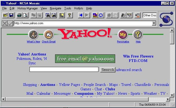
At that time Grids were not totally uncommon in web design — in the old Yahoo design some elements line up, but that is about it. There is no grid-based placement, instead you will see the (now frowned upon) horizontal scroll bar in the next image!
With the increased popularity, people started seeking for ways to extend the look and feel of web pages; to extend them beyond the simple text documents with more control over the placement of elements than margins and paddings.
Contents in this chapter
HTML Tables For Layout
HTML tables, introduced in the specification around the same time as images, were being quickly used to control the flow and positioning of elements on the page. However, this means presentational data — the table structure — is mixed in with the content.
Since tables were intended to be used for holding tabular data, not for the positioning of elements, this constituted the first major layout hack.
The use of tables for layout reduced the accessibility of the design, made sites more difficult to maintain, especially when nested tables were used to create the desired layout structure. Because of these and several other shortcomings, people started adopting CSS based methods when browser support increased. This shift from using tables to the conceptually better approach of separating layout and presentation imposed a significant challenge for many.
The First Grid Framework
These challenges, as well as the desire to create grid-based designs which people from the print world had been successfully using for decades, led to the first grid frameworks. At its core these frameworks used a predefined HTML and CSS structure to create rows with nested columns.
In this approach there is a master container, a <div>, that sets a (fixed) width for the page. For example 960px, which can easily be divided in multiple columns and fits within the common 1024px viewport during this pre-mobile era. Using some math that width is chopped up into left floating divs (columns) of equal widths and a (10px) gutter between them. Then specific grid number classes are created in the CSS and placed on the divs specifying how much width a column wrapper takes up.
For example, in a 12 column system with 20px gutters a .grid_1 class would make the div 60px wide, and a .grid_2 class would create a container of 140px (2 times 60px plus 20px for the gutter). Depending on the framework or settings, each row would consist of up to 8, 12, 16 or sometimes 24 columns. The actual content — images, text elements — was then placed in these columns (divs).
The mobile revolution increased the web layout pain...
This, of course, still mixes content with presentational markup. But it worked and we were just getting used to it when, driven by the mobile revolution, things got worse. A lot worse....
Bye Bye Fixed Canvas
Often things have to get worse before they can get better. For many the requirements imposed by the mobile viewers were mind-boggling. People are simply used to think in fixed, predefined, dimensions because that is the world we live in. Everything; from phones, magazines, car seats to paintings is designed or created in a specific unchangeable size.
Graphics programs like Photoshop, now about 30 years old and originally developed for print based design, brought the habit of using fixed pixel dimensions to the Web. Before a design can be started, a specific fixed canvas size must be defined.
But mobile phones, phablets, tablets, laptops, desktops, second screens, televisions screens — they all come in different sizes. Yet they are all used to browse the same web, visit the same sites, fill out the same (web) forms, view the same pictures and buy things. So this fixed pixel grid did not work anymore, a website had to be designed for an unknown display size.
Responsive Frameworks
In the early days of device agnostic design I compared a responsive site with a Harry Potter bus — both automagically flex and grow to fit the available width. In hindsight, the concept is not even that difficult. First pixel widths had to be replaced with percentages to make the layout flexible. But you can squish only this far until — with text wrapping and so on at some point everything becomes unreadable. So the magical media queries were used to redefine the layout a few times at so called ‘breakpoints’.
But, creating these sites requires doing a lot of calculations, way more code than before, even more testing, and can get hairy pretty quickly. A new series of responsive frameworks emerged, with Bootstrap emerging as the most popular choice. Another solid framework, and my personal preference, is Foundation.
Serving The Same Plain Soup
The advantage of working with these frameworks is that the calculations and structure are baked in, and that all this is well tested among browsers and devices. There are additional bonuses, such as predefined element styles and scripts for adding interactions. But, there are also drawbacks.
The first drawback is the heavily mixing of presentational data with content, even more so than before. Not only is a whole series of nested's needed to manage the layout, these also require a bunch of classes, one for every width change, only for layout purposes. The layout style sheets are equally heavy with layout related styles, whether used in that particular design or not.
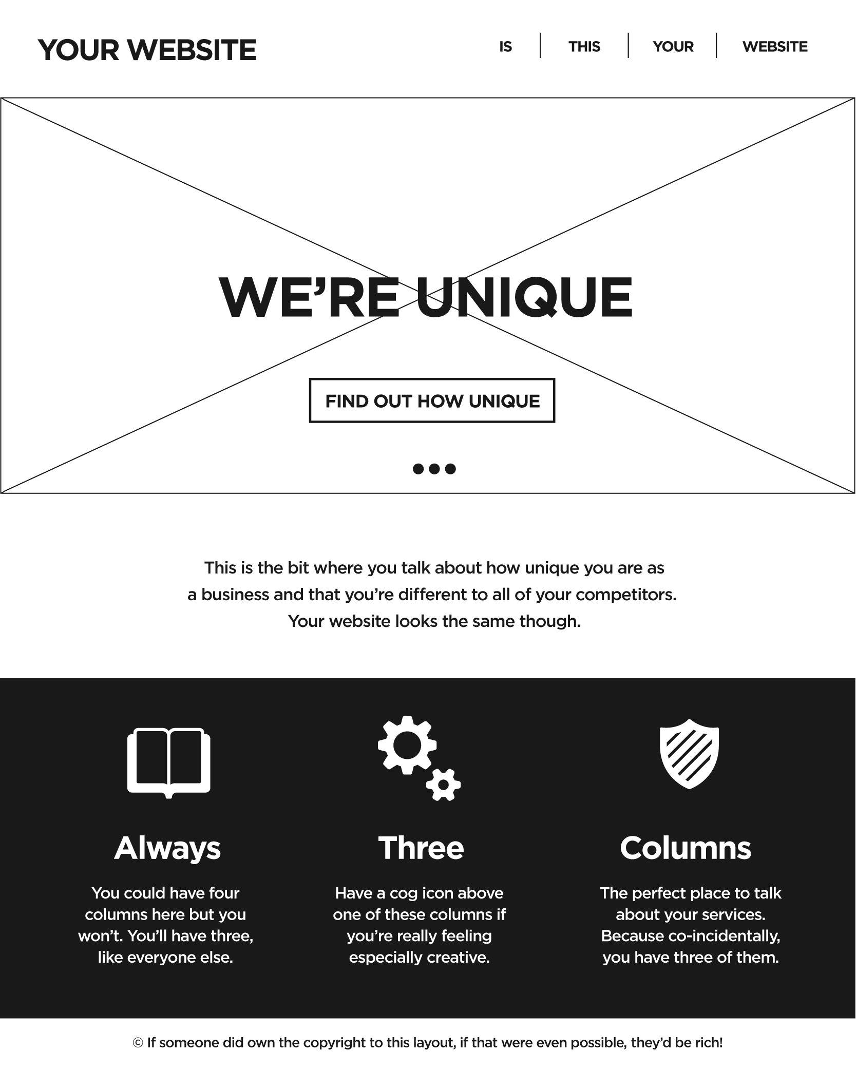
Responsive frameworks serve flavorless soup
The second drawback is that these frameworks are relatively rigid. Modifying the default layout and design rules required a significant learning curve. Instead of designing based upon intent and from the content out, people started adjusting their content and message to typical templates.
Source: All websites look the same.
I believe one of the 1st people to write about this and come up with the abstraction here was Dave Ellis, a Leeds based web designer. Other, more famous, designers have been ranting and writing about this as well. Brad Frost, for example, wrote an excellent piece labeled, trouble in framework paradise. CSS Grid is totally different, but will it change this? I think it will, let's get into it!