The Styles Pane – Design
The Styles Pane contains all the layout and design properties for an element. Here you'll position the element, set colors, size, spacing, font types, and shadows, along with applying any interactive effects.
Double-clicking any item on the canvas will automatically launch the Styles pane on the right. It is sorted into sections based on the element that is currently selected.
The Styles pane is the element command center for all of the layout and design traits you want to implement.
In the very top-right corner you'll see an A icon for editing text, an icon for duplicating the selection, and a trash can for deleting.
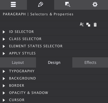
The control panel is broken down into 2 main sections. The top focuses on CSS Selectors and the State you want to style the element.
The lower section is divided into three sections: Layout, Design, and Effects. This chapter will focus on the Design and Effect controls.
Contents in this chapter
- Design Controls Overview
- Typography
- Additional Typographical Controls
- Text Shadow
- Backgrounds
- Background Gradients
- Background Images
- Borders
- Effects
- Filters and Blend Modes
- Demo 1: CSS Filters
- Demo 2: CSS-A-Gram Effects
- Demo 3: Blend Modes
- Demo 4: Blended Action
- Demo 5: Typography
- Object-Fit & Object-Position
Design Controls Overview
Depending on the element you have selected, the controls that popular under the Design section will vary. Only the options available for that specific element will appear.
Collections on the Styles pane have been organized in groups of related controls. Each of the groups (sections) can be collapsed an expanded when needed. When all the sections are expanded the scroll to the lower sections can be getting rather long
Typography
The right choice of font, colors, and spacing greatly help to communicate the message of a website and contribute to the brand recognition. Site Designer features a big selection of font choices as well as a large set of typographic controls.
The Font drop down gives access to all the 808 font families in the Google font collection. A web safe (system) font can be selected just in case the primary selected font fails to load with the Fallback Font control.
The third dropdown can be used to select the font-weight. Some font families do not provide all options — in those cases the closest available option will be applied.
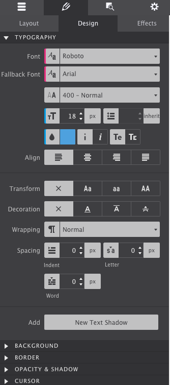
The next controls can be used to change the font-size and line-height for the active selector. These two properties can be specified in different units of measurement such as pixels (currently selected in the image) ems and rems. Clicking on the active unit will bring up a dropdown with other available options.
The color of the font can be changed by clicking on the little color tile — white in the image — next to the drop. The text element can also be set to be displayed in italic and small caps.
The last control visible in the above image can be used to align the text. Left, right, center and justify are the available options.
Additional typographical Controls
There are a couple more typographical controls available. The text-transform control can be used to specify the capitalization of an element's text. It can be used to make text appear in all-uppercase, all-lowercase or with each word capitalized.
Text-decoration sets the text formatting for the selector to underline, overline, or line-through. Underline and overline decorations are positioned under the text, line-through over it.
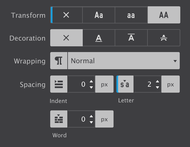
The wrapping control is for handling the white-space inside the text element which has a big effect on how the text wraps.
The three different Spacing icons show the effect of each of the controls on the text. The text-indent controls the indentation of the first formatted line of the block. The second control adds space between all the letters of the text element. Space can be added between words with the word-spacing control.
Text Shadow
The last control for styling text elements is for adding shadow effects.
The ability to add multiple font-shadows, and the ability to control the exact settings for each of them, allows for really cool effects.
SITE DESIGNER ROCKS!
The above effect is created using three text-shadows with slightly different settings for the blur and distance values. Higher values for Blur make the shadow wider and longer.
The offset-x and offset-y values specify the horizontal (X) and vertical (Y) distance the shadow is placed from the text. Negative values are allowed — a negative X value places the shadow to the left of the text, and negative Y value above the text.
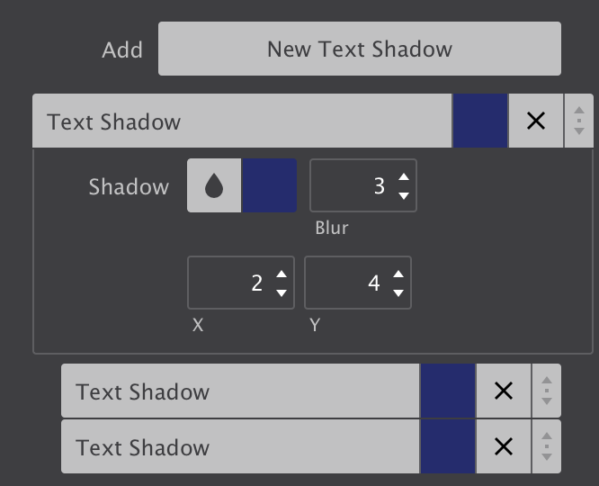
The offset-x and offset-y values specify the horizontal (X) and vertical (Y) distance the shadow is placed from the text. Negative values are allowed — a negative X value places the shadow to the left of the text, and negative Y value above the text.
Background
The background of an element is the total size of the element, that includes padding and border. The margin is the space between elements and not included.
The web got a whole lot more interesting and beautiful with the new background properties introduced in CSS3. In addition to simple solid backgrounds, beautiful full-size background-images can be applied. Background gradients can be declared in directly CSS. This offers better control over how the gradient is displayed as well as increased performance compared to using an image file.
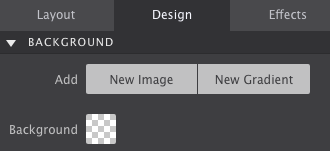
Jazz up the Background using a specific color, add an image, or apply a gradient.
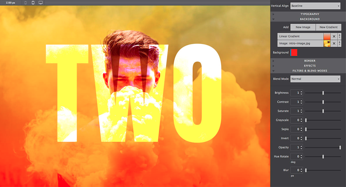
Then there's the ability to use multiple-backgrounds. Combining images with overlaying semi-transparent gradients for example, can create really stunning effects.
The order in which these backgrounds are being applied is important for the desired effect. Generally speaking a gradient will need to be on top of an image, a small image on top of a larger image, etc.
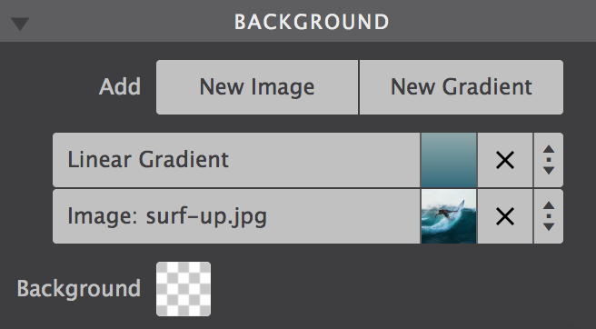
The background up top in the control, will be visually on top in the canvas. To reorder the background layering you can grab one at the arrow icon, and drag it up or down to a different position. Clicking on a background will open it up to tweak the settings. Let's look at the gradient settings first.
Background Gradient
A gradient is made of a progressive transition between two or more colors. A linear gradient follows a line on which the colors fade from one color into the next. A radial gradient starts at a center and changes colors going to the outside of the circle (or ellipse) type of shape.
Linear
Gradient
For a linear gradient the angle can be changed by specifying a specific Degree. For example, changing the value from 180 to 90 would make the gradient run from left to right instead if top to bottom. Any value in between is possible as well!
A gradient can consist of up to 4 colors. A Color can be added into the mix by clicking the checkbox. The Stop defines where the color starts. As can be seen in the example below, the colors don't have to transition, a 'hard-stop' can be created by giving two color stops the same value.
Linear
Please note that the color defaults to the color of the first stop, which is needed for the effect above.
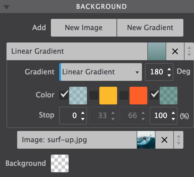
Linear and radial gradients work in very similar ways, except the degree control is not available for radials.

Background Images
Images can be added to the project or linked in from any online source. The Resource control provides these options. In the example below a local background image is used. To change it for an online image choose URL from the dropdown instead of Local Image, then paste the link to the image in the box that appears below.
To change the image for a different project image, click on the edit icon. A dialog will come up from which a choice can be made between the various images in the existing collection in the project. New images can be added to the collection as well.
Images can also be changed at breakpoints, this way smaller and lighter images can be served to smaller devices (which frequently use less bandwidth).
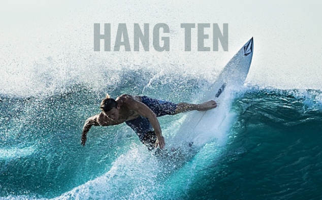
The Position control can be used to move the image around. The default values are Left and Top. Custom values can be used as well — in the example the image has been moved so the surfer takes up a central position in the container.
The Attachment control specifies if the image's position is fixed within the viewport, or can scroll along with its containing block. The local setting means that if the element has a scrolling mechanism, the background scrolls with the element's contents.
The fixed setting works well for large background images on containers. Please note that mobile devices offer limited support for fixed backgrounds as it is (said to be) resource intensive and negatively impacts battery life. A good practice is to change from scroll to fixed for desktop devices, more or less on the right of the second Foundation breakpoint.
Small image patterns are frequently used to create a full background pattern. This is done using Repeat. In the example below a tiny thumbnail is instructed to repeat along both the x and y-axis. Alternatively the image can be only repeated along the x or y-axis, or not at all.
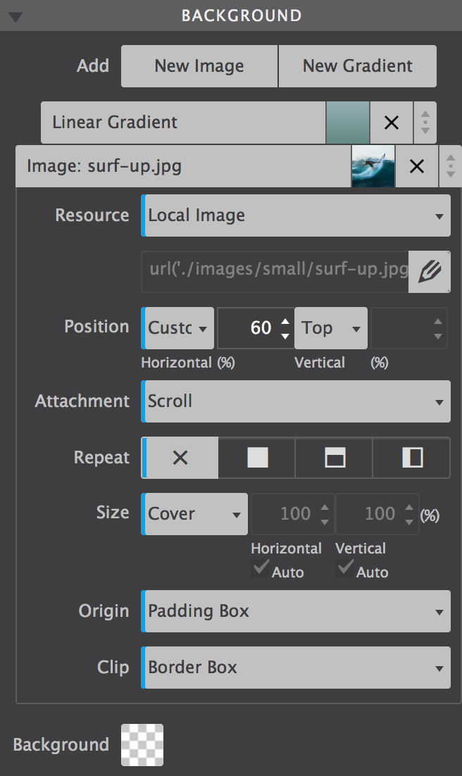
The Size control offers many options for specifying the size of the background-image. Images can be scaled up or down, made to cover the entire background or be instructed to display entirely. It's a very useful control so let's have a more detailed look.
The default is Auto, which tells the browser to calculate the size based on the actual size of the image and its aspect ratio.
Frequently used for full-background sections, Cover tells the browser to make the image covers the entire container. Even if the images needs to be stretched or cut a little bit off (on the edges). This is especially handy in a responsive design where the size of the element or container with the background usually has a variable width (and/or length).
The Contain setting on the other hand, gives the instruction to always show the whole image, even if that leaves a little space to the sides or bottom.
A Custom size can be specified for the width, height or both. By unchecking either or both Auto boxes a value can be specified. Please note that this can easily influence the aspect ratio and cause distortion in the image — use with care!
With backgrounds frequently defined for containing elements, Origin and Clip are probably the least frequently used background controls.
The Origin defines where the top-left corner of the background starts. Starting with the outside part of the element, the background extends to the edge of the border using the border-box value. The padding-box setting makes the background start at the border (underneath the padding) using padding-box.
When using content-box the background is restricted underneath the content area. Container type of elements don't have a content area and this setting will have no or minimal effect.
Clip works in a similar way, except it clips the background instead of resizing it.
Border
Borders can be added to elements using the Border control. Clicking on the circle in the center of the icon selects (or deselects) all borders. That does not mean that a border is enabled or disabled, it is just a way of selecting the border(s) for applying the style settings with the other controls.
Multiple borders can be styled at the same time. In the image the top, right and left border have been selected and a border-width or 2px has been applied. The border-style is (a) fixed (line) and the specified color is orange.
The bottom border — deselected in the image — has the same style and color, but has a width of 6px. This can be seen by deselecting the other borders and clicking on the bottom border in the icon to select it. The example below shows the result of the border (and border-radius) definitions.
If borders are selected that have different styles applied, a red line is visible at the bottom of the controls for which the styles differ. If these styles are changed, they will be synchronized over all selected controls and the red line will disappear.
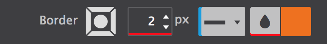
The border-width values are not the same for all borders.
Tool set for the border and border-radius.
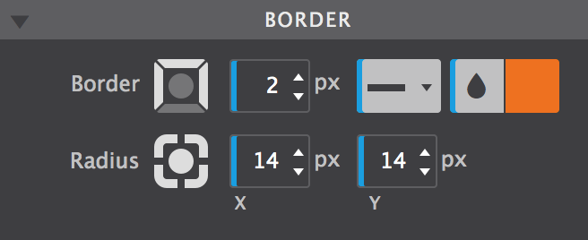
In terms of selecting the border, the Radius control works in the exact same way as the Border control. This control can be used to 'round' the corners of an element. It is not required for an element to have borders to do so, in the absence of a border this will be applied to the background of the element.
The higher the value, the more rounded the corners. Setting different values for the horizontal (x) and vertical (y) part of the corner and/or for different corners can be used to create certain shapes.
To create a circle as seen in the flex card example, define an equal width and height, in combination with high radius values.
Effects
The effects sections consist of a number of controls that can add a nice touch to the initial appearance of a design. The controls also work great in combination with the hover and out of view states.
The below example uses a scale and rotate effect when the images, respectively the buttons, are hovered. To see the effect in the app hit the Preview icon in the toolbar, then hover the example.

The buttons use a little bit of box-shadow. This control is very similar to the text shadow control but, as the name implies, it works on the (element) box instead of the text.
In addition the shadow can be set on the inner element, inside the border. To do so simply click on the icon with the inward arrows. The Spread will cause the shadow to expand and grow bigger.
Shadow controls.
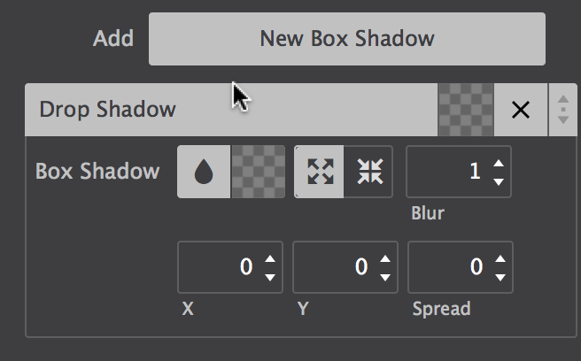
Just like backgrounds and text-shadows, box-shadows can be layered. In combination with the different controls for positioning, sizing and coloring the shadows, this can create some cool effects. One more thing that's good to know: if a border-radius is specified, the box shadow takes on the same rounded corners.
The Scale control is part of the CSS transform toolset. It modifies the size of an element or group of elements, increasing or decreasing it.
The Translate function moves an element sideways, up and down, or a combination. This 'shift' it often used for hover or 'scroll into view' animations. There are two main reasons, firstly moving objects with translate does not affect the position of other objects, the rest of the UI will remain stable. Secondly, moving elements with translate is less CPU intensive and better for overall performance then, let's say, moving absolutely positioned elements.
Tools for creating cool effects.
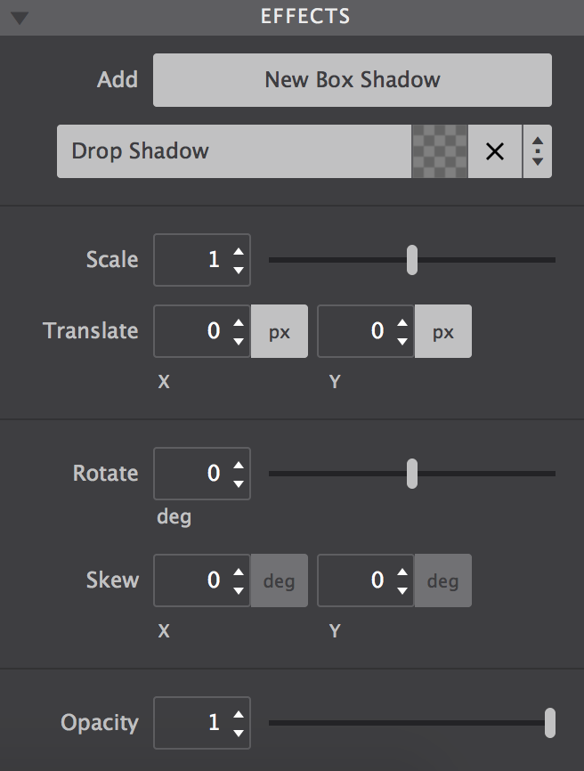
Elements can also be rotated. Rotate moves the element clockwise from its original position with positive values — negative values rotate it in the opposite direction.
The Skew transform tool 'tilts' an element one way or the other. It distorts the element by moving each point to the specified coordinates.
The Opacity tool defines the transparency of an element. The lower the value, the more of the background will 'shine through' the element. The value applies to the element as a whole, including the elements it contains.
Additional Resources
Filters & Blend Modes
With these controls you can change colors on the fly, tweak settings for smaller displays, and make them respond to user with interactive effects and transitions.
Filters and Blend Modes
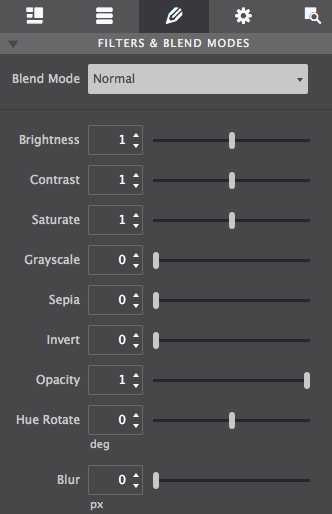
Demo 1: CSS Filters
Transform images into stylish works of art by altering brightness, contrast, sepia, and more.
Mouse over images to see the original
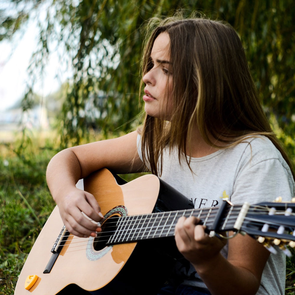
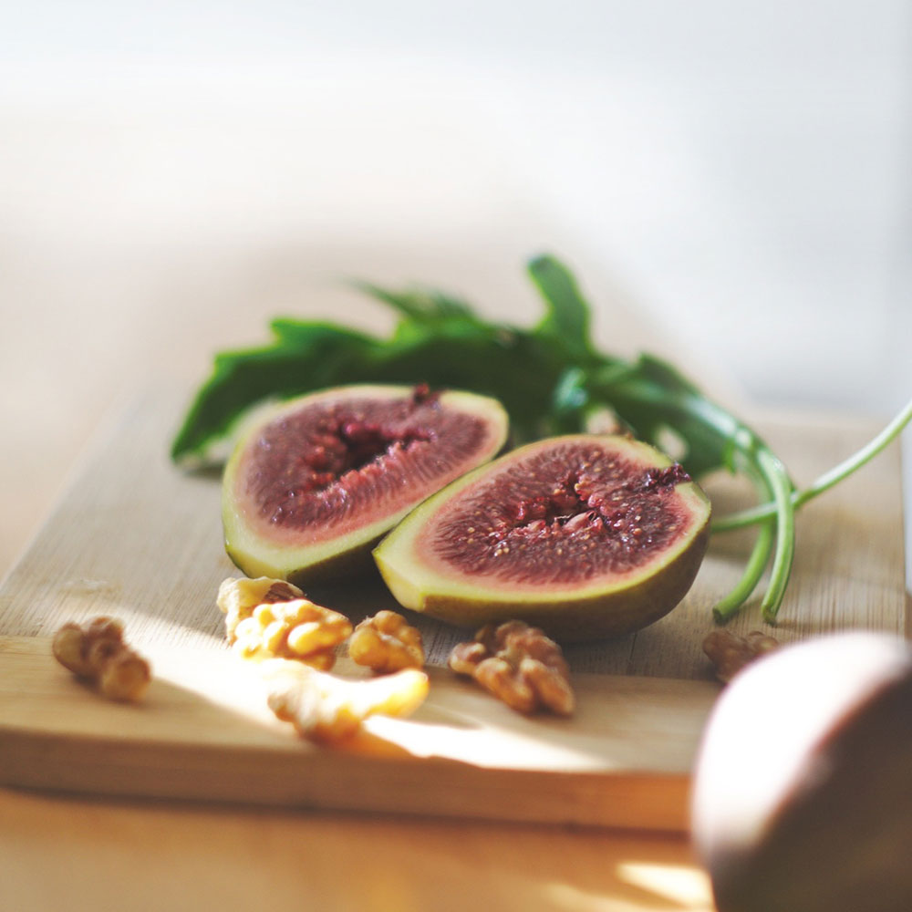
Demo 2: CSS-A-Gram Effects
Prestyled effects. Fun to make
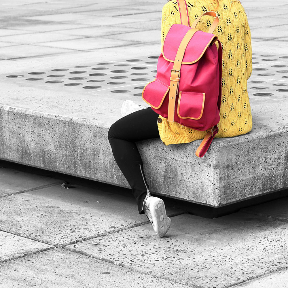
Demo 3: Blend Modes
Mix multiple backgrounds and colors together along with Photoshop-like blend modes such as Overlay, Hard Light, and Color Burn.
Exposure
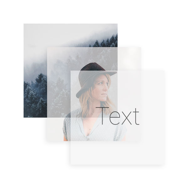
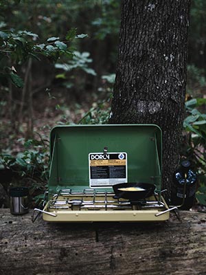
Double exposure, a trendy effect that is hard to recreate even with Photoshop. But with CoffeeCup you can get it running directly on pure CSS! Here we show a fixed forest image on the background with a girl scrolling over it and, lastly, text that blends on top. All them combined give you an incredible result that will make all the difference.
Demo 4: Blended Action
Apply scroll effects for desktop-viewers to stop them in their tracks as the image comes into view. Texts stay there which makes this accessible and SEO friendly.
Demo 5: Typography
Look mom, without images! Which makes this accessible and SEO friendly.