Create better, attractive forms
Forms are essential for connecting and interacting with site visitors. Stylish and attractive forms are necessary to actually make them want to fill it out.
Design stylish forms to fit the theme of your website.
Online forms are found on thousands of sites across the web due to their usefulness. However, this is one feature that always seems to fall victim to the ‘sameness’ category with standard text fields, boring radio buttons and a sea of checkboxes. Forms like that can feel more like a chore to fill out. In a web-centered world where first impressions mean everything, you’ll want to make sure your form stands out and is inviting for your audience. Whether you're a pro at the backend and struggle at the front- end, or you struggle at all ends yet still desire a unique form, Form Designer's there to cover your end.
Using visual CSS controls, the focus is on the content and experience design, not on hunting and tweaking code snippets.
Don’t know any CSS? This app will help you learn by doing.
The visual design tools in combination with the real-time preview provide an excellent feedback mechanism that helps to understand the effects of adding or changing CSS code. We have heard from a great many Photoshop and Illustrator specialists with limited CSS experience how spectacularly their workflow has improved. They are now designing in one of our responsive apps, directly for the web.
The graphics programs are now used as they should, for creating supporting materials such as icons, backgrounds and for image effects*. No more laborious static prototyping for various screen sizes, just one design that can be viewed and adjusted for any device width. And the results are super spectacular too!
Unchained from rigid form templates, design and function creativity can run wild and free.
Having yourself tied down to the rigid rules and limitations that several form templates provide can be a serious bummer. It not only puts a major strain in your design muscle, but it shifts your focus down to, "What is it that I can and cannot do?", which can detriment the progression of your app.
About this help guide
The workflow and interface of Form Designer are very similar to Responsive Site Designer and CSS Grid Builder. Sometimes we will link to more in-depth articles, tutorial videos or helpful tips originally created for these apps. Just thought to give you all the heads up when you notice a RSD or CGB icon or reference — the instructions will apply to Form Designer in the same (or scarily similar) way.
Do you have a special tutorial request? Let us know!
Contents in this chapter
Application Overview
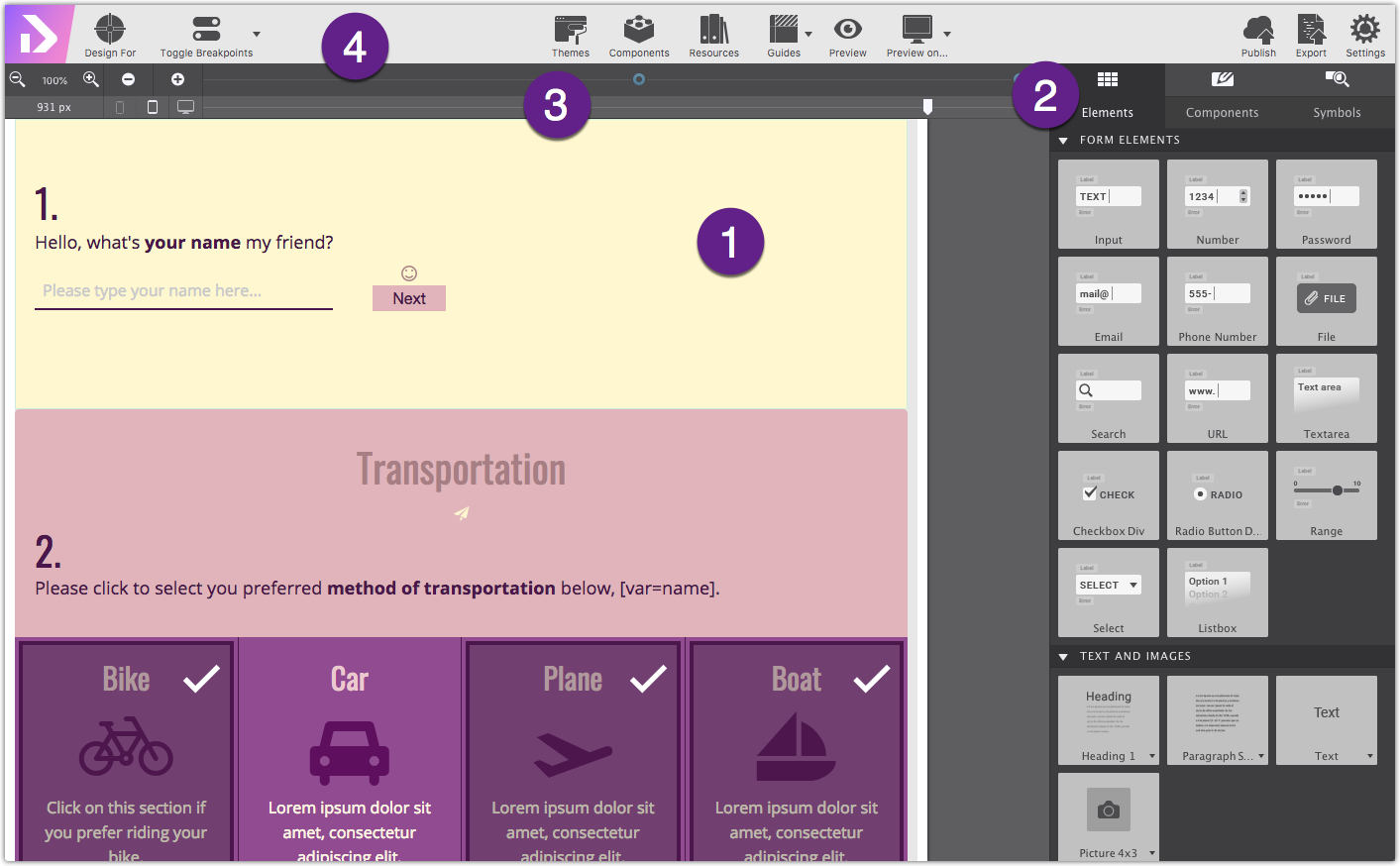
#1: The Real-Time Canvas. The most used part of Responsive Form Designer: the real-time canvas. The canvas, marked as #1 in the image below, is a browser-based working area. A major advantage is that what you are creating, will look and feel the same as when the site is actually published on the web. The canvas is mainly used for the live design view, selecting or reordering elements, and editing texts.
#2: The Control Panes. On the right, there are 3 panes, each with specific roles for visually managing the content, elements and effects.
#3: Viewport Slider & Breakpoint Manager. Right above the working area, you will see a bar aka 'The Responsifier’. This bar, contains a number of tools for managing the design at all possible devices widths.
The Form Designer uses a mobile-first workflow. This means the design process is initially focussed on small (mobile) devices at widths to the left of the first blue dot (breakpoint). All default styles will be applied first, then adjustments can be made for larger screens by moving the slider to the right of a breakpoint. A breakpoint becomes active when a blue dot shows a black center.
Breakpoints, which indicate changes in layout or content styles for a certain screen size, are noted with a dot along the top of the Width Slider. Framework specific breakpoints are indicated by a color, while custom breakpoints will display as white. Add and delete breakpoints using the +/- at the left side of the width slider bar.
#4: The Toolbar. Access commonly used functions such as the Page Manager, project Resources, browse the Components Library, launch a Preview in a specific browser, Toggle Breakpoints, even Publish.
THE CANVAS (WORKING AREA)
This area visualizes what the web site visitor will experience when landing on the page. In combination with the Slider (part of The Responsifier), every device width can be previewed while designing.
If you are interested to see how a specific part of the design behaves at different screen widths, select any element in that section. In normal browsers the content will flow out of view when resized, however, in Form Designer the selected content is auto-scrolled back into view. A small, but an extremely handy perk of the app!
On the canvas, elements can be selected by clicking on them or by selecting them from the dynamic dropdown. A selected element can be dragged and dropped into a different position or container. Selected elements can also be duplicated or copied and pasted into a different area.
Insert Page Text / Working with Text Editor
Text elements can be edited right on the screen when the Text Editor is active. It can be activated in a number of ways. Right-clicking a text element will open up a contextual menu with the option Text Edit.
You can also double click the text on screen to begin typing your words. Lastly, click the A the icon at the top of the Styles pane, or when you hover over any text element.
When the Text Edit Mode is activated a blue banner indicator will appear at the top of the panel.
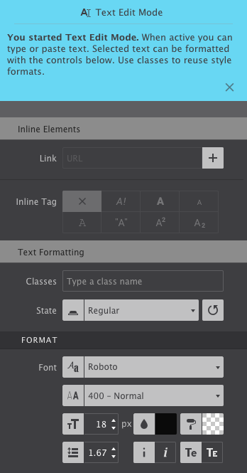
Several typography controls will display as well for making inline edit. You can bold words within a paragraph, insert a link, change colors or font and more. Only use these style controls when you want to make a variation from your regular, default typography selections.
For example, bolding words in the middle of a sentence, or changing a color of a word would be styled inline with the text editor pane.
Super Hot Tip!
The style choices configured on the Text Editor panel are for inline editing only. Your default typography selections (like font type, color, size, spacing, etc) should always be configured on the Styles Pane.
It is a common mistake to accidentally apply styles within the Text Editor pane. While it will work, it can cause difficulties for you in the future if you ever need to make global styles. Plus it makes the backend markup kinda messy.
Be sure to click out of the Text Edit/Inline Editor mode before you begin changing the appearance of the text.
THE CONTROL PANES
On the right side of the UI, there are three panes each with a specific role in creating the responsive design. The icon is replaced by the pane name upon hover. Here’s an overview of each of the panes, details on each pane are provided in the next sections.
The pane on the most left is the Content pane. The Content page is divided into three sections: Elements, Components, and Symbols.
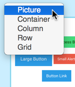
Under Elements, your form items such as text, images, buttons, and a bunch more can be inserted into any container on the canvas.
The subpane Components gives access to all saved, reusable form items.
The second control pane, the Styles pane, is probably the most frequented. It is organized into two main parts. The top section is used to configure the HTML / content part of the element. For example, framework classes can be ‘filtered up’ from a predefined list, CSS Type and custom Classes and ID's can be applied or you can select an Element's State (Hover, Active, Out Of View) for which you want to style.
The second part of the Styles pane is divided into three sections: Layout, Design, Effects. These contain all the inputs, tools and controls to manage the design's layout, style elements, Typography, Dimensions and so on. Layout controls such as Flexbox and CSS Grid can be found here as well.
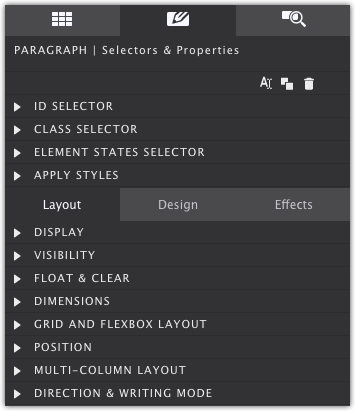
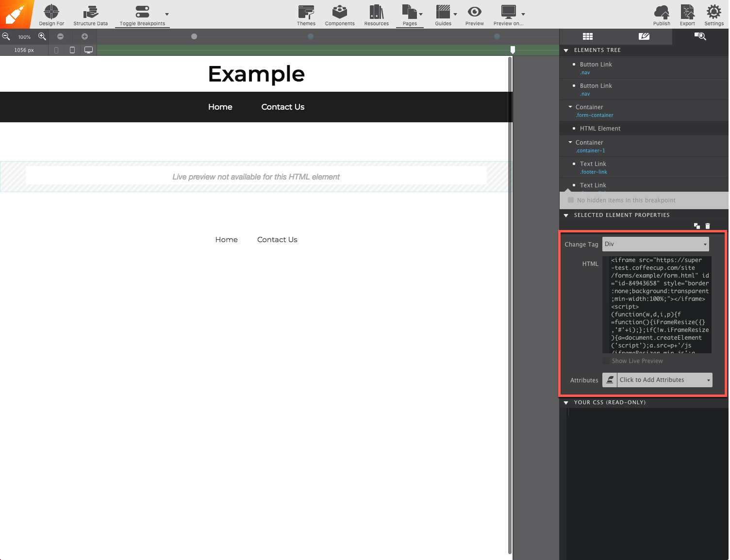
The third pane is the Element pane. The top part of this panel gives a page-inspector view, a tree-like, overview of all elements on the page. It offers a fast way of selecting and reordering elements and, for example, toggling the visibility of hidden elements. The bottom part offers a preview of the CSS rules added. And Property fields for special elements that require linking with a resource (such as an image file, video link, or custom HTML).
Element properties are also configured wihin the Element pane. For example, syncing image resources, or element restrictions such as making an item a required field.
TOOLBAR FUNCtIONS

The toolbar includes direct access to project tools, settings, and functions.
Manage project Resources such as images and oversee the file and folder structure. You can also use the toolbar functions to Preview in the canvas or Preview On any installed browser. Export the files to your computer, or Publish to your S-Drive account.
Access more advanced controls such as activating Feature Queries and insert Structured Data. You can also use the toolbar functions to Preview the design on any installed browser, to Export and Publish the site.
The Settings control is where you can name your project, choose configurations for exporting, or connect to S-Drive.
GUIDES
The Guides button allows you to visually toggle indicators around elements and the grid structure making it easy to know where elements are located and spaced.
Gridlines are lightly colored horizontal and vertical lines that appear around elements in your project. These guidelines are used to define the boundaries of elements and containers on the page.
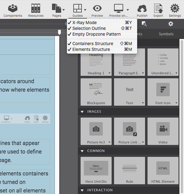
X-Ray mode allows you to see at a glance how the elements containers are set up. When this is enabled, all grid options are turned on background images are removed and an opacity is set on all elements allowing you to see the grid configuration. You will also notice that things are color coded for easy recognition.
THEME MANAGER
Start your project using File > New From Theme. This will launch the Theme Manager displaying any themes you have loaded in the app. Fresh themes are currently in development. You can view additional design for sale or pick up any complimentary form designs within our Theme Shop.
Save any form designs as a theme too! If you have created your own template and want to be able to re-use it for other projects, simply go to File > Save As Theme. This will save your creation to the Theme Manager.
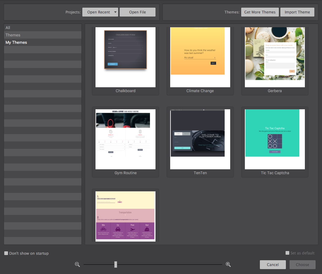
To build your form free of a pre-designed theme, use one of the “blank” themes and start with a clean canvas.
TOGGLE BREAKPOINTS
Breakpoint mode can be used to define styles for a particular media query, independent of the slider position. By disabling all breakpoints styles are not tied to any media query.
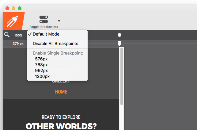
This, for example, allows you to have more space in the working area while working on the default styles. If you are used to working desktop-down this feature can be extremely handy. Just be sure to re-enable them when you are ready to make adjustments for larger screens.
DESIGN FOR...
The Design For.. toolbar icon allows you to activate Feature Queries.
This feature allows you to create production-ready designs with CSS Grid as the layout framework — as well as provide an alternative stylesheet for unsupported browsers! By applying fallbacks, your design will always look good everywhere.
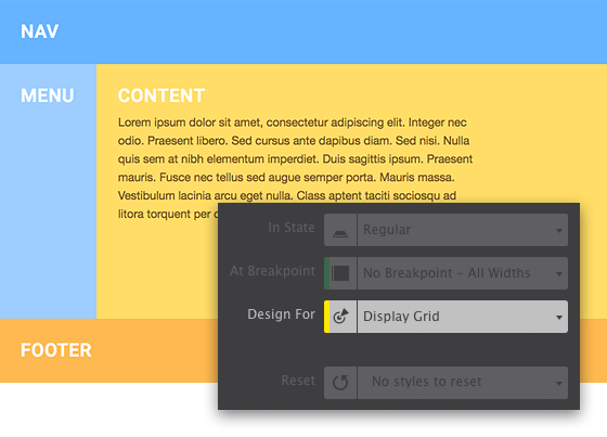
First, build your layout first for Internet Explorer (and any other browser that may not support CSS Grid). Once the default layout and styles are in place, switch the Display For control to Grid, and then tweak the design for modern browsers.
Additional Resources
Components
The benefit of using a CSS framework is the ability to create more complex site features. Components are typically a combination of elements that produce a specific action.
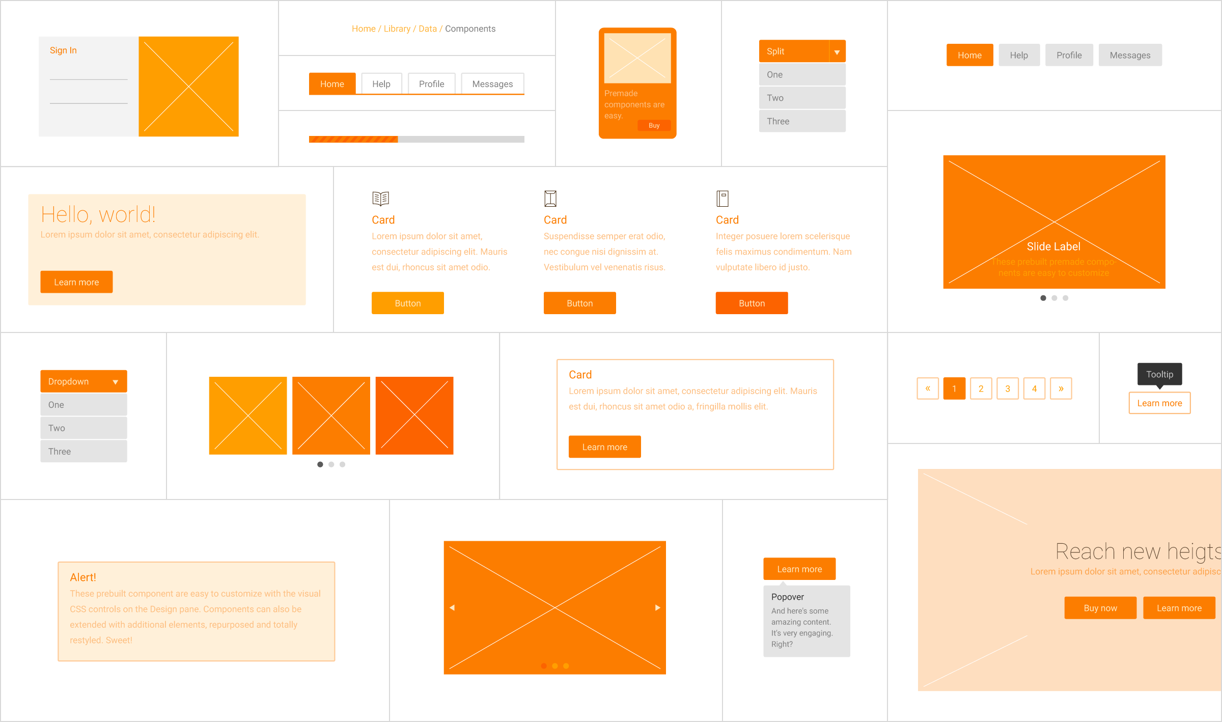
Save custom components to your library to reuse them throughout your projects. Items can be given a description and organized in folders to keep you organized.
Add Components from your library using the Components toolbar icon.
Additional Resources
PUBLISH AND EXPORT
Control your content with two options to choose from for putting your form online; publish to S-Drive or export to any server using an FTP client.
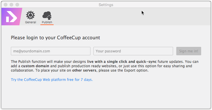
With Publish to S-Drive, the app does all the work for you by automatically uploading all files to your CoffeeCup Account. No muss, no fuss! To do so, click the Settings toolbar button and switch to the Publish section. Then enter your CoffeeCup account information.
When using the Export method, a folder will be generated that contains all of your form files. You then need to upload everything in this folder to your own hosting service. Click either the Export toolbar icon or go to the File menu > Export to begin the export process.
With both publishing methods, Form Designer will generate an embed code for you so you can insert the form into a website.
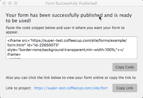
Using Responsive Site Designer to build your website? Open the page where you want the form to display. Add an HTML Element on the canvas. Then go to the Element pane to paste the code generated.
At this point the form is in the page — high-five! However, you will not be able to view it until you publish.
Additional Resources
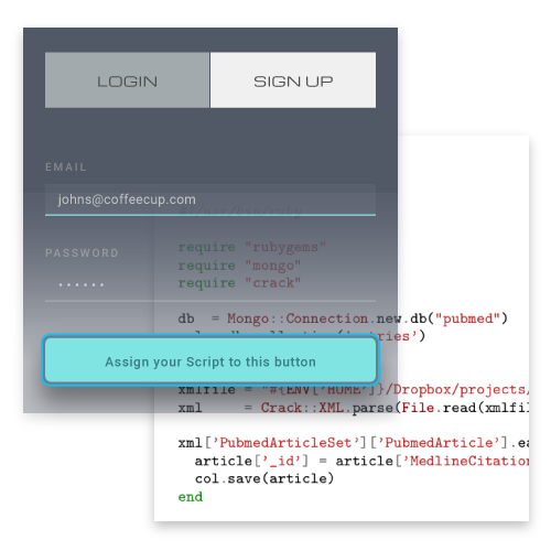
Connect To any script
Once it is embedded into your site, you'll need to connect it with your processing script. Forms can have many faces and functions. Form Designer allows you to design for anything and connect to any script you, your developers, system vendors or integrators see fit. (And anyone else too).
Using Web Form Builder? Brilliant! You can hook in a Form Builder form script into your Form Designer project.
Resources
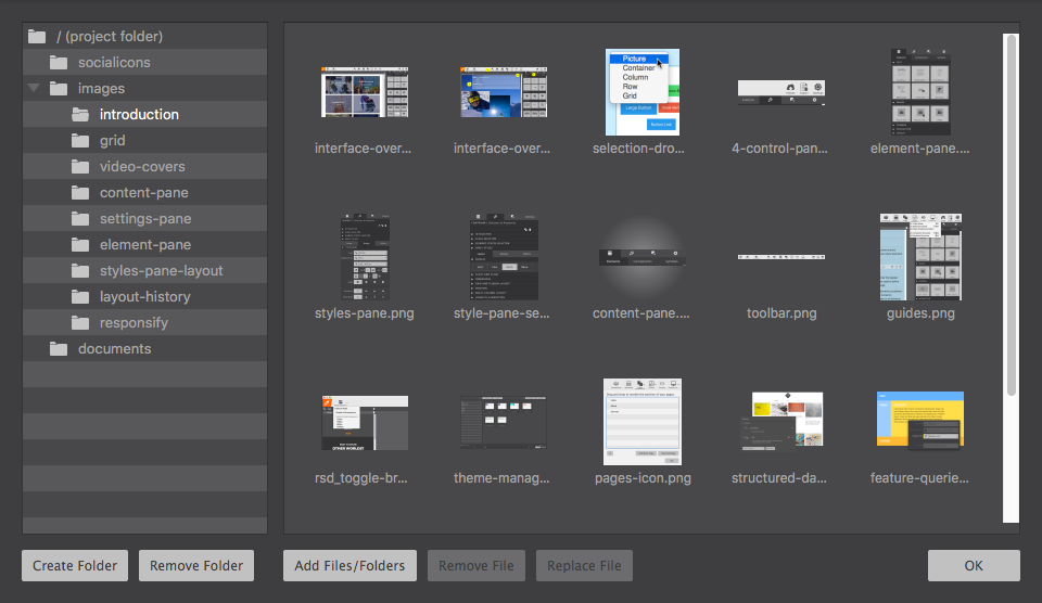
The Resources toolbar icon launches your file management window. This is where you manage additional project files.
Create folders to organize your content such as images, documents, and scripts. When the form is published or is exported, the file structure will remain intact.
Working with Variables
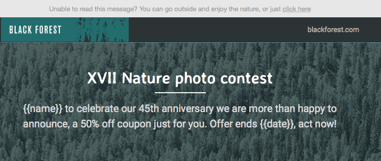
Yep, that's right, you can use variables to insert fields found in your recipient list and even use them to create conditionals! Variables are the fields found in your recipient lists and they allow you to pull information from those fields and automatically insert it into your email design.
Variables can be added to any text element or URL by selecting the element and entering the Text Edit Mode. Here you will find the variables dropdown where you can choose the desired variable and click the + (Plus) icon to add it to your design. Once your email is sent, the variable will be filled in with the recipient's information.
Variables can also be used to create a conditional message. Meaning if one variable is not present, another can be displayed. As an example {{#if url}} You can find your site here: {{url}}.{{else}} Your site will be ready soon!{{/if}}.
The above conditional in lamen terms says “If there is a URL found for this recipient say: ”You can find your site here:” and automatically insert the link to the URL, but if the recipient does not have a URL, say: “Your site will be ready soon!” Plus, delete the first part of this message.