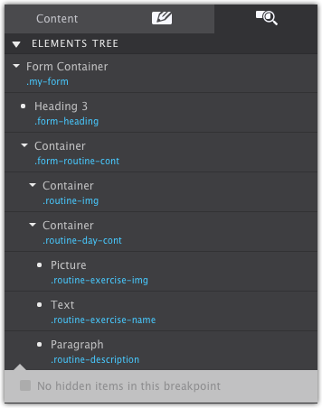
The Element Pane
This pane is very similar to the web inspectors found in browsers such as Chrome and Firefox. The top half of the inspector pane shows the DOM tree; a list of the page elements and their nesting. Mousing over an element highlights the element and shows its selector and dimensions on the canvas. The element itself is highlighted with the blue / gray color, and margins are displayed using the rose colored area.
Elements can also be selected and moved to other positions. When selected, the canvas scrolls automatically to the element position. Double-clicking the element will bring up the Styles pane for that element.
To move and element or element group, simply click and drag. While dragging, a gray indicator bar will represent where the element will be placed when dropped.
All the duplicate and copy and paste functions work when an element is selected in the tree. For example, the keyboard shortcut CMD/CTRL+C will copy it. Then select the element where you wish to place it and use CMD/CTRL+V to paste it (or use the right-click menu).
Element groups — containers and link containers — can be collapsed by clicking on the arrow.
The orange dot next to an element signifies that it acts as a symbol — updates to a symbol will trigger down to all instances of the 'symbol element group.'
Contents in this chapter
STYLING AND EDITING HIDDEN ELEMENTS
Elements or element groups are not always visible to the visitor and therefore also not always visible on the canvas. Examples include mobile menus that slide into view, accordions of which only one container is visible at a time, modal dialogs...up to simple dropdown.
The strike through eye icon next to an element in the tree indicates whether it is hidden on the canvas at the current breakpoint or state.
To show a hidden element — so it can be styled — just click on the icon. It will change to an eye and the app will override the styles that hide the item. You can also do that for all elements on a page by clicking the 'Show x hidden item' toggle at the bottom of the pane.

Please note that under certain circumstances this may currently override applied positioning styles such as flexbox. This happens only when the eye 'forces' the visibility and will not happen for the published or exported site.
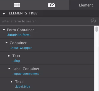
Inspector Filter with Search Functionality
Locate a class or element fast by keying in the term into the search. The app will bring up all the items that are a match and will highlight them on the canvas.
CSS Preview
The CSS that is applied to the selected element is visible in the bottom half of the inspector pane. By providing the CSS applied to the selected element at all breakpoints, the inspector gives you a sense of exactly what is going on "under the hood".
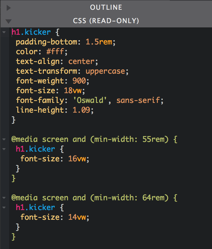
Read-only or editable? We do have plans to add the ability to edit the CSS live. To help us prioritize our development work, please let us know how important you find this by leaving us a note in the forums. Or just hit us up on Facebook or Twitter!
Element Properties
Elements that require special configurations will display their corresponding controls here. This includes applying the source for Link, Picture and Video elements. Insert custom markup into the HTML element, or configure interactive elements.
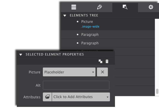
Connect your social media buttons to your accounts. Framework attributes can also be assigned to elements from this control panel.
Additional Resources
Data Attributes
The data attributes play an important part in adding interactivity to a design. See them as ‘hooks’ that tie an element to Javascript and clarifying can be used to as and to specify additional information about the element.
Interactive elements add a touch of professionalism and a dash of fun to any website (who doesn’t like a nav menu that transforms into a hamburger icon on small devices?). But these types of features require communication with JavaScript, which means building sites without this app you’d have to mess with pulling those codes in yourself. This hard work is eliminated for you using the Foundation and Bootstrap CSS frameworks as the JavaScripts are built right into the framework and can be pulled in by using Attributes.
Depending on which framework you are using, there are many different options to build using attributes. You will also find Aria attributes within this section allowing you to set Aria based roles for elements in your design.
Additional Resources
Attributes Tutorial: Show/Hide Items with Toggler
In the video demonstration, the webpage is built with Foundation. So the Class names and Attributes are assigned by that framework. The goal is for a button to show a hidden section of the page.
The Button will be the Toggle, and the pricing Container is the Toggler.
Video Recap:
1. The Data Toggle attribute is applied to the trigger element (in this case the button) on the Element pane. The attribute value Price. This value is the ID name of the content that is being called to appear.
2. Next, select the element or the group you want triggered to show/hide when the button is clicked. In the video, the parent container holding the pricing info is selected. On the Styles pane, the ID name Price is applied to that it matches the value entered to the Data Toggle.
3. The triggered element is given the Class Name is-hidden
4. On the Element pane, the triggered element is given the attribute Data Toggler with the value is-hidden.