Placing Grid Items
As we have seen above, as soon as a parent container is set up to display: grid; the child elements inside of it become grid-items. That means that they flow automatically into the cells of the grid, starting with the first row and according to their position in the source.
The first element in the code gets the first cell, the second element the next available cell in the row. When the row is filled, the same is repeated for the next row, until all items are positioned. If there are more items than cells, implicit rows are created using the same column structure until all items are placed. Especially when using a Content Management System such as Wordpress where content is created outside of the design, this can come in really handy.
The default positioning behaviour can be influenced through various properties for the grid container. We will come back to these more advanced grid configurations later, first let's see what can be done with the grid-items directly.
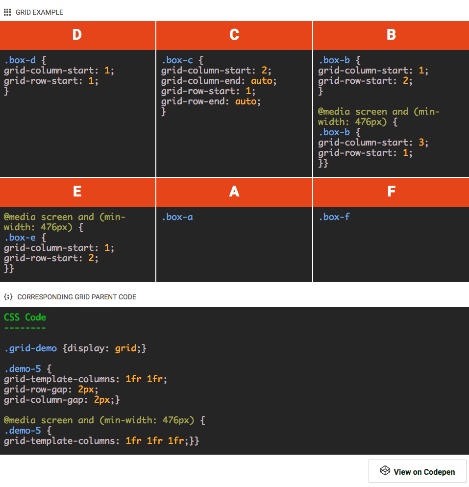
Grid-items can be specifically placed on any section of the grid, again with a minimum of simple instructions. In the example below the visual order of of the boxes has been changed — now Box D is placed in the first grid-cell, Box C sits in the second and so on. Please note that the HTML code, the order of the containers in the HTML, is still exactly the same as in the 'setting up the grid' example. In the HTML Box A comes before Box B which comes before Box C etc.
In this demo the items are placed in different cells using the 'grid lines' method. The CSS that determines where the boxes are placed has been included in the containers. How this exactly works is explained in detail below.
Contents in this chapter
- Code Demo: Placing Grid Items Using Grid Lines
- Explanation: Placing Elements On Grid Lines
-
Code Demo: Line-Based Grid Placement - Take Two
-
Explanation: Grid Item Placement Using Grid-Lines - Take Two
- Code Demo: Named Grid Areas For Item Placement
- Explanation: Placing Items In Named Grid Areas
- Code Demo: Semantic Grid Area Names
- Explanation: Creating A 'Layout Map' With Area Names
Code Demo: PLACING GRID ITEMS USING GRID LINES
EXPLANATION: PLACING ELEMENTS ON GRID-LINES
First, begin with the grid setup in the code box below the demo container. Since the items in this example don't have the same amount of content, and I don't want to run the risk of some columns being wider than others, I am not using the 'auto' values. Instead, I am defining equal width columns using the fr unit: each column gets 1 equal part of the available space.
For the rows, you will see how they are automatically filled — grid items with less content still take up the same height as the adjacent item. This is the default convenient behavior but, as almost anything with CSS Grid, that can be changed.
Now back to the placement of the items. Except for box A and F, each of the grid items shows a bit of code that controls its placement on the grid lines. Grid lines are horizontal and vertical lines that form the basis of the grid structure. They can be used to precisely position items on the grid. Whereas the boxes previously were automatically placed according to their order in the markup — their DOM order — in the demo above each box is explicitly positioned between grid lines.
Using the .box-b class selector, the B box is now placed in the first column and second row of the grid on small screens. This is done by specifying the starting and end lines for both the horizontal (grid-column-start: 1;) and vertical (grid-row-start: 2;) placement. At larger widths — for screens with a minimal width of 476px — it is positioned back in the first row (between row line 1 and 2) but in the third column (between column line 3 and 4).
The other boxes follow a similar pattern, the inserted code sections for each element show the exact code that determines their placement. There are a few things to note.
Boxes D and C have not been repositioned at the media query, they remain in the same position independent of screen-width. Also, Box A and F have not been positioned at all. They automatically flow to the first available spot — the first grid-cell that is not taken up by any of the other grid-items. Box A sits higher in the DOM Tree than Box F, so that item is placed first.
On small screens Box E is not placed either, so there Box A also takes the spot before E.
As briefly mentioned before, CSS Grid makes it easy to visually rearrange elements independent of their source order. However, this does not change the order in which content is being read by a screenreader or perceived by a search engine. They will keep following the HTML code — reordering is for visual (design) purposes only!
In the demo, each of the boxes only takes up a single cell of the grid. In that case the end position does not need to be specified. The default value is auto which makes them take up a single cell. The code area in Box C shows this.
Indeed that indicates that the boxes — grid items — can span multiple tracks (columns or rows). Positions can also be left open and grid-items can overlap —CSS Grid is a powerful beast allowing for all types of creative layouts. We will look at a few of those designs in just a bit, for now let's get some more placement experience in.
CODE DEMO: LINE-BASED GRID PLACEMENT — TAKE TWO
EXPLANATION:
GRID ITEM PLACEMENT USING GRID-LINES — TAKE TWO
The CSS Grid syntax is extensive and very flexible — there are a variety of placement options, while the same result can be achieved in a number of ways. Although the concepts behind CSS Grid are solid and clear, this is what makes learning Grid a bit involved. The above example summarizes a few of the most important placement use cases, let's briefly discuss them.
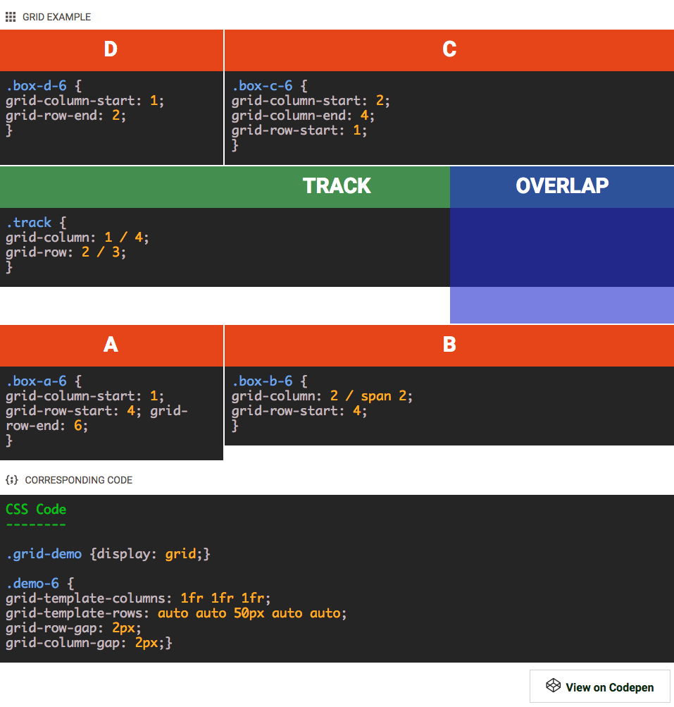
For this demo, the Grid setup has been modified from the intial example. Now also on small screens there are 3 columns — using the 1fr value each column takes up an equal portion of the width. I also created a total of 5 rows. All the rows use auto(matic) height sizing — they are flexing with the content, except for the middle row. This row has a fixed pixel height of 50px. No changes are made at any breakpoints.
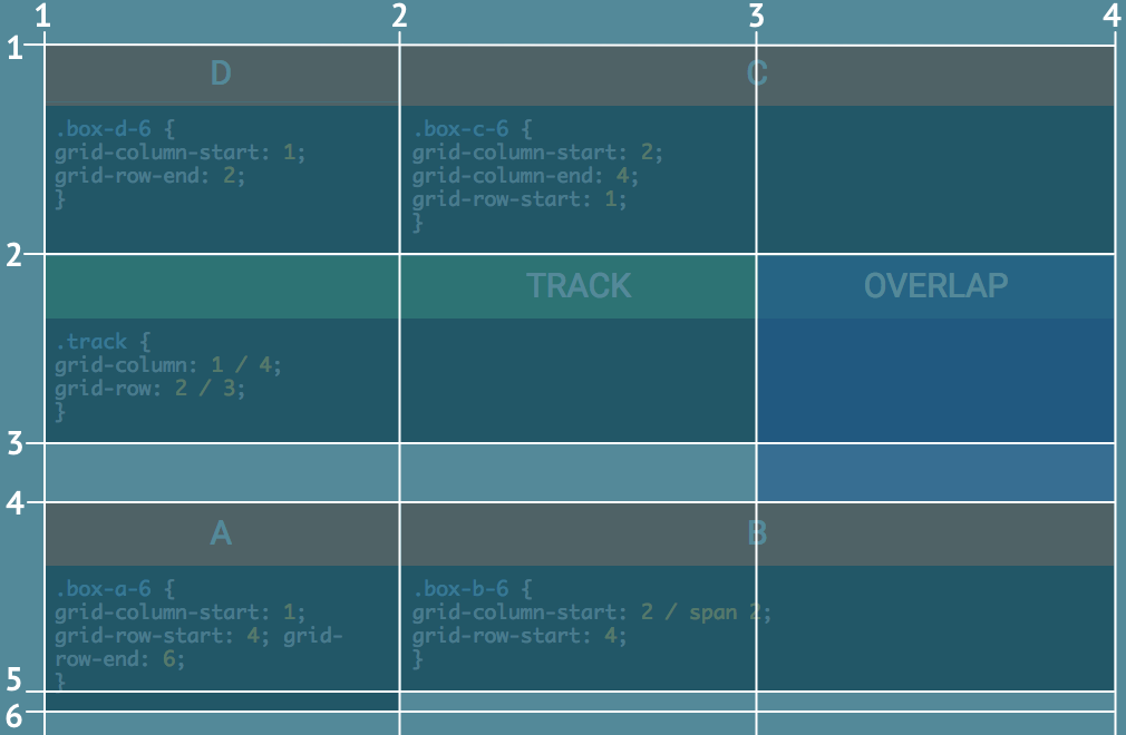
The detail of this grid setup are shown in the 'corresponding code' box in the example section. To clearly illustrate the grid-lines concept and show the rows, I added an image with overlay below. The grid-lines bordering each of the 5 rows are numbered 1 to 6 and white line has been drawn next to them. With the right visual in mind, let's see what's up with the grid items!
Starting with box D — which uses a new selector box-d-6 as to not upset the previous example — the row placement is done differently. The column-start definition is as we saw before, the item is placed as of line 1 and fills 1 cell by default. However, for the row, no start position has been specified. The row-end definition takes care of that though; ending the placement of the item at row 2 and automatically going back to fill the one cell before that.
Box C has something new to teach us as well. Grid items can be instructed to take up multiple cells by increasing the end value. Starting at line 2 and ending at line 4, this box spans columns 2 and 3.
Jumping to box B you will see that this grid item also uses column 2 and 3. Here however only the start is specified. Then the span keyword is used to make the box stretch 2 columns, up to line 4. This box is placed within row 4 — starting at line 4 and automatically spanning a single grid-line up to line 5.
Please note that this makes Box B slightly less tall than Box A . This box also starts at line 4 but ends at line 6, spanning 1 additional row.
There are also two new kids on the grid! A green box that illustrates the 'track' concept, and a blue box showing that elements can also be layered and overlapped. As mentioned before, a grid track is either a column or a row from the start to the end. The green track box is placed on the second row and shows the 'shorthand' syntax for its placement —column line 1 to 4 and row line 2 to 3 — in the embedded code box.
The blue overlap box is placed in the last column. For vertical placement it uses row 2 and 3 — starting at line 2 and ending at row line 4. Since this element was added after the green track box in the source order it sits on top of that box. The layering order — 'depth' — can be controlled using the z-index.The item with the higher value will be placed above, and potentiall cover, an item with a lower value.
The third row — which has a fixed height of 50px — shows that cells can be left unused. The Overlap box uses the third column cell, but the first 2 cells are 'empty'. Since there is no physical container like in an HTML grid — the CSS Grid creates 'virtual' space — 'empty' is a bit of a strange word here, but is does illustrate the concept. Please note that, if no elements are placed within a track and no size is specified, it will collapse to a 0px track. Since Box A uses row 5 this is not happening there, but it is what would happen if we would add a row 6.
Pwewies, that's a lot of layout power right there! Yet, there are more exciting things to come...let's continue with an alternative way of placing items, using grid area names — yay!
CODE DEMO: NAMED GRID AREAS FOR ITEM PLACEMENT
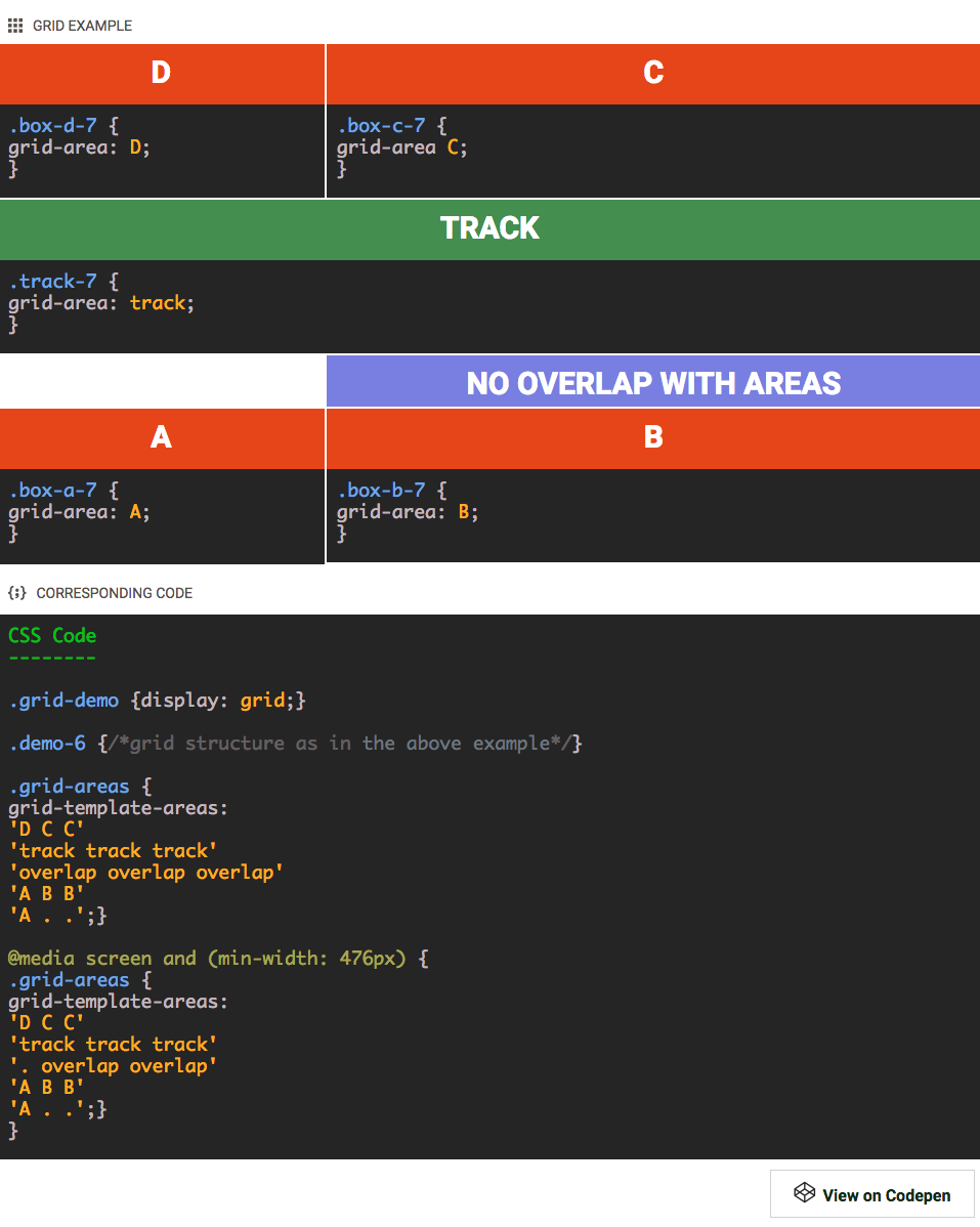
You can give grid cells a name and define areas by giving adjacent cells the same name. Taking this approach you are basically creating a semantic map of your design. And it gets even better, on its turm the grid-items can be positioned by simply entering the corresponding area name like so: grid-area: area_name;. Very powerful and intuitive, let's dig into this!
EXPLANATION: PLACING ITEMS IN NAMED GRID AREAS
To create the named grid areas I added the class .grid-areas to the grid container (parent) element. For that selector 6 grid-areas have been specified, one for each element.
The cells are named on a per row basis — for each row, from left to right, a name is entered between the quotes in the code section above. The first cell in the first row is defined as area D, the next two cells together create are C. The entire second row is defined as the 'track' area. An abstraction of of the map — and the way it would be seen in the app — would look as follows:
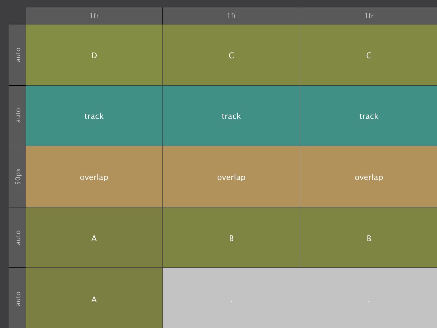
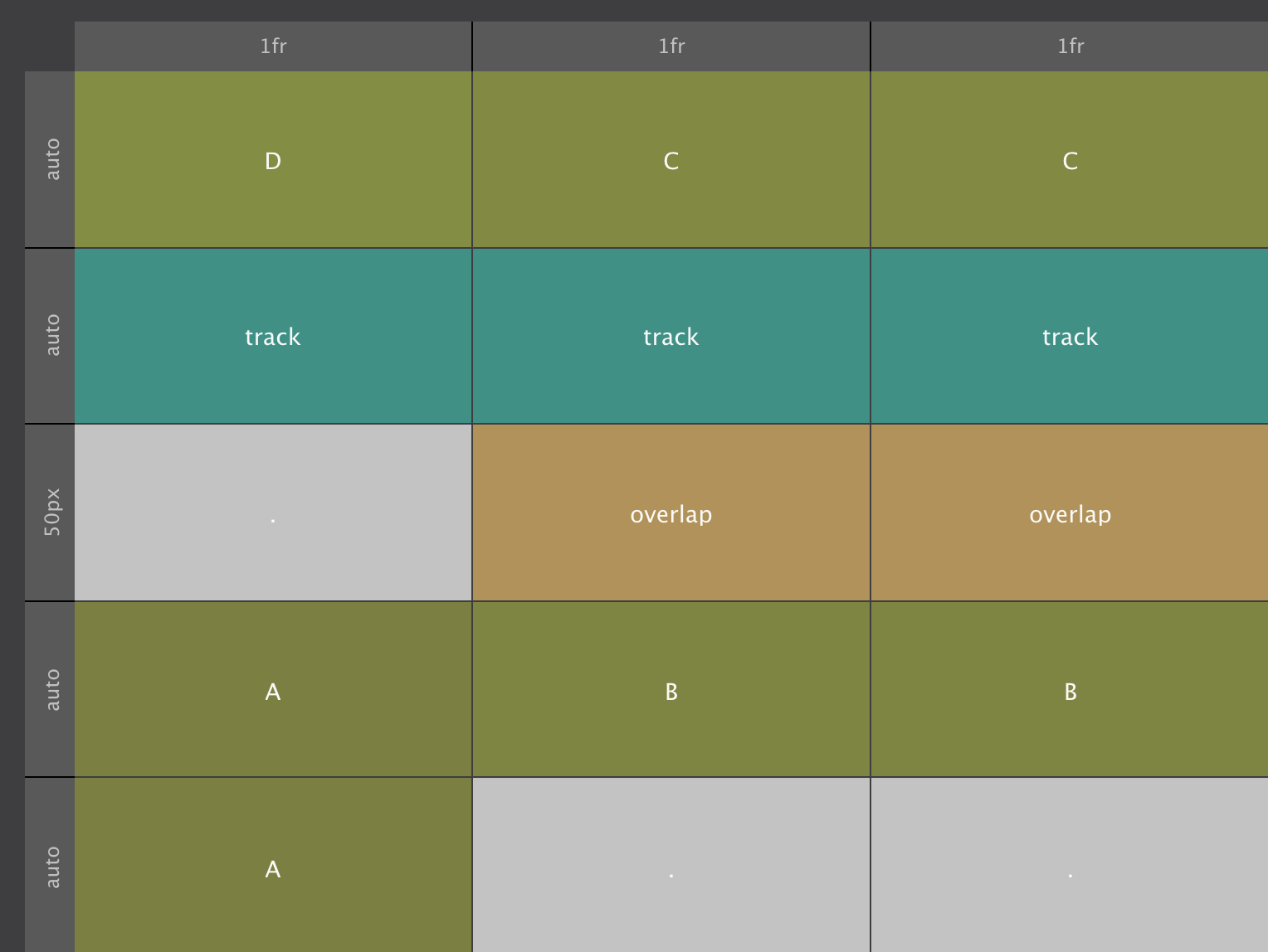
These grid-areas can be changed at breakpoints. At screens wider than 476px the overlap area does not start at the first cell, but in the second, leaving the first cell empty. When no name is specified, a period is used, they signify empty cells. There the map looks like this:
With the named areas defined, placing the items is as easy as pie. Box D, for example, finds its spot by simply telling it to go to grid-area: D; The other items are placed in a similar way, the code can be seen below each of the items in the example.
One thing to notice is that there is almost no height difference between Box A and Box B this time. This is explained by the content — since the amount of content is the same, thelast row collapses to zero pixels. However, it will still span over the gutter, explaining the 2px height difference.
This method of placing the items can be combined with line based placement. For example, the purple / blue container could still be placed in grid-column: 3; and grid-row: 2 / 4; to create the overlap from the previous example.
Clearly using letters for grid-areas is not the most intuitive way of naming them. Using more semantic names an intuitive map of the design can be created.