Introducing CSS Grid
Ever since the design profession came to the web world — when websites went beyond linked text documents — layout creation has felt limited and cumbersome. Starting with (nested) HTML tables, many hacks have come and gone to deal with the layout problem.
CSS Grid is the final answer to all layout hacks and inconveniences.
CSS Grid is the final answer to all layout hacks and (most) inconveniences. Defined as a two-dimensional system for placing elements, it is the very first layout method that truly separates content from layout configuration.
This is a big, big thing. Using 'grid' for layout is the hottest new design technique that has come to the web in years. And it is coming fast. Over the last year the browser suppliers have been scrambling to announce (future) support for the specification and getting it implemented. Firefox has been especially on the front lines, adding cool tools such as the Grid Inspector.
As of August 2017, all common browsers support CSS Grid...except for Microsoft Edge. The good news is that the next version of Edge will ship with good support. We have been testing with the Insider edition, version 16, and are overall pretty satisfied with how well everything grid related renders.
Does your browser support CSS Grid?
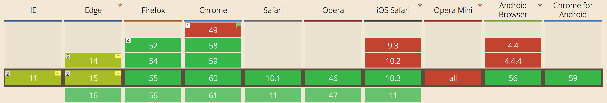
Better make sure you are using a green browser (version) before taking on this guide! Latest stats can be seen on caniuse.com.
The resources & news section for these chapters on CSS Grid are still a work in progress, so before we continue let's say a big thanks to Rachel Andrew and Manuel Rego Casasnovas right here. In addition to the official specs and the always awesome MDN, Manuel's write ups have helped to get a good grasp on element placement in a grid layout. Rachel's numerous grid examples and articles have been a big help. A full list of resources and references consulted for creating this guide and developing the CSS Grid Builder and Site Designer apps will follow soon. Now, about these Grid chapters...
Contents in this chapter
About The Guide to Grid
In the introduction of this guide we will briefly go over the interesting history of layout methods for websites. This will help you build a solid understanding of the advantages of using CSS Grid — the 'why' — for layout management.
Following that we will look into some of the basic technicalities and see how CSS Grid works using some demos with code examples. Here we will quickly enter into a major conceptual difference between CSS Grid and the older layout methods: entirely structured without HTML the CSS Grid is invisible by itself.
The Grid only becomes visible through the elements laid onto it. Not to worry, this is exactly what the elements placed into the grid containers in the various examples will make clear! The demo section also includes the so called 'Holy Grail Layout'. A basic understanding of CSS Grid is already enough to build these types of advanced layouts — how cool is that!?
With an understanding of the basic techniques we will be ready for the most exciting part, building real life designs that otherwise would be horrendously difficult to create without this cool new technology. Newspaper or magazine type of layouts that are device-agnostic are a good example.
Combined with CSS Shapes there are even more possibilities, but we'll save that for another guide. Now, before we start talking about historic layout hacks and grid powers, let's get acquainted with these two friendly folks.
Oh, Bob...

Not (too much) disturbed by that little fact, Bob found a passion for technology, writing and creating 'cool stuff'. People around him describe him as a 'pragmatic tennis-playing geek' with a weird sense of humor...which his wife and kids will quickly contest too.
Although Bob has been soaking up American culture since 2007, his accent still gives away that he's a Dutchman. As the COO of CoffeeCup Software, he and his team launched a series of digital design apps that do NOT generate bloated code. Crafted from a crazy pizza combination of skills and technologies, these apps are used by thousands of designers, business owners and large companies such as PayPal, Mens Warehouse and Opentable to create responsive sites and (email) newsletters.
Bob has been writing about and creating on the web even before he joined CoffeeCup — the creators of the first HTML Editor and inventors of great responsive web apps. He also speaks about his mixed experiences and emerging technologies at hip conferences.
He hit off his career at Heineken. After he got tired of starting to drink beer at 4pm every work day he became a VC for 8 years, mounted his consultancy company and did all types of interesting stuff that he does not want to bore you with. His current endeavor is to develop an intuitive theme and site design app for Content Management Systems...starting with Wordpress.
Bob also worked on... The Grid Editor!
Visual Grid Editing With CSS Grid Controls
The CSS Grid ain't real... That is to say, there is nothing there to see, no structure, no lines, no cells, nothing.
No more fear for the invisible grid.
At the very minimum the previously used grid systems consisted of visible HTML code — cells (columns) where HTML elements would be placed in. Therefore these constructs could also easily be made visible with borders or an overlay. With CSS Grid there is no HTML part to the grid — there is nothing to see. The grid only becomes apparent when content (elements) are added and positioned according to the grid rules.
Compare it to a boat at sea going to the exact right place using a GPS system. The sea looks the same everywhere, but some outside system 'guides' the boat to where it needs to be. To help create these systems we created a Grid Editor. Each container can act as a grid system and also contain other containers with grids. It offers visible help for setting up the structure, and changing it at breakpoints where needed.
Getting Started With The Grid Editor
To start toying with the grid, simply click on the Display toggle and set it to Grid. This works on all container elements, from a plain ol' <div> to an important <nav>. Then, launch Grid Editor — showcased in the big screenshot below this section — to visually configure the desired grid setup.
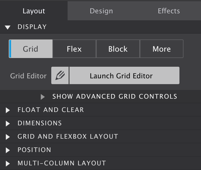
The Grid Editor Dialog
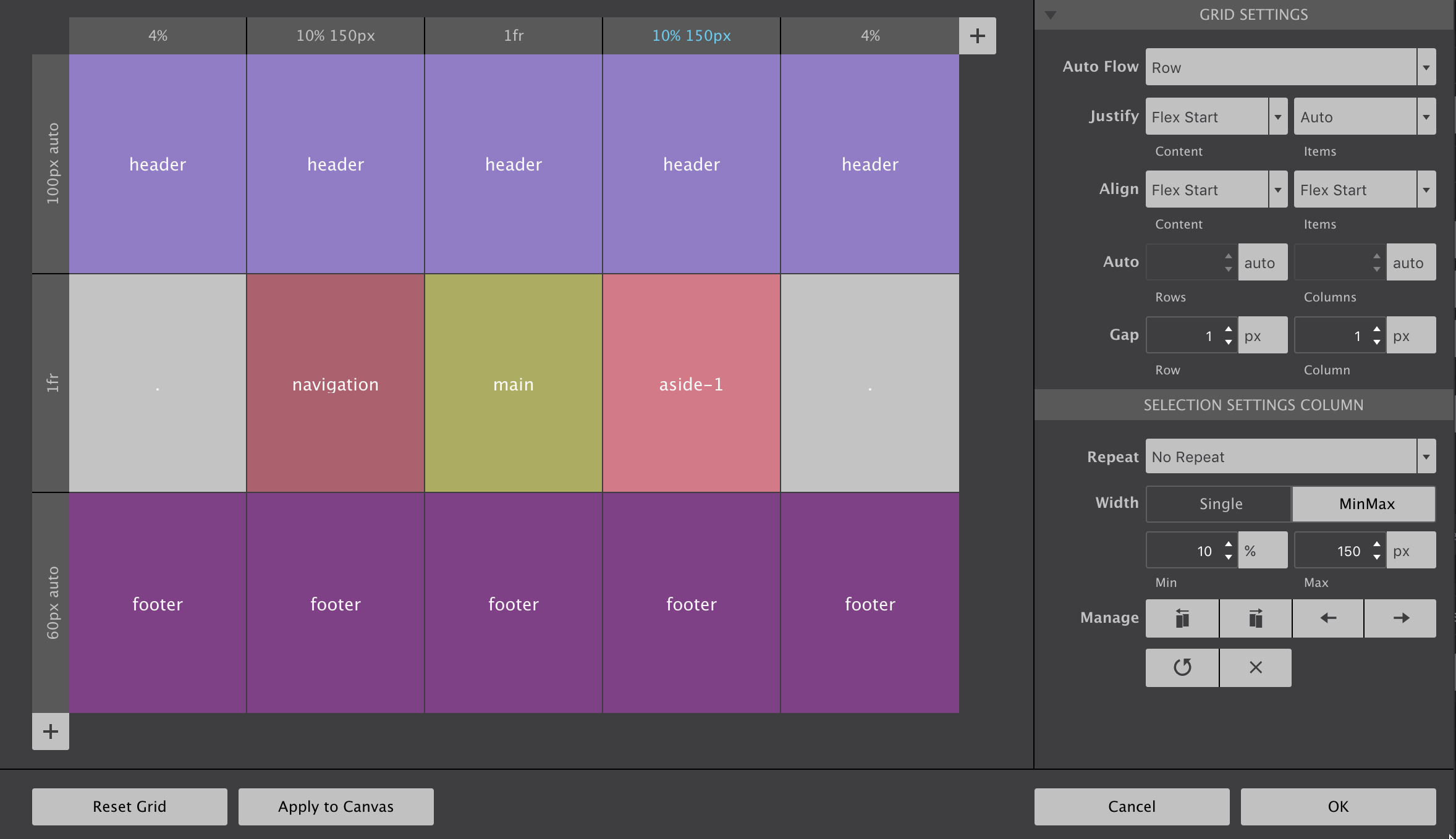
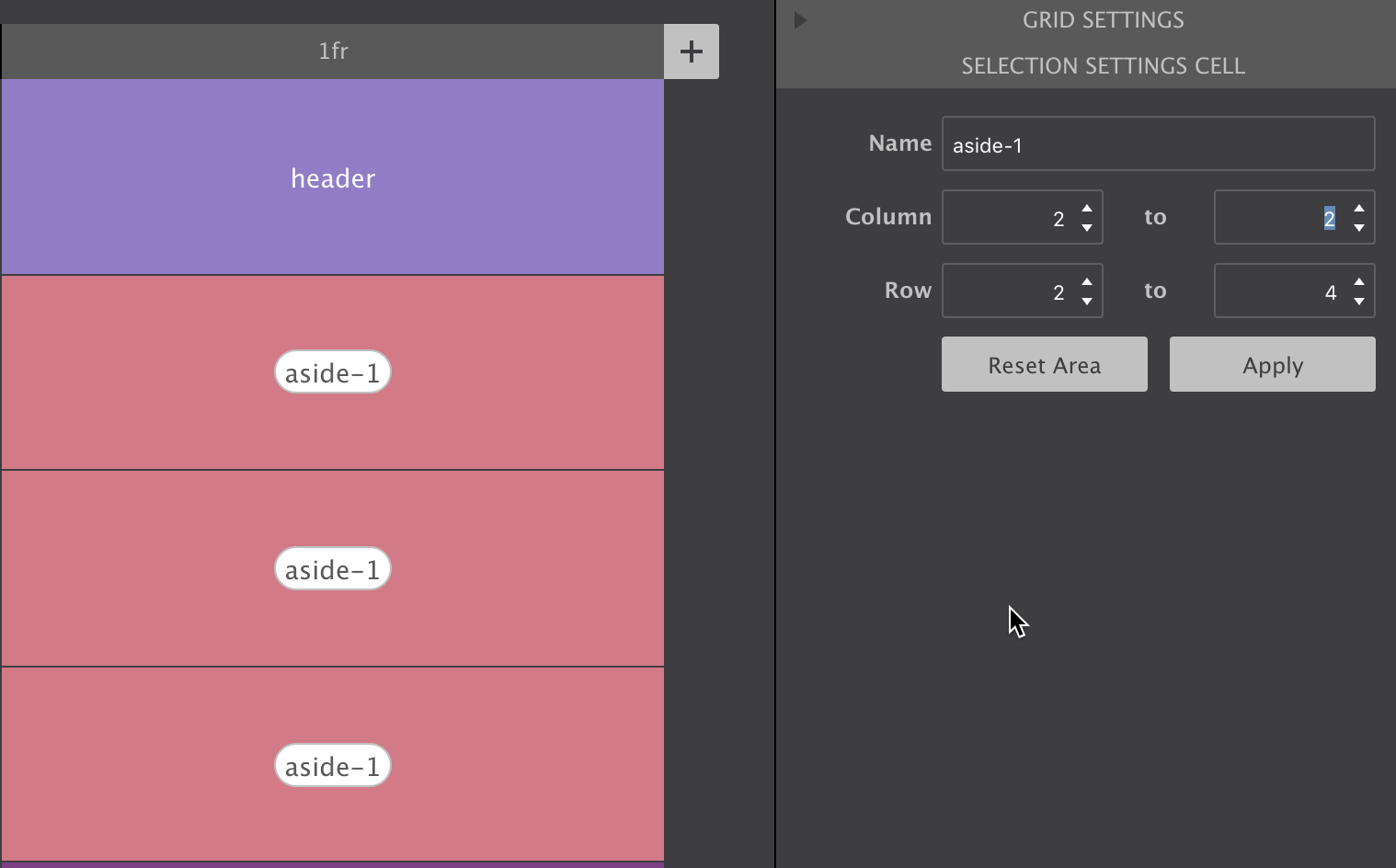
Configuring Grid Tracks
Grid columns and rows — grid tracks — are added using the respective + buttons. To configure row or column settings, simply click on the grey header. Then widths and heights can be specified using the input and unit chooser which includes the new awesome fr unit. A single value or MinMax values (really handy!) can be selected with the height (rows) or width (columns) toggle.
There are also manage controls that make it easy to duplicate rows and columns or move them into different positions. If you have a large screen and hit the Apply to Canvas button on the low left, you will see all elements in the grid container reposition accordingly.
Defining default placement behavior
This can be influenced through the controls in the Grid Settings section. By default grid-items are automatically filling the cells on a row by row basis. This auto placement algorithm can be influenced with the Auto Flow property available through the corresponding dropdown in this section. Some explanation on how the dense keyword works will be added to the Grid Guide soon.
The Justify and Align properties work very similar to how flexbox aligns items. They determine where the items are placed in a grid area along the column (block) and row (inline) axis.
Rows and columns that are automatically created normally grow and shrink to accommodate the content they hold. Using the Auto controls a default size can be specified for that situation.
Gutters can be specified with the Gap controls. If you are like me and have tried to do this in Flexbox layouts you will just love the way it works here!
Creating Grid Areas
Grid cells can be named. When adjacent cells have the same name grid areas are created. Items can be placed by simply specifying what area they belong to. A very semantic and convenient way of managing a layout!
Click on a cell to opens up a text input. The name can be entered directly in the cell or in the corresponding control area on the right (see below).
Using the control pane you can also specify how far an area needs to stretch, what column or row it starts and where it ends. Just don't forget to hit the Apply button when you’re done.
To place an item in an area, just select the element and enter the area name in the Grid and Flexbox Layout section on the Styles pane.
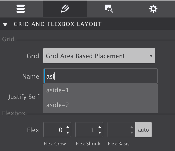
And if you are just like me and suffering from a bad memory when designing, the auto-suggest is a great help!
The video below gives a quick impression of how the CSS Grid editor works. And for those interested, we listed some reasons why we made this (free) app below it.
Quick Demo Of CSS Grid Controls
Reason #1 for Using Grid
Powerful, hot, flexible all apply this layout method of the future. But, powerful new technologies often come with a bit of a learning curve. The same is true for CSS Grid. And the fact that the grid configuration is not easily visible, does not help!
The visual grid editor (see previous big screenshot) illustrates the grid structure, and can serve as a quick reference. The structure can also easily be (re)defined using a range of cool controls.
But that is not all. As seen above, dropdowns with auto-suggest — showcased in the following screenshot — are ready to assist when placing items.
That summarizes a big part of the reasoning behind CSS Grid Builder and Site Designer. But there are more reasons why we developed this nifty app?
The Better Reason?
Frameworks like Bootstrap (4 alpha) and Foundation recently added a flex-grid to their code base. We think that's the wrong approach — flexbox was not made to serve as a page layout system. Flexbox was created to manage the layout for smaller page sections, and as such should be used in conjunction with CSS Grid.
Now we do understand part of their thinking: browser support for CSS Grid is currently not as high as for flexbox. However, it has been growing way faster than support for flexbox ever did, and we expect global support to be close to flexbox in a matter of months.
That's what makes this app experimental though — you probably don't want to create production web site using CSS Grid (although this site is), unless you want to be cutting edge or mainly target people with modern, updated, browsers.
Prototype like a boss
CSS Grid Builder it is great for prototyping responsive designs though. Changing layouts at breakpoints is blazing fast (as soon as you get the hang of it). And instead of multiple static comps, you will be able to present a single, naturally, flowing design.
Prototype with grid layout — skip static graphic editors.
At any rate, this app and tutorial will help you learn and prepare for the layout technique of the future. You can still use Bootstrap and Foundation, and see how to feels with CSS Grid for layout design.
Ready to master the grid? Enter you details above and we will send you an email with download links for both Windows and macOS. Don't worry, it's instant!
Both the app and this guide are works on progress. By signing up we will keep you in the loop with the latest developments and freshest updates. Enjoy!