Advanced Grid Configurations
Layouts that previously were difficult — sometimes even hairpullingly impossible — to create, are now within easy reach. New functions such as the MinMax that we touched upon in the last example, in combination with new sizing units such as the fr offer all types of responsive layout possibilities.
Another helpful function that the observant reader might have spotted in the last CSS Code box in the previous chapter is the Repeat function. This method allows you to define a pattern, which is repeated a certain number of times. In the previous example this was used to specify the last two grid rows by simply using repeat(2, minmax(80px, auto));.
That single piece of code creates two grid-tracks with a minimal size of 80px and allows them to automatically grow if needed by its contents. To create five of these tracks simply set the repeat value to 5.
When Repeat is used in combination with auto-fill (or auto-fit), tracks of a specific size or size range can be automatically generated as display room becomes available. This can be very helpful when responsively laying out 'unknown' content like, for example, content generated by Content Management Systems. Looking at a use case for this seems like a good idea and is what we will do later in this chapter.
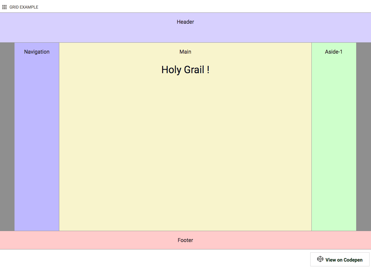
To kick oft this chapter we will be taking on a layout design that historically has been a tough nut to crack, the 'Holy Grail'.
Contents in this chapter
Code Demo: The Holy Grail Layout
The Responsive Holy Site Grail
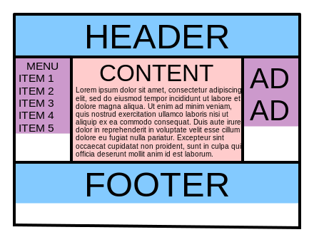
For starters let me point out that the 'Holy Grail' is not necessarily better or more effective than other site structures. The name comes from the elusive search to find a good implementation for creating this very specific layout structure. But now, with CSS Grid, it has become a piece of sweet cake!
The Holy Grail Layout consists of five sections - a header, main content area with two sidebars, and a footer. There are various requirements. On small (mobile) screens all the sections need to stack, with the header on top, followed by the sidebar with the navigation, the main content area, the second sidebar and finally the footer. Yet, in the source order the main content area needs to be placed before the sidebar with navigation. This requirement stems from the common belief that search engines consider content higher up in the DOM Tree — code of the page — to be more important.
Another important requirement is that on wider screens the sidebars and main content area have the exact same height, independent of their contents. By default, containers grow and shrink depending on the amount of content, visualized below in the 'No' Holy Grail image from wikipedia.
Now let's see how I recreated this structure with CSS Grid.
Explanation: Creating The Holy Grail Layout
Setting up the 'stacked' mobile version is nothing we have not seen before. The HTML code below gives us the handles to create the different layout areas.
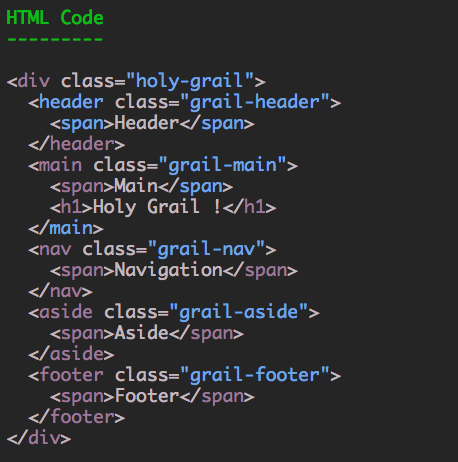
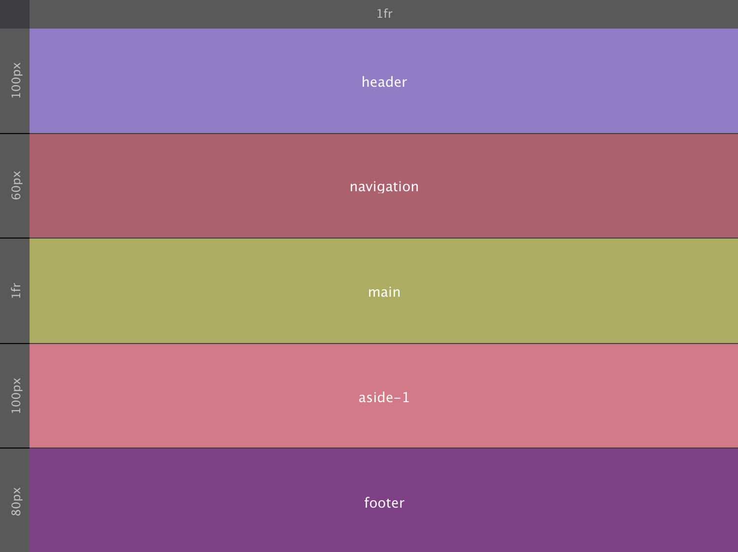
For the grid we are using a single column that takes up the full width using 1fr. Then there are five rows, one for each container. The resulting five cells will be getting the intended area names such as header, main and so on.
To mimic the height of the (device) viewport, the grid container has been given a height — the specific height of 580px is a bit arbitrary but will do the job. Of that height each of the rows / areas takes up a fixed part; 100px for the header, 60px for the navigation and so on. The main content section takes up all the free space (if any). The 1fr will do that job, causing the grid to always fill the screen (container in our example) even if the content does not help to fill it up.
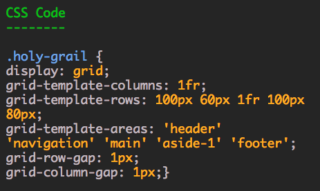
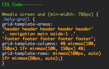
The grid setup for small screens would look as below. Please note that in contrast to the HTML code above, in the grid CSS main comes after navigation.
Or in code:
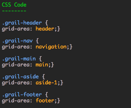
With that the only thing left to do is to add the grid areas names to the corresponding element selectors — the different classes for each container — like so:
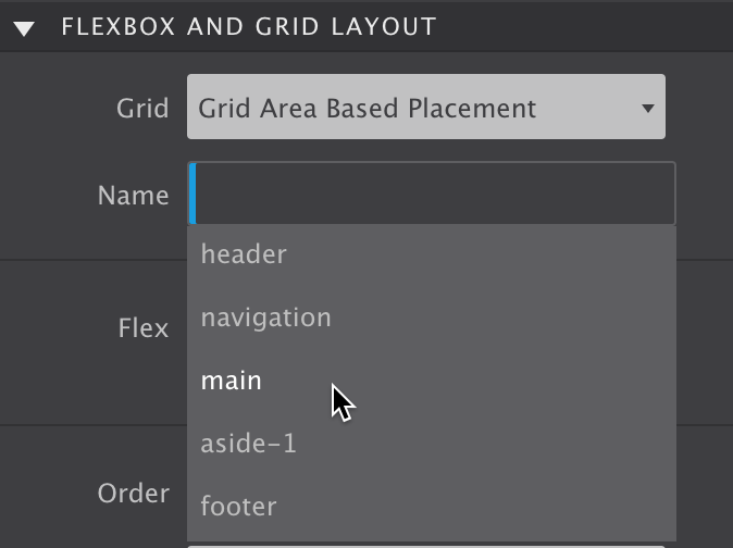
Or when done in the app using the auto-complete dropdown:
With the initial grid setup and containers mapped to the corresponding areas making adjustments to the layout for wider screens is super easy. Simply updating the grid setting will reposition the elements, nothing, zero, nada has to be done on the elements themselves! Here is the (visual) grid configuration following the 768px breakpoint:
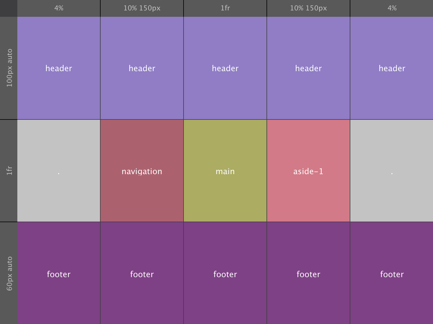
For viewports wider than 768px we switch to using 3 rows and 5 columns. Working from the inside out, with the 1fr size value both the middle row and column take up any 'left over' space. Both sidebars get 10% of the width, with a maximum of 150px.
The first and last column get 4% of the available space. Only the header and footer areas use these columns, making them stretch the full width. A nice contrast with the empty space on the left and right in the row with the sidebars and main content areas.
The effect is pulled off by leaving the left and right cells in the content row empty / without a name. If no name is given, a period ( . ) has to be used. That way no cells are skipped, creating a consistent structure for the browser to interpret. Just a slight but now easy to create enhancement to the original Holy Grail layout!
The header and footer rows take up a minimum height of 100px and 60px respectively. They can both grow if required by the content. So, at the minimum values the, height of the content area will be 420px (580 minus 160). In code the restructured layout will look as follows:
With the layout map redrawn the items (containers) will automatically shift to the new area positions, taking their contents with them. Again, all without changing a single thing on the grid-items themselves — sweeeet!
Before we start adding content into the layout sections (containers), let's see how we can build a grid that will automatically generate as many track as will fit into the grid container. When we need to work with a bunch of smaller content elements within containers that automagically reposition and change sizes, this is something that I suspect could come really really handy...
Code Demo: The Adaptive Grid
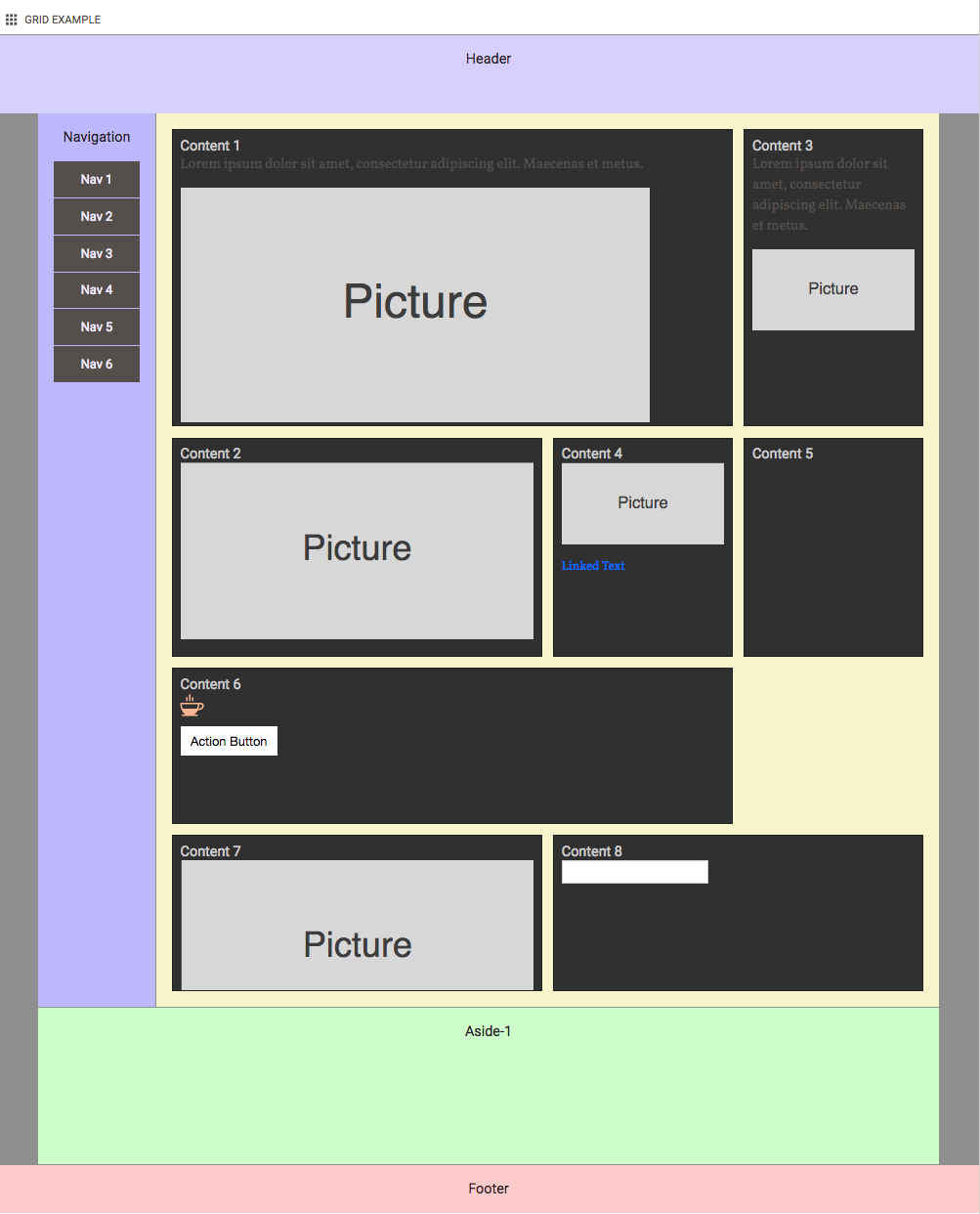
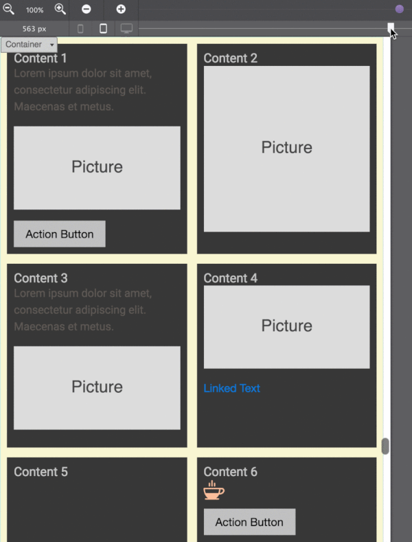
We have seen it a number of times now, CSS Grid is a smart creature. It is very aware of it's children, the grid-items, and will adapt where needed. This is illustrated with the above example where placeholder content is added the holy grail layout of the previous example.
Auto Grid Generation
The navigation section now contains an actual menu structure. This can be created in a number of ways — many people use an <ul> element with list items. In this demo I am using a simple container with a series of button elements inside. As you can guess, this container becomes the grid-parent, turning the buttons into grid-items.
On small screens, the navigation buttons are placed next to each other, with a small gutter between them. This process continues until the 'grid' runs out of space. At that point, grid is smart enough to create a new row where the exact same pattern is repeated. To set this row apart, a row gutter (gap) is defined as well.
It still gets better. When room does become available, on wider screens for example, buttons that were placed on a lower row will move up when possible. This also means that buttons can be added or removed as needed, or as generated by a Content Management System while the structure remains intact. There will always be a well organized and systematic laid out navigation menu, no matter how wide the screen or how many buttons there might be.
Setting up this type of structure only takes a few lines of code:
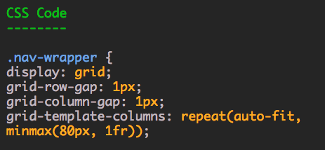
The heavy lifting is done by the repeat function in combination with the auto-fit and minmax keywords. As discussed at the the start of this chapter, repeat can be used define a row or columns pattern that repeats a certain number of times. When auto-fill is used instead of a numerical value, the pattern is repeated as many times as will fit in the grid container. The auto-fit keyword behaves in a very similar way, except that it will only create as many tracks as needed to place the grid-items.
The minmax function controls the size of the tracks. They will all be a minimum of 80px. If there is room available, if there are not enough grid-tems to fill the space, they can grow. In that case, the 1fr makes sure the tracks will all have the exact same size.
When the position of the navigation section changes to a small sidebar on wide screens, the buttons stack. No code changes are needed for this. Since there is simply no room for more than 1 track of 80px, new grid rows are automatically created until all items have been placed. Since these rows have not been explicitly created in the code, they are called implicit rows, generated by 'grid'. Although the columns are also auto-generated, they have been specified in code and are therefore explicit columns.
The main section uses similar techniques to place the items, especially on small screens where there is limit room for creating creative layouts. On wider screens however, we want to 'unbore' the structure and spice things up a bit.