The Content Pane
The Content pane uses three sub-panes for organizing the various form building blocks, one for content Elements, one for Components, and one for Symbols.
When the Content pane is selected the most frequently used Elements, sub-pane is open by default. From this pane, you can add input boxes, buttons, images and more. These elements are the smallest form building blocks.
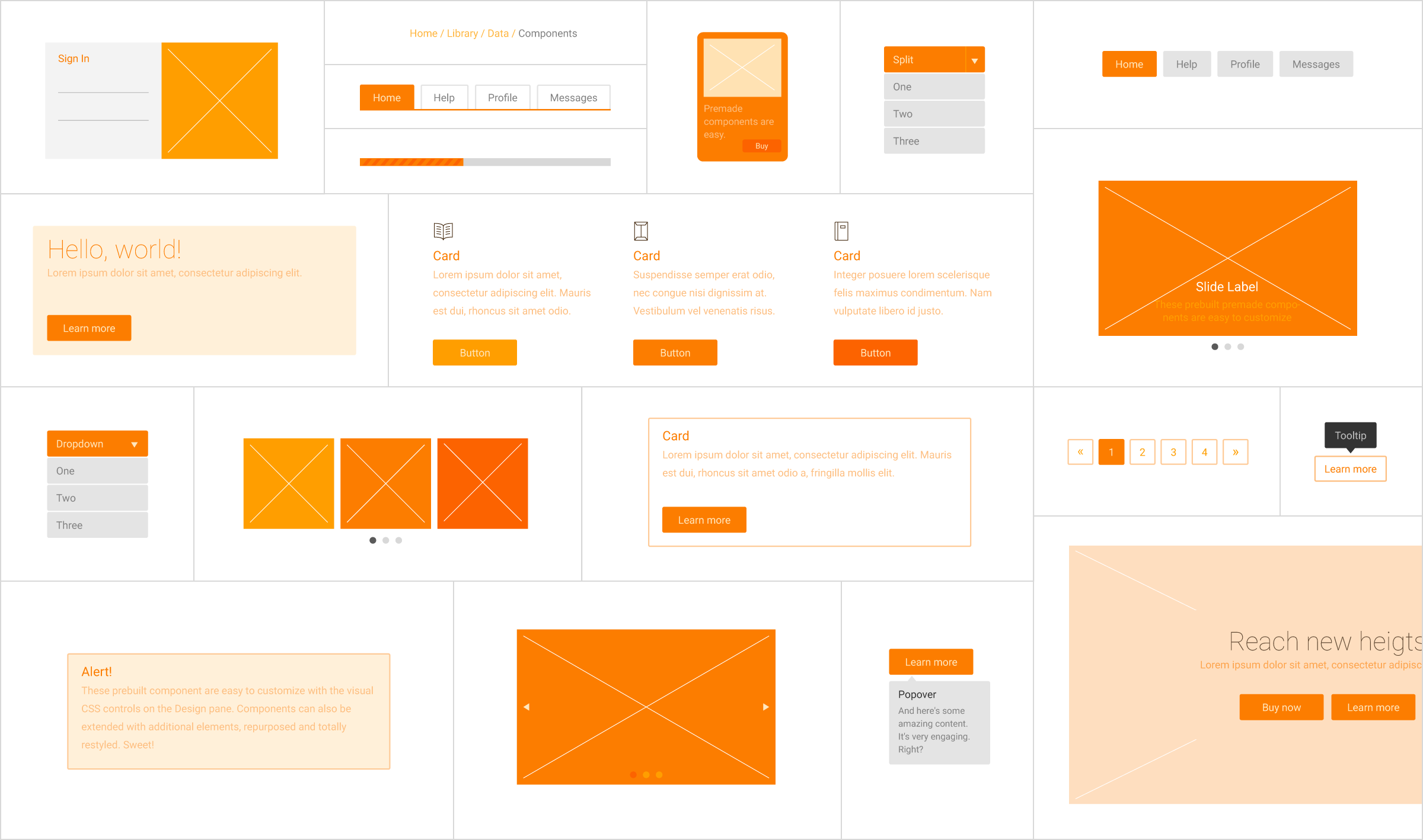
Components usually consist of several elements. Together they perform a more complex role such as a a (series of) cards, an accordion or tabs.
Symbols are special elements or groups of elements that are kept the exact same throughout a project. When one instance of a symbol is updated, all other instances in the project will be changed as well.
Contents in this chapter
Content Elements
Elements are the most basic building blocks, we believe in this so strongly that we changed their appearance to make them look like blocks themselves :-) They have been organized into categories by type. We placed the most frequently used elements, Form Elements, at the top of the pane.
The next category consists of elements that can help to create sophisticated responsive Layout constructs. Under the Add Spice section you'll find various buttons, page enhancements like videos or HTML inserts, along with social icons. Each of these categories is addressed in a bit more detail below.
Each selection can be added to the canvas when clicked or by dragging-and-dropping into place. Once in the canvas, the element can be styled using the Styles pane and the actions configured under the Elements pane.
Additional Resources
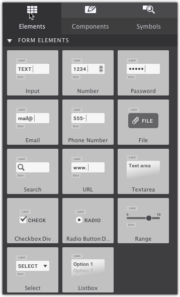
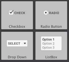
Form Elements
These are a few of the typical elements that are most commonly found on web forms. This includes Input boxes, Phone Number, Checkboxes, Radio Buttons, and more.
Click on the block to add the element to your canvas.
Element Properties can be configured on the Element pane. This include making a form element required or include specific restrictions or formatting.
Text elements
There are a few different text elements available. The ones with a little arrow on the right of the button come in variations. Clicking the arrow of, for example, the Heading 1 allows you to choose from a heading 1 - 6.
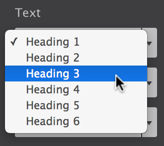
Each of the elements performs a different (semantic) role. A heading element, for example, describes the topic of the section that follows. A paragraph is usually a block of text and so on. Simply choose the element that you feel will most suit the purpose of the text.
The placeholder texts can be replaced by typing or pasting text blocks in Text Edit mode. Triple-clicking a text element will start the text editor. Alternatively, you can use the edit button on the Design pane or use the right-click menu. The Text Editor can also be used to add inline links and formatting.
Text elements can be edited in place when the Text Editor is active. The editor can be activated in a number of ways. Right-clicking a text element will bring up a contextual menu that gives access to common functions, including Text Edit.
image elements
When a Picture element is added, initially a placeholder image is used. This allows for rapid experimenting or prototyping without immediately having the spend time on finding, optimizing, etc. real images.
Replacing the placeholder happens on the Element pane. You can also right-click and select 'Edit Picture'.
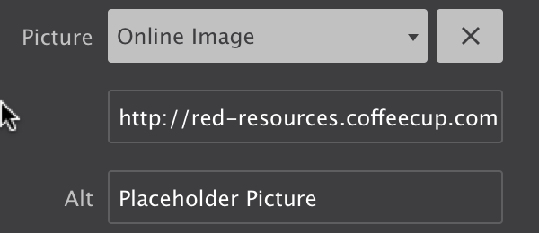
From the Element pane > Selected Element Properties > Picture use the dropdown to switch between the placeholder and a local or online image.
When selecting a local image, you will be asked to select one from the file system. The chosen image will be added to the project and be displayed instead of the placeholder image. When you choose to publish or upload your project, this images will be included in the images folder.
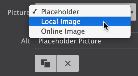
You can also provide a link to an online image. In that case, you can insert (paste) the URL to the image in the input box that appears below the dropdown.
You will notice that a newly added image will not be wider than 200px. This can be changed on the Styles pane with the max-width control.
Using the Picture element, you can change the image at breakpoints, serving smaller images to mobile devices for better performance.
Layout Elements
Layout elements offer more granular control over the form layout. They are also be used to build logical groups of elements or groups with a specific role of function such as an input box label with instructions combined with the answer field.
Containers often serve as ‘wrappers’ for related elements. When creating a card (component) the container often encapsulates one of more text elements, an image, a button and sometimes sub-container with additional elements. We will look at this in more detail in the Component section.
List Containers are unordered lists with each list item being its own container. They are often used to build multiple choice items.
A Link Container functions exactly as a Container, but wrapped in an label, making it one big link element.
Single Form Elements
The elements in this category are generally only used once within a form project.
This includes the form Submit button for transmitting the form data, or Reset button to enable the user to clear the form content.
Other elements include a Password field which masks the entry from prying eyes. Email and Phone number entries and more.
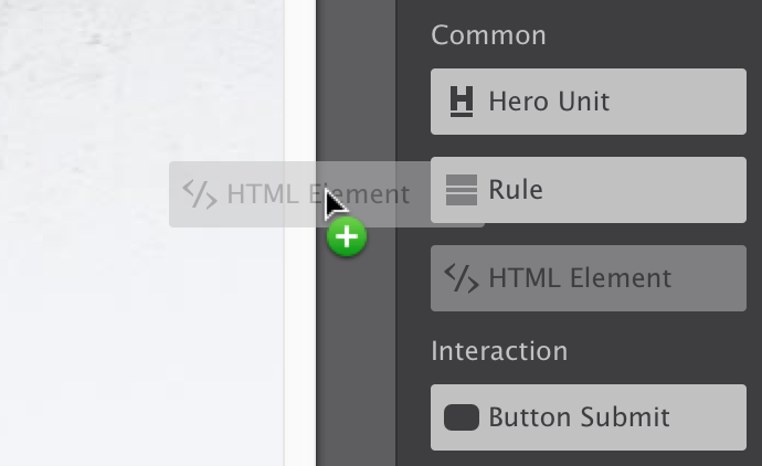
Add Spice Elements
This section contain elements to enhance the form or add special interaction. The Hero Unit is a popular as it is used to bring attention to the key content.
The Rule element is a thin (you can change that!) border used ideally as a divider between separate sections of your form.
The HTML element can be used to add custom code snippets or exports from other apps. To not interfere with the other elements on the page currently a placeholder visual is displayed.
A Button Link can be made to open a menu, reveal a hidden element or show modal dialog. It can also take the user to a different location, on the page, site or to an entirely different site.
The Social Icons can both be used to build a following on the social networks and allow visitors to share information. Select the Follow or Share option on the Styles pane (for networks that support these), then fill out the various options.
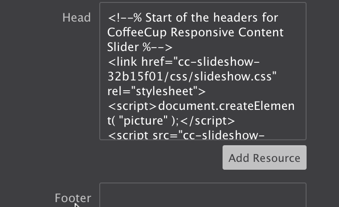
How to use the HTML Element
Adding custom HTML or code objects to your page is easy. Markup for the HTML element is inserted on the Element pane within the HTML box.
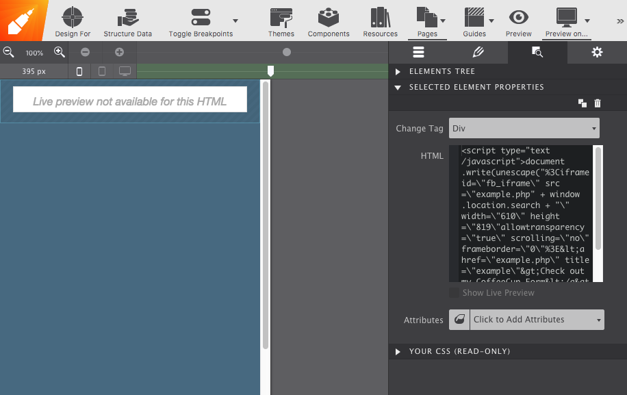
Please note, to not interfere with the internals of the app some objects, mostly the ones using Javascript, objects cannot be previewed live in the working area right now. You will need to use the ‘Preview on…’ icon in the toolbar to view them in the browser. For some items, you might need to publish to view the HTML element in action.
Additional Resources
Components Library
You've carefully crafted a site feature that is simply perfect. And now you want to duplicate this masterpiece somewhere else but don't want to build it all over again. Meet the Components Library. This feature lets you save and reuse content, rescuing you from repetitive design work and speeding up production time.
You can save anything to your component library. Generally, they make up a combination of elements that together produce a special function.
Since these items are saved to the library, anytime a new chapter is added, they can be popped into place quickly and then edited appropriately. Watch how it works:
Better than legos!
Save and reuse form features. They can be dropped into a project and customized with your preferred styles.
Save custom components to your library to reuse them throughout your projects. Items can be given a description and organized in folders to keep you organized.
PROJECT COMPONENTS
After adding a component to your project, you can access them on the Components sub-pane of the Content pane.
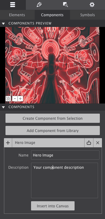
Component Controls
The upper part of the pane shows a preview of the component. To improve visibility — a white component does not display that well on a white background — the background color of the previewer can be toggled. The bottom left button can change the setting between white, black and transparent.
The plus and minus buttons next to the background color button can be used to zoom in and out. In case there are similar components in the project, this provides a good level of detail to find the right one.
The preview shows the currently selected component from the list below the preview window. Clicking on a component will expand it so the name can be edited. To add a component to the canvas, click the plus (+) button. It will get inserted below the currently selected element.
To remove a component from the list use the delete (X) button next to the component title. Note this will not remove the component from the canvas, only from the list.
Create Custom COMPONENTS
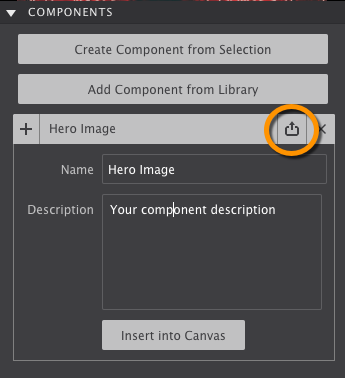
To save a selection from your project as a component, first select it on the canvas, then go to the Components Section.
Click Create Component from Selection button to generate a fresh component based upon the currently selected element (group). This component will be placed at the bottom of the list. Project components can not be reordered, filtered or sorted at this moment.
Give your component a Name so that you can identify what it is and add a description. To save it to your Component LIbrary to reuse in other projects, click the up arrow next to the component title.
WORKING WITH PREBUILT COMPONENTS
Most of the components found in the theme are core framework components. Using these ‘base’ components, themes can be used for quick functional prototyping and as a solid, proven, foundation for new projects.
Components generally consist of a number of nested elements combined with predefined classes. The image shows the classes for an accordion item.
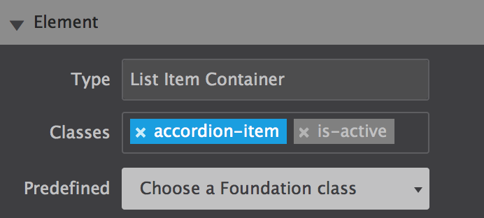
The image shows that the is-active Foundation classes have been disabled. This makes sure that any custom styles are only tied to the accordion-item class. We will talk more about the use and de-selecting of classes in the Style pane section.
SYMBOLS
Symbols are elements or groups of elements (components) that are kept the exact same throughout a project. When one instance of a symbol is updated, all other instances in the project will be changed as well.
Sync it up!
Update common items all at once. Edit everything all at once with just one edit.
This, for example, allows for adding a footer link across all pages with one single edit. Keep in mind that a single element such as a buy button or copyright notice that comes back in various place of a project can be a candidate for a symbol as well.
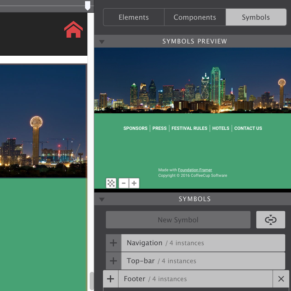
In the image below the footer symbol is selected on the Symbols sub-pane. The entire symbol is visible in the preview area, just as with the components. On the left, part of the footer is also visible on the canvas.
When a symbol is selected, it is surrounded by an orange line on the canvas. This is to help differentiate between symbols and ’normal’ element groups. The Symbol container will also have an orange dot on the right in the tree view of the Element pane. This pane will be discussed later in this guide.
Symbols can not be nested — symbols can not contain other symbols — because that could create an update loop nobody can get out of...
Adding a Symbol to the Canvas works the same as for components. However, any changes to a Symbol will update all of the ‘instances’ — wherever they are located in the project, the app will keep them all exactly the same everywhere.
Creating a New Symbol also works in the exact same way as creating a new Component. When a symbol is deleted, it will be removed from the list, but all instances will still be in the project. From that moment they will behave as normal element groups, any changes will no longer trigger updates anywhere else.
When looking at the image below, you will also note a few differences. For starters, the name of the Symbol is followed by an instances count. This tells you how many times the Symbol is used in the project.
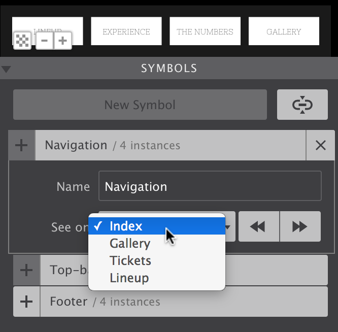
The name of a symbol can be changed using the Name input. With the See on function, you either can circle through the pages where an instance of the symbol is located, or directly jump to a specific page with the dropdown. Using this function, the canvas is automatically scrolled to the place on the page where the Symbol is located.