Viewport Slider & Breakpoints
The Viewport Width Slider and Breakpoint controls are used for previewing and managing the page at different screen sizes.
The built-in width slider helps to test the layout, design and usability of the content at all possible screen widths. The page elements proportionally grow and shrink depending on the available space for displaying it. However, at some point layout or design changes are needed to prevent elements and content to become too small or otherwise unusable.
This is where the so called breakpoints come in. They provide the power to serve your viewer's an altered design depending on screen size.
Contents in this chapter
Viewport Width Slider
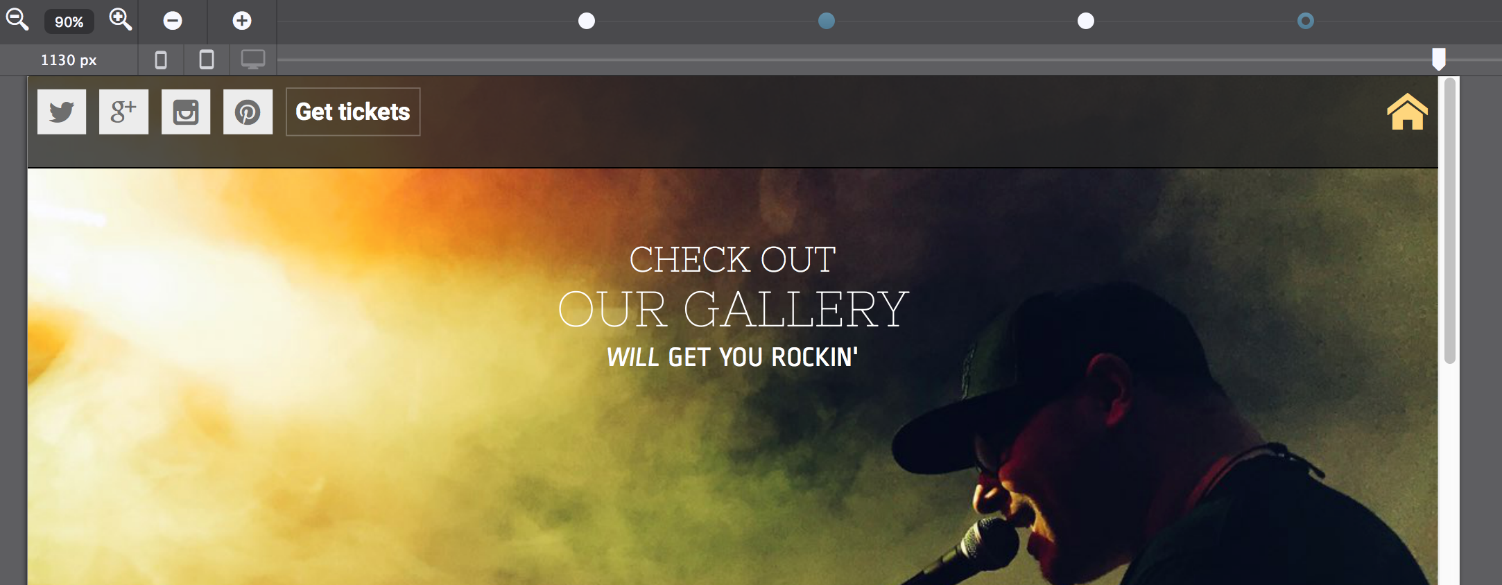
The ability to make layout and design changes where needed is key to any responsive design. On wider screens, content might need to be placed next to each other instead of being stacked. Font sizes might need to be increased and small images replaced with larger ones. The Width Slider can be used to view the website at any possible width and help decide if any such change will improve the user experience of the design.
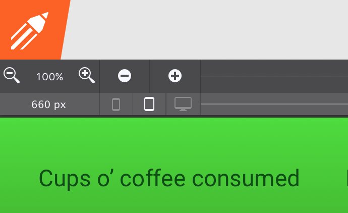
Just grab the handle to move the slider left or right and see the viewport and canvas change. You can also click on it and move it left or right pixel by pixel with the keyboard arrow keys.
The area for which you are designing for will light up. This allows you to quick indicate what screen size your selections will apply to.

The current viewport width — the position of the slider handle — is visible below the Zoom tool.
Breakpoint Management
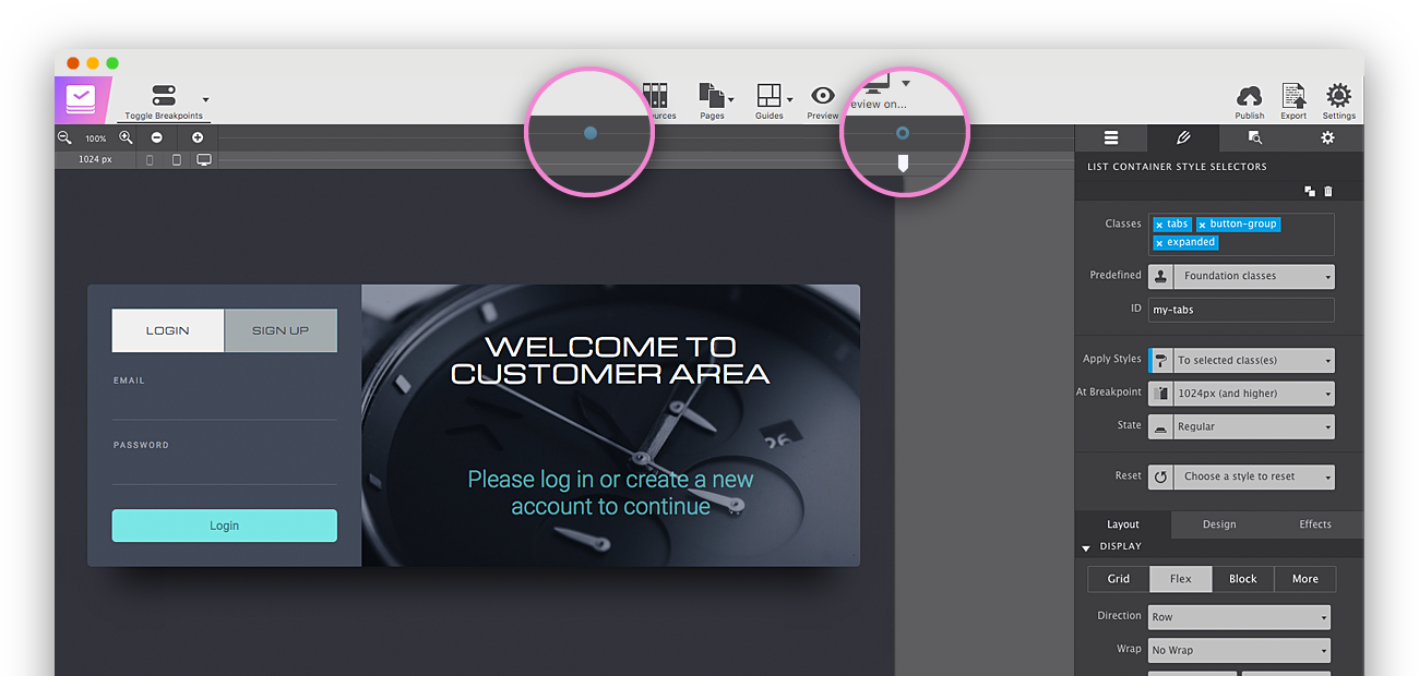
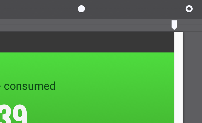
Breakpoints are the secret weapon of responsive web design. They are the places where layout or style changes are being made. They are represented by the little dots or 'points' above the Slider. The default breakpoints are colored in blue. A white dot, however, is a custom breakpoint.
Desktop monitors have grown a lot over the years and offer lots of space, allowing for a wide multi-content layout with large fonts and imagery. However, for content to be readable and usable on narrow screens such as mobile phones and tablets, a smaller but taller content structure is needed. With breakpoints the same content can be presented in optimal form across the entire range of device sizes and screen widths.
Following each breakpoint a specific set of style rules is delivered, so the site seems to ‘respond’ to the size of the display device. Layouts, widths, font sizes and other design elements are revised where needed to keep the content in focus and pleasant to consume. This feels really dynamic, that’s why we started calling these breakpoint induced changes ‘responsive actions’.
A breakpoint is active when it lights up — when there's a little dark circle on top of the point. In the image above this is the fourth point from the left. A breakpoint becomes active when the slider is placed on the right of it and until the next breakpoint is reached.
Any layout or design change they apply only as of that (break) point. They apply for all screens wider than the position of the active breakpoint but can be further changed at any of the next breakpoints.
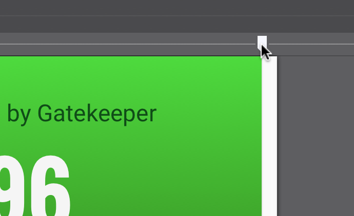
Custom breakpoints can be added by clicking on the breakpoint line or with the plus icon on the left. They can be removed by selecting one — click on it — and hitting the minus icon. When selected they can also be moved left and right with the keyboard arrow keys. Please note that the default Foundation breakpoints can not be moved, nor removed.
Design Changes At A Breakpoint
Layout changes is what responsive design is best known for. They create room where needed, or fill in gaps when enough room is available. Frequently minor changes to the font size of headings is made to prevent them from wrapping at smaller widths. Such a wrap can have a big impact on the overall layout but this is easy to remedy in the app. Simply add a breakpoint just before the wrap happens and the layout breaks, then adjust the font size. Now continue to slide and you will see that with that change the layout will continue to look good a long way.
In the video demonstration below, you can see how a design is adjusted for wide screens. You'll see that as the slider at the top is moved to the right, past the first breakpoint, the layout and menu are altered.
An almost endless number of responsive actions may be specified, ranging from minor adjustments to image sizes, margins, and font sizes, to major layout changes. These major layout modifications are what Responsive Web Design is best known for. Responsive actions like shifting, stacking, and swapping of page elements is what make a site truly device agnostic.
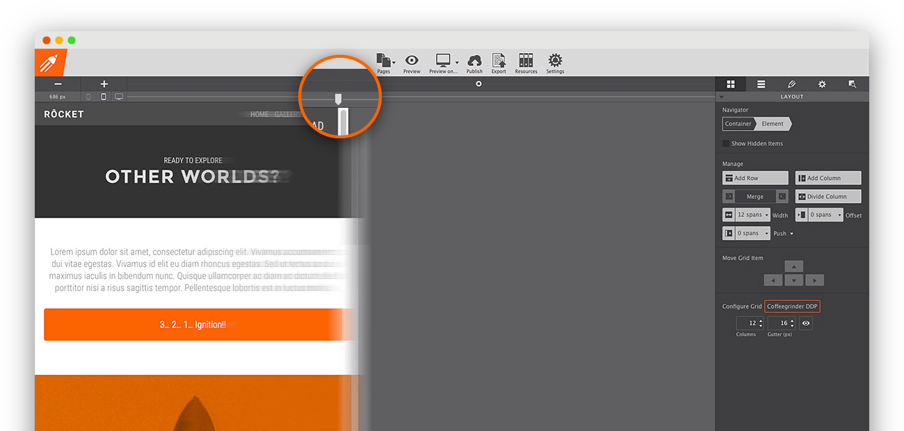
The Zoom Tool
The Zoom tool (the +/- magnifying glass) is placed on the left of the breakpoint buttons. Zooming out helps to design for large screens from smaller computers such as laptops and shows breakpoints that otherwise might be hidden behind the panes or even be offscreen.
Device Icons
The three device icons on the right of that become brighter when the device type is more common at the current width. As desktop monitors, tablets, and phones all come in a variety of sizes; this is just for reference purposes. There is no specific phone or tablet width, nor is it possible to ‘design for phone.'
Instead, responsive design has to look good and perform well at every width — the icons are merely an indication of what type of device might be used for viewing the site at the current position of the slider.